Enhance your calligraphy skills with structured practice exercises and worksheets. From basic strokes to complex letterforms, find the right exercises to improve your technique and develop muscle memory.
10 min readAll Levels Level
Table of Contents
Affiliate Disclosure: This page contains affiliate links to products selected for practical fit. When you purchase through these links, we may earn a commission at no additional cost to you. Recommendations are based on product specifications, community feedback, and fit for common calligraphy needs. See our complete Tools Guide for detailed product reviews.
The hours you log matter less than what happens inside each session. Deliberate, focused drills on specific motor skills and visual judgment will outpace any amount of distracted writing.
One principle holds across most teaching traditions, including the IAMPETH curriculum: quality repetition done with conscious attention builds muscle memory faster than mindless drilling. Motor-learning research backs this up. A focused 20 to 30 minute session, with a clear target like "consistent slant on minims" or "smooth pressure release on the 'o' exit," tends to produce better skill retention than an hour of unfocused writing.
This comprehensive guide breaks down practice routines for beginners through advanced practitioners. Whether you have 15 minutes or an hour, you'll find structured exercises that target specific weaknesses and accelerate improvement. We'll also explore how different calligraphy techniques inform your practice strategy, and how understanding various calligraphy styles helps you choose appropriate drills for your goals.
The methods here draw from traditional apprenticeship models documented in Edward Johnston's foundational text "Writing & Illuminating, & Lettering" (1906), combined with modern insights from cognitive psychology about habit formation. Stanford behavior scientist Dr. B.J. Fogg's research on tiny habits applies perfectly to calligraphy: small, consistent practice beats sporadic marathon sessions every time.
Start Here Today: Pick One Routine
Do not read the whole guide before practicing. Choose the routine that matches the time you actually have, print one sheet, and stop while your hand still feels fresh.
15 minutes
3 minutes strokes, 7 minutes one problem letter, 5 minutes one short word.
Busy days, habit building, and keeping the hand warm.
Weekend sessions or focused repair of a stubborn issue.
For the lowest-friction setup, open the practice sheet generator, choose your x-height and slant, and print one page. If your pen skips or the paper feathers, move to smoother paper such as Rhodia Dot Pad A4 before blaming your hand.
Foundation: Basic Stroke Drills
Every session, even for working pros, starts with basic strokes. Treat them as maintenance for the hand and eye, not as remedial work.
Watch any master calligrapher preparing for commissioned work, and you'll see the same routine: five to ten minutes of fundamental strokes before touching the actual project. Why? Because these exercises activate the precise muscle groups, calibrate pressure sensitivity, and establish rhythm. It's like a pianist running scales or an athlete stretching - you're preparing your neuromuscular system for complex movements.
Think of basic strokes as the alphabet of movement. Once the underlying gestures (downstroke, oval, branching arch, compound curve) are reliable, complex letterforms become recombinations of familiar motions. Skip the warm-up and every letter feels like starting from scratch, because the hand has to rediscover the gesture mid-letter.
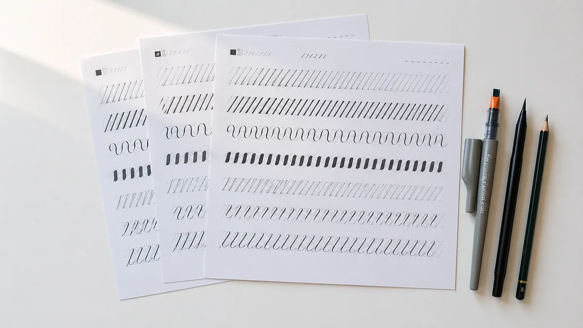
Essential Warm-Up Strokes (5-10 minutes)
These four drills come from the same families that traditional curricula have used for over a century: the Spencerian "principal strokes" sequence (straight line, right curve, left curve, oval), the Italic minim drill, and the Copperplate stroke ladder you'll find in most IAMPETH workbooks. Pick a metronome tempo of around 60 BPM, one stroke per beat, and stay there. If you only have time for one thing, do these.
Drill 1: Parallel Downstrokes
Draw vertical lines across the page, maintaining consistent spacing (about 5-7mm for copperplate, 8-10mm for italic). Each stroke should be identical in angle, weight, and length. This drill trains your eye to judge spacing and your hand to repeat identical movements.
Specific focus: Consistent 52-55 degree angle (copperplate) or 5-10 degrees (italic). Uniform thickness throughout each stroke. Equal white space between black strokes - the negative space matters as much as the positive.
Success metric: Can you achieve 10 consecutive strokes where the spacing variation is less than 1mm?
Drill 2: Pressure Transitions
Create graduated strokes that transition from hairline to full pressure and back. Start with light touch, gradually increase pressure to maximum (without breaking the paper or causing the nib to splay), then release back to hairline. The entire transition should be smooth and controlled.
Why this matters: Letters like 'o', 'a', 'd', 'g', and 'q' all require smooth pressure changes mid-stroke. Jerky transitions scream "beginner." Smooth transitions look professional.
Success metric: No visible "steps" or sudden thickness changes - just smooth gradation from thin to thick to thin.
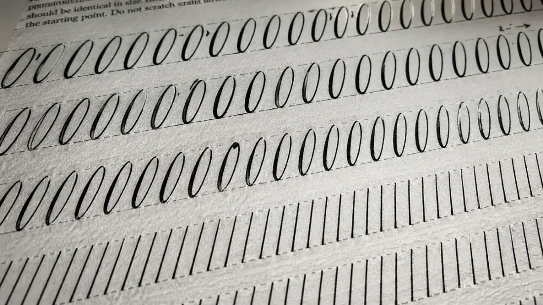
Drill 3: Compound Ovals
Draw ovals that match your style's proportions - typically 1:1.5 height-to-width ratio for Copperplate, more elongated for Gothic styles. Each oval should be identical in size, shape, and slant angle. This single shape forms the foundation of a, c, d, e, g, o, and q.
Pro insight: A common saying among type designers is that the 'o' is the mother of all letters. Get the oval right and roughly half the lowercase alphabet falls into place naturally; get it wrong and every letter that contains the shape inherits the same flaw.
Success metric: Place template overlay on your page - do your ovals match within 0.5mm variation?
Drill 4: Branching Strokes (n and u shapes)
Practice the branching stroke (the Italic minim drill) where the arch leaves the stem at roughly one-third of x-height. This movement is the core of n, m, h, r, b, p, and k. Get it wrong and the text wobbles; get it right and you've solved one of the most frequent gestures in the script.
Common mistake: Beginning the arch too high (makes letters look top-heavy) or too low (makes them look squat). The one-third rule comes from centuries of refinement by master scribes - it creates the most balanced, readable letterforms.
Success metric: Can you write a line of 'minimum' where every branching point occurs at the same height?
Expert Practice Strategy
Set a timer for each drill - exactly 2 minutes. This prevents the common trap of rushing through exercises you find easy while avoiding challenging ones. Every drill matters. Every drill develops specific capabilities.
Quality beats quantity. Ten clean repetitions teach the nervous system more than fifty sloppy ones. If you catch yourself speeding up or zoning out, stop. Take three breaths. Resume at deliberate speed. The classical-music teaching cliché holds here too: practice makes permanent, so only careful practice makes you better.
Use our practice sheet generator to create custom drill worksheets with guidelines perfectly sized for your style and nib width - pair it with a smooth, ghost-free pad like the Rhodia Dot Pad A4 so your nib glides instead of catching. For focused learning, try our specialized sheets: alphabet practice for mastering A-Z letterforms, sentence practice for improving fluency, and name tracing for personalized worksheets. Having pre-printed sheets eliminates setup friction and makes daily practice effortless.
Systematic Letter Practice
Drilling A through Z in order wastes time. Group letters by structural similarity instead, so the hand learns one gesture and reuses it across the family.
The letter-family method goes back to medieval scriptoria, where apprentice scribes learned letterforms in groups built around shared strokes. A student who had mastered 'n' picked up 'm', 'h', and 'r' quickly because they are variations on the same branching movement. The reason this still works has more to do with motor learning than tradition: the cortex generalises a learned gesture across related shapes far more easily than it memorises each shape from scratch.
Contemporary research in motor learning backs this up. A 2018 study in Applied Cognitive Psychology found that "blocked practice" (repeating similar movements) initially feels more productive than "random practice," and for building foundational patterns, it genuinely is more efficient. Once you've established the basic movement, then you introduce variation.
Study our complete alphabet guide for detailed letterform construction across different styles. Understanding calligraphy styles helps you recognize which letters will challenge you based on your chosen script.
The Four-Week Letter Family Progression
This schedule assumes 20-30 minutes of daily practice. If you practice less frequently, extend each week proportionally. The timeline matters less than achieving consistency within each family before moving forward.
Week 1: Straight Stroke Family
Letters: i, l, t, j
These letters teach you the most fundamental skill: drawing a consistent vertical stroke at your chosen angle. If your 'i' is inconsistent, every letter with a vertical element will be inconsistent. Nail this family, and you've solved about 40% of your letterform challenges.
Practice sequence:
Day 1-2: Master 'i' in isolation (the simplest vertical)
Day 3-4: Add 'l' (extended ascender, same vertical stroke)
Day 5: Practice 't' (introducing the crossbar)
Day 6: Tackle 'j' (descender and curve at bottom)
Day 7: Combine in words: "little," "title," "jilt," "tilt"
Write each letter 20-30 times before moving to the next. Yes, it feels tedious. But this is where you're programming muscle memory. Rush this stage, and you'll struggle for months.
Week 2: Arch Family
Letters: n, m, h, r, u
The branching stroke you learned in warm-ups? This is where it matters. These letters are essentially the same movement repeated with slight variations. Master 'n' and 'm' is just 'n' extended. The 'h' adds an ascender, 'u' inverts the arch, and 'r' truncates it.
Why 'minimum' is the classic practice word: It contains only these letters, forcing consistent repetition of the arch movement. When you can write 'minimum' with every arch identical, you've mastered this family.
Practice words:
"minimum" - the gold standard test
"runner" - tests consistent double letters
"human" - combines arch with ascender
"mourn" - brings in that oval from Week 3 prep
Week 3: Oval Family
Letters: o, c, e, a, d, g, q
The principle that "the 'o' is the mother of all letters" applies directly here. Every letter in this family contains the same fundamental oval shape you've been drilling in warm-ups. You're now adding entrance strokes, exit strokes, ascenders, and descenders, but the core shape stays constant.
Common trap: Students often make their 'c' narrower than their 'o', or their 'a' rounder than their 'd'. They're all the same oval - just with different entry and exit points. Use a template to check: the oval portion should be identical across all these letters.
Practice words:
"code" - combines c, o, d, e in one word
"cage" - tests consistency when letters repeat
"dodge" - multiple ovals, challenging spacing
"decade" - brings in previous learning (d, c, a, e)
By now, you can write most common English words. That's not coincidence - these three families cover roughly 70% of letter frequency in English text.
Week 4: Complex and Specialty Letters
Letters: s, f, k, x, z, b, p, v, w, y
These are the oddballs - each has unique challenges. The 's' curve confounds beginners for months. The 'f' combines ascender, descender, and curve. The 'k' requires a confident diagonal. Don't feel bad if these take longer. They're legitimately harder.
Strategy for complex letters: Isolate the challenging part. The 's' curve? Practice just that curve 50 times before attempting the full letter. The 'k' kick? Draw it disconnected from the stem until the angle feels natural. Break complex movements into components.
Practice words:
"fizz" - double 'z' forces consistency
"boxer" - combines multiple challenging letters
"swiftly" - tests your full skillset
"analyze" - brings y and z together
Practice Progression Framework
For each new letter, follow this five-stage progression. Don't skip stages. Each builds on the previous.
Isolation practice: Fill one full line with the letter. Focus only on consistent form, not speed.
Contextual position practice: Write the letter at the start of words ("nest"), middle ("wander"), and end ("sign"). Letter shapes change slightly based on position - you need to master all three contexts.
Combination practice: Pair the new letter with previously mastered letters. This tests whether you can maintain quality while thinking about letter transitions.
Word practice: Write complete words containing the letter multiple times. Now you're managing spacing, rhythm, and overall word shape - getting closer to real writing.
Phrase integration: Use the letter in sentences. Only when you can maintain consistency in flowing text have you truly mastered it.
Move to the next letter only when you can complete stage 5 with confidence. Rushing creates gaps in your foundation that you'll spend months trying to fix. Better to spend an extra day now than an extra month later.
Use our cursive generator to see how different styles render the same letters - it helps you understand what you're aiming for. And generate custom practice worksheets with our practice sheet tool pre-printed with the exact letters and words you're working on.
Daily Practice Routines
Fifteen focused minutes beats an hour of distracted drilling - consistency and attention matter more than duration.
Dr. B.J. Fogg's research at Stanford's Behavior Design Lab found that tiny, consistent behaviors create lasting change better than ambitious plans that fizzle out. His "Tiny Habits" methodology applies perfectly to calligraphy practice: better to commit to 15 minutes daily (which you'll actually do) than promise yourself an hour (which you'll skip when life gets busy).
Professional calligraphers like Denis Brown report that their skills deteriorate noticeably after just 3-4 days without practice. But here's the good news: daily practice - even brief sessions - maintains and builds skills remarkably well. The neuroscience backs this up. Motor skill consolidation happens during sleep, so daily practice with overnight rest between sessions lets your brain integrate what you learned.
Here are time-efficient routines for different schedules. Pick the one that fits your life right now. You can always adjust as circumstances change. The goal is sustainable practice, not burnout.
15-Minute Quick Session
15 Minutes
This is your minimum viable practice - the smallest session that produces results. Perfect for busy weekday mornings or lunch breaks. I've seen students make remarkable progress with just this routine, done consistently for six months.
Minutes 1-3: Basic strokes warmup Two minutes of parallel downstrokes and ovals. You're not trying to accomplish anything profound - just waking up the motor patterns.
Minutes 4-10: Focused problem work Pick your 2-3 weakest letters. Write each one 10 times slowly and deliberately. This targeted approach fixes specific weaknesses faster than random practice.
Minutes 11-15: Application sentence Write one sentence that includes your problem letters in context. This bridges the gap from isolated letters to actual writing.
Best for: Maintenance during busy periods, building initial habit, or supplementing weekend longer sessions.
30-Minute Standard Session
30 Minutes
The sweet spot for steady improvement. If you can manage this duration 5-6 days per week, you'll see dramatic progress within three months. This is what most serious students maintain long-term.
Minutes 1-5: Comprehensive warmup All four basic stroke drills (parallel lines, pressure transitions, ovals, branching strokes). By now these should feel automatic - you're building consistency, not learning new movements.
Minutes 6-15: Letter family practice Work through your current family systematically. If you're on Week 2, this is 'n', 'm', 'h', 'r', 'u' drills. Stay with each letter until it feels comfortable before moving on.
Minutes 16-25: Word and phrase work Write practice words that combine your learned letters. This is where skills solidify - moving from isolated letters to flowing text.
Minutes 26-30: Creative experimentation Try flourishes, explore variations, or copy text you admire. This keeps practice fun and helps you develop personal style. Strictly optional but valuable for maintaining motivation.
Best for: Active skill building, working through the four-week letter program, or preparing for a specific project.
60-Minute Deep Practice
60 Minutes
Weekend sessions, when you have time and mental energy for sustained focus. An hour of quality practice once or twice weekly, combined with 15-minute daily sessions, creates an excellent rhythm for rapid improvement.
Minutes 1-10: Extended warmup Do all basic drills, but add variations. Try different pen angles, experiment with pressure, practice at different sizes. A flexible brush pen like the Tombow Fudenosuke Brush Pens is ideal here - its soft and hard tips let you explore pressure response without committing to a dip-pen setup. You're exploring the edges of your control.
Minutes 11-30: Systematic letter practice Work through multiple letters in your current family, or revisit challenging letters from previous families. This longer block lets you achieve a flow state where skills click into place.
Minutes 31-50: Project work or composition Apply your skills to actual projects: addressing envelopes, creating a quote card, copying a poem you love. This is where practice becomes art - where technical skill serves creative expression.
Minutes 51-60: Experimental techniques Try a different style, experiment with new tools, or copy historical manuscripts. This cross-training develops versatility and prevents stagnation.
Best for: Breakthrough sessions, tackling difficult letters, developing creative style, or preparing portfolio pieces.
Practice Scheduling Strategies That Actually Work
Behavior design research tells us that successful habits anchor to existing routines and minimize friction. Here's how to apply that to calligraphy:
Same time, same place: Practice right after your morning coffee or right before dinner. Linking to an existing habit makes the new habit stick. James Clear's "Atomic Habits" calls this "habit stacking."
Morning practice advantages: Your hand is rested, your mind is fresh, and you haven't accumulated decision fatigue. Many professional calligraphers report their best work happens in the first two hours after waking.
Permission to miss occasionally: Life happens. Missing one day doesn't erase your progress. Missing two days in a row? That's when habits start to crumble. Get back to it quickly. No guilt, no drama - just resume.
The weekend-weekday hybrid: Many students do 15-minute sessions Monday-Friday (totally doable even with full-time jobs and families) plus 60-minute sessions on Saturday or Sunday mornings. This rhythm provides consistency with periodic deep practice.
Pre-setup your space: Leave your practice sheet, pen, and ink bottle ready on your desk. A self-contained kit like the Speedball Calligraphy Set - holder, nibs, and ink in one box - removes the "what do I need?" friction that kills momentum. Eliminating setup friction removes a major barrier. When your materials are waiting for you, you're more likely to actually practice.
Need structured accountability? Try our 30-day calligraphy challenge calendar for a day-by-day practice plan with specific exercises. Having a clear path removes decision paralysis - you just show up and do the day's assignment.
Practice Phrases and Sentences
Strategic phrase selection accelerates specific skills - the right practice sentence teaches more than random writing.
Professional calligraphers don't just practice random text. They select words and phrases that deliberately stress-test specific weaknesses or develop particular capabilities. A well-chosen practice sentence can reveal and fix spacing issues, letter consistency problems, or rhythm irregularities that you might miss in isolated letter drills.
Historical scribes used this approach too. Medieval apprentices copied religious texts not just for spiritual reasons but because these texts contained carefully balanced letter frequencies and challenging word combinations. The tradition continues: modern calligraphy masters assign specific phrases to target specific learning goals.
Practice by Skill Development Goal
For Letter Consistency Testing
These words contain repeated letters, forcing you to maintain identical forms. If your first 'n' looks different from your third 'n', you'll see it immediately.
"minimum" The classic consistency test. Six minim strokes (the vertical elements) should be identical. If they're not, you know where to focus tomorrow's practice. Also tests your 'm' versus 'n' consistency - they should be the same arch, just repeated.
"aluminium" (or "aluminum" in US spelling) Multiple 'm's, 'n's, and 'u's - all variations on the same arch family. If your branching strokes are inconsistent, this word will expose it brutally.
"onion" Multiple ovals in rapid succession. Your 'o's and 'n's should maintain the same slant, same spacing, same weight. This is harder than it sounds - try it and see.
"senselessness" The ultimate consistency challenge: five 's' letters and multiple 'e's. If you can write this word with consistent letter shapes, you've achieved a high level of control.
For Spacing and Rhythm Practice
Pangrams (sentences containing every letter) force you to handle diverse letter shapes while maintaining consistent spacing and rhythm. They're valuable for developing the "eye" that judges optical spacing rather than just mechanical measurement.
"The quick brown fox jumps over the lazy dog" The most famous pangram, though it's 35 letters - a bit long. Still, it's familiar and works well for testing complete alphabet competency.
"Pack my box with five dozen liquor jugs" Only 32 letters and includes challenging combinations like 'qu' and 'iq'. The 'x' and 'z' in close proximity test your ability to handle unusual letters without losing rhythm.
"How vexingly quick daft zebras jump" Just 30 letters - one of the shortest perfect pangrams in English. Efficient for quick full-alphabet checks without writing excessive text.
"Sphinx of black quartz, judge my vow" 29 letters. Includes tough letter combinations and word lengths that test your spacing judgment. The comma provides practice for punctuation positioning.
For Difficult Letter Combinations
Some letter pairs just hate each other. These phrases put challenging combinations in context so you can develop smooth transitions.
Words with 'ck': "quick," "bucket," "wicked," "rocket" The 'k' tends to crowd the 'c'. Practice maintaining proper spacing despite the visual density.
Words with 'qu': "queen," "question," "quiet," "quick" The 'q' tail needs to tuck under the 'u' without colliding. This combo fails frequently in beginner work.
Words with double letters: "coffee," "committee," "bookkeeper" Double letters shouldn't touch or merge - maintain a hairline gap. "Bookkeeper" is particularly brutal with three double-letter pairs.
Ascender-descender interactions: "highly," "lightly," "ugly," "bugle" When you write multiple lines, ascenders from line 2 can collide with descenders from line 1. These words force you to consider interline spacing.
Inspirational Quotes for Motivation
Sometimes you need practice text that reminds you why you're doing this. These phrases have both practical letter combinations and psychological value - they keep you going when progress feels slow.
"Practice makes progress" (multiple 'p's and 'r's, tests consistency)
"Every expert was once a beginner" (multiple 'e's, good spacing practice)
"Beautiful things take time" (multiple 't's, tests crossbar consistency)
"Progress over perfection" (double 'r' and 'p', tests spacing and rhythm)
"The master has failed more times than the beginner has tried" (long sentence, tests stamina and consistency)
"Art is not what you see, but what you make others see" (tests word spacing in longer composition)
Copy these slowly, focusing on letter quality rather than speed. When you finish a particularly satisfying version, save it. Months later, you'll look back and realize how far you've come.
How to Use Practice Phrases Effectively
Write slowly first: Speed comes naturally with repetition. Rushing ingrains bad habits that take months to unlearn.
Identify your weakest letter: After writing a phrase, circle the least satisfactory letter. That's tomorrow's focus.
Compare across repetitions: Write the same phrase five times. Your fifth attempt should show visible improvement over your first - if it doesn't, you're practicing mindlessly rather than deliberately.
Use different phrases for different goals: Monday: consistency words. Wednesday: pangrams. Friday: your personal weak spots. Variety prevents boredom while developing well-rounded skills.
Graduate to real text: Once phrases feel comfortable, copy poetry, song lyrics, or quotes you love. This transition from exercise to expression is where calligraphy becomes art.
Plateaus and persistent problems need diagnostic thinking. Identify the root cause first, then apply a fix targeted at that specific failure.
Every calligrapher hits walls. Progress is steady, then one specific thing stops improving. The 's' curve stays wobbly after hundreds of attempts. Spacing keeps drifting. Lines shake no matter how much the speed drops. These are normal learning phenomena, not signs of a lack of talent, and they respond to targeted intervention rather than more volume.
Motor skill research from the Journal of Motor Behavior identifies this pattern: general practice improves general competence, but specific deficits require specific remediation. Think of it like physical therapy. You can't fix a rotator cuff injury with general fitness - you need targeted exercises that address the specific dysfunction. Same principle applies to calligraphy troubleshooting.
Master calligrapher Denis Brown teaches a diagnostic method: When you're stuck, stop doing more of what isn't working. Instead, isolate the problem movement, slow it down to absurd speed, and rebuild the correct pattern from scratch. Here are the most common problems students face, with specific exercises that actually fix them.
Common Problems and Targeted Solutions
Problem: Inconsistent Slant Angle
What you see: Your letters lean different directions. Some verticals are steeper, others more slanted. The text looks drunk and unstable.
Root cause: You're moving your hand relative to the paper instead of keeping paper-to-hand relationship constant. Or you're using finger movement instead of arm movement for vertical strokes.
Specific fix:
Draw slant guidelines across your entire practice sheet - one line every centimeter, all at exactly 52 degrees (for copperplate) or 5 degrees (for italic)
Practice downstrokes that align perfectly with these guidelines. Your nib should track along the guideline like a train on rails
Do this for 10 minutes daily for a week. Yes, the guidelines feel like training wheels. That's the point - you're reprogramming muscle memory
Gradually reduce guideline frequency: every 2cm, then 3cm, then eventually remove them once consistency becomes automatic
Success metric: Can you write a line of text without guidelines where every downstroke matches within 2 degrees?
Problem: Shaky, Wobbly Lines
What you see: Your strokes have tiny zigzags or tremors. Lines that should be smooth have visible wobbles. Downstrokes look nervous.
Root cause: Usually one of three issues: (1) you're moving too slowly, giving your hand time to shake, (2) you're gripping the pen too tightly, causing muscle tension, or (3) you're using only finger muscles instead of engaging your whole arm.
Specific fix:
Counterintuitive exercise: Draw downstrokes deliberately slowly - taking 5 full seconds per stroke. This forces you to maintain smooth motion under challenge.
Focus on movement from shoulder, not fingers. Your fingers should barely move - the pen motion comes from arm movement. This feels weird at first but produces dramatically smoother lines.
Check your grip: hold the pen with the same pressure you'd hold a baby bird. Firm enough to maintain control, gentle enough not to crush it. Most beginners death-grip their pens.
Try "ghost writing" - make the same strokes in the air above your paper without touching down. This isolates the movement pattern from pen pressure concerns.
Paradoxically, sometimes the fix is to speed up slightly. Too-slow movement allows micro-corrections that create shakiness. Find the speed where your motion is smooth and confident.
Success metric: Can you draw 10 consecutive downstrokes with no visible tremor?
Problem: Poor Letter Spacing
What you see: Some letters crowd together, others have gaps. Words look uneven despite consistent letterforms. The rhythm feels off.
Root cause: You're spacing mechanically (equal physical distance) instead of optically (equal perceived space). Round letters like 'o' need different spacing than straight letters like 'l'.
Specific fix:
Exaggeration exercise: Write the alphabet with deliberately excessive spacing - about 1cm between each letter. This breaks your current (incorrect) spacing habit.
Gradually reduce spacing over multiple lines until it feels natural. Your "natural" spacing will now be better calibrated.
Take photos of your work and evaluate them on your phone. Distance reveals spacing issues you miss close-up. Squint at the photo - if you see uneven "color" (areas that look darker or lighter), that's spacing inconsistency.
Practice the principle: straight-to-straight gets maximum space, round-to-round gets minimum space, straight-to-round gets medium space. Write "IllustrIous" to see this principle in action - watch how you instinctively adjust spacing for different letter combinations.
Use our letter spacing guide tool to see visual examples of correct optical spacing across different letter pairs.
Success metric: Can you write a word where the negative space (white areas) looks evenly distributed?
Problem: Inconsistent Letter Heights
What you see: Your x-height (the height of lowercase letters like 'o' and 'n') varies. Some letters are taller, others shorter. Ascenders and descenders don't align.
Root cause: You're relying on "feel" instead of visual reference. Or you're not using guidelines, or you're using them but not actually touching the top and bottom lines.
Specific fix:
Use guidelines religiously. Every. Single. Time. No exceptions for the next month. Print custom guideline sheets from our practice sheet generator sized exactly for your nib width.
Write the same word 10 times. After each word, measure the x-height with a ruler and write the measurement next to it. You'll see variation that you didn't notice while writing - this awareness is the first step to fixing it.
Practice "kissing the lines" - every letter must touch the top guideline and bottom baseline. Not close. Not almost. Actually touching.
Check that your ascenders (b, d, f, h, k, l, t) all reach the same height, and descenders (g, j, p, q, y) all descend equally far.
Success metric: Can you write "height" ten times with x-height variation under 0.5mm?
Problem: Pressure Control Issues
What you see: Your thick strokes are too thick (nib splaying, ink pooling) or too thin (barely darker than hairlines). Pressure transitions are jerky with visible "steps" instead of smooth gradation.
Root cause: Usually inadequate practice with pressure scales, or the wrong nib flexibility for your natural pressure, or incorrect pen angle causing the nib to behave unpredictably.
Specific fix:
Pressure scale drill: Draw a graduated scale from hairline (zero pressure) to maximum controllable pressure (just before the nib splays or paper tears). Create 10 distinct levels. This calibrates your pressure awareness.
Number each pressure level 0-10. Now write letters at each pressure level. This teaches you exactly how much pressure creates which line thickness.
Practice smooth transitions: start at pressure level 0, gradually increase to level 10, then back to 0, all in one continuous stroke. No steps, no jumps - just smooth acceleration and deceleration of pressure.
Check your nib angle. Most styles require 50-55 degrees for copperplate. If you're writing at 30 degrees or 70 degrees, pressure response will be unpredictable.
Consider whether your nib flexibility matches your goals. If you're pressing hard and barely getting line variation, you need a more flexible nib. If light pressure causes excessive spread, you need a firmer nib.
Success metric: Can you write an 'o' with smooth pressure transitions - no visible steps or sudden thickness changes?
Problem: Specific Letter Won't Improve
What you see: Most of your alphabet looks good, but one letter (often 's', 'k', or 'z') remains stubbornly problematic despite hundreds of attempts.
Root cause: You've practiced the wrong movement pattern so many times it's deeply ingrained. More practice of the same wrong motion just reinforces the error. You need to interrupt and replace the pattern.
Specific fix:
Deconstruction method: Break the letter into its component strokes. For 's', that's two opposing curves. Practice just the top curve 20 times. Then just the bottom curve 20 times. Then combine them slowly.
Trace exemplars: find a beautifully written version of your problem letter (use our cursive generator for reference). Put tracing paper over it and trace it 10 times. This teaches your hand the correct motion.
Write the letter at 5x normal size. This removes fine motor complexity and lets you focus purely on the shape. As it improves, gradually reduce size.
Use the "tomato timer method": Set a timer for 10 minutes and write nothing but this letter, slowly and deliberately. When the timer ends, walk away. Next day, repeat. Within a week, you'll break through.
Review common calligraphy mistakes specific to that letter - you may be making a typical error you don't realize.
Success metric: Can you write the problem letter 20 times with at least 15 acceptable versions?
If you're working through beginner-level material, these problems are completely normal. Understanding proper calligraphy techniques helps prevent these issues from developing in the first place. But if they've already developed, these targeted exercises will fix them faster than generalized practice.
Track Your Progress
Documentation transforms scattered practice into visible progress - what gets measured gets improved.
Here's something nobody tells beginners: improvement in calligraphy happens so gradually that you can't perceive it day-to-day. You'll feel like you're not getting better. You'll question whether practice is even working. This is where documentation saves you. When you compare Week 1 to Week 8, the difference is startling - but only if you kept the evidence.
Behavioral psychology research confirms this. Teresa Amabile's "progress principle" research at Harvard Business School found that the single biggest motivator for continued effort is seeing evidence of progress. Visible improvement creates momentum. But calligraphy progress is invisible without documentation. Date your work, save it, and review it regularly.
Many working calligraphers keep dated practice journals for exactly this reason. Reviewing old work gives perspective on long-term development and helps you spot persistent patterns, both the wins and the recurring mistakes that need a different approach.
What to Track (and Why)
Date Everything
Write the date in the corner of every practice sheet. Every single one. This seems tedious until you're looking back through three months of work trying to figure out when you finally mastered the 's' curve, or when your spacing suddenly improved.
Pro tip: Date format matters. Use YYYY-MM-DD (2026-01-22) so your sheets sort chronologically when you stack them. "Jan 22" doesn't tell you which year, and it won't sort correctly.
Log Your Focus
At the top of each practice sheet, write what you're working on: "Oval family - focusing on c, e, o consistency" or "Pressure transitions in compound curves." This creates a training log.
Why this matters: When you hit a plateau weeks later, you can look back and see what you were practicing, how long you worked on it, and what helped you break through similar issues before. You're building a personalized troubleshooting guide.
Record Session Duration
Note how long you practiced: "15 min" or "45 min." This helps you correlate practice duration with improvement rate. You might discover that your sweet spot is 25 minutes - shorter than that doesn't engage full concentration, longer than that produces diminishing returns.
Surprising insight: Many students find they make better progress with consistent 20-minute sessions than occasional 90-minute marathons. Your data will reveal your optimal pattern.
Mark Your Best Attempts
After each practice session, circle or star your best 3-5 letters or words on that page. This serves two purposes: (1) it trains your eye to recognize quality, and (2) it documents your current "personal best" standard.
Advanced technique: Some calligraphers keep a "best of" folder - when you write something truly satisfying, cut it out and save it separately. Over months, this folder becomes a portfolio showing your developing style.
Write Qualitative Notes
At the end of each session, write 1-2 sentences about what felt good or what challenged you:
"Struggled with 's' curve - top half looks good but bottom half crashes"
"Spacing improved when I slowed down and checked negative space"
"Hand cramped after 20 min - maybe gripping too hard?"
These notes capture insights that you'll forget by next week. They're gold when you're troubleshooting similar issues later.
Weekly Review Ritual
Set a recurring calendar reminder for Sunday evening (or whenever your week ends). Spend 10 minutes reviewing the week's practice sheets. This ritual transforms random practice into progressive training.
Your Weekly Review Checklist
Compare this week to last week: Find your best work from both weeks. Place them side by side. What improved? What stayed the same? Be specific - don't just think "better," identify exactly what got better: "Slant consistency improved, spacing still needs work."
Identify most-improved letters: Which 2-3 letters showed the most visible improvement? These are your wins. Acknowledge them. Your brain needs positive reinforcement.
Note persistent problems: Which letters or issues showed no improvement despite practice? Write them down. These become next week's priorities. If something isn't improving with general practice, it needs targeted intervention (see the Problem-Solving section above).
Photograph your best work: Take a clear photo of your best page from this week. Add it to a "Portfolio" album on your phone. In three months, scroll through this album - you'll be amazed. This is your visible progress evidence.
Celebrate progress (however small): Did you practice 5 days this week? That's a win. Did your 'o' improve even slightly? That's progress. Calligraphy improvement is measured in millimeters and degrees, not dramatic transformations. Small wins compound into mastery.
The 30-Day Challenge
Want to see dramatic improvement fast? Commit to the 30-Day Calligraphy Challenge. The rules are simple:
Practice minimum 20 minutes every day for 30 consecutive days
On Day 1, write "The quick brown fox jumps over the lazy dog" and take a clear photo
On Day 30, write the same sentence and photograph it
Compare the photos - the difference will shock you
Why this works: Thirty days of consistent practice produces measurable neural adaptation. The motor cortex reorganises around the repeated gesture, muscle memory solidifies, and visual judgment sharpens. The brain adapts to repeated behaviour, but it needs consistent input over several weeks for the rewiring to stick.
What students report: Most see dramatic improvement in consistency (their letters start looking like they came from the same alphabet). Spacing improves noticeably. Confidence increases - writing feels less effortful. And most importantly, calligraphy becomes a habit rather than a chore.
Use our 30-day challenge calendar for a structured daily practice plan with specific exercises for each day. Having assignments eliminates decision fatigue - you just show up and do the day's work.
Advanced Progress Tracking
Once you've established the basics, consider these advanced tracking methods:
Video your sessions: Set up your phone to record your hand while practicing. Watch the video later - you'll see tension, incorrect angles, or movements you don't notice in real-time. Video reveals truth.
Monthly master comparison: Find exemplars from master calligraphers (search IAMPETH archives or use our cursive generator for reference standards). Once monthly, write the same text side-by-side with the master's work. The gap will narrow over time - this comparison shows progress relative to expert standards.
Practice journal: Some serious students maintain a separate notebook where they write weekly reflections: what they learned, what clicked, what confused them, what breakthrough happened. This metacognitive practice accelerates learning - thinking about your thinking improves your thinking.
Blind comparison tests: Every month, write the same sentence without looking at previous versions. After finishing, compare to last month's attempt. This removes confirmation bias - you're not trying to match previous work, so any similarity represents genuine muscle memory.
Progress tracking is about creating visible evidence that the effort is paying off, not about perfectionism or self-judgment. On the days when you feel stuck (and you will), the documentation proves that improvement is actually happening. Trust the process, keep the data, and accept the incremental wins for what they are.
Practice 15-30 minutes daily for best results. Consistent short sessions are more effective than occasional long sessions. Daily practice builds muscle memory and maintains steady progress. If daily practice isn't possible, aim for at least 4-5 times per week. Focus on quality over quantity - deliberate practice with attention to form beats mindless repetition.
What should I practice first in calligraphy?▾
Start with basic strokes before attempting letters. Practice straight lines, curves, ovals, and compound curves until you can create them consistently. These fundamental strokes form the building blocks of all letters. Once comfortable with basic strokes, progress to simple lowercase letters like 'i', 'l', 'u', and 'o' before tackling complex letterforms.
How can I improve my calligraphy consistency?▾
Use guidelines religiously to maintain consistent letter height, slant, and spacing. Practice the same letter repeatedly before moving on. Focus on one element at a time (slant angle, letter size, or spacing) rather than perfecting everything at once. Take breaks to avoid fatigue which leads to inconsistency. Compare your work regularly to identify patterns in your inconsistencies.
Are calligraphy practice sheets helpful?▾
Yes, practice sheets are extremely valuable, especially for beginners. They provide guidelines for consistent letter height and spacing, often include stroke order demonstrations, and offer tracing opportunities for muscle memory development. Start with traced exercises, then copy exemplars, and finally practice freehand. Graduated practice sheets help you progress systematically.
Continue Reading
Related Articles
Continue your calligraphy journey with these guides