Start your calligraphy journey with our comprehensive beginner's guide. Learn the fundamentals, discover essential tools, master basic strokes, and develop the skills to create beautiful lettering.
15 min readBeginner Levellearn · beginner
Table of Contents
Affiliate Disclosure: This page contains affiliate links to products selected for practical fit. When you purchase through these links, we may earn a commission at no additional cost to you. Recommendations are based on the registry's stated features, price, level, pros, cons, and best-for labels. We do not imply hands-on testing without an explicit page-level record. See our complete Tools Guide for comparison notes and selection criteria.
How to Learn Calligraphy: Your Step-by-Step Beginner Path
Want to learn calligraphy but have no idea where to begin? This is a step-by-step path, not a generic overview. In week one you drill the basic strokes, then shape letters and try words. The weeks below are suggested practice prompts, not deadlines. Repeat a stage whenever you need more time with the shapes.
You may enjoy the quiet concentration of lettering. Keep dated samples so you can compare your spacing and shapes over time. This guide does not claim neurological or clinical benefits.
Starting with decorative cursive and a pencil? The free practice-sheet generator makes font-based tracing pages. For a traditional calligraphic hand, follow the script-specific path below instead.
What should a beginner do first?
Start with one beginner-friendly pen, smooth practice paper, and a 20-minute routine built around basic strokes before full alphabets. Brush pens are the easiest entry point for modern calligraphy; broad-edge pens are better for Italic and other structured hands; pointed pens make more sense after pressure and spacing feel less mysterious.
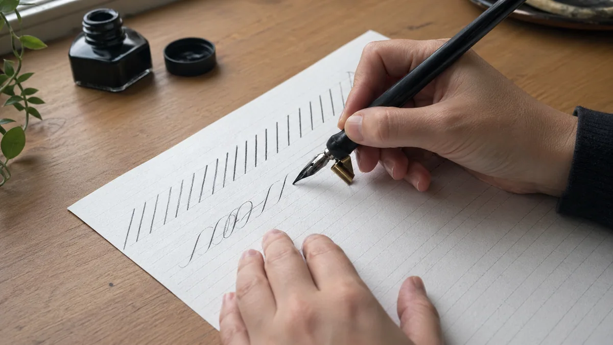
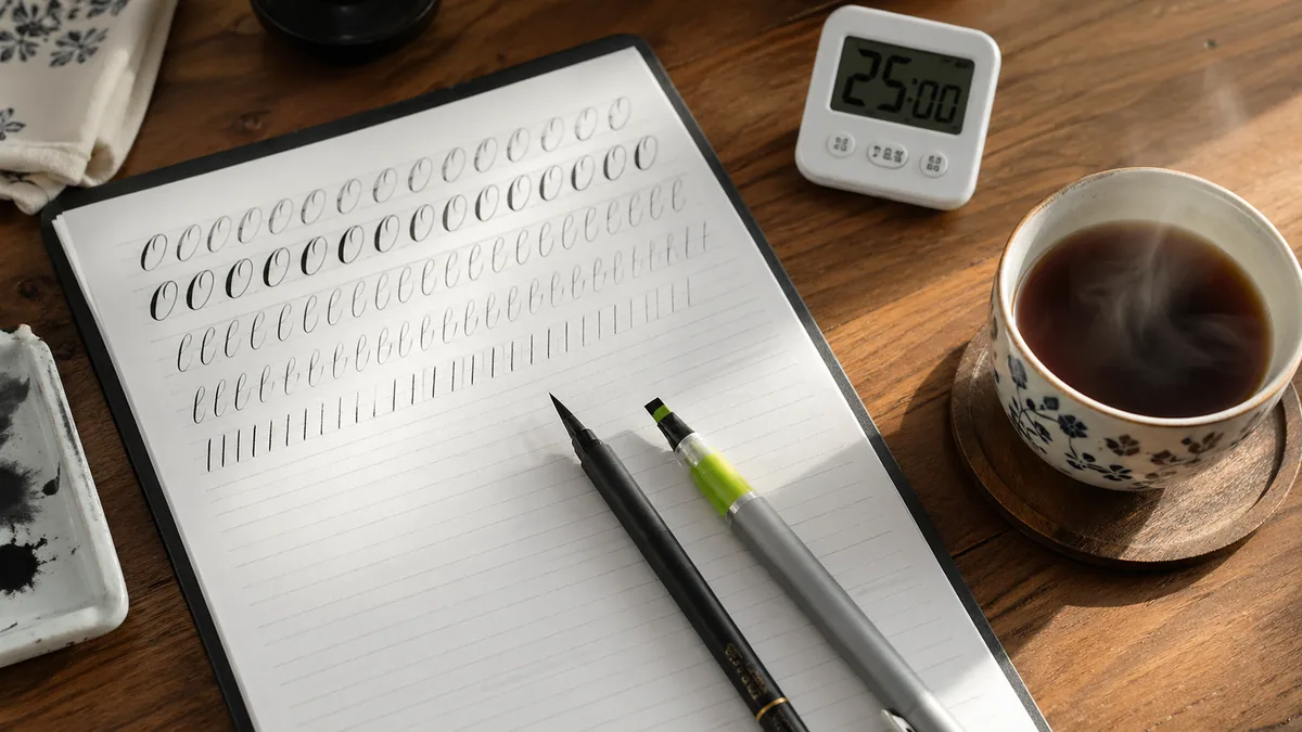
Week 1: print a simple practice sheet and fill it with ovals, upstrokes, downstrokes, and compound curves. Keep the session short enough that you can repeat it tomorrow.
Week 2: move into lowercase letters from the calligraphy alphabet, grouped by shared stroke patterns instead of A to Z order.
Week 3: write short words and check the space between letters with the letter spacing guide. This is where messy-looking practice starts turning into readable calligraphy.
Week 4: make small projects: names, place cards, envelopes, or a short quote. If you want a day-by-day prompt list, use the calligraphy challenges calendar.
Before buying more supplies, skim the tools guide and the practice guide. The right sequence matters more than owning every pen on the shelf.
Starter kit by budget
Keep the first setup small. Buy one pen system, paper that does not bleed, and a few printed guidelines from the practice sheet generator. Use the pen guide if you are choosing between brush, fountain, and dip pens.
If you are unsure, read the tools guide before buying anything beyond paper and one pen.
Maybe you want to address wedding invitations, make custom stationery, or just learn a new skill. Whatever your reason, this guide gives you a clear path: master basic strokes, build letters systematically, avoid the mistakes that trip up most beginners. No fluff, just what works. For historical context, check out the history of calligraphy.
Choose a traceable model
IAMPETH hosts historical penmanship manuals and exemplars. When studying one, note its author, title, date, and page so you can return to the same letterforms. An archive's older holdings do not establish how long the organization itself has existed.
This guide is structured to take you through a progressive learning path: selecting appropriate tools, choosing your first style, mastering basic strokes, forming letters systematically, and developing sustainable practice habits. Move on when you can repeat the target shape comfortably, rather than using a fixed timeline as a test of ability.
Why some practice works and some doesn't
Repeating a page without looking at the result can leave you repeating the same error. Choose one feature to inspect after each short row: oval closure, letter height, or spacing.
Leave room to rest
Stop before fatigue makes your grip tense. A short session that fits your day is a practical starting point, not a biologically proven dose. Return to the same exercise later and compare it with your earlier sample.
Let the task set the pace
At first you may need to check each stroke against the exemplar. If joining letters makes the shapes hard to control, return to a pair of letters before attempting a whole line. There is no fixed week or month when these movements must become automatic.
Choose a repeatable schedule
Try a short session you can fit into your schedule and adjust it when you lose concentration. Missing a day is not a failure. Compare the quality of your samples, not just minutes spent or pages filled. No daily-versus-weekly effect size is established here.
The difference between practicing and actually improving
Circle one letter that matches your exemplar and one that does not. Describe the difference: perhaps an open oval or a crowded join. Make that feature the focus of the next row. If you cannot identify the problem, ask a qualified teacher to look at the sample.
For a ready-made list of practice prompts, use our 30-day challenge calendar and adjust its schedule to your needs.
What Tools Do I Need to Start Calligraphy?
You need a calligraphy pen, practice paper, guidelines, and a ruler. That's it. A starter kit costs $20-40, and honestly, cheap supplies are better for learning than expensive ones.
Choose tools for the script you want to learn, not by price alone. A pointed nib and a broad-edge pen teach different skills. Start with a small compatible setup, then upgrade when you can identify a limitation in what you already use.
Start with cartridge-based fountain pen systems like Pilot Parallel Calligraphy Pen Set (most popular),Speedball Elegant Writer, or Manuscript Deluxe Calligraphy Set. These pens maintain consistent ink flow, don't require constant dipping, and help you focus on stroke formation rather than ink management.
Recommended nib widths for beginners: 2.4mm or 3.8mm (creates visible stroke contrast without overwhelming detail)
2. Practice Paper
Choose smooth, bleed-proof paper that works with your ink choice. Rhodia Dot Pad A4 pads (80gsm) are the gold standard for practice, though HP Premium 32lb Laser Paper printer paper offers excellent value. Avoid standard copy paper initially—bleeding and feathering create frustration and make evaluating your technique difficult.
Budget tip: Buy in bulk and cut to size. A ream of quality paper provides months of practice.
3. Guidelines & Templates
Consistent letterform height is what builds reliable muscle memory. Use printable guideline templates (available free through our practice sheets tool) or invest in a lightbox ($15-30) to trace guidelines beneath good paper. Standard x-heights for beginners: 4-5mm for Italic, 3-4mm for modern calligraphy.
4. Ruler & Mechanical Pencil
Create custom guidelines as you progress. A clear acrylic ruler (12" or 18") allows you to see your work underneath, and a mechanical pencil (0.5mm or 0.7mm) creates fine, consistent lines without needing sharpening. This combination costs under $10 but remains useful at all skill levels.
When to upgrade your tools
IAMPETH instructors say spend 3-6 months with cartridge pens before trying dip pens. I thought that was conservative until I watched beginners struggle with dip pens while still figuring out basic strokes. Cartridge pens just work. Consistent ink flow means you can focus on actually learning.
Once basic strokes feel automatic—you're not thinking about angle or pressure anymore—then exploreadvanced pens. Oblique holders, flex nibs, all that fun stuff. But give yourself time with the boring tools first.
Optional But Helpful Additions
Desk lamp with adjustable arm: Good lighting prevents eye strain during extended practice sessions and helps you see stroke details clearly.
Grip aids or pen grips: If you grip too tightly (common beginner issue), foam grips encourage relaxed holding and reduce hand fatigue.
Practice journal or binder: Dating and organizing practice sheets helps you track progress and identify improvement patterns over time.
Mirror or phone stand: Recording practice sessions and reviewing them helps identify technique issues you can't feel while writing.
Avoid these common beginner purchases
❌ Calligraphy marker sets:These don't teach proper pressure control and create habits that don't transfer to real calligraphy pens.
❌ Expensive dip pen sets initially:Save these for after you've mastered strokes with cartridge pens (typically 3-6 months).
Italic or modern calligraphy can be a starting point. If Copperplate, Gothic, or Spencerian is what interests you, choose a beginner course that teaches its strokes in manageable steps.
Choose a style you want to practise and find a clear beginner lesson for it. If the first exercise is too complex, simplify the exercise rather than assuming the entire script is beyond you.
Different calligraphic scripts demand different technical skills, physical coordination, and perceptual abilities. Starting with an inappropriately difficult style creates unnecessary frustration and can lead to abandonment before fundamental skills develop. Learn about the full spectrum of historical and contemporary scripts in our calligraphy styles guide.
Best for True Beginners
Italic Script (Chancery)
Italic script features straightforward 5-10° angles, clear geometric structure, and forgiving letter construction. Mistakes are less visually obvious, and the simplified stroke patterns help you focus on consistency rather than complexity.
Why It Works for Beginners:
✓ Uniform pen angle throughout (easier to maintain)
✓ Letterforms based on simple geometric shapes
✓ Minimal flourishing required for attractive results
✓ Skills transfer directly to more complex styles later
✓ Historically used for teaching handwriting to children
Best for Modern Expression
Modern Calligraphy
Modern calligraphy breaks traditional rules, allowing personal expression and style variation. Using accessible brush pens or pointed pens, it emphasizes natural movement and creative flourishing over strict historical accuracy.
✓ Brush pens are more intuitive than traditional nibs
✓ Popular for weddings, events, and social media
✓ Large supportive online communities and tutorials
✓ Visible results achievable within first week
For those drawn to contemporary aesthetics, our modern calligraphy guide provides detailed instruction on developing your personal style while maintaining legibility and balance. Modern calligraphy has become particularly popular for wedding invitations and place cards, making it a practical skill with commercial applications. Before buying a first pen, compare broad-edge and pointed-pen setups in the calligraphy tools guide.
Why starting simple actually works
Start with a small exercise whose result you can inspect, such as a row of repeated strokes. That gives you a specific question to bring to a teacher if the shape is not working.
Copperplate and Gothic need different tools and movements. Either can be studied through a suitable beginner sequence. A collection of historical manuals, such as IAMPETH's archive, is not one universal curriculum or evidence of a century-long institutional history.
Intermediate Styles (After 3-6 Months)
Once you've mastered basic stroke control and letter formation in Italic or modern calligraphy, you can explore these more challenging styles with proper foundational skills in place:
Foundational (Round Hand)
Round, geometric letterforms with consistent 30° pen angle. Beautiful formal style that teaches precision and spacing. Learn more about historical calligraphic traditions.
Uncial
Ancient script with distinctive rounded letters and minimal ascenders/descenders. Approachable complexity with historical significance dating to early medieval manuscripts.
What These Styles Ask You to Practise
These styles emphasize different skills, not a fixed prerequisite period. For help identifying problems in early practice, see our common calligraphy mistakes guide.
Copperplate and Engrosser's Script
What to practise: Hairline upstrokes, shaded downstrokes, and consistent letter slant. Letter slant is not the same as the nib's angle to the paper. Copperplate and Engrosser's Script are related, not interchangeable labels; follow the construction and proportions in your chosen lesson.
Gothic (Blackletter, Textura)
Why it's difficult: Complex geometric letterforms with strict construction rules, narrow letter spacing requiring advanced spatial judgment, and multiple stroke variations per letter. Success requires understanding of historical exemplars and significant practice building component strokes first.
Spencerian Script
Why it's difficult: Demands excellent pen control, consistent oval forms, delicate hairline strokes, and rhythmic movement patterns. The flowing, connected style looks effortless, but needs careful practice of its own component strokes. A beginner Spencerian course can introduce those directly; Italic is not a required prerequisite.
🎯 Recommended Learning Path
Start:Choose one style and work on its basic strokes, letterforms, spacing, and consistency.
Review:Compare practice with your exemplar and identify one feature to improve before adding more exercises.
Explore:Try a second style when you want to compare its tools and construction. Keep its rules distinct from your first style.
Apply:Use the skills in a small project. Readiness depends on the task and your practice, not a fixed number of months.
What Are the Basic Calligraphy Strokes I Need to Learn?
The seven basic strokes are downstrokes, upstrokes, overturns, underturns, compound curves, ovals, and loops. Master these fundamental building blocks before attempting full letters—they form the foundation of all calligraphic letterforms across every style.
Try basic strokes to isolate movements that are difficult inside a letter. Alternate a row of strokes with the letters that use them, then compare both against your exemplar.
IAMPETH hosts historical manuals and exemplars. Check a named manual and page for the specific hand you are learning rather than treating the archive as one universal method. Find practice ideas in our calligraphy practice guide or explore structured exercises in our calligraphy techniques guide. If your tool is still undecided, the calligraphy tools guide compares beginner-friendly pens and nibs by movement and script.
The Seven Fundamental Strokes (In Learning Order)
1. Downstroke (Primary Stroke)
A vertical line moving downward with applied pressure, creating the thick stroke characteristic of calligraphy. This is the most fundamental stroke—nearly every calligraphic letter contains at least one downstroke. For broad-edge pens, maintain consistent pen angle throughout. For pointed pens, gradually increase pressure from start to finish.
Practice goal: Fill one page (40-50 repetitions) with parallel, evenly-spaced downstrokes of consistent weight and angle. Spacing should equal stroke width.
2. Upstroke (Secondary Stroke)
A vertical line moving upward with minimal pressure, creating a thin hairline stroke. This stroke requires delicate touch - excessive pressure flattens the thick/thin contrast that gives calligraphy its beauty. The upstroke balances the bold downstroke and creates rhythm in letterforms.
Practice goal: Achieve hairline thinness without catching or sputtering. Practice alternating downstroke-upstroke patterns to develop pressure modulation.
3. Overturn (Entrance Stroke)
An upstroke that curves gracefully at the top, preparing for the following downstroke. This stroke appears in letters like 'n', 'm', 'h', and forms the characteristic arches in minuscule letters. The curve should be smooth and consistent, with the curve radius matching your style's standard proportion.
Practice goal: Create uniform arch heights with smooth transitions from upstroke to curve. Avoid angular corners—the curve should flow naturally.
4. Underturn (Exit Stroke)
A downstroke that curves at the bottom, transitioning smoothly into an upstroke. This stroke appears in 'u', 'y', 'i', 'j', and forms the bottom curves of many letters. The curve should mirror the overturn's proportions, creating visual harmony in your lettering.
Practice goal: Match underturn curves to overturn curves for consistency. Practice connecting underturns to overturns for compound letters.
5. Compound Curve (Connected Stroke)
Combines an overturn and underturn into a flowing 'n' shape. This stroke teaches rhythm and connection—the foundation of cursive calligraphy. The compound curve appears in 'n', 'm', 'h', and many capitals. Mastering this stroke means you've developed the ability to maintain consistency through complex movements.
Practice goal: Create repeating compound curves with identical spacing and proportions. This drill (often called 'fence posts') is the single most valuable foundational exercise.
6. Oval (Circular Form)
A circular or elliptical shape maintaining proper stroke weight variation. Ovals form the basis for 'o', 'a', 'b', 'd', 'g', 'p', 'q' and many capitals. Consistent oval formation requires controlled pressure throughout the circular motion and precise pen angle maintenance. For Italic and Roman styles, ovals are slightly compressed (not perfect circles).
Practice goal: Create uniform ovals with consistent width-to-height ratios. Practice both clockwise and counterclockwise directions for different letter applications.
7. Ascending/Descending Loops (Extended Strokes)
Extended strokes that rise above the x-height (ascenders in 'b', 'h', 'k', 'l') or descend below the baseline (descenders in 'g', 'j', 'p', 'q', 'y'). Loops add elegance and flow to calligraphy. They require spatial awareness to maintain consistent proportions and avoid collisions with adjacent lines.
Practice goal: Maintain consistent loop heights (typically 2-3x x-height) and widths. Practice loops in isolation before incorporating into full letters.
Recommended Daily Practice Routine (Weeks 1-3)
5 min:Warm up with downstrokes and upstrokes. Focus on relaxed grip and consistent angle.
5 min:Practice overturns and underturns. Aim for smooth curves without angular transitions.
10 min:Drill compound curves (fence posts). Fill at least one page with consistent repetitions.
5 min:Practice ovals in both directions. Check for consistent proportions and smooth curves.
5 min:Cool down with ascender/descender loops. Experiment with different extensions.
Total practice time: 30 minutes daily. Use our 30-day challenge calendar to stay consistent and track your progress.
💡 IAMPETH Master Penmen Guidance
Historical teaching methods from IAMPETH emphasize quantity before quality during the foundational stroke phase. Fill entire pages with single stroke types to develop automaticity—the ability to execute strokes without conscious thought. This approach, documented in century-old penmanship manuals, remains the fastest path to confident letter formation.
Master penman Michael Sull recommends spending 2-3 weeks exclusively on strokes before attempting letters. This timeline allows sufficient repetitions for motor pattern consolidation. Students who rush to letters typically develop inconsistent habits requiring extensive correction later.
Common Stroke Practice Mistakes
Learning correct stroke formation from the start prevents difficult-to-correct habits. Review our common calligraphy mistakes guide for additional pitfalls to avoid:
Rushing to Letters Too Quickly
Most beginners attempt letters after only 1-2 practice sessions. Strokes should feel automatic before letter formation. Minimum recommendation: 15-20 practice sessions over 2-3 weeks focusing exclusively on strokes.
Inconsistent Pen Angle
Letting your pen angle drift during practice creates uneven stroke widths. Mark angle guides on your practice paper or use an angle indicator. For Italic: 40-45°, for Foundational: 30°, for pointed pen: 52-55°.
Gripping Too Tightly
Excessive grip tension causes hand fatigue and shaky strokes. Hold your pen firmly enough to control it but loosely enough that someone could pull it from your hand without significant resistance. Regular breaks prevent tension buildup.
Practicing Without Guidelines
Without guidelines you lose the visual reference your eye needs to keep letters consistent. Always use guidelines until stroke proportions become second nature (typically 3-6 months). Download free guidelines through our practice sheet generator.
Speed Over Accuracy
Beginners often practice too quickly, prioritizing quantity over quality. Slow, deliberate practice builds accurate motor patterns. Speed develops naturally after accuracy is established—rushing this progression creates sloppy habits.
🎯 Stroke Mastery Checklist
You're ready to progress to letter formation when you can:
Execute all seven strokes without consciously thinking about pen angle or pressure
Maintain consistent stroke weight and angle across an entire page of repetitions
Create smooth curves in overturns, underturns, and ovals without angular transitions
Practice for 20-30 minutes without hand cramping or tension (indicates proper grip)
Space strokes evenly without measuring (demonstrates developed spatial awareness)
How Do I Progress from Strokes to Letters?
Start with simple letters like 'i' and 'l', then progress to more complex letters systematically. Practice letter families that share similar strokes to build consistency and muscle memory while leveraging your foundational stroke work.
Try combining a familiar stroke with the next part of a letter. Compare the result with your exemplar. You do not need to wait for every movement to become automatic before trying letters.
Letter formation systematically combines the seven basic strokes you've mastered. Rather than random letter practice, organize your learning around letter families that share construction principles. Reference our comprehensive calligraphy alphabet guide for detailed formation instructions across different styles, or dive into our Cursive Letters A–Z series for step-by-step stroke guides, common mistakes, and font previews for each individual letter.
Progressive Letter Learning Sequence (8-12 Weeks)
Weeks 1-2
Simple Vertical Letters
Letters to master: i, l, t, n, m, h, u, v, w
Why start here: These letters use primarily downstrokes, upstrokes, and simple compound curves you've already practiced extensively. Minimal new techniques to learn means you can focus on letter spacing, baseline consistency, and maintaining uniform height.
Practice Strategy:
• Day 1-3: Practice 'i', 'l', 'n' until spacing becomes consistent
• Day 4-7: Add 't', 'h', 'u' and practice common combinations (in, it, the, an)
• Day 8-14: Complete the family with 'm', 'v', 'w' and write simple words
Weeks 3-4
Circular Letters
Letters to master: o, c, e, a, d, g, q, b, p
Why this sequence: These letters build on the oval stroke you've practiced. Start with pure ovals (o), then progress to partial ovals (c, e), and finally combination forms that merge ovals with downstrokes (a, d, g, q, b, p). This gradual complexity increase prevents overwhelm.
Common Challenges:
• Maintaining consistent oval width across letters—use guidelines with width markers
• Smooth oval closure points—practice the join repeatedly in isolation
• Counter space (interior white space) consistency—aim for uniform internal proportions
Weeks 5-6
Complex & Angular Letters
Letters to master: s, r, f, x, y, z, k, j
Why save these for later: These letters often require unique strokes not found elsewhere (like the distinctive 's' curve) or combine multiple complex elements (like 'f' and 'k'). By this point, you have enough foundational control to tackle these challenges systematically.
Special Attention Needed:
• 's' and 'z': Practice the unique reverse curves separately before full letters
• 'f' and 'k': These tall, complex forms need extra spacing consideration
• 'r': Often the most challenging lowercase letter—expect significant practice time
Weeks 7-10
Uppercase (Capital) Letters
Letters to master: All 26 uppercase letters, organized by construction similarity
Why uppercase comes later: Capital letters are less frequently used but more decorative, often incorporating flourishes and variations. Master minuscules (lowercase) first since they form 95% of most texts. Uppercase letters provide opportunities for creative expression once fundamentals are solid.
Uppercase Learning Strategy:
• Group 1 (straight letters): I, H, T, F, E, L (weeks 7-8)
• Group 2 (curved letters): O, C, G, Q, D, B, P, R (weeks 8-9)
• Group 3 (diagonal letters): A, V, W, X, Y, Z, K, M, N (weeks 9-10)
• Group 4 (complex letters): S, J, U (week 10)
Weeks 11-12
Letter Connections & Word Practice
Skills to master: Smooth letter connections, consistent word spacing, line composition
Once individual letters are comfortable, practice connecting them naturally. Different calligraphy styles handle connections differently—Italic uses subtle joins, modern calligraphy emphasizes flowing connections, while Gothic maintains letter independence. Use our cursive text generator to create custom practice phrases in various styles.
Why letter families matter
Your brain has limited working memory. If you learn 'n', 'm', and 'h' together, you're using the same stroke pattern. It's easier. If you jump randomly between 'n', 'o', 's', and 'k', your brain treats each one as completely new. That's exhausting and inefficient.
This isn't unique to calligraphy. Music teachers use the same approach with scales. Athletic trainers drill component movements before full plays. Learn related skills together, master them, then add complexity. Simple concept, but most people skip it because it feels slow.
Essential Letter Formation Principles
Maintain Consistent Slant Angle
All letters should lean at the same angle (if using slanted style). For Italic: 5-10°, for Copperplate: 52-55°, for vertical styles: 90°. Draw slant lines on your guidelines to maintain consistency across entire pages.
Keep Letter Heights Uniform
X-height (height of lowercase letters like 'x') must remain absolutely consistent. Ascenders (b, h, k, l) and descenders (g, j, p, q, y) should also maintain uniform extensions. This consistency creates visual rhythm and professional appearance.
Practice Individual Letters Before Words
Fill entire lines with single letters before attempting words. This repetition builds muscle memory for consistent letter formation. Most IAMPETH teaching methods recommend 20-30 repetitions per letter before moving to combinations.
Control Letter Spacing
Space between letters should be consistent and appropriate for your style. General rule: space should equal the width of a lowercase 'n'. Avoid equal mathematical spacing—optical spacing (what looks even) matters more than measured spacing.
📚 Recommended Practice Resources
•Download custom alphabet practice sheets from our practice sheet tool with horizontal practice lines, not adjustable millimetre x-heights or a verified stroke-order model
•Explore specialized techniques for difficult letters in our techniques guide
What Mistakes Do Calligraphy Beginners Make?
Let me save you weeks of frustration. Most beginners make the same handful of mistakes, and they're all fixable if you catch them early.
Compare one feature at a time with your chosen exemplar. If a stroke keeps going wrong, check the setup and movement rather than repeating it without a change. For more troubleshooting, see our complete mistakes guide.
1. Rushing to Words and Projects Too Early
The Problem: Attempting full words, quotes, or projects before stroke patterns are automatic forces your brain to simultaneously manage stroke formation, letter construction, spacing, and composition. This cognitive overload prevents mastery of any component and creates inconsistent, frustrating results.
Why It Happens: Social media showcases finished pieces, not the months of foundational practice behind them. Beginners understandably want immediate results but skip the unglamorous groundwork.
✓ The Fix:
Follow the progression strictly: 2-3 weeks on strokes alone, then 6-8 weeks on individual letters, then simple words. Only attempt finished pieces after 10-12 weeks of consistent practice. This patience pays dividends—students who follow this timeline develop faster, cleaner skills than those who rush.
2. Inconsistent Pen Angle Throughout Practice
The Problem: Letting your pen angle drift even slightly creates uneven thick/thin contrast, inconsistent letter widths, and unprofessional appearance. Many beginners don't notice angle drift until comparing their work to exemplars.
Why It Happens: Hand position naturally shifts during extended practice as muscles tire or attention wanders. Without explicit monitoring, these small shifts accumulate.
✓ The Fix:
Mark angle guides directly on practice paper using a protractor. Place angle reference marks every few lines. Check pen angle consciously every 5-10 minutes during practice. Consider video recording practice sessions to identify drift patterns. For broad-edge pens, maintain constant nib angle; for pointed pens, focus on consistent holder angle.
3. Gripping the Pen Too Tightly
The Problem: Excessive grip tension causes hand cramping, trembling strokes, and fatigue after just 10-15 minutes of practice. Tight gripping also restricts fluid movement needed for smooth curves and consistent letterforms.
Why It Happens: Beginners often equate tight grip with better control. Additionally, concentration and performance anxiety unconsciously increase muscle tension.
✓ The Fix:
Hold your pen firmly enough for control but loosely enough that someone could easily pull it from your hand. Practice the "pen wiggle test"—periodically wiggle your pen slightly in your grip to ensure you're not clenching. Take 30-second hand-shake breaks every 10 minutes. Consider foam grip aids that encourage relaxed holding. See our left-handed calligraphy guide for additional grip considerations.
4. Practicing Without Proper Guidelines
The Problem: Attempting calligraphy without guidelines removes essential visual feedback. Letter heights become inconsistent, baselines drift, and spacing varies wildly—creating unprofessional results that don't reflect your actual skill level.
Why It Happens: Guidelines feel restrictive or "training wheels" that advanced calligraphers don't need. Some beginners believe freehand practice develops better instincts.
✓ The Fix:
Always use guidelines for the first 6-12 months minimum. Professional calligraphers still use guidelines for finished work. Download free customizable guidelines from our practice sheet generator. Use a lightbox to trace guidelines beneath good paper for final pieces. Guidelines are a professional tool, not a crutch.
5. Comparing Progress to Expert Work
The Problem: Comparing your week-2 practice sheets to master calligraphers with decades of experience creates discouragement and unrealistic expectations. This comparison trap is the leading cause of early abandonment despite normal progress.
Why It Happens: Social media and online galleries showcase polished final work without revealing the thousands of practice hours behind it. Confirmation bias makes us notice experts' effortless execution while forgetting they were once beginners too.
✓ The Fix:
Compare your work only to your own past work. Date all practice sheets and review them monthly to see genuine progress. Seek out beginner calligraphy groups and forums where realistic progress timelines are normalized. Remember: master calligraphers typically have 5-20+ years of regular practice. Your 3-month progress is not meant to match their decade-plus of dedication.
6. Irregular, Inconsistent Practice Schedule
The Problem: Practicing 3 hours on Saturday but nothing during the week provides insufficient repetition frequency for motor learning. The brain requires distributed practice with short gaps between sessions to consolidate motor patterns effectively.
Why It Happens: Busy schedules make weekend marathon sessions seem more practical. Beginners don't realize that practice frequency matters more than session duration for skill acquisition.
✓ The Fix:
Commit to 20-30 minutes daily rather than longer weekly sessions. Research from Stanford's Behavior Design Lab (Dr. B.J. Fogg) shows that consistency trumps intensity for habit formation. Use our 30-day challenge calendar to build and track daily practice habits.
7. Using Inappropriate Tools for Skill Level
The Problem: Starting with advanced tools like flexible pointed nibs, oblique holders, or complex inks before developing basic control creates unnecessary frustration. These tools require techniques best learned after foundational skills are solid.
Why It Happens: Beautiful tools are appealing, and beginners assume "proper" supplies will accelerate learning. Marketing often targets beginners with advanced toolsets.
✓ The Fix:
Start with forgiving cartridge pens (Pilot Parallel, Speedball Elegant Writer) and standard practice paper. Advance to dip pens after 3-6 months of consistent practice. Consult the tools guide and pen selection guide for skill-appropriate recommendations.
⚠️ The Hidden Mistake: Not Learning from Mistakes
The most subtle mistake is passive practice—mindlessly filling pages without analyzing errors or making corrections. Research on deliberate practice from performance psychology demonstrates that improvement requires active error identification and targeted correction.
After each practice session, review your work critically. Circle your three best letters and three letters needing improvement. Identify specific issues (angle drift, spacing, stroke weight) and focus the next session on those particular weaknesses. This analytical approach accelerates improvement dramatically compared to passive repetition.
How Should I Practice Calligraphy Effectively?
Choose a short practice session that fits your schedule. Stop when tired or uncomfortable rather than treating a daily target as compulsory.
A repeatable schedule can make it easier to return to an exercise. Keep a dated sample and compare the shape you are practising, not just the time spent at the desk.
The routines below are practice suggestions, not a research-backed dose or a promise of faster learning. Adapt them to your energy and the instructions in your chosen handwriting model.
Daily Practice Routine (30 Minutes)
5 min
Warm-Up Strokes
Practice downstrokes, upstrokes, and compound curves. Focus on relaxed grip and consistent angle. This activates muscle memory and prepares your hand.
12 min
Focused Letter Practice
Work on 2-3 letters from your current learning phase. Fill entire lines with repetitions, focusing on consistency. Target your weakest letters.
8 min
Word Practice
Combine mastered letters into simple words. Practice common words and letter combinations (the, and, with, for). Focus on spacing and flow.
5 min
Cool Down & Review
Practice creative flourishes or write a favorite quote. Review today's work, circle best/worst examples, identify specific improvements for tomorrow.
Progress Tracking System
Date Every Practice Sheet
Write the date prominently on each page. This creates chronological evidence of progress that provides motivation during plateaus.
Maintain Practice Journal
Note practice duration, focus areas, observations, and frustrations. Written reflection enhances learning and helps identify patterns.
Weekly Review Sessions
Every Sunday (or your chosen day), review the week's practice sheets. Identify consistent issues and plan next week's focus areas.
Monthly Progress Photos
Photograph your best work monthly. Side-by-side comparisons reveal progress invisible in daily practice. Share in communities for feedback.
Celebrate Small Wins
Acknowledge improvements explicitly: "My 'n' is more consistent today" or "I practiced 7 days straight." Positive reinforcement strengthens habits.
30-Day Beginner Practice Plan
Follow this structured 30-day plan to build foundational skills systematically. Use our interactive challenge calendar to track your progress and receive daily prompts. Choose the exercises that match your current model and adjust the pace as needed.
Days 1-10: Stroke Mastery Phase
Practice all seven basic strokes exclusively. Fill minimum one page per stroke type daily. Focus on consistency over creativity. No letters yet.
Days 11-20: Simple Letter Phase
Introduce letters i, l, n, m, u, h, t. Practice each letter for at least 20 repetitions before moving forward. Maintain stroke warm-up routine.
Days 21-30: Circular Letters & Words
Add o, c, e, a, d letters. Begin combining letters into simple words (in, on, the, an, to). Continue daily stroke warm-ups.
Optimizing Your Practice Environment
Physical Setup
•Desk height: Elbows at 90° when writing reduces strain
•Paper angle: Slant paper 30-45° (perpendicular to forearm)
•Lighting: Bright, shadow-free illumination from opposite hand
•Chair support: Feet flat on floor, back supported
Mental Approach
•Minimize distractions: No TV, phone notifications, or interruptions
•Set intention: Know your practice goal before starting
•Embrace mistakes: Errors provide learning opportunities
•Stay present: Focus on current stroke, not end result
📊 What to Expect: Realistic Progress Timeline
Week 1-2:Strokes feel awkward. Hand cramps common. Inconsistency is normal. Focus on building the daily habit.
Week 3-4:Strokes become more automatic. Less conscious thinking required. Noticeable improvements in consistency.
Week 5-8:Letters start looking "like calligraphy." Spacing improves. Can write simple words legibly.
Week 9-12:Consistent letterforms across pages. Can complete short phrases attractively. Ready for first "real" projects.
Month 4-6:Developing personal style. Comfortable with primary script. Exploring second style or advanced techniques.
These timelines assume consistent 20-30 minute daily practice. Progress varies based on previous handwriting experience, motor skill aptitude, and practice quality. Be patient with yourself!
Building Muscle Memory for Automatic Execution
Familiar movements can become easier to repeat with practice. There is no verified repetition count that makes a calligraphy stroke automatic for every learner.
Here, "muscle memory" is shorthand for increasing familiarity with a movement, not a biological explanation or a clinical claim. Check whether your repeated strokes actually match the exemplar.
Use the suggestions below to decide what to practise next. They are not a validated calligraphy learning schedule or a measure of ability. Start with the stroke practice guide if you need a named movement to repeat, then compare your work against the same model rather than adding unchecked repetitions.
Practise one movement at a time
A new stroke asks you to coordinate angle, pressure, speed, and direction. Pick one feature to compare with the model rather than trying to correct everything in the same row.
When the movement feels more familiar, try it inside a letter. If the letter loses its shape, return to the difficult section rather than adding more unchecked repetitions.
Alternate strokes, letters, and words as your selected lesson recommends. IAMPETH's archive contains different teaching models; check the specific source rather than attributing one rule to all of them.
Practice Focuses to Revisit as Needed
Focus 1: Learn the movement
Characteristics: High conscious effort, frequent errors, inconsistent results, rapid fatigue, significant attention required for each movement.
What to check: Notice grip, angle, pressure, and direction. Ask for feedback if the exemplar's motion is unclear.
Practice Strategy for This Stage:
• Slow, deliberate movements with full conscious attention
• Immediate feedback (watch your strokes while executing)
• High repetition of single stroke types (fill entire pages)
• Focus on accuracy over speed or fluidity
• Expect fatigue after 10-15 minutes—take breaks
Focus 2: Combine familiar movements
Characteristics: Reduced conscious effort, more consistent results, can self-correct errors, longer practice sessions possible, movements feel more natural.
What to check: Compare the shapes before and after joining them. Keep looking at your work rather than assuming that a familiar motion is necessarily accurate.
Practice Strategy for This Stage:
• Gradually increase speed while maintaining accuracy
• Practice with varied conditions (different papers, angles)
• Combine basic elements (strokes into letters, letters into words)
• Develop error-detection skills without always watching
• Challenge yourself with slight variations and applications
Focus 3: Apply the shapes in a layout
Characteristics: Automatic execution, minimal conscious attention, consistent quality, can perform while thinking about other aspects, resilient to distractions.
What to check: Look at spacing and composition without neglecting letter construction. Return to an earlier exercise whenever a particular shape needs attention.
Practice Strategy for This Stage:
• Focus on refinement, personal style, and creative expression
• Learn new, more complex styles using established learning process
• Experiment with challenging compositions and layouts
• Teach others (teaching deepens your understanding and automaticity)
• Maintain skills with regular practice (automaticity can fade with disuse)
Accelerating Muscle Memory Development
Practice at Optimal Difficulty
Challenge yourself just beyond current ability ("zone of proximal development"). Too easy creates no progress; too hard creates frustration and poor-quality practice.
Prioritize Sleep After Practice
Leave time to rest and return to the exercise when comfortable. No overnight skill improvement is promised.
Use Mental Practice (Visualization)
You can look through the stroke sequence before writing it. Imagining a movement does not replace checking it on the page.
Interleave Different Elements
Mix different stroke types or letters within practice sessions rather than blocking (100 'a's then 100 'b's). Interleaving improves retention and transfer.
Creating Sustainable Practice Habits
Make practice easy to return to, but leave room to rest. A missed session does not erase what you have learned.
An ambitious plan may be difficult to fit into a busy week. Try leaving a pen and the next exercise ready, then choose a session length you can manage comfortably. A printable sequence such as the Seven Days to Smoother Cursive workbook ($3) can reduce the decision-making at the start of a session. Its Pinyon font-copying exercises are separate from historical-script lessons.
The suggestions below are planning aids, not a tested calligraphy intervention or a guarantee that a habit will persist.
Planning a Manageable Session
Decide what you want to practise, how much you can comfortably do, and when it might fit into your day. Treat this as an adjustable plan, not a rule about how everyone forms habits.
Motivation
This fluctuates constantly. You'll have motivated days and days when the last thing you want is to practice calligraphy. Don't rely on it. Design for the low-motivation days.
Ability
On a busy day, try a small exercise such as three downstrokes rather than a full page. If you are exhausted or uncomfortable, rest instead.
Prompt
Attach it to something you already do: "After I pour coffee, I practice." Clear, specific prompts work. "Practice daily" doesn't—it's too vague.
A Small-Session Practice Plan
Step 1: Start Absurdly Small
Your initial habit should be so small it feels trivial: "After [existing habit], I will write 3 downstrokes." Not 30 minutes, not a full page—literally 3 strokes (takes 30 seconds).
Adjust the plan: A small exercise leaves less to prepare and review. Increase it only when you have the time and attention; there is no established deadline here for making practice automatic.
Step 2: Anchor to Existing Routine
Choose an established daily habit as your prompt: "After I pour my morning coffee…"or "Right after I close my laptop at 5pm…" Existing habits are reliable triggers.
Example Habit Recipes:
• "After I sit down with breakfast, I will practice 5 downstrokes"
• "After I finish lunch, I will trace 3 compound curves"
• "After I brush my teeth at night, I will write the letter 'n' 5 times"
Step 3: Celebrate Immediately
After practice, acknowledge what you completed. You might circle a stroke you want to repeat or note a spacing improvement.
Keep feedback specific: Note what changed and what to try next. You do not need to feel enthusiastic about every session or follow a celebration ritual.
⚡ Removing Friction & Creating Environment Design
Reduce the setup work where you can. Keep supplies accessible and choose a place where you can write comfortably.
Keep Materials Visible & Ready
Leave pen, paper, and guidelines on your desk or kitchen table. Pre-stage materials the night before. Never let "I need to find my supplies" become a barrier.
Designate a Practice Spot
Reusing a comfortable location saves you from rearranging supplies each time. Change it if the lighting or posture does not suit you.
Use Implementation Intentions
Write down: "When [situation], I will [practice action]." This gives you a concrete plan to try and revise, not a guaranteed improvement in follow-through.
Tracking & Maintaining Momentum
Visual progress tracking provides motivation and accountability. Use our 30-day challenge calendar to mark daily practice completion and build streak momentum.
✓ The "Don't Break the Chain" Method
Mark practice days if a calendar helps you see your routine. Include rest days rather than treating an unbroken streak as the goal. Twenty-one days does not establish an automatic habit.
Returning After a Break
Missing more than one day is not a failure. When you return, start with a familiar exercise and adjust the plan to your current time and energy. Practice should not displace rest or other responsibilities.
Tracking Your Calligraphy Progress
Track your progress or you'll convince yourself you're not improving. I'm serious about this one.
Some days your writing will look less settled than it did the week before. Keep dated samples so you can compare the same task over time. Use the weekly practice planner (Free) to choose a focus and note what you want to try next. A completed plan records practice, not a guaranteed improvement.
📅 Practice Log (Daily)
Record after each practice session. Takes 2 minutes but provides invaluable data over time.
Date & Duration
Track consistency and total practice hours
Focus Areas
What strokes/letters did you practice?
Observations
What felt good? What struggled?
Energy Level
Note if tired, distracted, focused
📸 Visual Archive (Weekly)
Photograph your best work weekly. Side-by-side comparisons reveal subtle improvements invisible in daily practice.
Best Letter of Week
Your most improved or consistent letter
Full Alphabet Sample
Shows overall consistency development
Favorite Quote/Phrase
Demonstrates word-level composition skills
Challenging Elements
Document struggle areas for targeted practice
📊 Skill Assessment Rubric (Monthly)
Rate yourself 1-5 in each category monthly. Track scores over time to identify improvement patterns and persistent weaknesses.
Stroke Consistency
Uniform thickness and angle across pages
Letter Proportion
Consistent x-height, ascenders, descenders
Spacing & Rhythm
Even letter and word spacing
Slant Angle
Maintaining consistent angle throughout
Baseline Adherence
Letters sit uniformly on baseline
Speed & Fluidity
Smooth, confident execution
Plateaus are normal (and they suck)
Skill learning follows a weird pattern. Fast improvement at first, then you hit walls where nothing seems to change for weeks. These plateaus are when most people quit. But here's what's actually happening: your brain is consolidating skills. The breakthrough is coming, it just doesn't feel like it.
When you'll hit walls:
Weeks 5-7:Your first major plateau. Strokes stop improving. Push through—breakthrough is close.
Weeks 10-13:Letters look the same for weeks. Frustrating, but normal. Your brain is working in the background.
Months 4-6:Long plateau where small improvements aren't obvious. Trust that consistent practice still works.
What helps during plateaus:
• Look at work from a month ago—progress is clearer with distance
• Change something: different paper, new practice time, alternate phrases
• If letterforms feel stuck, work on spacing or composition instead
• Get feedback from communities or teachers—fresh eyes see things you miss
• Remember: plateaus always come before breakthroughs. Always.
Your Next Steps: Beyond the Basics
After 3-4 months of consistent practice, you'll have solid basics. Now the fun part starts—finding your own style and actually making things you're proud of.
Getting competent is just the beginning. The calligraphers I admire most have been at this for 10, 20, even 30 years and they're still learning. That might sound daunting, but it's actually what makes it interesting. Here's what comes next.
1. Expand Your Style Repertoire
Once you've mastered your first style (Italic or modern calligraphy), learning additional styles becomes progressively easier. Your foundational motor skills transfer—you're learning new patterns, not starting from scratch.
Complementary styles to explore: If you started with Italic, try Foundational (Round Hand) or Uncial. If you mastered modern calligraphy, explore traditional Copperplate or Spencerian. See our comprehensive styles guide for detailed comparisons and recommendations.
2. Master Advanced Techniques
Once the basics feel automatic, the next step is the techniques that separate competent calligraphy from work that genuinely stops people. Our advanced techniques guide covers flourishing, pressure variation, and layout composition in depth.
• Flourishing: Decorative extensions and embellishments
• Pressure modulation: Advanced thin/thick contrast control
• Color theory: Effective use of inks and pigments
• Mixed media: Combining calligraphy with watercolor, gold leaf, illustration
3. Experiment with Materials & Surfaces
Explore different papers, inks, and unconventional surfaces. Experimentation develops versatility and helps you discover preferred materials and aesthetic directions. Review our detailed materials guide for advanced recommendations. When you are ready to compare specific supplies, use the calligraphy tools guide before buying a larger kit.
Paper Experimentation:
Handmade papers, colored papers, textured surfaces, vellum, watercolor paper
Apply your skills to meaningful projects. Creating for yourself and loved ones builds confidence before pursuing commercial work. Practical application also reveals areas needing further refinement.
Connect with other calligraphers for feedback, inspiration, and accountability. Communities accelerate learning through shared knowledge and provide the social support that sustains long-term practice.
•Local guilds & chapters: Search for IAMPETH chapters, calligraphy guilds, or adult education classes in your area
•Workshops & conferences: Intensive learning with master calligraphers, networking opportunities
6. Explore Commercial Opportunities
If you're interested in monetizing your skills, calligraphy offers diverse income opportunities. Start small with friends and family before pursuing broader commercial work. See our calligraphy business guide for detailed guidance on pricing, marketing, and business setup.
Service-Based Income:
• Wedding invitation addressing ($2-5 per envelope)
• Event signage and place cards
• Custom quotes and commissions
• Logo design and branding elements
• Teaching classes and workshops
Product-Based Income:
• Greeting card designs
• Printable art and downloadables (Etsy)
• Digital fonts based on your calligraphy
• Custom calligraphy templates
• Instructional resources and practice sheets
7. Develop Your Personal Style
After mastering traditional forms, gradually develop your unique aesthetic voice. Personal style emerges from thousands of hours of practice, experimentation, and intentional design choices. It can't be rushed, but it can be nurtured.
Study widely: Analyze work from calligraphers you admire. What specific elements appeal to you? Proportions, flourishing style, color choices, layout preferences?
Experiment deliberately: Systematically vary elements—try different slant angles, letter proportions, flourishing approaches, spacing rhythms.
Document evolution: Your style will shift over months and years. Date the back of every practice sheet so you can flip through six months of work and see what actually changed.
For contemporary approaches, explore our modern calligraphy guide which emphasizes personal expression and rule-breaking within legible parameters.
🎓 Continued Education Resources
Most calligraphers who keep improving past the first year do it by mixing two things: structured instruction from someone better than they are, and a lot of self-directed practice in between. Books are the cheapest way in - historical manuals like Edward Johnston's Writing & Illuminating, & Lettering still teach foundational hands better than most modern courses, and contemporary guides fill in gaps for brush and pointed-pen work.
For paid instruction, Skillshare and Domestika both have decent introductory courses, while specialist platforms run by working calligraphers tend to go deeper on technique. Free YouTube tutorials are useful but uneven - cross-check anything you learn against a second source, especially for nib angle and stroke order. When you can swing the cost, a weekend workshop with a master calligrapher will compress months of self-correction into a few days; the IAMPETH conference and regional guild events are the usual starting points.
Finally, spend time with the historical exemplars themselves. The IAMPETH archive of penmanship documents and the Society of Scribes and Illuminators' manuscript collections are free, and reading the originals will sharpen your eye faster than any tutorial.
Ready to put it into practice?
Generate font-based tracing sheets with horizontal practice lines. Use a separate ruled guide for script-specific slant or nib proportions.
You can begin with four simple items: a calligraphy pen, smooth practice paper, a ruler for guidelines, and an ink or cartridge that fits the pen. A cartridge pen can feel easier while you are learning letter shapes because it removes some ink-management variables, but a dip pen is also a valid starting point if that is the style you want to learn. Start with a modest setup and upgrade after you know what you enjoy practicing.
What is the easiest calligraphy style for beginners?▾
There is no single best first style. Italic gives you a clear broad-edge structure, while modern brush lettering lets you explore pressure with a brush pen. Copperplate, Spencerian, and Gothic scripts ask for different kinds of control, so choose based on the tools and examples you want to copy. The important part is to pick one style for a few weeks instead of changing styles every session.
How long does it take to learn calligraphy?▾
Progress depends on the style, tool, and regularity of your practice. A short session several times a week is easier to repeat than an occasional marathon. Track one or two specific changes, such as steadier downstrokes or more even spacing, rather than expecting a fixed timetable. You can use the practice sheet generator and date each page so the change is visible.
Can I teach myself calligraphy at home?▾
Yes. Begin with a clear model, work on one small weakness at a time, and compare dated practice pages. Our free practice sheets and challenge calendar provide structure without requiring an account. If you later want feedback, a local class or a teacher whose work you can verify may help you spot habits that are hard to see on your own.
What paper is best for calligraphy practice?▾
For daily practice, choose a smooth sheet that matches your pen. Rhodia, HP Premium 32lb, and marker paper are common starting points, but test a small area first: ink behaviour changes with nib, pressure, and paper coating. Textured watercolor paper can slow a pointed nib, while glossy stock may dry slowly. Keep a note of which combination gives you clean hairlines and does not feather.
Why does my calligraphy look shaky or inconsistent?▾
Shaky lines often come from tension, an awkward pen angle, or trying to steer a long stroke with only the fingers. Check your grip, slow down enough to keep the nib under control, and use visible baseline and x-height guides. Repeat one letter several times, then compare the first and last attempts. If you are comfortable doing so, a short recording can reveal a movement you did not notice while writing.
Should I learn calligraphy or hand lettering first?▾
Choose based on the result you want. Calligraphy is written with repeated strokes and a tool held in a consistent relationship to the page; hand lettering is drawn letter by letter. Learning basic calligraphy can improve your sense of rhythm and stroke direction, while hand lettering may be the better first choice if you want to build display letters slowly.
How do I hold a calligraphy pen correctly?▾
Start with a relaxed tripod grip and let the pen rest on the middle finger. The exact hand position changes with the tool: a broad edge depends on nib direction, while a pointed nib changes width through pressure. Keep the tool steady enough to repeat the same stroke, and use the forearm for longer movements. If the nib catches, stop and adjust the angle rather than forcing it across the page.
What's the difference between broad-edge and pointed pen calligraphy?▾
Broad-edge pens (like Pilot Parallel) use a flat nib, so line weight changes with stroke direction. They suit hands such as Italic and Gothic. Pointed pens use a flexible tip, so pressure changes the width of the stroke; they are common for Copperplate, Spencerian, and some modern calligraphy. Neither is automatically the right first choice. Pick the family you want to study and use a tool that makes its basic strokes visible.
How much should I practice calligraphy each day?▾
Choose a session length you can repeat without rushing. A simple pattern is a few warm-up strokes, focused work on one letter or connection, and a final minute to note what changed. Stop when fatigue makes the strokes worse. A dated page and a small practice note are more useful than a promise to fill a certain number of pages.
Continue Reading
Related Articles
Continue your calligraphy journey with these guides