Affiliate Disclosure: This page contains affiliate links to products selected for practical fit. When you purchase through these links, we may earn a commission at no additional cost to you. Recommendations are based on product specifications, community feedback, and fit for common calligraphy needs. See our complete Tools Guide for detailed product reviews.
Table of Contents
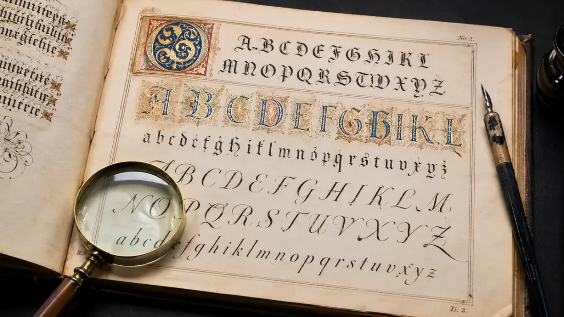
A useful calligraphy alphabet shows more than pretty A-Z samples. It lets you compare the same letter across styles, check the stroke angle, and see where the thick and thin lines should land before you start a page of drills.
Use this guide as a working letter chart. Start with Italic if you want a steady broad-pen foundation, compare Copperplate when you need pressure-based contrast, or jump to Gothic when you want a dense, formal look. If you are practicing handwriting rather than pointed-pen calligraphy, pair this page with the cursive letters A-Z guides and the alphabet practice sheets.
Letter Anatomy: Understanding Structure
Before you practice specific alphabets, you need the vocabulary that calligraphers use to describe letter construction. Edward Johnston, who revived broad-pen calligraphy in the early 20th century, systematized much of this terminology in his foundational text "Writing & Illuminating, & Lettering" (1906). The terms haven't changed much since—they're still what professional calligraphers use when teaching workshops or critiquing work.
Vertical Guidelines
- Baseline: The line letters sit on. This is your anchor—if your baseline wobbles, everything looks unstable.
- X-height: The height of lowercase letters like 'a', 'e', 'x' (without ascenders or descenders). In most calligraphic hands, this is measured in "nib widths"—typically 3-5 nib widths depending on the style.
- Cap height: Height of capital letters. Usually 2-3 times the x-height, though modern calligraphy breaks this rule constantly.
- Ascender line: Where tall letters like 'h', 'l', 'b', 'k' reach. In traditional Italic, ascenders are about 3 nib widths above x-height.
- Descender line: How far 'g', 'y', 'p', 'q', 'j' drop below the baseline. Descenders often match ascender height for visual balance.
Letter Components
- Stem: The main vertical stroke. In letters like 'l', 'i', 'b', the stem carries most of the letter's weight.
- Bowl: The round or curved part of letters like 'b', 'd', 'p', 'q'. Bowl shapes define your style—tight and compact or generous and open.
- Counter: The enclosed white space inside or partially inside a letter. The 'o' has a counter. So does 'n' (though it's open on one side).
- Loop: The enclosed space in ascenders and descenders. Copperplate has delicate loops; Italic keeps them simple or skips them entirely.
- Crossbar: The horizontal stroke crossing through 't' and 'f'. Placement affects legibility—too high or too low looks off.
- Serif: The small stroke at the end of a main stroke. Gothic styles have heavy, angular serifs; Italic serifs are subtle or absent.
Use custom practice sheets with ruled guidelines at the correct ratios for your chosen style. For systematic alphabet learning, try our dedicated cursive alphabet practice sheets featuring complete A-Z worksheets, or explore individual letter stroke guides in our Cursive Letters A–Z series. Many beginners skip this and wonder why their letters look inconsistent. The guidelines aren't training wheels—professionals still use them for finished work. They're the difference between wobbly approximations and letters that sit properly on the page.
Italic Alphabet Guide
Beginner FriendlyItalic is where most serious calligraphers start, and for good reason—it's forgiving, readable, and teaches fundamental pen control.
When Edward Johnston revived formal penmanship in early 1900s England, he built his teaching method around Italic letterforms. The structure is clean. Mistakes don't compound. You can see when a stroke goes wrong and fix it. Compare this to Copperplate, where one shaky hairline ruins an entire word, or Gothic, where beginners can barely tell if they're forming letters correctly through all those vertical strokes.
The Society of Scribes and Illuminators still recommends Italic as the foundation for beginning calligraphers. Once you've developed consistent letter width, proper pen angle (typically 45 degrees), and comfortable rhythm, the skills transfer to more complex styles.
Lowercase Letters: The Letter Family Approach
Don't try to learn the alphabet in order. Calligraphy teachers group letters by structural similarity—once you nail the basic pattern of one family, the related letters come faster.
These all start with the same basic stroke—a vertical stem followed by a curved arch branching to the right. Master 'n' first. If your 'n' is solid, you basically know how to write 'm' (two arches instead of one), 'h' (add an ascender), 'r' (stop the arch early), and 'u' (flip the direction). This one pattern accounts for five letters.
The arch should spring from about two-thirds up the stem, not from the top. When beginners start the arch too high, letters look cramped and stiff. Watch for consistent arch width—your 'n' letters should be nearly identical in width, like fence posts.
The 'o' is foundational. In Italic, it's not a perfect circle—it's an oval tilted to match your letter slant (5-15 degrees). Get your 'o' right and you've got the basic shape for 'c' (three-quarters of an 'o'), 'e' (add a crossbar), 'a' (oval plus stem), 'd' (oval plus ascender), 'g' (oval plus descender), and 'q' (another oval-descender combo).
Common mistake: making ovals too round. Italic ovals are slightly compressed horizontally. The pen angle naturally creates this shape—trust the tool. If you're fighting to make rounder ovals, check your pen angle (should be around 45 degrees).
These are your simplest letters—mostly just vertical strokes. But simple doesn't mean easy. Keeping verticals truly parallel with consistent weight takes practice. The 'i' is a single stroke (plus dot). The 'l' is an ascender-height version. The 't' adds a crossbar. The 'j' drops below the baseline with a slight curve or hook.
These letters are excellent for warming up and checking your pen angle. If your verticals look inconsistent in weight, your pen angle is drifting. Use our 30-day practice calendar to build daily consistency with basic strokes.
These don't fit neat patterns. Each one is its own puzzle. The 's' frustrates beginners for weeks—it's a double curve that needs to flow in one motion but tends to look choppy when you're learning. The 'f' has both an ascender and a descender in some Italic variants, making it the tallest letter. The 'k', 'v', 'w', 'x', and 'z' involve diagonal strokes that break from the dominant vertical rhythm.
Save these for last. Practice the other families until they're automatic, then tackle these oddballs one at a time. The 's' alone might take a month of daily practice before it feels natural.
- Pen angle: 45 degrees (or 30-45 degrees depending on preference)
- Slant angle: 5-15 degrees forward (not zero, not 45—somewhere subtle)
- X-height: 5 nib widths (stack your pen 5 times to mark it)
- Ascender height: 3 nib widths above x-height (total 8 nib widths from baseline)
- Descender depth: 3 nib widths below baseline (matching ascenders)
- Letter width: Approximately equal to x-height (slightly narrower is fine)
These ratios come from historical manuscripts and generations of teaching practice. You can adjust them as you develop your own style, but start here. Use the practice sheet generator to create ruled guidelines with these exact proportions.
Uppercase Letters
Italic capitals are less standardized than lowercase. You'll find variations across different historical sources and modern teachers. That's actually liberating—there's room for personal interpretation. The key is that capitals should be about twice the x-height (10 nib widths if your x-height is 5) and maintain the same pen angle and slant as your lowercase.
- Simple verticals first: I, L, T, F, E, H—mostly straight strokes with minimal curves
- Curved forms: O, C, G, Q, D—based on that oval shape you've already practiced in lowercase
- Angular letters: A, M, N, V, W, K, X, Y, Z—diagonals and V-shapes
- Complex curves: B, P, R, S, J—multiple curves, tricky weight distribution, save for when you're comfortable
Don't expect to master capitals as quickly as lowercase. They're bigger, more exposed, and small flaws show up more. Professional calligraphers often spend years refining their capital letters. The good news: you'll use them less frequently, so you don't need them to be as automatic as lowercase.
Copperplate Alphabet Guide
AdvancedCopperplate is where precision meets elegance—and where many intermediate calligraphers hit a wall for months before something clicks.
This style emerged in 17th and 18th century England from engravers who copied the flowing scripts of professional penmen onto copper printing plates (hence "Copperplate"). The actual historical name is English Roundhand, but everyone calls it Copperplate now. It's the style you see on wedding invitations, formal certificates, and anywhere people want that classic, elegant look.
Unlike Italic, Copperplate is unforgiving. A shaky hand shows immediately in the hairlines. An inconsistent slant angle makes the whole word look drunk. Master penman Michael Sull (author of "American Cursive Handwriting," recognized by IAMPETH) often tells students to expect six months of daily practice before their Copperplate starts looking respectable. That's not discouragement—it's realism. The muscle memory for that 52-55 degree slant and delicate pressure modulation takes time.
Lowercase Letter Construction
Copperplate lowercase letters are built around a few core strokes that you'll repeat hundreds of times. The key is learning to transition from hairline to shade (thick stroke) with smooth, consistent pressure.
- Slant angle: 52-55 degrees is standard, though some historical examples go as low as 50 or as high as 60. Pick one angle and stick with it religiously. Use a slant guide underneath your practice paper—a smooth, bleed-proof pad like the Rhodia Dot Pad A4 works well—and you can generate ruled guidelines at our practice sheet tool.
- Oval shapes: All round letters (o, a, d, g, q, etc.) are based on ovals that match your slant angle. The oval isn't vertical—it leans at 52-55 degrees. This takes weeks to internalize.
- Hairline upstrokes: The hallmark of Copperplate. On upward strokes, you use minimal pressure so the flexible nib creates an ultra-thin line. This requires a pointed flexible nib, not the broad-edge nibs used for Italic or Gothic.
- Shaded downstrokes: On downward strokes, you apply pressure to spread the nib tines, creating a thick stroke (called a "shade"). The contrast between hairlines and shades is what makes Copperplate elegant.
- Connected letters: Copperplate flows with minimal pen lifts. Each letter connects to the next via hairline upstrokes. The rhythm is: upstroke (light), downstroke (press), upstroke (light), downstroke (press).
- Precise loops: Ascender loops (h, b, l, k) and descender loops (g, j, y, p, q) must be consistent in size and shape. Historical examples show descender loops often being slightly larger and more elaborate than ascender loops.
The Foundation Letter: 'o'
Every Copperplate teacher says the same thing: master the 'o' first. It's constructed with four strokes in traditional teaching methods: two curved hairline upstrokes and two shaded downstrokes that meet to form an oval. Once your 'o' is consistent—same size, same slant, same oval shape every time—you've got the template for most other letters.
- The 'o': Foundation shape. Practice until you can write twenty identical 'o's in a row without thinking.
- The 'i': Simple stroke plus connection. Teaches the basic rhythm of upstroke-downstroke.
- The 'u': Two 'i' strokes side by side. Tests consistency.
- The 'n', 'm': Variations on 'u' with more arches. Once you have 'u', these follow naturally.
- The 'a', 'd', 'g', 'q': Oval-based letters. Your 'o' practice pays off here.
- The 'l', 'h', 'b', 'k': Ascender practice. Loop consistency is the challenge.
- The 'p', 'y', 'j': Descender practice. Loops below the baseline need the same care as ascenders.
- The 'e', 'c': Partial ovals with their own quirks.
- The 'f', 'r', 't': Break from the oval pattern, each unique.
- The 's': The final boss. Two compound curves that need to flow as one stroke. Many calligraphers practice 's' for months before they're satisfied with it.
Copperplate Capital Letters
Copperplate capitals are more decorative than lowercase, with elaborate flourishes and curves. There's more variation in historical sources—no single "correct" way to form many capitals. Master penmen like Zaner, Bloser, and Mills each had their own interpretations. Modern calligraphers often study multiple sources and choose capital forms that suit their personal style and project needs.
Some capitals (C, O, E, L) are relatively simple. Others (G, J, Q, Z) can have wildly different forms depending on which historical source you're following. The key is that capitals should maintain the same slant angle and pressure contrast (hairlines vs. shades) as your lowercase, even if the overall forms are more elaborate.
- Inconsistent slant: The #1 problem. If you learn nothing else, learn to hold a consistent 52-55 degree angle. Check our common calligraphy mistakes guide for more troubleshooting.
- Too much pressure on upstrokes: Upstrokes should be feather-light. Heavy upstrokes ruin the contrast that makes Copperplate elegant.
- Rushing the rhythm: Copperplate needs a slow, deliberate pace. Speed comes after months of practice, not before.
- Uneven loops: Ascender and descender loops should be similar in height and width. Measure them.
- Wrong pen: You need a pointed flexible nib (like a Nikko G, Zebra G, or vintage Gillott 303). Broad-edge nibs can't create the hairline/shade contrast.
These words contain repeated letter patterns that force consistency. Write each word 20 times and compare the last five to the first five—you should see improvement.
- "minimum" - Repeated 'i', 'n', 'm' shapes test rhythm and spacing
- "aluminium" - Mixed letter shapes with multiple repeated patterns
- "momma", "manna" - Repeated curves and arches
- "loop", "pool" - Oval practice with consistent counters
- "quality", "quietly" - Descender loops and difficult letter combos
Gothic (Blackletter) Alphabet Guide
IntermediateGothic scripts—also called Blackletter—are dense, angular, and intensely medieval. They're readable once you know the patterns, but they'll always look heavy and dramatic.
These scripts dominated Europe from roughly 1200 CE through the 1500s, used for everything from Bibles to legal documents. When Gutenberg invented movable type around 1450, he based his first typefaces on Gothic scripts because that's what educated Europeans expected to read. Today, Gothic calligraphy is used for certificates, diplomas, Celtic-themed designs, and metal band logos. It signals formality, tradition, or intentional intimidation depending on context.
"Gothic" is an umbrella term covering several distinct substyles. The two most common are Textura (rigidly formal, very vertical) and Fraktur (slightly more relaxed with occasional curves). There's also Rotunda (Italian Gothic, rounder) and several others. Each developed in different regions and time periods. For beginners exploring styles, Textura is the most accessible starting point.
Textura: The Most Formal Gothic Style
- Vertical, parallel strokes dominate: The defining feature. Letters look like fence posts or woven fabric ("textura" means "weave" in Latin).
- Minimal curves: Most letters are straight lines broken by sharp angles. The letters 'o', 'd', 'p', 'q' have angular shapes, not round ovals.
- Diamond shapes: At the top and bottom of vertical strokes, the broad-edge pen (a beginner-friendly option is the Pilot Parallel Calligraphy Pen Set) creates diamond or triangular shapes. These come from pen angle (typically 40-45 degrees) and the way you start/end strokes.
- Extremely compressed spacing: Letters are packed tight horizontally. The internal white space (counters) is minimal, making words look like solid blocks of black ink.
- Consistent rhythm: Vertical strokes appear at regular intervals. The word "minimum" in Textura is almost unreadable—just a series of vertical lines with barely distinguishable differences.
The Basic Building Block: Minims
A "minim" is the basic vertical stroke that appears in letters like 'i', 'n', 'm', 'u'. Learning Textura means learning to write consistent minims, then assembling them into letters. The letter 'n' is two minims with a connecting stroke. The letter 'm' is three minims. The letter 'i' is one minim. Once your minims are consistent, you can build most of the alphabet.
Historical scribes used guidelines with very specific proportions. X-height is typically 5 nib widths (same as Italic), but the letters feel much heavier and darker because of the compressed spacing and angular construction. Ascenders and descenders are often shorter relative to x-height compared to Italic—sometimes only 2 nib widths, which adds to the squat, dense appearance.
- Minims: The basic vertical stroke. Master this first. It should be straight, parallel to other minims, with diamond shapes top and bottom.
- Angles: Where you'd have curves in Italic, Gothic uses sharp angles. The 'o' is made of angled strokes meeting at corners, not a flowing oval.
- Feet: The decorative endings on vertical strokes, usually small serifs or diamond shapes at the baseline. These add to the texture and help with legibility (slightly).
- Hairline connectors: Some letters connect minims with thin diagonal hairlines. These are made by rotating the pen to use the corner of the nib.
- Capitals: Gothic capitals are wildly decorative—almost a separate art form. They often include elaborate strokes, internal flourishes, and complex construction. Some are harder to read than the lowercase letters they introduce.
Fraktur: A Slightly More Readable Gothic
Fraktur developed in Germany and became the standard printed typeface there until the 1940s. It retains the angular, dramatic feel of Gothic scripts but introduces some curves, especially in letters like 'o', 'b', 'd', 'p', 'q'. Fraktur is more readable than Textura while still looking distinctly medieval and formal.
If you're learning Gothic styles for practical application (certificates, signage, event materials), Fraktur is often more useful than Textura. It's still dramatic enough to make an impact but readable enough that modern audiences can actually parse the words without squinting. Many calligraphy style guides recommend learning basic Textura first to understand the Gothic approach, then moving to Fraktur for practical work.
Gothic scripts sacrifice readability for visual impact. Use them for titles, names, headings, and short phrases where the dramatic appearance is worth the comprehension cost. Don't write body paragraphs in Gothic unless you specifically want readers to struggle.
In medieval times, readers were trained on these scripts from childhood and read them daily—they had no trouble. Modern readers aren't trained this way. A full page of Textura looks impressive but reads slowly. Mix Gothic titles with readable body fonts for the best combination of drama and usability.
Practicing Gothic Alphabets
Gothic practice follows a different path than Italic or Copperplate. Start with basic minim drills—write rows of vertical strokes until they're consistent in height, weight, spacing, and angle. Then practice two-minim combinations (like 'n'), three-minim combinations (like 'm'), and so on. The rhythm is meditative once you get it: pen down at angle, stroke straight down, lift to create diamond, move to next stroke.
Use our letter spacing tool to understand how tight Gothic spacing should be—much tighter than Italic or Copperplate. The compressed spacing is what creates that distinctive "black letter" appearance. Try spacing Gothic letters at Italic-width intervals and you'll see how wrong it looks—too much white space, loses the woven texture.
Modern Calligraphy Alphabet
Most FlexibleModern calligraphy doesn't follow one set of rules—it's a wide-open field where personal style matters more than historical accuracy.
Unlike the styles covered above (Italic, Copperplate, Gothic), which have centuries of documented standards, modern calligraphy is barely 20 years old as a distinct category. It emerged in the early 2000s when designer-calligraphers started blending brush lettering, pointed pen techniques, and intentional rule-breaking into something fresh. Instagram and Pinterest accelerated the trend. Now "modern calligraphy" is everywhere—on wedding signage, greeting cards, logos, and hand-painted murals.
What defines it? The thick-downstroke, thin-upstroke contrast borrowed from Copperplate, but with everything else negotiable: slant angle, baseline consistency, letter height ratios, flourish placement, connection style. You'll see modern calligraphy at 15-degree slants and 90-degree slants (fully upright). Baselines might be ruler-straight or intentionally bouncy. Some practitioners connect letters; others don't. There's no governing body, no historical manuscripts to reference, no "correct" form.
Core Principles That Define Modern Calligraphy
- Thick downstrokes, thin upstrokes: This is the non-negotiable element. It's what makes modern calligraphy look like calligraphy rather than regular handwriting. Achieved through pressure control with brush pens or flexible pointed nibs.
- Variable slant angle: Unlike Copperplate's rigid 52-55 degrees, modern calligraphy accepts anything from 15 degrees forward to fully upright. Pick what feels comfortable and stick with it within a project.
- Personal flourishes and loops: Ascenders and descenders are opportunities for expression. Loopy, swoopy extensions are common. The key is intention—flourishes should enhance, not distract.
- Bouncy baseline: Traditional styles demand letters sit on a straight baseline. Modern calligraphy often lets letters bounce up and down slightly, creating energy and movement. Too much bounce reads as sloppy; the right amount reads as playful.
- Mixed letter heights: Varying the height of ascenders and descenders adds visual interest. Some 'h' letters might have short ascenders, others tall. This intentional inconsistency is a feature, not a bug.
- Simplified or exaggerated forms: Modern calligraphers often simplify letterforms for readability or exaggerate features for drama. The lowercase 'f' might lose its descender. The 'k' might gain an extra-long ascender. If it works visually, it's fair game.
Developing Your Personal Alphabet
The goal in modern calligraphy isn't to copy someone else's alphabet exactly—it's to develop your own recognizable style. That takes practice and intentional experimentation. Here's the path most successful modern calligraphers follow:
- Start with basic structure: Learn a lowercase alphabet with consistent letterforms. No flourishes yet. Focus on smooth thick-to-thin transitions and comfortable letter shapes. Use our font generator to see different baseline structures across calligraphy, blackletter, and hand-lettering.
- Practice until automatic: Write that basic alphabet until you can produce it without thinking. Aim for 30 days of daily practice. Muscle memory is essential before you start modifying things.
- Add one variation at a time: Pick one letter and experiment with different forms. Try three different versions of lowercase 'r', for example. Write each version 20 times. Choose your favorite. Move to the next letter.
- Experiment with flourishes: Once your basic alphabet is solid, start adding decorative elements. Try different loop styles on ascenders. Experiment with tail extensions on 'y', 'g', 'j'. Keep what feels natural, drop what looks forced.
- Find your rhythm: Modern calligraphy has rhythm—the bounce, the slant, the spacing. Write full words and sentences to see if your letters flow together. Adjust problem areas where letters clash or look disconnected.
- Refine through repetition: Once you've established your alphabet, practice it repeatedly. Write quotes, song lyrics, pangrams. The more you write your chosen forms, the more consistent and confident they become. Check out our practice techniques guide for structured drills.
Tools for Modern Calligraphy Alphabets
Modern calligraphy is often practiced with brush pens (like the Tombow Fudenosuke Brush Pens, Tombow Dual Brush, or Pentel Fude Touch) rather than traditional dip pens. Brush pens make the thick-thin contrast easier for beginners—you press down for thick strokes, lighten up for thin strokes. They're portable, don't require ink bottles, and are more forgiving than pointed nibs. However, pointed pen modern calligraphy exists too, using flexible nibs similar to Copperplate but with looser rules. See our calligraphy pens guide for detailed tool recommendations.
If you're developing modern calligraphy skills for client work (addressing envelopes, creating signage, designing logos), consistency matters more than in personal projects. Clients expect your 'a' to look the same across 200 wedding envelopes. Build a reference sheet of your finalized alphabet and keep it visible while working.
For business applications, study our calligraphy business guide which covers pricing, contracts, and managing client expectations around custom lettering work.
Alphabet Practice Guidelines
Knowing how to form letters is different from being able to write them automatically—that gap is closed only through deliberate, structured practice.
Motor skill research from applied psychology shows that handwriting is a "closed-loop" skill—you need repetition with feedback to improve. Writing a letter once tells you nothing. Writing it 100 times while paying attention to consistency, angle, pressure, and rhythm builds neural pathways. According to habit formation research from Stanford's Behavior Design Lab, daily practice (even 10-15 minutes) creates stronger skill acquisition than sporadic long sessions.
Effective Daily Practice Routine
- Warm up with basic strokes (5 minutes)
- Practice letter families (10 minutes)
- Write each family's letters 5-10 times
- Focus longer on problem letters
- End with one pangram sentence
- Use our 30-day challenge calendar for structured progression
- Brief warm-up (2-3 minutes)
- Full alphabet practice (one complete run)
- Letter connection drills (common pairs)
- Write 3-5 pangrams
- Practice problem letters in context (words, not isolated)
- Copy a short quote or poem for flow
Pangrams for Complete Alphabet Practice
Pangrams are sentences containing every letter of the alphabet. They're ideal for calligraphy practice because they force you to write the full range of letterforms in natural context. Professional calligraphers use these for warm-ups and to test new tools.
- "The quick brown fox jumps over the lazy dog" (35 letters) - The most famous, though not the shortest. Every letter appears at least once.
- "Pack my box with five dozen liquor jugs" (32 letters) - Shorter, more challenging letter combinations.
- "How vexingly quick daft zebras jump" (30 letters) - Even shorter, tests unusual letters like 'z' and 'x'.
- "Sphinx of black quartz, judge my vow" (29 letters) - One of the shortest perfect pangrams.
Letter Spacing and Kerning Principles
Consistent spacing between letters is as important as consistent letter formation. In traditional typography, this is called "kerning"—the adjustment of space between specific letter pairs. In calligraphy, you develop this intuition through practice and attention.
These pairs require special attention because their shapes either allow tight spacing (good) or create awkward gaps (bad). Use our letter spacing guide tool to visualize optimal spacing.
- AV, AW, AY, LT, LY: Can tuck together closely because of their shapes. Beginners often space these too far apart.
- To, Tr, Te, Tu: The capital T creates a large open space underneath. Subsequent lowercase letters can slide partially under that space.
- ff, fi, fl: These combinations need special ligatures in formal calligraphy (connected forms) because two 'f' letters side-by-side clash.
- rn, nn, mm: Watch these carefully—they can look like other letters ('rn' looks like 'm') if spacing is inconsistent.
Tracking Your Progress
Keep samples from your practice sessions dated and stored. After 30 days, compare your initial attempts to your current work. The improvement is often dramatic but hard to see day-to-day. Many calligraphers find that progress happens in plateaus—weeks of seeming stagnation followed by sudden breakthroughs where everything clicks.
Join online communities (r/Calligraphy on Reddit, #calligraphy on Instagram, calligraphy groups on Facebook) to share work and get feedback. The Calligraphers Guild and regional groups often host challenges and provide critique. External feedback helps identify blind spots in your practice. For more structured learning, explore our advanced techniques guide.
Mastering Capital Letters Across Styles
Capital letters are where calligraphy becomes most expressive—and most challenging. They're larger, more visible, and carry more decorative weight than lowercase.
In traditional calligraphy education, students often spend 6-12 months on lowercase before seriously tackling capitals. This isn't arbitrary gatekeeping—it's practical. Capitals require confident pen control, understanding of letter proportion, and enough experience that you can make intentional design choices rather than random strokes.
General Capital Letter Guidelines
- Height ratio: Capitals are typically 2-3 times the x-height. In Italic, they might be exactly twice the x-height. In Copperplate, often 2.5x. In modern calligraphy, anything goes, but there should be clear visual hierarchy—capitals obviously taller than lowercase.
- Decorative but readable: Capitals can be more elaborate than lowercase, but they still need to be recognizable. An overly flourished 'G' that looks like a 'J' or 'S' fails its job.
- Complement, don't overwhelm: Capital letters should enhance the word, not dominate it. If your capital is so large or decorative that it dwarfs the following lowercase letters, scale it back.
- Context-dependent: Formal project? Use restrained, elegant capitals. Personal project or modern design? Add flourishes, exaggerate features, play with proportions.
- Practice both simple and flourished versions: For each capital letter, develop a basic form (for readability-priority contexts) and an embellished form (for when you want drama).
A complete alphabet—uppercase, lowercase, numbers, punctuation—takes months to internalize. That's not discouragement; it's realism based on how motor skills develop. Edward Johnston's students at the Central School of Arts and Crafts in London typically spent a full year on Foundational hand (a form of Italic) before moving to other styles.
Modern learners often want faster results. That's understandable. But there's no shortcut for muscle memory. Fifteen minutes daily for three months beats eight hours once a month. Consistency and attention matter more than total hours. Celebrate small improvements: better oval consistency, smoother thick-thin transitions, more confident capitals. The journey is the point. Explore our left-handed calligraphy adaptations if you need specialized guidance.