Table of Contents
Affiliate Disclosure: This page contains affiliate links to products selected for practical fit. When you purchase through these links, we may earn a commission at no additional cost to you. Recommendations are based on product specifications, community feedback, and fit for common calligraphy needs. See our complete Tools Guide for detailed product reviews.
Modern calligraphy is basically what happens when traditional calligraphy decides to loosen up and have some fun. It keeps the gorgeous thick-and-thin strokes but throws out the rulebook about perfect angles and straight baselines. Letters can bounce, flourishes can be wild, and your personal style is encouraged rather than frowned upon.
Here's the game-changer: traditional classical styles like Copperplate are beautiful, but they're also unforgiving. Miss that 52-degree angle? It shows. Vary your baseline even slightly? Your calligraphy teacher would notice. Modern calligraphy? It welcomes those variations. Plus, you can start with a $3 brush pen from the craft store instead of investing in dip pens, oblique holders, and bottles of ink before you even know if you like it.
The whole modern calligraphy movement really exploded around 2012-2013 when Instagram became the visual playground we know today. Calligraphers started posting these gorgeous, flowing letters that looked approachable rather than intimidating. Suddenly, people who'd never touched a calligraphy pen were thinking, "Hey, maybe I could try that." The Society of Scribes and Illuminators says this has created the biggest wave of interest in lettering since the early 1900s Arts and Crafts movement. That's over a century—pretty impressive for something that basically got famous through hashtags.
To understand how modern calligraphy fits within the broader lettering landscape, explore our comparison of cursive vs. calligraphy and calligraphy vs. hand lettering.
The Evolution of Modern Calligraphy
Modern calligraphy didn't just appear out of thin air—it's got roots. Throughout the history of lettering, there have always been calligraphers pushing boundaries. Masters like Hermann Zapf and Sheila Waters spent decades experimenting with looser, more expressive letterforms. They knew all the traditional rules and sometimes chose to bend them. Those experiments quietly laid the groundwork for what would eventually become modern calligraphy's full-blown rule-breaking party.
But the real explosion happened when three things collided: First, Tombow released their Fudenosuke brush pens in 2013. Affordable, easy to use, no mess. Second, Instagram hit its stride as the visual platform where beautiful lettering could rack up thousands of likes overnight. Third, people were getting tired of everything looking the same digitally and craved that handmade, personal touch. It was perfect timing. Edward Johnston sparked the calligraphy revival in 1906 by teaching it to a new generation. Instagram did the same thing in 2012, except this time the classroom was global, free, and open 24/7. Self-taught artists could learn from each other, develop their styles, and build followings—no formal training required.
According to calligraphy historian Patricia Lovett, modern calligraphy represents the first major lettering movement to emerge entirely through digital communities rather than formal guilds or academic institutions. This peer-to-peer learning model created unprecedented accessibility but also highlighted the importance of grounding contemporary work in fundamental calligraphic techniques to avoid common pitfalls.
What Makes Modern Calligraphy Different?
The distinctions between traditional and modern calligraphy aren't just aesthetic preferences—they represent fundamentally different philosophies about the purpose and practice of lettering arts. Understanding these differences helps you choose the right approach for your projects and learning goals.
| Feature | Traditional Calligraphy | Modern Calligraphy |
|---|---|---|
| Slant Angle | Strict consistency (52-55°) | Variable angles allowed |
| Baseline | Uniform and straight | Bouncy, dynamic baseline |
| Letter Spacing | Precise spacing rules | Creative spacing decisions |
| Letterforms | Historical forms followed exactly | Personal style development encouraged |
| Appearance | Formal, elegant | Relaxed, contemporary feel |
| Tools | Dip pens or fountain pens required | Works with brush pens, markers, etc. |
| Learning Curve | Years to master | Accessible to beginners |
Here's something important: modern calligraphy isn't about not caring about the rules—it's about knowing them well enough to break them on purpose. Master calligrapher Molly Suber Thorpe makes a great point: the best modern calligraphers usually have a solid foundation in at least one traditional style first. That background gives their rule-breaking work structure and intention. It's the difference between "I'm deliberately making this baseline bouncy for visual rhythm" versus "I don't know how to keep letters straight." One looks artistic; the other just looks sloppy. You can tell the difference, and so can your audience.
This flexibility makes modern calligraphy particularly well-suited for wedding stationery, social media content, and personal branding projects where personality and visual distinction matter more than historical authenticity. However, for formal certificates, legal documents, or period-specific design work, traditional calligraphy remains the more appropriate choice.
Key Characteristics of Modern Calligraphy
Modern calligraphy's distinctive appearance comes from several intentional stylistic choices that differentiate it from both traditional calligraphy and casual handwriting. Mastering these characteristics allows you to create work that's recognizably modern while maintaining legibility and visual appeal.
Bouncy Baseline
Imagine your letters doing a little dance. Some sitting higher, some dipping lower, all grooving along an imaginary line. That's the bouncy baseline, and it's what gives modern calligraphy that playful, energetic vibe. Now, this doesn't mean just randomly throwing letters wherever. Good bouncy lettering still flows horizontally; you're just varying the height by a few millimeters (usually 2-5mm) to create visual interest. It's controlled chaos, if that makes sense.
Interestingly, research in the Journal of Motor Behavior found that this bouncy approach actually mirrors how we naturally write by hand more than perfectly straight traditional calligraphy does. Maybe that's why it feels so much more personal and less formal. It's closer to how we'd actually write a note to a friend. Want to dive deeper into spacing? Check out our letter spacing guide.
Variable Letter Heights
While traditional calligraphy demands uniform x-height (the height of lowercase letters like "a," "e," "o"), modern calligraphy allows slight variations for visual interest. Certain letters might extend taller or sit shorter to create pleasing compositions, with 10-20% variation being typical in accomplished modern work.
This variation serves both aesthetic and practical purposes. It helps distinguish similar letterforms, creates emphasis on key words, and prevents the mechanical uniformity that can make strictly traditional work feel stiff to modern eyes. However, maintaining some consistency within each word prevents the text from appearing chaotic.
Exaggerated Flourishes
Those dramatic swoops and swirls you see all over Instagram? That's flourishing, and it's probably the most recognizable feature of modern calligraphy. These decorative strokes aren't just showing off (okay, maybe a little)—they fill empty space, balance your composition, and add that signature personality that makes each calligrapher's work unique. Flourishing has always been part of calligraphy history (check out Zaner's work from 1895 if you want to see some seriously impressive swirls), but modern calligraphers tend to go bigger and bolder, especially when creating work for social media where you need to grab attention in a crowded feed.
Here's the thing though: less is more. I know it's tempting to flourish every single letter because it looks cool, but that's actually the fastest way to make your work look messy and hard to read. Most pros stick to flourishing just 1-3 letters per word. Usually the first or last letters, or letters like "f," "h," "k," and "y" that naturally lend themselves to extension. Think of flourishes like jewelry: one or two statement pieces make you look polished, but wear everything at once and you look like you're trying too hard.
Mixed Styles
Modern calligraphy embraces stylistic variety within single compositions—combining script with print, varying weights, or blending calligraphy with hand lettering. This eclecticism reflects contemporary design sensibilities where visual interest often trumps strict stylistic purity.
Successful mixed-style compositions maintain coherence through careful attention to weight relationships, spacing, and hierarchical structure. Typography principles still apply. Contrasting styles should have clear purpose (emphasis, hierarchy, visual variety) rather than appearing random. Our font pairing assistant can help develop an eye for complementary style combinations.
Pressure Variation
Strong thick-thin contrast achieved through pressure control creates the signature calligraphic look. In traditional calligraphy, this contrast comes from the fixed edge width of a broad-nib pen. Modern calligraphy achieves similar results using flexible brush pen tips—light pressure on upstrokes creates thin hairlines, while heavy pressure on downstrokes creates thick, dramatic swells.
This pressure-based approach makes the characteristic calligraphic thick-thin pattern accessible without mastering traditional dip pen techniques. However, developing consistent pressure control requires deliberate practice. Typically 20-40 hours of focused stroke work before the pattern becomes automatic, according to motor learning research.
Master these five characteristics individually before attempting full compositions. Spend one week focusing solely on baseline consistency (even if "bouncy"), another week on pressure control, and so on. This deliberate practice approach, supported by motor learning research from Stanford University, builds stronger muscle memory than trying to implement all characteristics simultaneously. Use our practice sheet generator to create targeted drills for each characteristic.
Modern Calligraphy Tools
One of modern calligraphy's biggest advantages is tool accessibility—everything you need is available at local craft stores or online, often for under $20 to start.
While traditional calligraphy requires specialized materials like oblique pen holders, various nibs, and specific inks that can intimidate beginners, modern calligraphy thrives with simple brush pens. This tool accessibility has democratized the art form, allowing anyone to start immediately without significant investment or specialized knowledge.
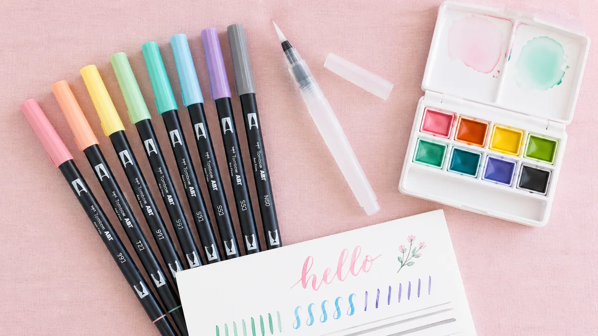
Brush Pens (Most Popular)
Brush pens revolutionized modern calligraphy by eliminating the setup, maintenance, and technique barriers associated with traditional dip pens. The flexible brush tip naturally creates thick-thin variation through pressure alone—press harder for thick downstrokes, lighten pressure for thin upstrokes. This intuitive mechanism makes the fundamental calligraphic gesture accessible within minutes rather than months.
This is where almost every modern calligraphy beginner starts, and for good reason. At $3-4, it's a low-risk way to find out whether lettering is for you. The firm tip (choose the hard version for learning) offers enough control to develop pressure habits without feeling unpredictable. It's forgiving enough to stay enjoyable, responsive enough to actually teach you something, and widely recommended in beginner workshops as a sensible first pen.
Once you've got the basics down, the Pentel Fude Touch is a great next step. The colors are gorgeous and vibrant (way better than the Fudenosuke), and the more flexible tip lets you create bigger, bolder letters. It's still only $3-5 per pen, so you can experiment with different colors without feeling guilty. The sign pen version is particularly nice for bridging that gap between beginner and intermediate skill levels.
Two tips in one pen—large brush and fine bullet point—with blendable, water-based ink ($4-5 per pen). Industry standard for professional work and wedding calligraphy. The 96-color range allows sophisticated color work. Requires moderate pressure control due to very flexible brush tip.
48-pack of colors with decent quality brush tips ($25-30 for set). Great value for beginners who want color variety for daily practice without investing in expensive individual pens. Quality is serviceable though not quite professional level.
Soft tip with hard tip variants — ideal for thin/thick stroke control while you build muscle memory.
See current priceOther Modern Tools
Beyond brush pens, modern calligraphers use various tools depending on desired effects and project requirements:
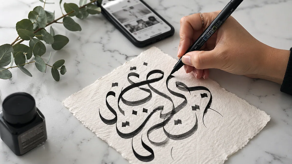
- Pointed Dip Pens: Traditional tool repurposed for modern styles. Offers the finest hairlines and most dramatic thick-thin contrast. Popular nibs include Nikko G (beginner-friendly, forgiving), Zebra G (flexible, expressive), and Brause EF66 (extremely fine, delicate). Requires ink, pen holder, and more maintenance than brush pens.
- Water Brushes: Hollow handles filled with water or diluted ink create watercolor calligraphy effects. Perfect for gradient lettering and soft, artistic looks. Brands like Pentel and Kuretake offer various tip sizes.
- iPad + Apple Pencil: Digital modern calligraphy using apps like Procreate, which simulates brush pen behavior with customizable brushes. Offers unlimited undo, non-destructive editing, and easy sharing, though some purists argue digital lacks the authentic texture of analog work.
- Crayola SuperTips: Surprisingly capable budget option for practice ($10 for 50 markers). Washable, widely available, and decent enough for learning basic strokes before investing in quality brush pens. Not suitable for finished work due to streaky ink.
7 Essential Modern Calligraphy Tools
Starting modern calligraphy requires fewer tools than traditional calligraphy, but choosing the right basics makes a significant difference in early success. For comprehensive guidance, visit our complete tools guide.
- Brush Pen (Tombow Fudenosuke Hard Tip): The most important tool. This small brush pen with firm bristles provides excellent control for beginners learning pressure variation without being too responsive. The hard tip version offers resistance that helps develop proper muscle memory.
- Smooth Paper (Rhodia 80g or HP Premium 32lb): Essential for preventing brush pen fraying and feathering. Smooth paper allows clean strokes and extends your pen's lifespan significantly—cheap paper destroys brush tips within hours. Rhodia pads offer European smooth paper; HP Premium 32lb is an excellent, affordable American alternative.
- Practice Worksheets or Guidelines: Pre-printed sheets with slant guidelines and x-height markers help maintain consistency while learning basic strokes. Generate custom practice sheets tailored to your learning needs with our free practice sheet generator.
- Pencil and Eraser (mechanical pencil recommended): For sketching layouts before committing to ink, especially useful when planning word spacing, flourish placement, and overall composition. Even experienced calligraphers pencil rough layouts for commissioned work.
- Ruler or Straightedge: Create your own practice guidelines and ensure straight baselines in finished pieces. A transparent grid ruler offers added versatility for checking alignment and spacing. Even with "bouncy" baselines, you need a straight reference to bounce from.
- Lightbox or Window (optional but helpful): Trace over templates or guidelines placed underneath your final paper, eliminating visible pencil marks in finished work. A sunny window works perfectly—tape your guideline sheet to the glass, overlay your final paper, and trace.
- Blending Palette (for advanced work): Mix custom colors when using water-based brush pens, creating unique gradients and color combinations. A simple ceramic plate or plastic palette suffices. Use water to blend and transition between colors within single words or letters.
A common beginner pattern: see a beautifully styled Instagram setup, order $200 of pens, papers, and accessories, then stall under the weight of too many choices. Most people can get a working starter kit for under $30. Hold off on the bigger spend until you actually know what you're missing.
There's research backing this up: fewer options when learning a new skill helps focus and accelerates progress. You stop second-guessing tool choice and just practise with what you have, which is how you build a real feel for one pen. Master your first brush pen, then expand the kit once you know what you'd use the new gear for.
Popular Modern Calligraphy Styles
Modern calligraphy encompasses several distinct substyles, each with its own aesthetic, technical requirements, and ideal applications. Understanding these variations helps you choose the right approach for different projects and develop your personal style through intentional experimentation.
Faux Calligraphy
Want to try calligraphy but not ready to buy any special tools? Faux calligraphy is your answer. Grab literally any pen you already own, write in cursive, then go back and manually thicken all the downstrokes by drawing a parallel line and filling in the space. Boom—instant calligraphy look with zero investment. It's perfect for testing whether you even like lettering before dropping money on brush pens.
Some calligraphy snobs will tell you faux calligraphy "doesn't count" as real calligraphy. Ignore them. Faux calligraphy teaches you crucial stuff like which strokes go down, how weight should be distributed, and how to compose words—all without the added challenge of mastering pressure control. Plus, plenty of professional calligraphers still use faux techniques for chalkboard work or when they need to use a specific pen that isn't flexible. If it works, it works.
- Write your word in cursive with any pen, maintaining consistent slant
- Identify all downstrokes (any stroke moving downward on the page)
- Draw a parallel line approximately 2-3mm inside each downstroke
- Fill the space between the original line and parallel line completely
- Optional: Add entry and exit flourishes for enhanced calligraphic effect
Brush Lettering
Brush lettering uses flexible brush pens to create authentic thick-thin variation through pressure control. This is the most common modern calligraphy style—what most people envision when they think of contemporary calligraphic work. It combines traditional calligraphic principles (thick downstrokes, thin upstrokes) with relaxed, contemporary aesthetic sensibilities.
The style emerged directly from East Asian brush lettering traditions but adapted through Western script letterforms. Japanese brush pen manufacturers like Tombow and Pentel created the tools that made this crossover possible, essentially democratizing calligraphic effects that previously required years of traditional training. Master these fundamentals through our practice strategies guide.
Bouncy Lettering
Bouncy lettering features letters that vary significantly in height and baseline position, creating an energetic, playful appearance. This style became enormously popular on Instagram around 2015-2017, defining the "modern calligraphy" aesthetic for mainstream audiences. It's particularly effective for casual celebrations, party decorations, and social media content where personality trumps formality.
The challenge with bouncy lettering is maintaining readability while achieving sufficient variation for visual interest. Poorly executed bouncy lettering can appear chaotic or difficult to read. Successful examples typically vary baseline position by 3-7mm while maintaining consistent letter spacing and recognizable letterforms. The "bounce" should feel intentional and rhythmic, not random.
Monoline Script
Monoline script maintains uniform line weight throughout—no thick-thin variation. This minimalist approach creates clean, contemporary lettering that works beautifully for modern branding, digital applications, and projects where simplicity matters. The style proves that calligraphic letterforms don't require contrasting line weights to be effective.
Monoline script is typically created using fine-tip pens, gel pens, or digital tools with constant line weight. While it eliminates the pressure control challenge, it requires exceptional attention to letterform accuracy, spacing, and baseline—without weight variation to add visual interest, every other element must be precise. This style relates closely to custom font development where consistency is paramount.
Don't feel pressured to commit to a single style. Professional calligraphers typically work in multiple styles, choosing based on project requirements. Spend 3-4 weeks exploring each style before deciding which resonates with your aesthetic preferences and target applications. Your personal style will naturally emerge through this experimentation process.
Advanced Techniques
Once you've mastered basic modern calligraphy, several advanced techniques can elevate your work from competent to exceptional. These approaches require solid foundational skills but open new creative possibilities.
Blending and Gradients
Water-based brush pens can be blended directly on paper to create stunning color transitions within individual letters or words. Apply one color, immediately apply a second color where you want transition, then use a water brush or colorless blender to merge the colors. This technique requires smooth paper and quick work before ink dries—typically 10-15 seconds depending on paper and humidity.
For more controlled gradients, use the palette blending method: scribble both colors on a ceramic plate, mix with water or blending solution, then load your brush with the custom blend. This approach allows unlimited color customization. Explore color theory further with our color palette tool.
Galaxy and Watercolor Effects
Create dreamy watercolor backgrounds or galaxy effects behind lettering using wet-on-wet watercolor techniques. Paint your background first (letting it fully dry for 30+ minutes), then add lettering on top. Alternatively, create white space for lettering using masking fluid, paint your background, remove the mask once dry, and letter in the reserved space.
Embossing
Heat embossing adds dimensional, glossy finish to calligraphy. Write with embossing ink or a clear embossing pen, immediately sprinkle embossing powder over the wet ink, tap off excess, then apply heat with an embossing tool or heat gun. The powder melts into a raised, shiny finish. This technique works beautifully for wedding calligraphy and formal invitations.
Pointed Pen with Modern Aesthetics
Traditional pointed pen technique (dip pen with flexible nib) applied with modern calligraphy's relaxed rules creates stunning, professional results. The pointed pen produces finer hairlines and more dramatic thick-thin contrast than any brush pen can achieve. However, it requires learning ink consistency, nib pressure, and dip pen mechanics—skills detailed in our beginner's guide.
Getting Started with Modern Calligraphy
Learning modern calligraphy follows a progressive path from basic stroke mechanics to personal style development, typically requiring 6-12 weeks of consistent practice to achieve confident results.
The learning curve for modern calligraphy is significantly gentler than traditional calligraphy, largely because modern style permits imperfection and celebrates personal expression. However, rushing through fundamentals leads to ingrained bad habits that later impede progress. According to motor learning research from the American Psychological Association, deliberate practice with immediate feedback produces skill acquisition 3-5 times faster than unstructured experimentation.
4-Week Structured Learning Path
Don't buy anything yet. Seriously. Spend this first week doing faux calligraphy with whatever pen is closest to you right now. Write short words or quotes, then go back and thicken the downstrokes. This teaches your brain which strokes should be thick without the pressure (literal and figurative) of using a brush pen. You're building awareness of letterforms, getting a feel for which way strokes should go, and figuring out if you even enjoy this before spending a dime.
What to do each day: Write 5-10 simple words like "hello," "love," "dream," or "coffee" (whatever motivates you), then thicken every downstroke. Try to keep your letters slanted at roughly the same angle. Around 55° works well. Date your practice sheets and save them. Trust me on this: looking back at day 1 compared to day 7 will blow your mind and keep you motivated. Check out common beginner mistakes so you can avoid them from the start.
Acquire a brush pen (Tombow Fudenosuke hard tip recommended) and master pressure control through isolated stroke practice. The eight fundamental strokes—upstroke, downstroke, overturn, underturn, compound curve, oval, ascending loop, and descending loop—form the building blocks of all letterforms.
Daily Practice: Fill one page (approximately 100 strokes) with each fundamental stroke before moving to the next. Focus on making upstrokes consistently thin and downstrokes consistently thick through pressure variation alone. No pausing or redrawing. This develops muscle memory faster than practicing full letters prematurely. Use our practice sheet generator to create targeted stroke drills.
Learn the lowercase alphabet systematically, grouping letters by common stroke patterns: i-family (i, t, l, h, k, b), n-family (n, m, r, u, y), a-family (a, d, g, q), c-family (c, e, o), and s-family (s, f, z). This grouping approach, endorsed by calligraphy educator Melissa Esplin, accelerates learning by building on established muscle memory.
Daily Practice: Master one letter family every 2-3 days. Write each letter 20-30 times, focusing on consistent height, slant, and spacing. Avoid adding bounce or flourishes yet. Master basic forms first. Compare your letters to reference alphabets and identify specific issues (inconsistent slant, varying height, weak pressure contrast) rather than generically thinking "it doesn't look right."
Connect letters into words, practice common phrases, and begin developing your personal modern calligraphy style. Focus on consistent letter spacing (approximately one "n" width between words), smooth connections between letters, and maintaining rhythm across entire words rather than perfect individual letters.
Daily Practice: Write 10-15 short phrases (3-5 words each), focusing on flow and consistency. Common practice phrases include "the quick brown fox," wedding-related terms, and inspirational quotes. Begin experimenting with slight baseline variation and simple entry/exit flourishes. Document your work on Instagram or in a dedicated practice journal to track progress and build community connections.
Consistency beats intensity: 20 minutes a day will outpace a single two-hour session every week, because muscle memory consolidates through repetition. Follow a small handful of letterers whose work you genuinely admire (not 500), and resist comparing your first weeks to someone else's five-year portfolio.
Date everything you practise and keep it. Flipping back through old pages is the most reliable motivation when progress feels invisible. Once the basics feel comfortable, try a few different styles to find what you actually enjoy, and upgrade tools only when you know what limitation you're trying to solve.
After completing this 4-week foundation, continue developing skills through our 30-day practice challenges, which provide structured prompts and progressive difficulty to maintain motivation and skill growth.
When to Choose Modern vs Traditional Calligraphy
Choosing between modern and traditional calligraphy depends on your project requirements, target audience, and aesthetic goals. Both approaches have distinct strengths and ideal applications—understanding these differences helps you make strategic choices rather than defaulting to one style for all situations.
Modern calligraphy fits situations where personality matters more than period accuracy: social-media content that needs to read at thumbnail size, relaxed or backyard-style weddings, creative branding, journals and gift tags, and anything personal where the goal is warmth rather than ceremony. It also wins on time-to-results and budget. A workable kit costs $15-30, and you can produce presentable lettering in weeks rather than years, which makes it the practical choice for self-taught learners and small creative businesses.
Traditional scripts earn their keep when the work calls for formality, gravitas, or historical accuracy: diplomas, certificates, legal documents, museum or academic commissions, and reenactment or period-themed projects. They're also the right call for black-tie weddings where Copperplate or Spencerian is what the couple has in mind, and for luxury or heritage brands whose visual language depends on a timeless, authoritative letterform. Choose this route when authenticity and weight are part of the message, not just the aesthetic.
You don't have to commit to one camp permanently. Many working calligraphers move between modern and traditional styles based on what each project needs, and some — Suzanne Cunningham among them — blend the two within a single piece. Deep familiarity with traditional letterforms makes modern work structurally stronger; the choice is project by project, not identity for life.
For business applications, explore our guide on building a calligraphy business, which covers pricing, marketing, and client management for both modern and traditional services.
Real-World Applications
Modern calligraphy has found diverse applications across creative industries, demonstrating its commercial viability and cultural relevance beyond hobbyist pursuits.
Wedding and Event Stationery
The wedding industry represents modern calligraphy's largest commercial application. Calligraphers create custom invitations, envelope addressing, place cards, menu cards, welcome signs, and seating charts. Pricing typically ranges from $3-8 per envelope for addressing to $500-2000+ for complete custom invitation suites. Our wedding calligraphy guide covers techniques, pricing, and client management specific to this lucrative market.
Commercial Branding and Packaging
Brands increasingly commission custom calligraphy for product packaging, logo development, and marketing campaigns. The handcrafted aesthetic differentiates products in crowded markets, particularly in artisanal food, cosmetics, and lifestyle sectors. Commercial projects typically command $200-1000+ depending on usage rights and complexity.
Social Media and Content Creation
Calligraphers build substantial followings on Instagram, TikTok, and YouTube, monetizing through digital products (practice sheets, guides), online courses, brand partnerships, and advertising revenue. Successful content creators often earn more from digital products and sponsorships than commission work. Try our cursive generator tool to explore different lettering styles for content creation.
Live Event Calligraphy
Corporate events, trade shows, and retail activations increasingly feature live calligraphers who personalize products, create custom artwork, or demonstrate techniques. These appearances typically command $150-400 per hour, combining entertainment value with branded takeaways for attendees.
According to the International Association of Master Penmen, Engrossers and Teachers of Handwriting (IAMPETH), modern calligraphy has created unprecedented opportunities for new calligraphers to build sustainable creative businesses. The style's accessibility allows practitioners to achieve commercial competence within 6-12 months compared to 3-5 years typical for traditional calligraphy mastery. However, successful professionals consistently emphasize the importance of continuous learning, studying historical forms, and understanding typography principles that separate competent work from exceptional pieces.