Affiliate Disclosure: This page contains affiliate links to products selected for practical fit. When you purchase through these links, we may earn a commission at no additional cost to you. Recommendations are based on product specifications, community feedback, and fit for common calligraphy needs. See our complete Tools Guide for detailed product reviews.
Bad calligraphy habits are surprisingly easy to develop and frustratingly hard to break.
According to research published in the Journal of Motor Behavior, motor skill patterns become neurologically embedded within 21-30 days of consistent practice. Practice the wrong technique during that window and your nervous system will lock in the wrong technique - the habit gets carved into the same place the correct one would have lived. This is why instructors at institutions like the Society of Scribes and Illuminators push proper technique from day one rather than letting students "find their own way" first and clean it up later.
Every mistake listed here can be corrected with deliberate practice. I've seen students fix technique issues within a few weeks once they know what to look for. Recognizing the problem is honestly half the solution. Even experienced calligraphers occasionally catch themselves slipping into these habits—the difference is they notice quickly and adjust.
These mistakes come from decades of observation by master penmen through the International Association of Master Penmen, Engrossers and Teachers of Handwriting (IAMPETH) and modern calligraphy instructors worldwide. Let's look at what actually derails beginners and what to do about it.
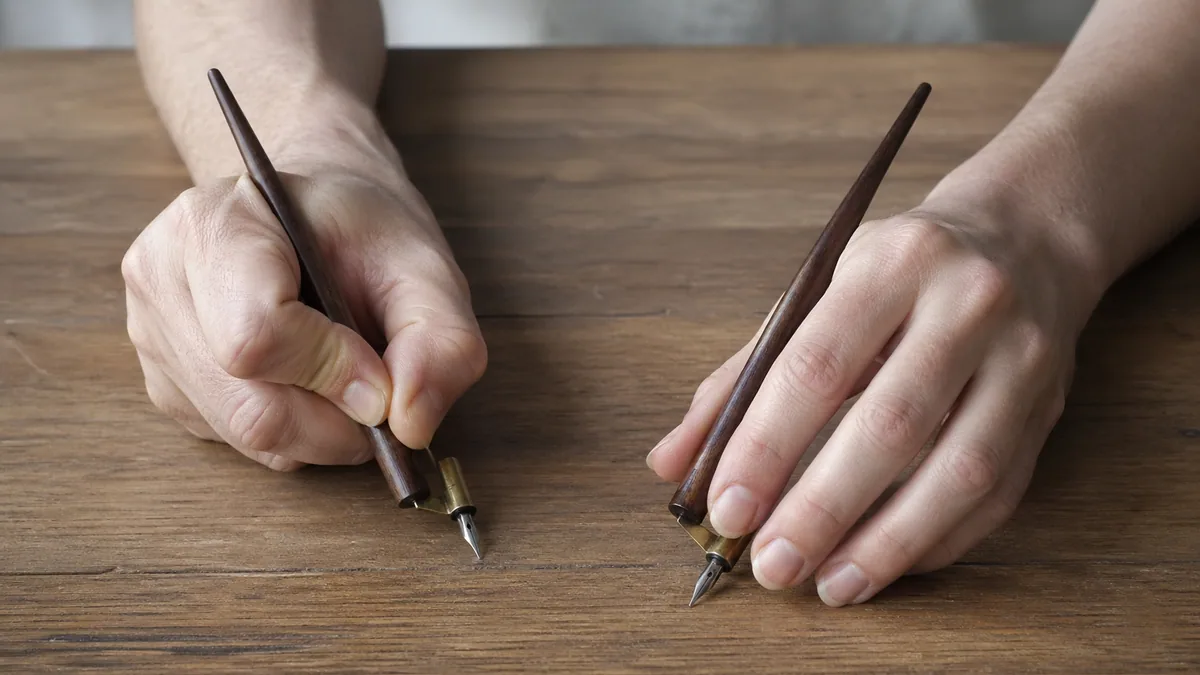
Wrong Pen Angle
Most beginners hold their calligraphy pen like a regular ballpoint—perpendicular to the paper, gripped down near the nib like they're about to sign a check. This is the single most common mistake I see, and it makes proper thick-and-thin contrast almost impossible to achieve.
Calligraphy relies on the relationship between pen angle, stroke direction, and pressure. When Edward Johnston revitalized calligraphy in the early 20th century (documented in his foundational text Writing & Illuminating, & Lettering), he emphasized that pen angle determines which strokes receive thick vs. thin treatment. Get the angle wrong, and your letterforms will lack the defining characteristic of calligraphy: consistent contrast.
The fix:
Different calligraphy styles require different angles, so there's no universal rule. However:
- Broad nib calligraphy (Italic, Uncial, Foundational): Hold at 30-45 degrees depending on the specific style. Italic typically wants 35-45°, while Uncial prefers closer to 30°.
- Pointed pen calligraphy (Copperplate, Spencerian): Hold at 52-55 degrees. This steeper angle is essential for proper hairline upstrokes.
- Brush calligraphy: Angles vary, but typically 45-60 degrees depending on the stroke.
Check your angle every few letters when you're starting out. Your hand will naturally want to drift back to familiar ballpoint grip. Use practice sheets with angle indicators, or place a protractor on your desk as a visual reference until the angle becomes automatic. This usually takes about two weeks of conscious attention.
Death-Gripping the Pen
I can spot this mistake from across a room: white knuckles, tension radiating up the forearm, shaky strokes that look like they were drawn during an earthquake. Beginners often grip calligraphy pens like they're trying to strangle them.
Excessive grip pressure causes hand fatigue within minutes, creates tremor in your strokes (particularly visible on long, slow curves), limits your range of motion, and prevents the fluid arm movement that calligraphy requires. You're essentially working against your own hand. According to occupational therapy research on writing ergonomics, excessive grip pressure (over 200g for a tool requiring only 60-80g) can lead to repetitive strain injuries over time.
The fix:
Hold your pen like you're holding a small bird. Firm enough that it won't escape, gentle enough that you won't hurt it. Your fingers should guide, not clench.
Here's a drill from master penman Michael Sull: Place your pen between your thumb and first two fingers. Without gripping, try to balance it there for a few seconds. Now add just enough pressure to control it—that's your target grip pressure. Practice this balance drill before each session until light grip becomes habitual.
Take breaks every 10-15 minutes when starting out. Set a timer. Shake out your hand, rotate your wrist, stretch your fingers. These micro-breaks prevent you from unconsciously tensing up as you concentrate, and they're standard practice in professional calligraphy practice routines.
Using the Wrong Paper
Paper quality makes a shocking difference. I've watched frustrated beginners blame their technique when the real culprit was the textured, absorbent mess they were practicing on.
Ink bleeds (called "feathering"), creating fuzzy edges instead of crisp lines. Nibs catch on paper texture and splatter. Hairline strokes disappear because the paper absorbs too much ink before it can dry. You get discouraged, practice less, and progress stalls. The wrong paper can make even perfect technique look amateur.
The fix:
Use smooth, coated paper designed for ink work. The professional standard for practice is:
- Rhodia Dot Pad (particularly the Dot Pad or the Ice series)
- HP Premium 32lb (available at office supply stores—surprisingly good)
- Canson Bristol (smooth finish, not vellum)
- Clairefontaine Triomphe (similar to Rhodia, slightly less expensive)
Avoid: Standard printer paper (too absorbent), watercolor paper (way too textured), heavily sized cardstock (ink skates on the surface), and anything labeled "parchment" or "linen finish" (texture catches nibs).
Good paper costs more upfront, but the payoff stacks. Better-behaved ink means cleaner letters, cleaner letters keep you motivated, and motivated calligraphers practise more. Budget beginners: HP Premium 32lb gives you 90% of the performance at a fraction of Rhodia's price. For more on supplies, check the materials guide.
Inconsistent Pressure
Calligraphy isn't just about letter shapes. It's about the contrast between thick and thin strokes. Without proper pressure variation, your work will look like it was written with a marker, not a calligraphy pen.
The fundamental principle in pointed pen calligraphy (and to some extent in modern calligraphy styles): heavy pressure on downstrokes, feather-light pressure on upstrokes. This isn't arbitrary—it's the defining visual characteristic of the style. Hermann Zapf, one of the 20th century's master calligraphers, called this pressure variation "the soul of the letterform."
We're not used to varying pressure while writing. Ballpoint pens require consistent pressure. Your hand has years of muscle memory telling it to press the same amount for every stroke. Breaking this pattern requires deliberate reprogramming.
The fix:
Practice pressure drills before attempting full letters. Here's the drill that works:
- Draw a vertical line downward with heavy pressure. Count "one" as you press.
- Draw a vertical line upward with feather-light pressure. Count "two" with minimal pressure.
- Repeat this down-up pattern for an entire page. Just lines. Count "one-two, one-two" as you work.
- Do this daily for 5-10 minutes before regular practice.
Alternative method: Use a pressure-sensitive brush pen (like Tombow Fudenosuke) for a few weeks. The brush tip exaggerates pressure differences, making it easier to feel and see the effect. Many modern calligraphers use this approach because the feedback is immediate and obvious.
If you're learning pointed pen and your nib keeps catching or hooking on upstrokes, the nib itself may be working against you. Stiffer pointed nibs punish heavy-handed beginners. The Nikko G nib is the standard recommendation for new pointed-pen calligraphers because it's forgiving, holds up to inconsistent pressure without snagging, and still produces clean hairlines once your control improves.
This muscle memory typically takes 2-3 weeks of daily practice to develop. Once it clicks, it's automatic—but you have to put in those initial focused repetitions. Use the 30-day challenge calendar to track your daily pressure practice.
Rushing Past the Basics
Everyone wants to write beautiful quotes. Nobody wants to fill pages with oval drills. I get it. But skipping fundamental stroke practice is like trying to play piano concertos before you can play scales. It doesn't work.
You build inconsistent letterforms because you haven't trained your hand in the foundational movements. You develop compensatory techniques to make up for missing skills. You get frustrated when full words don't look like the exemplars you're copying. Your progress is slower overall because you're essentially learning everything simultaneously instead of building on solid foundations.
The fix:
Spend 2-4 weeks on basic strokes before attempting full alphabets. This is the approach used at the Royal College of Art's calligraphy program and recommended by the Society of Scribes and Illuminators.
The foundational strokes you need to master:
- Straight vertical lines (with consistent pressure)
- Ovals (clockwise and counterclockwise)
- Compound curves (S-curves and C-curves)
- Ascending and descending strokes
- Connecting strokes and entrance/exit strokes
Fill entire pages with just one stroke type. This is boring. Nobody enjoys it. But every professional calligrapher I've studied with says the same thing: master these boring basics, and letterforms come easily. Rush past them, and you'll struggle with letters for months.
For structured progression through these fundamentals, follow the beginner's guide, which breaks down the learning sequence used by professional calligraphy instructors.
Ignoring Letter Spacing
You can execute perfect individual letters and still have your work look unprofessional if the spacing is wrong. Letter spacing (called "kerning" in typography) is half of what makes calligraphy look good.
The problem: beginners practice letters in isolation. "a, b, c, d..." But letters don't exist in isolation. How an "h" connects to an "e" is different from how it connects to an "i." Every letter pair has unique spacing requirements based on their shapes.
Spacing isn't about equal distance between letters—it's about equal visual weight. The space after an "i" needs to be physically smaller than the space after an "o" because the "o" has more visual mass. This is called "optical spacing," and it requires you to judge by eye rather than measure mechanically. It's a skill that takes practice to develop.
The fix:
Stop practicing isolated letters. Start practicing letter combinations and whole words. Focus on:
- Common pairs: "th," "er," "in," "on," "at," "ed," "ing"
- Problem combinations: "To," "Wa," "We," "Ya" (letters with open space on one side)
- Full words you'll use often: "the," "and," "for," "with"
Professional calligraphers use the "squint test": squint at your work until you can't read the letters, just see the shapes. The spacing should create even gray tone—no dark clumps where letters are too close, no white gaps where they're too far apart.
The letter spacing guide tool can help you visualize proper spacing for different letter combinations in various calligraphy styles, though ultimately you need to develop this judgment through practice.
Not Using Guidelines
Some beginners think using guidelines is cheating or a sign they're not "real" calligraphers yet. This is completely backward. Professional calligraphers use guidelines for formal work. Always.
Your baseline wanders up and down like a sine wave. X-height becomes inconsistent—some letters tall, others short. Letter slant varies (some letters leaning 52 degrees, others at 60 degrees, creating a drunk appearance). Cap height and ascender height drift. The overall appearance is amateur no matter how good your individual letterforms are.
The fix:
Always practice with proper guidelines. A complete guideline sheet includes:
- Baseline: Where letters sit
- X-height line: Top of lowercase letters like "a," "e," "n"
- Ascender line: Top of tall lowercase letters like "h," "l," "b"
- Descender line: Bottom of letters that drop below baseline like "g," "y," "p"
- Cap height line: Top of capital letters
- Slant lines: Vertical guides showing consistent letter angle
You can print guideline sheets for your chosen style, use a lightbox to see guidelines through your practice paper, or purchase guideline pads. Many calligraphers use Rhodia Dot Pads because the dot grid serves as subtle guidelines.
Historical note: Edward Johnston's students at the Central School of Arts and Crafts used ruled guidelines for all practice work. Even master penman Zanerian (from the famous Zanerian Manual) advocated for guideline use until letter proportions became automatic through thousands of repetitions.
Use the practice sheet generator to create custom guideline sheets for any calligraphy style, with adjustable x-height, slant angle, and spacing.
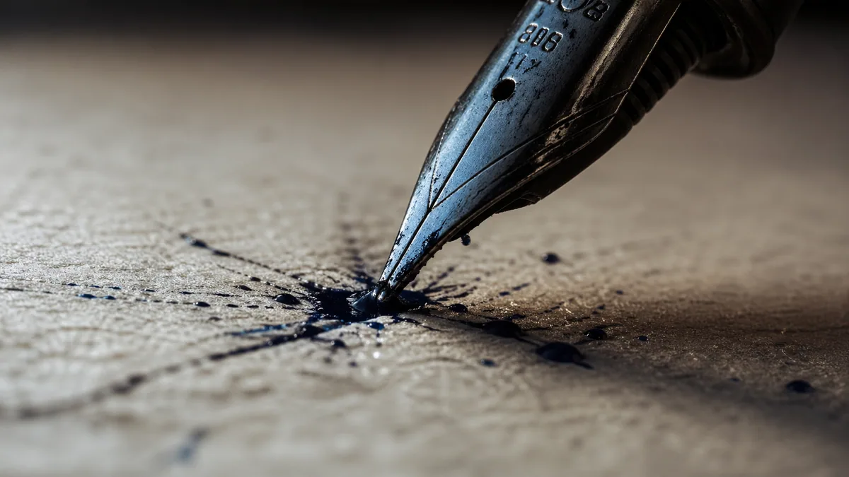
Using Old or Wrong Ink
Ink quality matters more than most beginners realize. The wrong ink can make even perfect technique produce terrible results.
Too thick: Ink doesn't flow smoothly from the nib, causing skipping and hard starts. You can see globs forming on the nib.
Too thin: Ink flows too quickly, creating blobs and difficulty controlling stroke width.
Expired or dried: Old ink has inconsistent viscosity, sediment at the bottom, and unpredictable flow characteristics.
Wrong ink for the tool: India ink in fountain pens (clogs), fountain pen ink with dip nibs (too thin), etc.
The fix:
Use fresh, appropriate ink for your tool type:
- For dip pens (pointed nib): Sumi ink, Higgins Eternal, Iron Gall ink, Speedball Super Black India Ink (a reliable studio standard that flows cleanly and dries jet black), or Ziller Calligraphy Ink
- For broad nib dip pens: Same as above, or specialized calligraphy inks like Manuscript or Winsor & Newton
- For fountain pens: Only fountain pen-safe inks (Pilot, Noodler's, Diamine, etc.)—never India ink or calligraphy ink
- For brush pens: Built-in ink—just replace the marker when it dries out
If your dip pen ink is too thick, thin it with distilled water (not tap water—minerals can affect ink chemistry). Add a few drops at a time, test, adjust. If it's too thin, let the bottle sit open for an hour to allow water to evaporate, or buy new ink.
Replace dried-out brush markers promptly. Trying to coax a few more letters from a dying Tombow just teaches your hand to compensate for poor ink flow. For more on ink types and pen options, see the calligraphy pens guide.
Poor Posture and Setup
Calligraphy requires different body mechanics than regular writing. Most people hunch over a flat desk, writing with small finger movements. This works for quick notes but fails for calligraphy.
Poor posture causes back and neck pain(obviously), but it also limits your range of motion, reduces your ability to see what you're writing, creates hand fatigue faster, and prevents the fluid arm movements that produce smooth strokes. Occupational health research on writing posture shows that ergonomic setup reduces fatigue and improves fine motor control.
The fix:
Set up your workspace like a professional:
- Chair height: Sit with feet flat on the floor, thighs parallel to ground, forearms parallel to desk surface
- Desk angle: Use a slanted drawing board at 20-45 degrees (most calligraphers prefer 30-35 degrees). This keeps your work perpendicular to your line of sight
- Lighting: Light should come from the side opposite your writing hand (left side for right-handers) to prevent shadow-casting
- Arm position: Support your writing arm from shoulder to elbow, not just wrist. Move your whole arm for large strokes, not just fingers
- Paper position: Angle your paper 30-45 degrees counterclockwise (for right-handers) so your forearm stays comfortable
You don't need an expensive drafting table. A $15 art board propped on a few books works fine. Some calligraphers use a 3-ring binder as a makeshift slant board.
Professional calligraphers often stand to work on large pieces, using the full range of arm movement from shoulder. For everyday practice, a comfortable seated position with proper desk angle is sufficient. The tools guide covers recommended workspace setup in more detail.
Inconsistent Practice
This is probably the biggest factor that determines who becomes proficient and who gives up. Talent is overrated. Consistency is everything.
Calligraphy is a motor skill. Motor skill acquisition requires consistent practice to build neural pathways and muscle memory. Research from habit formation studies (particularly Dr. B.J. Fogg's work at Stanford) shows that small, frequent practice sessions are more effective than occasional long sessions for building automaticity in motor skills.
You practice for 2 hours on Sunday, feeling productive. Then life happens and you don't touch your pen until the following Sunday. You've forgotten what you learned. Your hand feels rusty. You spend the first 30 minutes getting back to where you were last week. You're not progressing—you're just maintaining at best, more likely regressing.
The fix:
Practice 15-30 minutes daily. That's it. Frequency beats duration for skill development.
Make it a non-negotiable daily habit by:
- Scheduling it: Same time every day. Treat it like a doctor's appointment—it doesn't get moved.
- Keeping supplies visible: Set up a small practice station that stays ready. Lower friction means higher adherence.
- Starting tiny: Even 5 minutes counts. On busy days, do 5 minutes of basic strokes. That's enough to maintain the habit.
- Tracking progress: Keep a practice journal. Date, duration, what you worked on, what improved. This provides motivation and accountability.
- Always warming up: Never skip warm-up strokes. Cold hands produce poor results, which discourages you. 2-3 minutes of basic strokes prepares your hand.
Professional calligrapher Denis Brown, whose work appears in the British Library, has said in interviews that he still does basic stroke warm-ups every morning before working on commissions. It's not about talent—it's about daily preparation.
Use the 30-day challenge calendar to build a consistent practice habit with daily prompts. For structured guidance on what to practice each day, follow the practice routines guide.
Pre-Practice Checklist
Before each practice session, run through this checklist. It takes 30 seconds and prevents most of the problems above:
Additional Advice From Experience
- →Film yourself practicing to spot technique issues you can't feel
- →Keep a practice journal documenting what you worked on and what improved
- →Study exemplars (historical examples) of your chosen style regularly
- →Join online communities (r/Calligraphy, calligraphy Discord servers) for feedback
- →Practice the same stroke until it becomes automatic, then move to the next
- →Take breaks every 15-20 minutes to prevent fatigue
- ×Compare your day 1 to someone else's year 5 (you'll just discourage yourself)
- ×Skip warm-ups and basic stroke practice (even pros warm up)
- ×Practice only when "inspired" (inspiration follows action, not vice versa)
- ×Use cheap tools as a beginner (bad tools teach bad technique)
- ×Practice mistakes by going fast—slow down and do it correctly
- ×Ignore pain signals—they mean your technique needs adjustment
The difference between people who quit and people who become proficient isn't talent. It's recognizing these mistakes, correcting them deliberately, and practicing consistently despite the boring parts.
I made every mistake on this list when I started. Most calligraphers did. The ones who kept going are the ones who got good. It's that straightforward.
Now that you know what to watch for, you're already ahead. Check yourself against this list regularly, especially in your first few months. Fix problems early, before they become habits. Keep practicing.