Affiliate Disclosure: This page contains affiliate links to products selected for practical fit. When you purchase through these links, we may earn a commission at no additional cost to you. Recommendations are based on product specifications, community feedback, and fit for common calligraphy needs. See our complete Tools Guide for detailed product reviews.
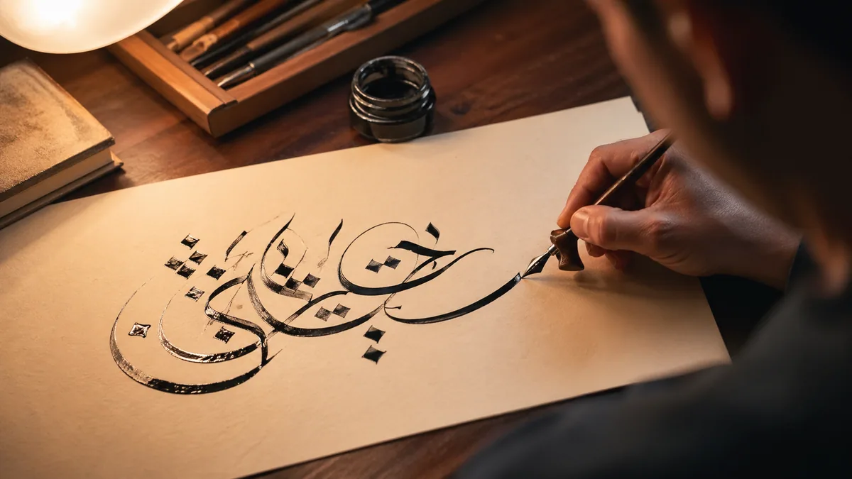
How to Practice Calligraphy Techniques
To practice calligraphy techniques, work one skill at a time in short daily sessions: warm up with drills, isolate a single technique (pressure, pen angle, spacing, or flourishing), then write real words and compare them against an exemplar. Fifteen focused minutes a day beats a long weekend session.
Here is the routine most teachers, including the penmen documented by IAMPETH, recommend for steady improvement:
- Warm up (2–3 minutes): Fill a line with ovals, parallel slant strokes, and push-pull strokes to loosen your hand.
- Pick one technique: Choose a single focus for the session — pressure control, a fixed pen angle, even spacing, or one flourish.
- Drill it in isolation: Repeat the movement on ruled lines until it feels automatic. Print free guides from the practice sheet generator.
- Apply it to letters and words: Write a short word that uses the technique, then your own name and a few addresses.
- Review against an exemplar: Compare your strokes to a model letterform and mark the one thing to fix tomorrow. The calligraphy alphabet reference gives you per-letter targets.
Expect results on a slow curve. Most people see cleaner, more consistent strokes after three to four weeks of daily practice, and technique starts to feel automatic around month four or five. If you want a day-by-day structure, follow the calligraphy practice guide. Brand new to lettering? Start with the beginner's guide first, then come back here to refine.
Learning calligraphy is about more than copying letterforms. The difference between amateur lettering and professional calligraphy comes down to mastering a handful of fundamental techniques.
Common beginner mistakes include focusing on the wrong things. Many learners obsess over buying expensive pens or finding the perfect style, when what really matters is developing solid technique. A calligrapher with excellent pressure control and consistent pen angles can make a $5 pen look stunning. Someone with mediocre technique will struggle even with top-tier tools.
The International Association of Master Penmen, Engrossers and Teachers of Handwriting (IAMPETH) has documented the techniques used by master penmen since the early 1900s. What's interesting is how consistent their advice remains. Whether you're reading Platt Rogers Spencer's work from 1848 or Denis Brown's contemporary guidance, the core techniques stay the same: pressure control, consistent angles, rhythmic spacing, and deliberate practice.
If you're completely new to calligraphy, I'd suggest starting with the beginner's guide first. That covers the basics of holding a pen and understanding different scripts. This guide assumes you know the fundamentals and are ready to refine your technique.
Pressure Control: The Foundation of Beautiful Strokes
Pressure control is what creates those characteristic thick and thin strokes in calligraphy. Without it, you're just writing cursive.
Traditional Copperplate instructors typically spend the first month of a beginner course on pressure control alone, before students are allowed to write whole letters. It can feel like overkill at the time. It isn't. Pressure control is the single most important technique in pointed pen calligraphy styles like Copperplate, Spencerian, and modern calligraphy.
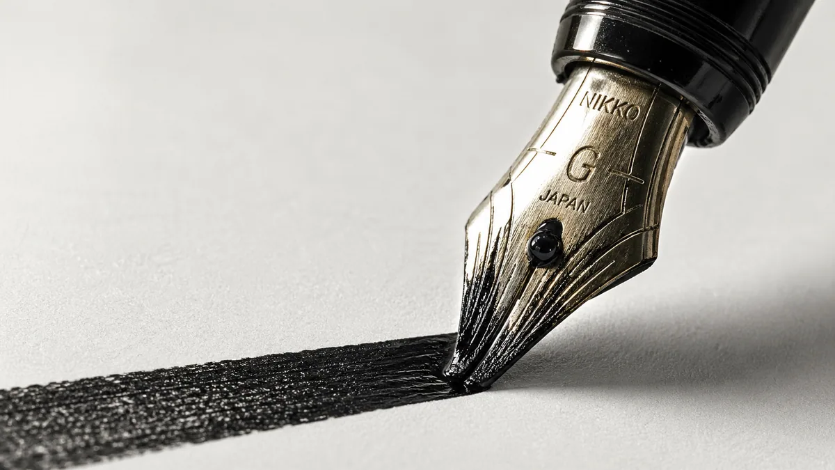
The principle comes from traditional copperplate engraving. Engravers would press harder on downstrokes to cut deeper lines, creating wider marks when ink filled the grooves. Pointed pen calligraphy mimics this effect. The flexible nib (a beginner-friendly option is the Nikko G Nib) spreads when you apply pressure, creating thick strokes. When you release pressure, the nib returns to its original width, producing hairline strokes.
How Pressure Control Actually Works
The mechanics are straightforward but take months to master. During downward strokes (when your pen moves toward you or downward on the page), you apply pressure. During upward strokes, you maintain the lightest possible touch. This isn't arbitrary. It follows the natural motion of your arm and hand.
According to research on motor skill acquisition published in the Journal of Motor Behavior, this type of pressure modulation engages both gross motor skills (arm and shoulder movement) and fine motor skills (finger control). That's why beginners struggle. You're essentially learning to coordinate multiple muscle groups with precise timing.
- Downstrokes: Apply firm, consistent pressure. Your nib should spread to create a line roughly 3–4 times wider than the unflexed nib width.
- Upstrokes: Use the lightest pressure possible while maintaining contact with paper. The line should be a hairline, barely visible from across the room.
- Transitions: Gradually increase or decrease pressure through curves. Abrupt changes create blotchy, uneven strokes.
Practice Drills That Actually Work
Forget about writing letters initially. You need muscle memory first. These drills are used by calligraphy instructors at the Society of Scribes and Illuminators:
- Vertical lines drill: Draw 50 vertical lines, alternating between heavy pressure (downstrokes) and light pressure (upstrokes). They should look like a picket fence.
- Oval drill: Create ovals with pressure only on the left and right sides. The top and bottom should be hairlines. This mimics the pressure pattern in letters like "o" and "a".
- Graduated pressure scales: Draw a single stroke that gradually increases from hairline to maximum thickness, then decreases back to hairline. This teaches pressure transitions.
- The "minimum" test: Write the word "minimum" five times. This word is perfect because it contains many vertical strokes that require consistent pressure.
You can use the practice sheet generator to create custom worksheets with guidelines for these drills.
The Most Common Mistake
Beginners use finger pressure. This is wrong. Your fingers should barely move. The pressure comes from your arm and shoulder. Think of your hand as a fixed unit that your arm moves across the page.
When you press down with your fingers, two bad things happen. First, you fatigue quickly. Finger muscles are small and tire fast. Second, you lose control. Finger pressure creates jerky, inconsistent strokes because fine motor control becomes erratic under fatigue.
Generate the downstroke by relaxing the weight of your arm into the pen rather than pushing with your fingers. Gravity and arm weight flex the nib for you. On the upstroke, lighten by lifting slightly from the shoulder. Used together, this gives you effortless thick-thin contrast without exhausting your hand or cramping your grip.
This approach also helps you avoid the common mistakes that lead to ink splatters, bent nibs, and inconsistent letterforms. If you want to see this technique in action, I recommend exploring different cursive styles to understand how pressure creates contrast.
The Nikko G is forgiving for beginners while flexible enough for advanced hairlines—the nib most calligraphy instructors recommend for your first year of practice.
See current pricePen Angle Mastery
Inconsistent pen angles are the telltale sign of amateur calligraphy. Get this right and your work immediately looks more professional.
Pen angle refers to two different things depending on your writing style, and mixing them up is a common source of confusion. For broad edge pens (like those used in Gothic, Italic, and Uncial scripts), angle means the orientation of the nib edge relative to your writing line. For pointed pens (Copperplate, Spencerian), it means the slant angle of your letters relative to vertical.
Edward Johnston, who revived calligraphy in the early 1900s with his foundational text "Writing & Illuminating, & Lettering," stressed that consistent pen angle was more important than perfect letterforms. A perfectly shaped letter written at varying angles looks worse than an imperfect letter written at a consistent angle. Your eye picks up on the inconsistency immediately.
Broad Edge Pen Angles
With broad edge pens (fountain pens with wide, flat nibs—the Pilot Parallel Pen is the most accessible option), the angle of the nib edge creates the thick and thin strokes. Hold the pen at 30 degrees and your vertical strokes will be thin while your horizontal strokes are thick. Hold it at 45 degrees and you get more balanced stroke weights.
Italic: 30–35 degrees
The shallow angle creates dramatic thick/thin contrast. Vertical strokes are thin, horizontals are thick. This is why Italic looks so elegant and flowing.
Gothic/Blackletter: 40–45 degrees
The steeper angle creates more uniform stroke weights, giving Gothic its dense, heavy appearance. This angle makes the vertical strokes thicker.
Uncial: 15–25 degrees (sometimes flat)
Very shallow angle, sometimes completely flat. This creates the wide, round letterforms characteristic of medieval manuscripts.
The angle stays constant throughout your writing. You don't rotate the pen to make different strokes—the angle of the edge does all the work. When you move the pen diagonally down-right, you get a thick stroke because the full width of the nib contacts the paper. When you move it perpendicular to the edge, you get a thin stroke.
Pointed Pen Slant Angles
Pointed pen angles refer to letter slant, not nib orientation. The traditional Engrosser's Script (Copperplate) uses a 52-55 degree slant from vertical. That's pretty steep—imagine your letters leaning heavily to the right.
This specific angle comes from 18th century English copperplate engraving. Engravers sat at angled desks and held their tools at this slant for ergonomic reasons. When calligraphers started imitating engraved letterforms with flexible pens, they maintained the same angle.
Oblique holders (such as the Speedball Oblique Holder) were invented specifically to maintain consistent slant angle. The offset flange holds the nib at the correct angle automatically. You can write with your hand in a natural position, and the oblique holder does the geometry for you.
Without an oblique holder, you'd need to angle your entire hand and wrist awkwardly to achieve the 52-degree slant. This causes fatigue and makes it nearly impossible to maintain consistency. Check the tools guide for recommendations on oblique holders.
Training Your Angle Consistency
Here's the practice method used at calligraphy workshops: Place a ruler or straight edge at your target angle next to your practice area. Write a line, then check it against the ruler. Your downstrokes should be parallel to the ruler.
Do this for every line you write for the first two weeks. It feels tedious, but muscle memory forms fast. By week three, you'll rarely need to check. By week four, it becomes automatic.
Modern calligraphers sometimes use grid paper printed with angle guidelines—a Rhodia Dot Pad is a popular pre-printed option. Our practice sheet generator can create these for you with any angle you need. This is particularly helpful when learning modern calligraphy, which sometimes uses slightly different angles than traditional scripts.
Rhythm and Flow
Good calligraphy has rhythm. Your eye should move smoothly across the letters without catching on inconsistencies or awkward spacing.
When calligraphers talk about rhythm, they mean the visual pattern created by consistent letterforms and spacing. It's similar to musical rhythm—a predictable pattern that feels satisfying. Letters that are too close create visual clumping. Letters too far apart feel disconnected. When you get the rhythm right, reading becomes effortless.
A useful way to think about good letter spacing is that the space between letters is not empty: it's a shape, and that shape is as important as the letters themselves. This applies to handwritten calligraphy even more than typography because you're creating those shapes in real time.
What Creates Rhythm
The space between letters should look equal, not measure equal. This is called optical spacing. An "i" next to an "n" needs different spacing than an "o" next to an "n" because the letters have different visual weights.
Think about the white space inside and around each letter. You want roughly equal amounts of white space between all letters. Letters with open sides (like "r" or "c") need to be closer to their neighbors than letters with closed sides (like "n" or "h").
Every "a" should be the same height. Every "t" should reach the same point. Every "g" descender should drop the same distance. When heights vary, your eye catches the inconsistency immediately.
This is why guidelines are essential for beginners. You need four lines: baseline, x-height, ascender line, and descender line. Modern calligraphers sometimes bounce letters slightly above or below the baseline for artistic effect, but that's an intentional choice made after mastering consistency. You can generate custom guidelines with our practice sheet tool.
Letters should sit on the baseline like a string of pearls—aligned but not rigidly mechanical. A slight natural variation is fine (and actually looks more handwritten), but every letter should clearly sit on or near the line.
When letters float above or dip below the baseline randomly, it breaks the rhythm. Your eye has to work harder to follow the text. In modern calligraphy and wedding calligraphy, slight baseline variation adds personality, but it should be controlled and intentional.
The 10-Repetition Practice Method
Here's a practice technique from Sheila Waters, a master calligrapher trained by Edward Johnston's daughter: Write the same word ten times in a row. Don't rush. After you finish, look at all ten versions and identify which one has the best rhythm.
That version is your benchmark. Try to feel what was different when you wrote it. Were you more relaxed? Was your posture better? Did you slow down slightly? Whatever it was, try to replicate that feeling in your next practice session.
These words are specifically chosen to develop rhythm and spacing skills:
- "minimum" – Repetitive vertical strokes test consistency
- "onion" – Round letters with different connection points
- "aluminum" – Mix of round and vertical forms
- "illuminate" – Challenging letter combinations with varied spacing needs
Practice these words using the 30-day calligraphy challenge for structured improvement.
Rhythm takes time to develop. It's one of those skills where you suddenly "get it" after weeks of practice. One day you'll write a word and think, "That felt right." That's the moment your muscle memory clicks. From there, it becomes easier to maintain that rhythm consistently.
The Art of Flourishing
Flourishes are decorative extensions that add personality to calligraphy. But they're also the fastest way to ruin otherwise good work if you overdo them.
I see this pattern constantly in beginner work: someone practices for weeks, develops decent letterforms, then covers everything with excessive flourishes. The letters disappear under curlicues and loops. The message becomes illegible. Flourishing is an advanced technique that requires restraint and good judgment.
Master penman Jake Weidmann, who at 29 became the youngest living Master Penman designated by IAMPETH, puts it this way: "A flourish should enhance the message, not compete with it. If someone comments on your flourishes before they comment on your message, you've failed."
When to Use Flourishes
Flourishes work best in specific contexts. Wedding invitations and formal certificates use them because the aesthetic matters as much as the information. Business cards and quotes use them to create focal points. Short phrases (three words or less) can support more flourishing than longer texts.
For longer texts like poems or paragraphs, limit flourishes to initial capitals and final letters of lines. Too much decoration makes text hard to read. Your goal is legibility first, beauty second. If someone can't read what you wrote, the flourishes don't matter. For specific wedding calligraphy applications, strategic flourishing creates elegance without sacrificing clarity.
Flourishing Principles
Balance
If you flourish the left side of a word or composition, balance it with something on the right. Asymmetry feels intentional only when the whole composition balances. An over-flourished left side with a bare right side looks unfinished.
Proportion
Flourishes should be proportional to letter size. A massive flourish on a small letter looks awkward. The visual weight of the flourish should complement, not overwhelm, the letters. Generally, flourishes shouldn't exceed twice the x-height of your letters.
Flow
Flourishes should grow naturally from the letters, not look pasted on. The exit stroke of a letter extends into the flourish smoothly. There shouldn't be a visible "joint" where the letter ends and the flourish begins. Practice transition strokes repeatedly until they flow.
Purpose
Every flourish should serve a purpose: filling empty space, creating balance, or directing the eye. Random decoration for decoration's sake usually looks amateurish. Before adding a flourish, ask: "What does this accomplish?" If you don't have a good answer, skip it.
Beginner Flourishing Strategy
Start with simple exit stroke extensions. In pointed pen calligraphy, many letters naturally end with an upstroke. Extend that upstroke slightly—just 1-2 x-heights. That's a flourish. It doesn't need to loop or curl dramatically.
Focus on capital letters. They're the easiest to flourish because they're larger and typically start or end words (giving you space to work with). The capital "S," "B," "L," and "T" are particularly flourish-friendly. You can study historical examples in The Zanerian Manual or in contemporary custom calligraphy fonts.
- Don't cross flourishes carelessly. When two flourishes intersect, it looks messy. Plan your composition to avoid crossings, or make sure intersections happen at deliberate angles.
- Don't flourish every letter. Choose one or two letters in a word to flourish. More than that creates visual chaos.
- Don't sacrifice legibility. If someone can't identify the letter under your flourishes, you've gone too far. The letterform should always be recognizable.
- Don't add flourishes to fix bad letters. Beginners often use flourishes to hide poorly formed letters. This never works. Fix the letterform first, then consider flourishing.
Practice Method
Write the same word or phrase five times. On the first version, add no flourishes. On the second, add one small flourish. On the third, add two flourishes. Continue adding more with each version. This lets you see how flourishing affects readability and composition.
Usually, version two or three looks best. By version five, it's probably over-flourished. This exercise trains your eye to recognize when you've added enough. You can practice this systematically with the calligraphy challenges calendar, which includes flourishing-specific exercises.
Letter Connections and Joins
In cursive calligraphy, how letters connect is as important as the letters themselves. Awkward connections break the flow and ruin rhythm.
When you're learning individual letters, connections seem like a minor detail. Then you start writing words and realize that most letters don't connect as easily as you thought. Some letter combinations flow naturally. Others require specific techniques. And some combinations work better with a deliberate pen lift rather than forcing a connection.
Platt Rogers Spencer, who developed the Spencerian script in the 1840s, spent considerable effort documenting proper connections. His manual shows that thoughtful joining creates the "rhythm and harmony" that makes Spencerian so distinctive. The same principles apply to Copperplate and modern calligraphy styles.
Types of Connections
Baseline Joins (Most Common)
The exit stroke of one letter flows along the baseline into the entrance stroke of the next letter. This works for most combinations: "an," "on," "in," "el," "al," etc. The key is maintaining a consistent baseline height. Practice "manual" and "annual" to master these joins.
Top Joins
Some letters connect at the top of the x-height. The classic example is "oo"—the exit stroke of the first "o" flows into the top of the second "o." Other combinations: "oa," "ow," "va," "wa." The connection should look natural, not forced.
Broken Joins (Deliberate Pen Lifts)
Some combinations look better with a pen lift. After letters like "b," "o," "v," and "w," it's often cleaner to start the next letter fresh. Modern calligraphers use broken joins frequently—they create visual interest and solve awkward angle problems.
Difficult Letter Combinations
Certain letter pairs always cause problems. Here's how to handle them:
- "or" – Use a top join. Exit the "o" at the upper right and flow into the top of the "r."
- "br" – Lift your pen after the "b." A forced connection looks awkward.
- "os" – Top join works, but many calligraphers prefer a pen lift for cleaner spacing.
- "wh" – Pen lift after the "w." The "h" starts fresh from the baseline.
- "xc" – Almost always requires a pen lift. Don't fight it.
Practice these combinations specifically. Write words that contain them repeatedly: "orange," "brother," "ostrich," "where," "excellent." You can use the practice sheet generator to create focused worksheets for problematic combinations.
The Letter Spacing Connection
Connection type affects spacing. Baseline joins keep letters closer together. Top joins create more space between letters because the joining stroke arcs upward. Broken joins (pen lifts) give you complete control over spacing.
This is why optical spacing matters more than measured spacing. Two letters with baseline joins sit closer than two letters with top joins, even if you measured the same distance between them. Your eye judges spacing by white space, not inches. For more on this, check the letter spacing guide.
Spacing and Composition
Good spacing is what separates amateur from professional calligraphy. You can have perfect letterforms, but poor spacing ruins everything.
Spacing is harder to teach than letterforms because it requires visual judgment rather than mechanical skill. You can trace a perfect "a," but you can't trace good spacing. It's something your eye has to learn. That's why beginners struggle with it—they expect rules and measurements when what they need is to develop their visual sense.
The most useful reframe is to treat the space between letters as belonging to the letters themselves: not empty, but a shape the letters create together. When you start seeing white space as an active design element rather than just "the gaps between letters," your spacing improves dramatically.
The Four Levels of Spacing
1. Within Letters (Counters)
The white space inside letters like "o," "a," "d," and "p" should be consistent in size and shape. If your "o" counters vary from narrow to wide, the letterforms look inconsistent. Practice the word "onion" repeatedly—it forces you to create uniform round counters.
2. Between Letters
This is optical spacing—making white space look equal rather than measuring equal distances. Letters with open sides (c, r, f) sit closer to neighbors. Letters with closed sides (n, h, m) need more physical distance to create equal visual space.
3. Between Words
The traditional rule is "roughly the width of a lowercase 'n' or 'o.'" This creates clear word separation without excessive gaps. Too much word spacing makes text feel disconnected; too little makes words run together.
4. Between Lines (Leading)
Line spacing should prevent descenders from one line crashing into ascenders of the line below. Minimum safe spacing is 1.5 to 2 times the x-height. Wedding invitations can use tighter spacing, but paragraphs of text need more breathing room.
The Squint Test
Here's the fastest way to check spacing: squint at your work until the letters blur into gray shapes. You should see an even gray tone across the entire piece. Dark spots indicate letters too close together. Light spots indicate too much space.
Professional calligraphers use this technique constantly. It lets you see the overall texture of your work without getting distracted by individual letterforms. If the gray tone is uneven, your spacing needs work—even if every individual letter is perfect.
Write the same phrase three times with different spacing:
- Tight spacing – letters as close as possible without touching
- Normal spacing – optical spacing with equal-looking white space
- Loose spacing – generous space between letters
Compare all three. Version 2 should look most professional and readable. Versions 1 and 3 show you what happens when spacing goes wrong. This trains your eye to recognize good spacing. Create practice sheets for this exercise using the practice sheet generator.
Common Spacing Mistakes
The most common mistake is using measured spacing instead of optical spacing. Beginners measure equal distances with a ruler, then wonder why their work looks amateurish. The letters have different shapes, so equal measurements create unequal visual spacing.
The second most common mistake is inconsistent spacing within a piece. Maybe the first line has good spacing, but by the third line, letters are either cramped or spread out. This happens when you rush or fatigue. Maintaining consistent spacing requires constant attention. It doesn't become automatic as quickly as letterforms do.
For more detailed spacing guidance, particularly for digital applications, check the letter spacing guide. And remember that different calligraphy styles use slightly different spacing conventions, so adapt these principles to your chosen style.
Fix Common Technique Problems
When a stroke looks wrong, the cause is usually one specific technique, not your overall ability. Use this table to match the symptom you see on the page to the drill or worksheet that fixes it.
| What you see | Likely cause | Drill or worksheet to fix it |
|---|---|---|
| Strokes are all the same width | No pressure variation between up and down strokes | Pressure-control drills on ruled lines from the practice sheet generator |
| Thick strokes look blotchy or ragged | Pressure applied too abruptly through the curve | Slow push-pull strokes, easing pressure on and off gradually |
| Letters lean at different angles | Pen angle drifting as you write | Parallel-line drills on slant-guide sheets; mark your angle on the page |
| Words look cramped or uneven | Inconsistent spacing and rhythm | Spacing drills against the calligraphy alphabet and the letter spacing guide |
| Flourishes look forced or muddy | Adding decoration before the base letters are stable | Isolated flourish drills; practice the movement separately, then attach it |
| Letters drift off the baseline | Writing on blank paper too soon | A structured daily routine from the practice guide on guideline paper |
If you want to see how the same word looks across different scripts before you drill it, type it into the cursive generator and use the output as a quick visual target. For the full diagnostic version of these symptoms, the common mistakes guide explains what each wobble tells you about your hand.
Building Consistency and Putting It All Together
Mastering these techniques individually is one thing. Using them all simultaneously is another challenge entirely.
When you're focused on pressure control, your pen angle might drift. When you're concentrating on spacing, your rhythm suffers. This is normal. These techniques eventually integrate into a single fluid skill, but that takes time—usually 6-12 months of regular practice.
Dr. B.J. Fogg's research on habit formation at Stanford shows that complex skills develop through consistent small practice rather than occasional intensive sessions. Fifteen minutes of daily focused practice produces better results than a three-hour weekend marathon. Your muscle memory needs regular repetition to consolidate.
A Systematic Practice Approach
Instead of trying to practice everything at once, focus on one technique per week or two weeks. This gives each skill time to solidify before adding the next layer of complexity.
Weeks 1-2: Pressure Control
Daily drills focusing only on pressure. Practice vertical lines, ovals, and graduated scales. Write "minimum" and "maximum" repeatedly. Ignore pen angle and spacing for now.
Weeks 3-4: Pen Angle Consistency
Add angle awareness to your pressure drills. Use angle guides or a ruler reference. Write full words but don't worry about perfect spacing yet. Focus on maintaining consistent slant/angle while controlling pressure.
Weeks 5-6: Rhythm and Spacing
Now that pressure and angle are becoming automatic, focus on spacing. Use the squint test frequently. Write the same sentence multiple times, comparing spacing quality. Practice problem letter combinations.
Week 7: Letter Connections
Practice baseline joins, top joins, and deliberate pen lifts. Write words that contain difficult combinations. Focus on smooth, natural-looking connections that maintain rhythm.
Week 8: Introduction to Flourishing
Only after mastering the fundamentals should you attempt flourishing. Start with simple exit stroke extensions on capital letters. Practice restraint—less is usually more.
Use the 30-day calligraphy challenge calendar to structure your practice with daily prompts and focused exercises.
What to Practice With
Don't practice with random words. Use specific texts designed to challenge your technique. Pangrams (sentences containing every letter) like "The quick brown fox jumps over the lazy dog" force you to write all letterforms. But they're not ideal for calligraphy because they're awkward to read.
Better practice texts include meaningful quotes, song lyrics, or poetry. When the text has meaning, you're more likely to practice carefully rather than rushing through mechanical drills. The calligraphy idea generator can suggest practice texts and projects.
Also practice your own name, frequently-written words, and addresses. These have practical value and give you immediate feedback on improvement. If you write your name daily, you'll notice technique improvements week by week. For specific practice sheets tailored to your needs, use the practice sheet generator.
Avoiding Common Pitfalls
The most common mistake is moving too fast. Beginners want to write beautiful letters immediately, so they skip technique drills and jump to finished pieces. This creates bad habits that are hard to break later. Spend time on fundamentals. It's boring but necessary.
The second mistake is practicing without feedback. You need to critically evaluate your work. Compare it to exemplars. Identify specific problems: Is my pressure inconsistent? Is my pen angle drifting? Is my spacing too tight? Then practice the specific technique that needs work. The common mistakes guide can help you identify and fix specific issues.
Third mistake: not using proper materials. You can't learn pressure control with a rigid pen. You can't practice pointed pen techniques with a broad edge pen. Make sure you have appropriate pens and materials for your chosen style.
When Technique Clicks
There's a moment in learning calligraphy when technique becomes unconscious. You stop thinking about pressure and angle and spacing. Your hand just does it. That's when calligraphy becomes enjoyable rather than frustrating.
For most people, this happens around month four or five of consistent practice. Not constant practice—consistent practice. Fifteen minutes daily beats three hours on weekends. Your brain needs regular input to build muscle memory, according to research on motor learning.
Until that moment comes, be patient with yourself. Every master calligrapher struggled with these same techniques. Michael Sull, Jake Weidmann, Denis Brown, Sheila Waters—they all spent months or years developing consistent technique. You're not behind. You're exactly where every calligrapher started.
Now that you understand the essential techniques, here's how to continue developing your skills:
- Follow the structured practice guide for daily exercises and progressive skill development
- Explore different calligraphy styles to understand how these techniques apply to various scripts
- Build a complete tool kit with quality materials appropriate for your chosen style
- If you're interested in professional work, check the business guide for monetizing your skills
- Use the cursive generator to visualize how different techniques create varied styles
Remember that technique is a means, not an end. You're learning these skills so you can write beautifully without thinking about them. Once technique becomes automatic, you can focus on composition, creativity, and personal expression. That's when calligraphy transforms from a craft into an art.