Table of Contents
Affiliate Disclosure: This page contains affiliate links to products selected for practical fit. When you purchase through these links, we may earn a commission at no additional cost to you. Recommendations are based on product specifications, community feedback, and fit for common calligraphy needs. See our complete Tools Guide for detailed product reviews.
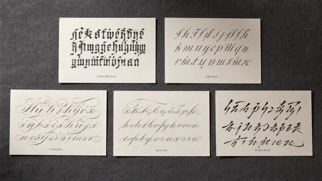
Most calligraphy styles fall into four practical families: broad-pen scripts like Italic and Blackletter, pointed-pen scripts like Copperplate and Spencerian, brush styles for modern lettering, and drawn hand-lettering styles.
If you are choosing a first style, start with Italic for clean, readable structure or modern brush calligraphy for cards, names, and looser creative work. Copperplate is beautiful, but it asks for steadier pressure control, thinner hairlines, and a consistent slant before it starts looking polished.
| Your goal | Start with | Why it fits |
|---|---|---|
| Clean, readable practice | Italic calligraphy | Structured letters and a moderate slant make spacing mistakes easier to spot. |
| Cards, names, or envelopes | Modern brush calligraphy | It is decorative without being rigid. If you want to test a name first, try your name in cursive before practicing it by hand. |
| Formal pointed-pen work | Copperplate | Best for fine hairlines and shaded downstrokes, but it needs more control than most first styles. |
| Manuscript or medieval projects | Gothic or Blackletter | Strong visual style, best saved until you can hold a broad pen at a steady angle. |
| Everyday script inspiration | Cursive or script preview | Use the cursive generator to explore a look quickly, then copy the spacing and rhythm by hand. |
The blackletter scripts of Gothic Europe look nothing like the flowing curves of Copperplate, and that's the point. Each style emerged because scribes needed something specific: speed, formality, legibility, or pure artistic expression. The tool shapes the style as much as the scribe does — broad-edged pens naturally create angular letterforms, while pointed nibs excel at delicate contrast.
Understanding these styles means understanding why they exist. Textura was dense and space-efficient when vellum cost a fortune. Spencerian was fast enough for 19th-century business correspondence. Modern calligraphy breaks the rules because Instagram values personality over historical accuracy. When you're choosing a style for your project, you're really choosing a conversation partner from history.
This guide organizes styles by tool type—broad pen, pointed pen, brush, and ruling pen—because that's how calligraphers actually think about them. If you're just starting out, check our beginner's guide to understand which tools and styles make sense for your skill level. For the historical context behind these scripts, see our history of calligraphy.
Calligraphy Style Decision Framework
Six styles cover almost everything a beginner will want to write: Italic, modern brush, faux calligraphy, Gothic blackletter, Copperplate, and Spencerian. The table below lines them up by the four things that actually decide your first style — how hard it is to start, what tools you need, what it is good for, and what each one looks like on the page. Pick the row that matches your project, then follow the last column to a lesson or tool to start practicing.
| Style | Beginner difficulty | Tools you need | Best for | What it looks like | Start here |
|---|---|---|---|---|---|
| Italic (broad pen) | Easy | Pilot Parallel or broad-edge dip pen, ink, grid paper | Journaling, quotes, invitations, daily practice | Slanted, structured letters with an even, readable rhythm | Beginner's guide |
| Modern brush | Easy | Tombow Fudenosuke brush pen, smooth paper | Cards, names, envelopes, social posts | Loose, bouncy strokes with thick downs and thin ups | Modern calligraphy |
| Faux calligraphy | Easiest | Any pen or marker you already own | Chalkboards, digital mockups, learning the look first | Drawn letters with downstrokes thickened by hand | Practice sheets |
| Gothic / Blackletter | Moderate | Broad-edge pen held at a steady angle, dense ink | Manuscripts, certificates, posters, tattoo lettering | Dense, angular, dramatic vertical letterforms | Blackletter section |
| Copperplate | Hard | Nikko G nib and an oblique holder, ink | Weddings, formal invitations, framed pieces | Fine hairlines, shaded downstrokes, steep ~55° slant | Wedding guide |
| Spencerian | Hard | Pointed nib and holder, light hand pressure | Signatures, monograms, business-style writing | Light, airy ovals written fast with subtle shading | Techniques |
Which calligraphy style should beginners learn first?
Start with Italic if you want clean, readable structure, or modern brush if you want decorative results fast. Both forgive shaky early attempts and give you quick wins, which is what keeps people practicing. If you do not have tools yet, faux calligraphy lets you learn the thick-and-thin look with a pen you already own before you spend money on nibs. Leave Copperplate, Spencerian, and formal Gothic until you have a few months of letterforms behind you — they reward control you have not built yet.
- Left-handed writers:Modern brush and faux calligraphy adapt most easily because you control stroke weight by hand rather than fighting a fixed pen angle. For broad-pen Italic, a left-oblique nib helps. Sharp pointed-pen slants like Copperplate are the hardest left-handed starting point, so save them for later.
- Digital / Procreate users:Modern brush translates almost directly to a tablet, since the pressure curve mimics a brush pen. Faux calligraphy is also a natural fit for any drawing app. Audition a look first with our font generator before you commit to redrawing it by hand.
- Weddings & events:Copperplate and formal Italic carry the traditional look clients expect, but they take practice. If an event is close, start with brush or faux calligraphy for signage and save pointed pen for envelopes. Our wedding calligraphy guide covers timelines and pricing.
Whatever you choose, you will learn faster by writing than by researching. Generate custom practice sheets for your style, or preview a name in script with the cursive generator before you letter it by hand.
Blackletter (Broad Pen) Styles
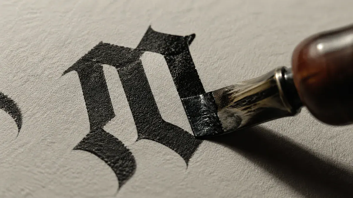
Blackletter calligraphy dominated European manuscripts from the 12th to 15th centuries, and if you've ever squinted at a medieval Bible wondering what letter you're looking at, you've met these scripts. They're dense, angular, and unforgiving—created with broad-edged pens held at consistent angles. According to the International Association of Master Penmen (IAMPETH), these scripts required such strict pen discipline that apprentice scribes spent months just learning proper pen angle before writing actual letters.
These aren't beginner-friendly styles. The broad-edged pen must maintain a 30-45 degree angle throughout, and any wobble shows instantly. But there's something satisfying about the geometric precision once you get it right. Want to practice the letterforms? Try our custom practice sheet generator to create guidelines specific to blackletter proportions, or audition Fraktur and medieval-revival fonts in the blackletter generator.
Medieval scribes developed blackletter partly because vellum was expensive. The tight, vertical letterforms packed more text per page, which mattered when your writing surface cost as much as a cow. Historian Marc Drogin notes in Medieval Calligraphy: Its History and Technique that a skilled scribe could fit 40-50% more text using Textura versus the earlier Carolingian scripts.
Textura (Textualis)
13th CenturyTextura is the blackletter you see in illuminated Bibles and Gothic cathedral inscriptions—the one that looks like a picket fence made of letters. It's called "textura" because the page literally looks woven or textured when you step back. Edward Johnston, who revived calligraphy in the early 20th century, called it "the most severe and formal script ever developed."
The letterforms are so vertical and tightly spaced that medieval readers sometimes needed context to distinguish certain letter combinations. The words "minim" and "unum" could look nearly identical—just a series of vertical strokes. Scribes developed conventions (like dots above the 'i' and 'j') partly to solve this readability problem.
Key Characteristics:
- Highly angular, geometric letterforms with almost no curves
- Tightly spaced vertical strokes creating a dense, woven appearance
- Pen angle typically 30-40 degrees for maximum angularity
- X-height to ascender ratio often 1:2 for dramatic vertical emphasis
- Diamond-shaped serifs formed by pen manipulation
Best for: Certificates, medieval-themed projects, formal documents, historical recreations, wedding materials with Gothic themes
Rotunda
Southern Europe, 13th CenturyRotunda is what happened when Italian and Spanish scribes looked at northern Gothic scripts and said "this is illegible." It keeps the Gothic character but adds curves where Textura had angles, and loosens the spacing enough that you can actually read it without a magnifying glass. The Society of Scribes and Illuminators notes that Rotunda was the preferred script for university texts in southern Europe because students needed to read quickly.
Key Characteristics:
- Rounder letterforms with curves replacing some angular strokes
- Looser spacing than Textura for improved legibility
- Pen angle around 30 degrees, but curves soften the effect
- Retains Gothic weight and formality
Best for: Manuscripts, early printed book aesthetics, Mediterranean-influenced designs, more readable Gothic applications
Fraktur
Germany, 16th CenturyFraktur is the most ornate member of the blackletter family. The name comes from the Latin fractura ("broken"), describing the way the strokes appear visibly fractured or shattered. It served as the standard typeface in Germany until 1941, which means generations of German readers learned to read in it before Antiqua took over.
Master penman Michael Sull notes that Fraktur offers more room for personal expression than its blackletter siblings. The elaborate capitals and flourishing conventions allow two calligraphers' Fraktur to look quite different while both remaining technically correct. Expect ornate, fractured strokes with visible breaks; elaborate capitals; strong contrast between thick and thin elements; and noticeable regional variation. It works well for official documents, German typography, historic-feeling designs, beer labels, metal band logos, and traditional certificates. For modern applications, explore custom calligraphy fonts that adapt Fraktur for digital use.
Schwabacher
Germany, 15th CenturySchwabacher is the readable middle ground in the blackletter family. Where Textura is rigid and Fraktur is ornate, Schwabacher rounds the letterforms and softens the angles, which made it the practical choice for everyday German documents before Fraktur displaced it. Strokes are flourished and organic rather than picket-stiff, with a balance between ornamentation and legibility that holds up well for vintage German branding, folk-art applications, and historic texts that still need to be read at speed.
Bastarda (Bâtarde)
14th-16th CenturyBastarda mixes Gothic angularity with cursive flow, which is where its name comes from (a "bastardized" or hybrid hand). It was the transitional script between formal bookhand and everyday handwriting, and regional variations were common: French Bâtarde, Flemish Bastarda, and English Secretary hand all shared the same core idea — Gothic, but faster and more personal. The result is a less rigid, more adaptable letterform suited to personal correspondence aesthetics, less formal medieval documents, and transitional-period designs.
Uncial & Half-Uncial
4th-8th CenturyUncial predates the Gothic scripts by centuries. These rounded majuscule letters filled early Christian manuscripts like the Book of Kells, written between two parallel guidelines with a near-flat pen angle (around 0–15 degrees) and almost no ascenders or descenders. The name probably traces back to the Latin uncia ("inch"), though that etymology is contested. What isn't contested is its dominance: Uncial was the script of important texts before Carolingian minuscule eventually pushed it aside.
Half-Uncial introduced lowercase characteristics — short ascenders and descenders — bridging the gap between all-caps Uncial and the lowercase scripts that followed. Calligraphy instructor Christopher Calderhead describes Uncial as "surprisingly contemporary-looking for a 1,600-year-old script," and that holds up in practice: the spacious, serene letterforms read just as comfortably on modern wellness branding and book titles as they do on historical manuscripts and Celtic designs. Try Uncial-inspired letterforms in your own projects with our cursive generator, or apply them in decorative techniques.
Pointed Pen Calligraphy Styles
Pointed pen calligraphy creates those dramatic thick-and-thin contrasts by varying pressure on a flexible nib. Push down, the tines spread, you get a thick stroke. Release pressure, you get a hairline. It's mechanically simple but takes real control—beginners often either press too hard and get ink bleeds, or not hard enough and wonder where the contrast went.
These scripts emerged after the broad-edged pen era, reaching peak popularity in the 18th and 19th centuries. Master penman Michael Sull (who literally wrote the book on Spencerian) notes that pointed pen scripts were designed for "beauty and speed in equal measure"—unlike blackletter, these styles needed to work for everyday business correspondence, not just ceremonial documents. That practical requirement shaped everything from letter connections to flourishing conventions.
Here's where pointed pen gets confusing: pen angle and letter slant are different things. The nib stays roughly perpendicular to your writing line (that's pen angle), but the letters slant 52-55 degrees to the right (that's slant angle). Beginners often try to hold the pen at 52 degrees, which makes pressure control nearly impossible. Your forearm provides the slant; the nib provides the contrast. See our tools guide for proper pen positioning.
Copperplate (English Roundhand)
17th-18th CenturyCopperplate is the pointed pen script everyone pictures for wedding invitations—all those delicate hairlines and dramatic thick strokes. The name comes from copper engraving plates used to reproduce writing manuals in the 1700s. Ironically, the engraved versions often looked better than the hand-lettered originals, setting an intimidating standard that calligraphers are still trying to match.
This style demands patience. You're making constant pen lifts, drawing the letters more than writing them. Master penman Jake Weidmann (one of the few living Master Penmen in the US) estimates that Copperplate capitals require 10-15 separate strokes each. That's why formal Copperplate takes forever—you're constructing architecture, not writing words. But the results justify the effort, especially for luxury applications where elegance matters more than speed. Most professionals start with a Nikko G Nib seated in an oblique dip pen holder to lock in that 52–55° slant without fighting their wrist.
Key Characteristics:
- 52-55 degree slant angle (consistent throughout)
- Delicate hairline upstrokes, thick weighted downstrokes via pressure
- Graceful loops and controlled flourishes
- Based on oval shapes (not circles)
- Many pen lifts for precision and control
- 3:2:3 ratio (ascender:x-height:descender)
Best for: Wedding invitations, formal announcements, certificates, luxury branding, professional calligraphy services, high-end stationery
Engrosser's Script (Engraver's Script)
19th Century AmericaEngrosser's Script is Copperplate's even more meticulous sibling. It was developed specifically for "engrossing"—the art of creating formal legal and ceremonial documents with decorative lettering. If Copperplate requires patience, Engrosser's demands obsession. Each letter gets broken down into individual strokes that you place with architectural precision.
This is the script you see on diplomas, legal charters, and presentation pieces where perfection matters. According to calligraphy historian Heather Held, professional engrossers in the 19th century would spend 20-30 hours on a single diploma, and mistakes meant starting over. The level of precision required means this style works better for short texts than long passages.
Key Characteristics:
- Extremely formal and precise execution
- Each letter composed of multiple separate strokes
- More pen lifts than Copperplate for maximum control
- Drawn rather than written—each stroke is a conscious decision
- Shading added stroke-by-stroke with multiple passes
Best for: Diplomas, certificates, professional awards, legal documents, presentation pieces, museum-quality work
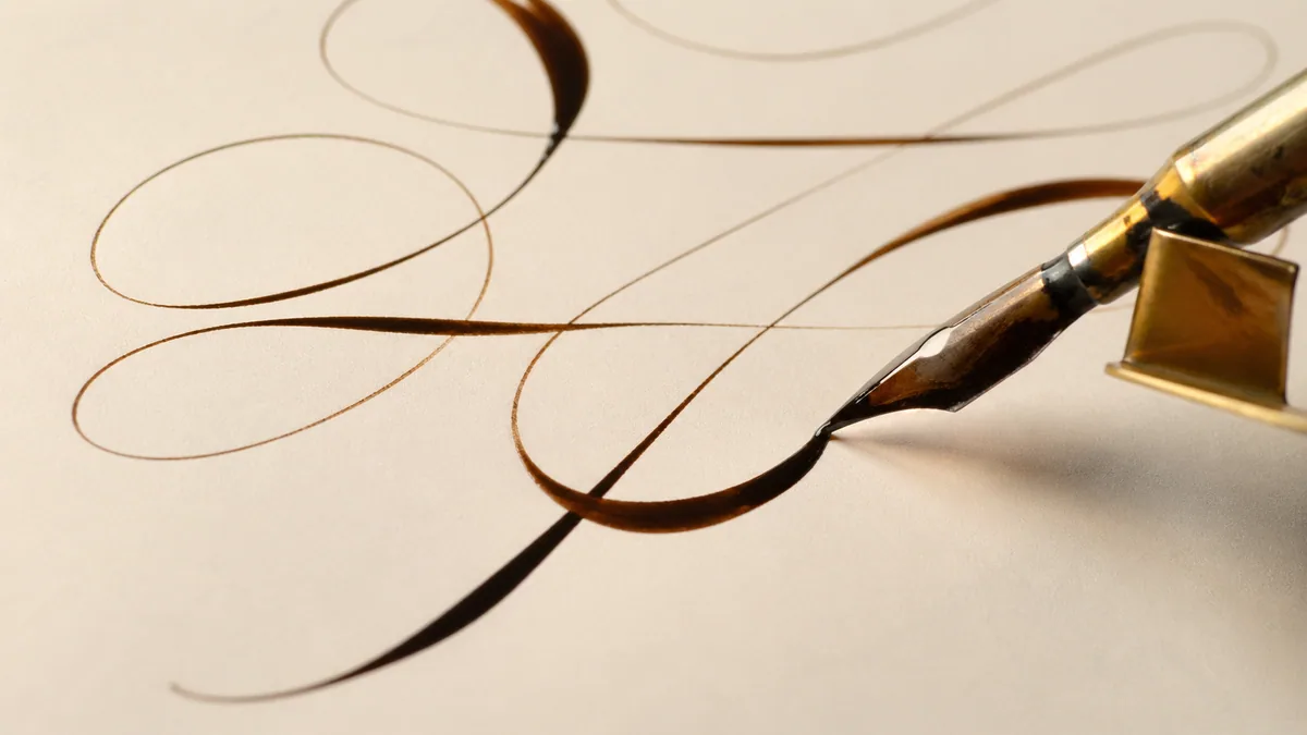
Spencerian Script
American, 1840sPlatt Rogers Spencer developed this script because American business needed something elegant but fast. Copperplate was too slow for everyday correspondence, so Spencer created a flowing alternative that you could actually write at reasonable speed. The result became America's standard business hand for decades—if your great-great-grandmother wrote in cursive, this is probably what she learned.
The Coca-Cola logo is modified Spencerian, which tells you something about its enduring appeal. Master Penman Michael Sull, who revived Spencerian in the modern era, describes it as "the most American of calligraphy styles"—optimistic, flowing, and practical. The subtler shading makes it more approachable for learners than Copperplate, while still providing that elegant pointed-pen aesthetic. Try practicing Spencerian letterforms with our custom practice sheets set to the proper 52-degree slant, or preview Spencerian and Copperplate-style fonts in the calligraphy font generator.
Key Characteristics:
- 52-degree slant angle (consistent but less rigid than Copperplate)
- Lighter, subtler shading than Copperplate
- Slender, tall letterforms with elongated ascenders
- Fewer pen lifts enabling faster writing speed
- More handwriting-oriented than architectural
- Delicate shading concentrated on ascenders and descenders
Best for: Personal letters, journaling, vintage designs, branding, everyday cursive writing, business correspondence aesthetics, nostalgic projects
Italic
Renaissance Italy, 15th CenturyItalic emerged in Renaissance Italy as a faster, more compact alternative to formal scripts. It works with both broad pen and pointed pen—the pointed pen version offers those elegant, slanted letterforms with flowing connections. Humanist scholars loved it because you could write quickly without sacrificing elegance, which mattered when you were copying entire manuscripts before the printing press became common.
Edward Johnston and Alfred Fairbank revived Italic in the early 20th century, and it's remained popular for good reason. The moderate slant (5-15 degrees) is comfortable, the letterforms are forgiving, and the results look sophisticated without requiring Copperplate-level precision. It's genuinely the best beginner-friendly calligraphy style if you want something that looks impressive quickly. For broad-pen Italic and Foundational hands, the Pilot Parallel Pen set gives you four crisp nib widths without the mess of dip ink—ideal for learning consistent pen angle.
Key Characteristics:
- Gentle slant (5-15 degrees, much less than Copperplate)
- Flowing, connected strokes with natural rhythm
- Oval letter shapes (laterally compressed circles)
- Moderate stroke weight contrast
- Faster execution than formal scripts
Best for: Invitations, personal correspondence, poetry, elegant designs, beginner practice, everyday applications
Brush Calligraphy Styles
Brush calligraphy has exploded in popularity thanks to Instagram and the hand-lettering renaissance. Unlike pointed pen or broad pen styles that have centuries of formal training methods, modern brush calligraphy is wonderfully anarchic—there's no single "right" way, which makes it both accessible and confusing for beginners.
The basic mechanism is similar to pointed pen: pressure creates thick strokes, light touch creates thin strokes. But brushes behave differently than nibs. The bristles compress and spring back, ink flows less predictably, and you get organic texture that pointed pen can't match. Contemporary calligrapher Molly Suber Thorpe notes that "brush calligraphy rewards looseness and punishes overthinking" which is exactly backwards from Copperplate's careful precision.
Traditional brushes (pointed round watercolor brushes) offer maximum expressiveness but require more skill. Brush pens (felt-tip markers with brush-like tips) provide consistency and convenience. Neither is "better"—they're different tools for different purposes. Tombow Dual Brush Pens and Pentel Sign Pens dominate the beginner market for good reason, but traditional brushes unlock textures and effects that felt tips can't achieve. Check our materials guide for specific tool recommendations.
Modern Brush Calligraphy
ContemporaryModern brush calligraphy is the Instagram star of the calligraphy world—bouncy baselines, variable slants, and zero concern for historical accuracy. It's wonderfully democratic: no centuries of tradition telling you you're doing it wrong. Artist and educator Karin Newport calls it "calligraphy's permission slip to play," and that freedom is exactly why it's become the most popular entry point for beginners.
This style emerged from wedding calligraphers in the 2010s who wanted something less formal than Copperplate but more sophisticated than plain handwriting. The bouncy baseline (where letters dance up and down) became the signature look, along with exaggerated flourishes and mixed letter heights. It's enormously forgiving—mistakes can become "stylistic choices." Most beginners start with the Tombow Fudenosuke brush pens because the firm tip builds muscle memory faster than a floppy brush. Practice modern styles with our 30-day challenge calendar.
Key Characteristics:
- Variable slant angles (letters can lean different directions)
- Bouncy baseline creating rhythm and movement
- Mixed letter heights for visual interest
- Personal flourishes and embellishments
- No strict rules—creative freedom prioritized
- Accessible for self-taught learners
Best for: Social media content, modern weddings, casual invitations, personal art projects, beginner-friendly applications
Casual Brush (Sign Painting Style)
Mid-20th CenturyThis style comes from mid-century sign painters who needed to letter storefronts and windows quickly by hand. It's loose, friendly, and deliberately imperfect in ways that feel authentic rather than sloppy. Think vintage diner signs or 1950s advertising—that energetic, slightly rough aesthetic that digital fonts can mimic but never quite capture.
Key Characteristics:
- Bouncy, fluid letterforms
- Varying stroke thickness with confident execution
- Relaxed, approachable appearance
- Based on traditional sign painting techniques
- Works at large scale
Best for: Shop signs, posters, vintage-inspired projects, social media graphics, retro branding
Copperplate Brush Calligraphy
Contemporary AdaptationThis takes traditional Copperplate letterforms and executes them with a brush instead of a pointed nib. It keeps the 52-degree slant, the oval shapes, and the dramatic thick-thin contrast, but adds the organic texture that only brush bristles create. It's technically challenging—you're trying to maintain Copperplate's precision with a tool that's inherently less predictable.
Key Characteristics:
- Slanted, elegant letterforms (52-55 degrees)
- Strong thick-thin contrast through brush pressure
- Refined, classical appearance with brush texture
- Mimics pointed pen Copperplate structure
Best for: Formal invitations with modern twist, luxury branding, elegant event materials, wedding stationery
Expressive Brush Lettering
ContemporaryThis category covers bold, experimental brush work where expression matters more than legibility. These styles showcase what brushes can do that no other tool can—raw, gestural mark-making with energy and attitude. Contemporary lettering artist Bobby Haiqalsyah's "Fuego" style exemplifies this approach: dramatic, confident, impossible to ignore. Use our font pairing tool to combine expressive brush lettering with complementary fonts.
Key Characteristics:
- Bold, expressive strokes
- High contrast through extreme pressure variation
- Dramatic, energetic appearance
- Flexible, organic shapes
- Often features dramatic flourishes and extensions
- Prioritizes impact over traditional letterform rules
Best for: Posters, motivational quotes, art prints, modern branding, social media content, hand lettering projects
Ruling Pen Calligraphy
Ruling pen calligraphy is gloriously weird—you're using a technical drawing tool (literally designed for ruling straight lines with a compass) to create letterforms. There's no centuries-old tradition here, no formal alphabets passed down through generations. It's pure experimentation, which makes it intimidating and liberating in equal measure.
Contemporary calligraphers started playing with ruling pens in the 1990s and 2000s, discovering that these tools could create both razor-sharp lines and wild, splattered textures depending on how you use them. Calligraphy instructor Brody Neuenschwander pioneered much of this experimental work, showing that architectural precision and gestural chaos could coexist in the same letterform. The learning curve is steep but short—you'll figure out what works through experimentation faster than studying rulebooks.
Traditional Ruling Pen
Technical/ModernAn architect's ruling pen has two adjustable metal blades that hold ink between them. Turn the screw to change the gap, and you control line width. The trick is that you can also control how much the blades splay apart during use, which creates those characteristic splits and splatters. It's unpredictable in the best way—you set up conditions, then let the tool and ink do something surprising.
Key Characteristics:
- Adjustable line width via screw mechanism
- Can produce both razor-sharp lines and rough, splattered effects
- Subtle and explosive textural possibilities in one tool
- Excellent for decorative borders and underlining
Best for: Experimental lettering, abstract art, decorative borders, mixed media, contemporary calligraphy projects
Cola Pen (Folded Pen)
DIY ContemporaryThis is the ultimate calligraphy DIY: you fold and cut aluminum from soda cans to create a custom nib. The edges are sharp (literally—be careful), and the ink flow is delightfully chaotic. Every cola pen behaves differently because each one is hand-made. Contemporary calligraphers love them for workshops because they democratize experimentation—you don't need expensive tools to try something new.
Key Characteristics:
- Custom-made from aluminum cans or similar materials
- Unique textural effects from irregular edges
- Unpredictable ink flow creates organic patterns
- Highly experimental and individual to each pen
Best for: Experimental art, unique textures, calligraphy workshops, personal projects, texture exploration
- Line Width: Adjust the gap between blades for consistent or dramatically varied thickness
- Pressure & Speed: Heavy pressure plus fast movement creates explosive splatters; light touch gives hairlines
- Surface: Rough watercolor paper enhances texture and splatter; smooth paper gives cleaner lines
- Ink Loading: Load with paintbrush for control, or direct dipping for unpredictable effects
- Styles: No strict alphabets exist—invent new letterforms or adapt from other calligraphy styles
Hand Lettering Styles
Hand lettering is drawing letters rather than writing them. The distinction matters: calligraphy flows from practiced muscle memory, while lettering is construction—you're designing each letterform deliberately. This makes lettering slower but infinitely flexible. You can combine styles, break rules, and prioritize visual impact over writability. For more on this distinction, see our guide on calligraphy vs hand lettering.
Contemporary hand lettering artists like Jessica Hische and Sean Wes have shown that treating letters as illustration opens creative possibilities that traditional calligraphy can't reach. You're not limited by what a pen can do in one stroke—you can build letters from multiple passes, add dimension and shading, combine different styles in one composition. The tradeoff is time: what takes seconds in calligraphy might take minutes in lettering.
Serif Lettering
ClassicSerifs are those small decorative strokes at the ends of letters, and they've carried associations of tradition and authority for centuries. When you hand-letter serifs, you're building those details stroke by stroke, which gives you control that typed fonts can't match. You can make serifs delicate or bold, geometric or organic, depending on what the composition needs.
Key Characteristics:
- Decorative feet or serifs on letter strokes
- Traditional, authoritative appearance
- Variations: Roman Capitals, Slab Serif, Old Style
- Can be geometric or organic depending on style
- Hand-drawn flexibility in serif treatment
Best for: Logos, book titles, traditional designs, formal projects, alphabet studies
Sans Serif Lettering
ModernSans serif (French for "without serif") strips away the decorative elements for clean, modern letterforms. This is the aesthetic of the 20th century—Bauhaus, Swiss design, tech startups. When you hand-letter sans serif, the challenge becomes proportion and spacing since you can't rely on serif details to anchor the letters visually.
Key Characteristics:
- No decorative strokes at letter ends
- Clean, minimalist appearance
- Variations: geometric, humanist, grotesque
- Can range from bold display to delicate fine weights
- Requires careful attention to optical spacing
Best for: Modern branding, tech projects, minimalist designs, signage, contemporary applications
Script Lettering
FlowingScript lettering draws cursive-style letters but builds them deliberately rather than writing them fluently. This gives you the flowing elegance of scripts like Spencerian without requiring pointed pen mastery. You can adjust letterforms, fix connections, and perfect each curve—it's calligraphy's aesthetic without calligraphy's real-time performance pressure.
Key Characteristics:
- Flowing, connected letterforms
- Cursive-style appearance
- Elegant and personal feeling
- Often features decorative flourishes
- More control than written calligraphy
Best for: Invitations, branding, romantic designs, personalized projects, luxury products
Monoline Lettering
UniformMonoline means uniform stroke weight—no thick and thin variation. This constraint forces you to think about form and proportion since you can't rely on contrast for visual interest. The result looks clean, refined, and remarkably versatile. It works for both vintage 1950s aesthetics and contemporary minimal branding.
Key Characteristics:
- Consistent stroke weight throughout all letters
- Clean, refined appearance
- Can be applied to script, serif, or sans serif styles
- Works for both modern and retro applications
Best for: Logos, minimal designs, social media graphics, retro projects, versatile branding
Vintage Lettering
NostalgicVintage lettering recreates the aesthetic of specific eras—Victorian ornamentation, Art Deco geometry, 1950s optimism, 1970s psychedelia. You're often combining multiple lettering styles, adding dimensional effects (shadows, outlines, inline details), and incorporating period-appropriate textures. It's historically informed pastiche, and when done well, it transports viewers to a specific time and place. Use our font pairing tool to combine vintage lettering with complementary modern fonts.
Key Characteristics:
- Decorative, ornamental elements from specific eras
- Textured, distressed appearances for authenticity
- Period-appropriate styling (Victorian, Art Deco, Mid-Century, etc.)
- Often features shadows, outlines, or inline decorative details
- Combines multiple lettering techniques
Best for: Branding, posters, packaging, historic recreations, nostalgic designs, craft beer labels
Eastern Calligraphy Styles
Eastern calligraphy traditions deserve their own extensive study—what follows is respectful overview, not comprehensive instruction. These traditions predate European calligraphy by millennia and carry profound cultural, spiritual, and artistic significance. If Western calligraphy asks "how should this letter look?", Eastern calligraphy asks "what does this gesture reveal about the calligrapher's spirit?"
Chinese Calligraphy (Shufa)
Chinese calligraphy represents one of humanity's oldest continuous artistic traditions, dating back over 3,000 years. The practice integrates technical mastery, scholarly cultivation, and spiritual expression. Master calligraphers spend lifetimes perfecting single characters, understanding that each brush stroke carries both aesthetic and philosophical weight.
Major Historical Styles:
Arabic Calligraphy
In Islamic tradition, Arabic calligraphy elevates the written word of the Qur'an to visual art. Since Islamic art traditionally avoids figurative representation, calligraphy became the primary vehicle for aesthetic and spiritual expression. Different styles evolved for different purposes—angular Kufic for monumental architecture, flowing Naskh for manuscripts, elaborate Diwani for Ottoman imperial documents.
Major Styles:
Japanese Calligraphy (Shodo)
Shodo, "the way of writing," integrates Zen philosophy with calligraphic practice. Like Chinese calligraphy, it uses brush and ink, but Japanese aesthetics emphasize different qualities—ma (negative space), wabi-sabi (imperfect beauty), and the concept that each stroke is unrepeatable, making every piece unique and irreplaceable. The practice is meditation as much as art.
If you're drawn to Eastern calligraphy, seek instruction from practitioners within those traditions. The tools, techniques, and philosophies differ fundamentally from Western calligraphy. What looks simple—a brush, ink, paper—conceals decades of disciplined practice and cultural knowledge. Appropriating surface aesthetics without understanding context does disservice to these profound traditions.
The "best" calligraphy style doesn't exist—there's only the right style for your specific project, skill level, and aesthetic goals.
Here's the truth about choosing a calligraphy style: beginners agonize over this decision way more than they should. Master calligrapher Denis Brown recommends spending less time deciding and more time practicing, because "your first style won't be your only style, and you'll learn more from three months of practice than three weeks of research." That said, some practical guidance helps.
Match Style to Purpose
- Formal events & weddings:Copperplate, Spencerian, or formal Italic. These styles carry centuries of association with important occasions. See our wedding calligraphy guide for specific applications.
- Medieval or historical:Textura, Rotunda, or Uncial depending on the specific period you're referencing. Match the script to the historical context for authenticity.
- Modern, casual projects:Modern calligraphy or brush lettering. These styles embrace personality over rules, perfect for social media and contemporary design.
- Business & professional:Spencerian, Italic, or clean sans serif hand lettering. Professional without being stuffy. Explore professional calligraphy services for commercial applications.
- Experimental art:Ruling pen calligraphy, expressive brush lettering, or develop your own style. The goal is expression, not historical accuracy.
Consider Your Skill Level
- Best for beginners:Italic (broad or pointed pen) or modern brush calligraphy. Both offer quick wins and forgiving letterforms. Start with our complete beginner's guide.
- Intermediate challenge:Spencerian, Uncial, or Rotunda. These require control but don't demand the precision of Copperplate. Practice with our 30-day practice calendar.
- Advanced mastery:Copperplate, Engrosser's Script, or Textura. These styles take months or years to master, but the results are worth it. Learn advanced calligraphy techniques to refine your skills.
Practical Advice from the Pros
According to a 2019 survey by the Calligraphers Guild, most professional calligraphers are fluent in 3-5 styles, but they typically built that repertoire over 5-10 years. The most common learning path:
- Start with one foundation style (usually Italic or modern calligraphy) and practice for 3-6 months
- Add a contrasting style (if you started with pointed pen, try broad pen, or vice versa)
- Develop personal variations as you understand the principles behind the styles
- Expand strategically based on project needs rather than collecting styles randomly
The International Association of Master Penmen (IAMPETH) emphasizes that style choice matters less than consistent practice. Master Penman Jake Weidmann spent his first year doing nothing but basic strokes and letterforms, which is why his work now looks effortless. Start practicing now—you can always course-correct later. Use our practice sheet generator to create custom practice materials for any style you choose.
Want to explore how different styles look before committing? Try our font generator to audition cursive, calligraphy, blackletter, and hand-lettering side-by-side with your own text. And if you're worried about making common calligraphy mistakes, our guide covers what to watch out for as you learn.