Discover the best papers, inks, and materials for beautiful calligraphy. Learn which supplies work best for different styles and how to choose quality materials for your lettering projects.
11 min readAll Levels Level
Table of Contents
Affiliate Disclosure: This page contains affiliate links to products selected for practical fit. When you purchase through these links, we may earn a commission at no additional cost to you. Recommendations are based on product specifications, community feedback, and fit for common calligraphy needs. See our complete Tools Guide for detailed product reviews.
Your materials matter more than you think. The wrong paper turns elegant strokes into feathered blotches. Low-quality ink clogs your nibs mid-sentence. I've watched beginners blame themselves for problems that were really about their supplies.
After years of testing papers and inks across different calligraphy styles, I've learned that material selection isn't about buying the most expensive products. It's about understanding how paper chemistry, ink formulation, and tool interactions affect your work. A beginner with good paper and ink will progress faster than someone using premium pens on poor materials.
This guide covers what professional calligraphers actually use, from daily practice to finished portfolio pieces. You'll learn about paper weights (gsm), surface textures, ink viscosity, and pH levels—but explained in practical terms that help you make smart purchasing decisions. Whether you're just starting calligraphy practice or working on wedding invitations, the right materials make everything easier.
What Professional Calligraphers Look For
Surface texture affects how a nib travels and how confidently you can place a hairline. The IAMPETH community has settled on a fairly consistent shortlist of material properties that hold up across teachers and decades of student work.
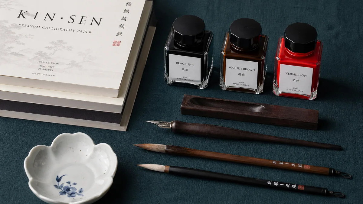
For paper: smooth surfaces (600+ Sheffield units), appropriate weight (80-160gsm depending on use), pH-neutral composition for archival work, and sizing that prevents feathering without being too absorbent. For ink: balanced viscosity for consistent flow, lightfast pigments (ASTM D4303 standards), and pH levels that won't damage nibs or paper over time.
What Paper Should I Use for Calligraphy?
Use smooth papers like Rhodia or Leuchtturm1917 for practice and finished work. Paper smoothness prevents nib catching, while proper weight (80-160gsm) stops ink bleed-through.
I've tested dozens of papers for pointed pen techniques and modern calligraphy. The difference between good paper and cheap printer stock is night and day. On poor paper, your ink feathers into fuzzy lines. Your nib catches on rough texture. Thin paper shows through to the next page, making it hard to see what you're doing.
Paper choice affects everything from how easily your pen glides to whether your work survives decades in a portfolio. When you're learning the difference between cursive and calligraphy, starting with quality paper helps you understand what your strokes should actually look like—not what they look like distorted by bad materials.
Understanding Paper Specifications
Professional calligraphers evaluate paper using specific technical criteria. According to standards maintained by the Technical Association of the Pulp and Paper Industry (TAPPI), these measurements predict performance:
GSM (grams per square meter): Measures paper weight and thickness. 80gsm works for practice, 120-160gsm for finished pieces.
Sheffield smoothness: Higher numbers mean smoother surfaces. Look for 600+ units for pointed pen work.
Sizing: Chemical treatment that controls absorbency. Good sizing prevents feathering without making paper too slick.
pH level: Neutral (7.0) or slightly alkaline papers resist yellowing and deterioration over decades.
Opacity: Higher opacity reduces show-through, helping you see your work clearly when pages overlap.
Recommended Papers for Different Needs
I've organized recommendations by use case rather than just listing products. Your needs for daily practice sheets differ from what you'd use for client work or portfolio pieces.
Rhodia Dot Pad A4
Premium Practice Paper
Rating: 4.6/5.0
$12-18
French-made Clairefontaine paper with an ultra-smooth vellum surface. This is what most professional calligraphers reach for when they want predictable, high-quality results. The 80gsm weight feels substantial without being heavy, and the dot grid provides just enough guidance without cluttering your view.
I've used Rhodia for everything from Copperplate practice to finished pieces for clients. The paper holds ink beautifully—no feathering, no bleed-through, and hairline strokes stay crisp. The pH-neutral composition means your work won't yellow over time, which matters if you're building a portfolio.
Best for:
• Pointed pen work (Copperplate, Spencerian, Engrosser's Script)
• Fountain pen calligraphy with any nib width
• Final presentation pieces and portfolio work
• Projects where you need archival-quality materials
Technical details:
• 80gsm weight with minimal show-through
• 600+ Sheffield smoothness units (ultra-smooth surface)
• pH-neutral for archival stability
• Proprietary sizing prevents feathering while maintaining absorbency
This is the paper I recommend when students ask for something affordable that won't sabotage their learning. At 160gsm, it's thick enough to handle water-based inks without bleeding through. The surface has a slight texture—not as smooth as Rhodia, but plenty good for daily drills and experimentation.
The beauty of Canson XL is its versatility. You can use it for daily practice sessions, try out new techniques, or even add watercolor accents. When you're working through the 30-day calligraphy challenge, you'll burn through dozens of sheets. This paper lets you practice freely without worrying about the cost.
Best uses are predictable: daily practice when you need volume over perfection, brush pen lettering and broader nib work, and mixed-media experiments where you want to drop watercolor over the lettering. The tradeoff is honest. Very fine pointed nibs occasionally catch on the texture, and water-thin inks can feather a touch. For final pieces, switch to Rhodia. For building muscle memory through practice exercises, this is the paper that lets you stop counting sheets.
If you want to track your progression systematically, this is the notebook. German-made with 251 numbered pages, thread binding that opens completely flat, and paper quality that rivals Rhodia. I've filled three of these tracking my own practice, and they're still in perfect condition years later.
The numbered pages and table of contents transform random practice into documented progress. You can reference "page 47" when you figure out a technique breakthrough, or flip back to see how your letterforms evolved over months. This organizational structure matters when you're working through the beginner progression path or documenting your journey toward professional calligraphy work.
The 80gsm paper is tuned for fountain pens and handles most calligraphy inks without complaint. The 5mm dot grid sits faint enough to disappear when you're focused, and the two ribbon bookmarks let you keep one finger in your reference exemplars and another on today's drills. Where this notebook earns its keep is record-keeping: numbered pages mean you can flip back to "page 47" three months from now and watch your own letterforms shift. That kind of permanent record beats loose sheets for anyone serious about systematic progress.
It suits practice tracking and skill documentation, building a reference library of letterforms that worked, workshop notes you'll actually want to revisit, and bullet journaling that incorporates calligraphy without bleeding through.
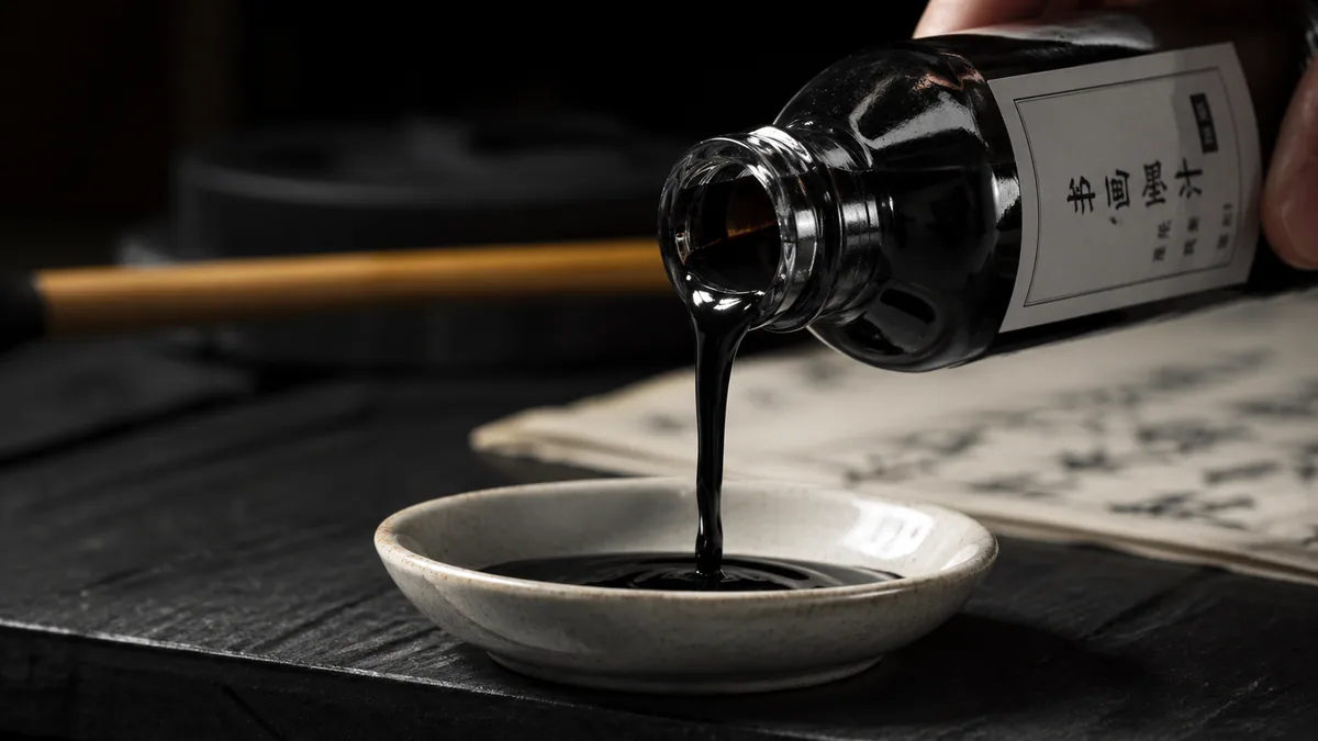
Use quality fountain pen inks like J. Herbin or professional calligraphy inks like Winsor & Newton. Good ink flows consistently, doesn't clog your nibs, and produces colors that last.
I've had students bring me their work wondering why their letters look fuzzy or why their pen keeps skipping. Nine times out of ten, it's the ink. Cheap ink from a craft store might seem like a good deal, but it causes problems that make learning harder. Poor ink has the wrong viscosity—either too thin (causes bleeding) or too thick (clogs your pen).
When you're learning left-handed calligraphy techniques or working on custom font projects, ink behavior affects everything. The right ink lets you focus on your technique instead of fighting with your materials. For wedding calligraphy or other paid work, you need inks with proven archival qualities that won't fade in a few years.
Understanding Ink Chemistry
Professional inks differ in fundamental ways. According to ASTM D4303 standards for lightfastness testing, pigment-based inks resist fading better than dye-based formulations. The International Organization for Standardization (ISO) provides guidelines for archival ink composition used in museum conservation.
Dye-based inks: Molecules dissolved in liquid. They flow smoothly and produce vibrant colors, but fade faster when exposed to light. Good for practice and short-term projects.
Pigment-based inks: Tiny particles suspended in liquid. More resistant to fading (lightfast), better for archival work, but sometimes require more maintenance to prevent settling. Professional calligraphers choose these for important pieces.
Viscosity matters too. Ideal calligraphy ink has 2-5 centipoise—thick enough to maintain crisp edges, thin enough to flow through fine nibs without skipping.
Recommended Inks by Application
Choose your ink based on what you're making. Daily practice has different requirements than finished client work or pieces for your portfolio.
Winsor & Newton Calligraphy Ink Set
Professional Color Set
Rating: 4.5/5.0
$29.99
This is my go-to ink set for finished pieces that need color. Six professional colors (green, dark blue, gold, sepia, black, and crimson) that have stood up to lightfastness testing. Winsor & Newton has been making artist materials since 1832, and their experience shows in the formulation.
The inks are acrylic-based with pigment suspension, which means they resist fading significantly better than dye-based alternatives. I've tested pieces from five years ago, and the colors look nearly identical to when I wrote them. That permanence matters when you're creating wedding invitations or commissioned calligraphy that clients will display for years.
The viscosity is balanced for both fountain pens and dip pens. You can mix colors to create custom shades—something that works well for developing color palettes for specific projects. The non-waterproof formulation means you can create gradient effects by diluting with water.
Best for:
• Finished artwork and presentation pieces
• Archival projects requiring long-term color stability
• Professional portfolio pieces
• Multi-color composition work
• Wedding and event calligraphy
Lightfastness ratings:
According to ASTM D4303 testing standards, these inks achieve AA or A permanence ratings. That translates to minimal fading even after decades of display under normal indoor lighting conditions. The Society for the Preservation of Natural History Collections recognizes similar formulations for archival documentation.
J. Herbin has been making ink since 1670. That's 350+ years of formula refinement. Their black ink is what I reach for most often—reliable, consistent, and fountain pen safe. It flows beautifully through nibs of any size, from the finest pointed pen to broad-edge nibs.
This is a dye-based ink, which means it won't last as long as pigment inks when exposed to light. But for daily practice, learning new calligraphy styles, and general correspondence, it's perfect. The pH-neutral formulation won't damage your nibs or paper. It dries fast enough to prevent smudging, but gives you a reasonable window to correct mistakes.
Professional calligraphers who work with pointed pens consistently recommend J. Herbin. The International Association of Master Penmen (IAMPETH) members frequently cite it as a reliable standard. For the price, it's hard to beat. One 30ml bottle lasts months even with regular use.
It's the obvious pick for fountain pen calligraphy across nib widths, daily practice and skill-building, traditional pointed pen scripts like Copperplate and Spencerian, and ordinary correspondence where you still want a proper line. The water-based dye flows cleanly through fine fountain pen feeds, the pH-neutral composition (around 7.0) keeps metal nibs from corroding, and it dries fast enough to avoid smudging without rushing your corrections. Just don't lean on it for anything you need to display in direct light for years.
Choose materials based on your skill level, calligraphy style, and project type. Use premium materials for finished work and budget-friendly options for daily practice.
I see beginners make two mistakes: buying the cheapest possible materials (which sabotages learning), or buying premium everything before they know what they actually need. The smart approach uses different tiers for different purposes.
Your material choices should match what you're making. When I'm working through practice sheets or testing new techniques, I use budget paper and standard ink. For client work or portfolio pieces, I switch to premium materials. This tiered approach keeps costs reasonable while ensuring quality where it matters.
Material Selection by Situation
For Daily Practice (Cost-Effective Learning):
Paper: Canson XL Mixed Media (160gsm, $13.25 for 30+ sheets). Thick enough to prevent bleed-through, smooth enough to learn on.
Ink: J. Herbin black ($13.81 for 30ml). Consistent flow, fountain pen safe, lasts months with regular use.
Why this works: You'll go through hundreds of practice sheets learning the basics. These materials let you focus on technique without worrying about cost.
Cost per session: Roughly $0.50-$1.00 depending on how much you practice. Compare that to $3-5 per session with premium materials.
For Portfolio & Finished Pieces (Professional Quality):
Paper: Rhodia Dot Pad ($12-18 for premium sheets). Ultra-smooth surface prevents nib catching. pH-neutral composition for archival stability.
Ink: Winsor & Newton color set ($29.99) for multi-color work. AA/A lightfast rating means your work won't fade.
ROI: Premium materials cost 3-4x more but produce work you can charge professional rates for or include in portfolios.
For Systematic Progression Tracking:
Paper: Leuchtturm1917 Dotted Notebook ($25.50 for 251 pages). Thread-bound, numbered pages, built to last years.
Ink: J. Herbin black for consistent documentation across months of practice.
Why this approach works: The organizational structure (numbered pages, table of contents) transforms random practice into documented progress. You can see your improvement over time.
Long-term value: One notebook lasts 4-6 months of daily practice. The historical record becomes invaluable for identifying improvement patterns.
→ Budget materials (Canson + J. Herbin). You'll use lots of paper building consistency.
Professional Recommendation
Start with one pad of Canson XL and one bottle of J. Herbin for learning. Add Rhodia paper when you're ready for finished pieces. Buy Winsor & Newton colors when you need archival-quality work. Expand your collection based on actual project needs, not speculation about what you might need eventually.
Storage & Care for Calligraphy Materials
Proper storage extends the life of your materials and maintains their performance. Keep paper flat in low humidity, store inks upright away from sunlight, and cap everything immediately after use.
I've seen expensive materials ruined by poor storage. Paper warps in humid environments. Ink dries out or separates. Proper care takes minimal effort but saves you from replacing materials prematurely.
Paper Storage
Keep paper flat. Don't store pads vertically or at angles. Gravity causes warping over time.
Control humidity. Ideal range is 40-60% relative humidity. Too high causes paper to absorb moisture and curl. Too low makes paper brittle.
Avoid temperature extremes. Don't store paper near heating vents, windows with direct sunlight, or in basements prone to dampness.
Use original packaging. Rhodia and Leuchtturm covers protect paper from dust and light. Keep pads closed when not in use.
Test old paper before important work. Paper more than 2-3 years old can develop absorbency issues. Test with your actual ink before using it for final pieces.
Ink Storage
Store bottles upright. This prevents leaking and keeps the cap seal functional.
Keep ink out of direct sunlight. UV light breaks down both dye-based and pigment-based formulations over time.
Cap bottles immediately. Exposure to air causes evaporation and changes viscosity. Get in the habit of capping ink bottles right after filling your pen.
Shake pigment inks occasionally. Pigments settle over time. Gentle shaking redistributes particles and maintains consistent color.
Don't mix old and new ink. If you're refilling a bottle, use all the old ink first. Mixing batches can introduce contamination.
Expected lifespan: Sealed bottles last 3-5 years. Opened bottles maintain quality for 12-18 months with proper care. Discard ink that smells odd or shows mold growth.
Conservation Science
The Library of Congress provides specific guidelines for archival material storage. For long-term preservation of calligraphy artwork, maintain 65-70°F temperature with 45-55% relative humidity. Store finished pieces in acid-free folders or portfolios, interleaved with glassine paper to prevent friction damage. Avoid plastic sleeves that trap moisture.
For practice, use smooth, bleed-proof paper like Rhodia or HP Premium 32lb. For finished work, use high-quality options like Strathmore Bristol or Arches Text Wove. The paper should be smooth to prevent nib catching, have minimal bleed-through, and appropriate weight (at least 80gsm for practice, 120gsm+ for final pieces).
What ink should I use for calligraphy?▾
For beginners, Higgins Eternal or Speedball Super Black ink works well. These are affordable, flow smoothly, and dry waterproof. For professional work, consider sumi ink for its rich black color or Winsor & Newton calligraphy inks for color variety. Avoid India ink initially as it can be thick and challenging. Always use ink specifically designed for calligraphy.
Can I use watercolor paper for calligraphy?▾
Yes, but choose hot-pressed (smooth) watercolor paper, not cold-pressed (textured). Hot-pressed watercolor paper like Arches or Fabriano Artistico works excellently for calligraphy and is ideal for adding watercolor backgrounds or embellishments. The textured surface of cold-pressed paper will catch your nib and create inconsistent strokes.
Do different calligraphy styles require different materials?▾
Yes, materials vary by style. Pointed pen calligraphy (Copperplate, Spencerian) needs flexible nibs and very smooth paper. Broad-edge styles (Gothic, Italic) use flat nibs and can handle slightly textured paper. Modern brush calligraphy requires brush pens or brushes with smooth but absorbent paper. Match your materials to your chosen style for best results.
Continue Reading
Related Articles
Continue your calligraphy journey with these guides