Master paper selection with this comprehensive guide to smooth, textured, and watercolor papers. Learn about GSM weights, sizing treatments, surface finishes, and how different paper types affect your calligraphy results.
14 min readAll Levels Level
Table of Contents
Affiliate Disclosure: This page contains affiliate links to products we recommend. When you purchase through these links, we may earn a commission at no additional cost to you. Recommendations are based on product specifications, community feedback, and fit for common calligraphy needs. See our complete Materials Guide and Tools Guide for more product reviews.
I've watched too many talented beginners give up on calligraphy because their paper fought them at every stroke. Your nib catches. The ink bleeds. Hairlines vanish into fuzzy blotches. You blame your technique when it's actually the paper.
After testing hundreds of papers for students and my own wedding calligraphy business, I've learned that paper chemistry matters as much as your pen choice. The smoothness rating, sizing treatment, and weight determine whether you'll develop clean strokes or fight your materials. According to research from the Technical Association of the Pulp and Paper Industry (TAPPI), surface properties directly affect ink spread and nib friction—technical terms that translate to "will this paper make calligraphy miserable or enjoyable."
This guide covers what professional calligraphers actually buy, from daily practice sheets to archival portfolio pieces. You'll learn about GSM weights, sizing methods, pH levels, and surface finishes—but explained in practical terms that help you choose wisely. Whether you're just starting calligraphy practice or working on formal materials for client projects, understanding paper science helps you avoid expensive mistakes. The International Association of Master Penmen, Engrossers and Teachers of Handwriting (IAMPETH) emphasizes that paper selection is foundational to calligraphic success—they're right, and you'll understand why after reading this.
Quick Answer: What's the Best Paper for Calligraphy?
For pointed pen (Copperplate, Spencerian): Ultra-smooth papers like Rhodia Dot Pad, HP Premium 32lb, or Strathmore Bristol smooth (120gsm+). The smoothness prevents nib catching on delicate hairline strokes.
For brush calligraphy: Hot-pressed watercolor paper or smooth mixed media paper (160-300gsm). The weight handles moisture without buckling.
For high-volume practice: HP Premium 32lb laser paper ($0.05 per sheet) or Canson XL Mixed Media Paper Pad pads. Save expensive papers for finished work.
Smooth Papers: The Foundation of Pointed Pen Calligraphy
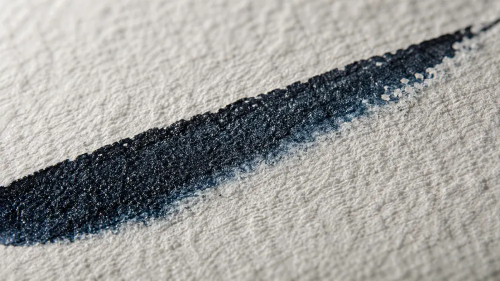
If you're learning pointed pen styles like Copperplate or Spencerian, paper smoothness isn't optional—it's everything. A rough surface catches your nib tines on hairline upstrokes and creates inconsistent line variation.
The difference shows up quickly in practice: same ink, same nibs, different papers. On smooth paper, beginners produce clean hairlines. On textured paper, nibs catch and spray ink mid-stroke. What looks like "bad technique" often disappears when the paper changes. Professional calligraphers target papers with Sheffield smoothness ratings of 600+ units—a measurement based on how much air leaks between paper and glass. According to pointed pen technique principles taught by IAMPETH masters, smooth papers allow the delicate nib tines to spread under pressure (thick downstroke) and spring closed (hairline upstroke) without catching in surface valleys.
Why Pointed Pen Nibs Require Smooth Surfaces
Pointed pen nibs have flexible tines that separate under pressure. Think of them like tiny springs. When you press down, they spread (creating thick lines). When you release pressure, they snap back together (creating hairlines). Any surface texture—even microscopic bumps—catches one tine while the other glides, causing skips and ink splatters. Paper manufacturers create smoothness through calendering (pressing sheets between heavy rollers) and surface sizing treatments that fill in fiber irregularities. You'll see papers labeled "vellum finish" or "bristol smooth"—both indicate the surface treatment that beginning calligraphers need for consistent results.
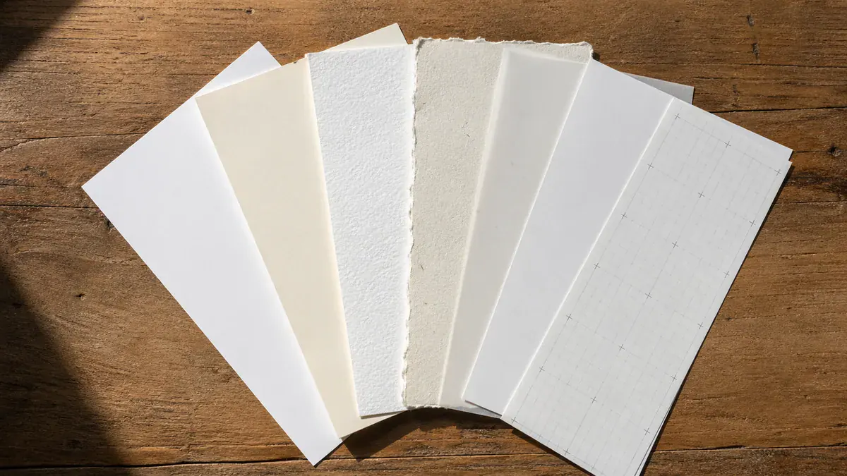
Smooth Papers I Actually Use and Recommend
I've tested these papers with pointed pen, fountain pen, and brush pen over years of teaching and client work. These recommendations come from actual use—not manufacturer marketing claims. You'll find specific details about performance, real-world applications, and honest limitations.
What it is: 80gsm Clairefontaine Triomphe Paper Pad vellum paper with ultra-smooth finish (650+ Sheffield units). French manufacturing. pH-neutral acid-free composition. Surface-sized to control ink spread. The 5mm dot grid helps with slant angles and baseline alignment without being visually intrusive.
What I use it for: Daily practice drills with Copperplate and Spencerian, final pieces for portfolio work, and client proofs. The dot grid helps me check if my slant angle stays consistent—something I struggled with on blank paper.
Real performance: Zero feathering with liquid inks (I use Sumi and iron gall). Minimal show-through even at 80gsm weight. Handles pointed pen hairline strokes without catching. Some translucency if you hold it up to light, but not enough to cause problems in normal use.
Limitations: Not archival-grade for heirloom pieces (use cotton rag paper instead). Dot grid shows faintly in photographs if lighting is harsh. At 80gsm, it's light enough that you should be gentle when erasing pencil guidelines.
What it is: 32lb/120gsm laser printer paper. Ultra-smooth coating (designed for toner but works great with ink). Bright white with 98 brightness rating. ColorLok technology helps with ink absorption. You can buy it at any office supply store.
What I use it for: Daily practice drills when I need 50-100 sheets. The 500-sheet ream lasts months and costs what three fancy pads would run. I also cut it down for envelope addressing practice. At $0.05 per sheet, I don't feel guilty about throwing away failed attempts.
Real performance: Smooth enough for pointed pen—my Nikko G and Hunt 101 nibs don't catch. At 120gsm, there's minimal show-through. The bright white can feel stark compared to natural paper colors, but that's personal preference. Works with liquid inks (Sumi, iron gall, walnut) and doesn't feather.
Limitations: Not archival-grade (acidic paper will yellow in decades). The bright white isn't suitable for formal invitations where you want elegant natural tones. But for practice and learning common mistakes to avoid? Hard to beat the value.
What it is: 100lb/270gsm heavyweight bristol board with plate finish (their term for smooth). Two-ply construction so it won't buckle or warp. Acid-free and lignin-free for archival longevity. Designed specifically for pen-and-ink work, which is exactly what calligraphy is.
What I use it for: Client work that needs to last—wedding certificates, award presentations, and portfolio pieces I'll photograph. The weight feels substantial when you hand it to someone. No show-through at all, so you can write on both sides if needed.
Real performance: Smooth enough for my most delicate pointed pen work (Hunt 512 bowl-pointed nib). At 270gsm, it doesn't buckle when using watercolor backgrounds or gouache. The bright white holds up well in photographs. Archival-quality means this won't yellow in 50 years.
Limitations: Price makes it wrong for practice. At $1.20 per sheet, I only use this when the piece needs to last or when presentation quality matters. The weight makes it stiff—great for framing, but you can't fold it for envelopes.
Textured Papers: When They Help (and When They Hurt)
Texture works for broad-edge calligraphy and brush scripts. It destroys pointed pen work. The difference comes down to tool width and how it interacts with surface valleys.
I learned this the expensive way with a batch of cold-pressed watercolor paper. Beautiful surface, reasonable price, completely wrong for my Nikko G nibs. The texture that makes watercolor paintings interesting—those microscopic peaks and valleys—caught my nib tines on every upstroke. Same paper worked fine with a 3mm broad-edge nib because wide tools bridge surface gaps that delicate pointed nibs fall into. This isn't opinion; it's physics. Master calligrapher Denis Brown notes that historical scribes chose vellum smoothness carefully based on their writing implements.
Understanding "Tooth" and Why It Matters
"Tooth" refers to surface texture—the bumps you feel when you run your finger across cold-pressed watercolor paper. Moderate tooth helps with brush lettering and broad-edge Gothic scripts because these tools are wide enough to span the texture valleys. Pointed pens have tines thin enough to drop into those valleys, causing catches and skips. Rule: Never use cold-pressed or rough watercolor paper for pointed pen calligraphy. You'll damage your nibs and blame yourself for "bad technique" when it's actually just wrong materials.
140lb/300gsm cold-pressed watercolor paper with moderate tooth. I use this for broad-edge calligraphy combined with watercolor washes or gouache lettering. The texture holds wet media well while still accepting ink from wide nibs. Works for rustic invitations or artistic pieces where texture adds character to the aesthetic.
Test your specific nibs and inks before committing. I've had pointed pens that tolerated slight texture and others that caught immediately. Your mileage will vary based on nib flexibility and sharpness.
Watercolor Papers: Hot-Pressed vs. Cold-Pressed
Hot-pressed watercolor paper works beautifully for calligraphy. Cold-pressed doesn't. The difference comes down to surface texture and how it's made.
During manufacturing, wet pulp passes through pressing rollers. Hot-pressed paper goes through heated, smooth rollers that compress fibers tightly, creating a plate-like surface perfect for nibs. Cold-pressed uses textured felts or blankets, creating the "tooth" that watercolorists love but calligraphers can't stand. I use hot-pressed watercolor paper when I need archival quality or plan to combine calligraphy with watercolor backgrounds. The 100% cotton rag composition means pieces last centuries without yellowing.
Why Use Watercolor Paper for Calligraphy?
Cost and archival requirements. At $1.50-2.50 per sheet, this isn't for practice. But for wedding invitations that need to last generations, award certificates, or museum-quality artwork, cotton rag paper is the standard. The gelatin sizing gives superior ink control. It handles wet media (watercolor washes, gouache lettering, gold leaf) while maintaining perfect pen response. Professional calligraphers use this when longevity matters more than budget.
What it is: 90lb/245gsm mould-made 100% cotton rag paper. French manufacturing using traditional methods. Gelatin-sized for ink control. Natural white (not bright white), which photographs beautifully. pH neutral with 500+ year archival rating.
What I use it for: Client wedding invitations that need to last in family albums for generations. Award certificates. Portfolio pieces I'll display or sell. This is what professional calligraphers use when longevity and prestige matter.
Real performance: Smooth enough for my most delicate pointed pen work. The gelatin sizing means ink sits on top initially, then absorbs just enough for permanence without feathering. Handles watercolor backgrounds without buckling (though I still tape it down). The natural white color is elegant without being stark.
Limitations: Expensive. This costs 36x more than HP Premium 32lb per sheet. Not for practice or experimentation. The natural white won't match bright white envelopes perfectly (which sometimes matters for wedding suites).
What it is: 140lb/300gsm 100% cotton hot-pressed watercolor paper. Made in Italy using mould-made methods. Gelatin sized. Heavier than Arches (300gsm vs 245gsm). Bright white instead of natural white.
What I use it for: Mixed media projects where I want calligraphy combined with substantial watercolor backgrounds. The extra weight handles more moisture without buckling. Also for pieces where bright white matches the overall design better than natural tones.
Real performance: Smooth surface handles pointed pen well. At 300gsm, it feels substantial—almost cardstock-like. The bright white photographs with more contrast than Arches' natural tone. Slightly less expensive than Arches, which matters when buying in quantity.
Limitations: The bright white can feel clinical compared to Arches' warmer natural white (personal preference). Heavier weight means it's harder to fold if you're creating folded cards. Still expensive enough that I wouldn't use it for practice.
Practice Papers: Affordable Options That Don't Compromise Learning
You'll go through hundreds of practice sheets. Buy paper that's smooth enough to learn proper technique but cheap enough that you won't hesitate to fill pages with drills.
I watched a student spend $40 on fancy paper, then barely use it because each "mistake" felt expensive. She made faster progress after switching to $25 reams of HP Premium 32lb. The mental freedom to practice without cost anxiety matters more than marginal paper quality when you're building fundamental skills. According to motor learning research published in the Journal of Motor Behavior, high-volume repetition with immediate feedback produces the fastest skill acquisition—which means you need paper you can afford to use daily.
The Three-Tier Paper System
Professional calligraphers keep three paper categories: Budget paper (80-100gsm) for daily drills and muscle memory work—this is where volume matters more than quality. Mid-tier paper (120-160gsm) for technique refinement, testing ink colors, and practicing specific projects. Premium paper (160-300gsm archival) only for final deliverables when your skills are proven. This system removes cost anxiety while ensuring quality when it counts. See our beginner's guide for practice routines that work with any paper tier.
Practice Papers by Use Case
These are organized by what kind of practice you're doing, not just price. Your needs for daily drills differ from technique refinement, which differs from testing project layouts.
Specialty Papers: Vellum, Parchment, Colored, and Metallic
These papers create dramatic effects but require different inks and techniques than standard calligraphy. Test extensively before committing to projects.
I ruined 15 sheets of expensive vellum before learning that my regular inks wouldn't dry on its translucent surface. Specialty papers often have coatings or surface treatments that repel water-based inks. You'll need pigment-based inks, paint markers, or gouache instead of traditional calligraphy inks. According to IAMPETH historical documentation, even 19th-century calligraphers had to adjust ink formulations for vellum (animal skin) versus paper—surface chemistry matters, and these specialty papers have very different chemistry from standard writing papers.
Translucent Vellum
Modern vellum (translucent paper, not animal skin) creates elegant overlay effects for wedding invitations. Use pigment-based or waterproof inks as dye inks may not dry properly on non-absorbent vellum surface. Test drying time—often 24+ hours. Excellent for layered invitation designs.
Slow drying time, smudging risk, requires pigment inks, delicate handling
Parchment Paper
Parchment-finish paper mimics historical manuscripts with aged, mottled appearance. Typically cream or tan colored with subtle texture. Works well for medieval-themed certificates, diplomas, or historical reproductions. Moderate absorbency—test your specific ink. Often has slight texture that challenges pointed pens.
Texture challenges pointed pens, color limits ink choice, may feather with liquid inks
Colored Papers
Dark or vibrant colored papers create stunning contrast with white, gold, or silver inks. Black paper with white gel pen or gouache produces dramatic modern calligraphy. Navy or burgundy with gold ink works beautifully for formal occasions. Ensure sufficient paper weight (120gsm+) and smoothness for your nib type.
Best Uses:
Modern wedding suites, place cards, bold artwork, holiday cards, dramatic presentation
Recommended Inks:
White gouache, metallic gold/silver, white gel pens (Gelly Roll, Sakura), opaque inks
Metallic Papers
Metallic-finish papers have shimmer coatings that create ink adhesion challenges. Similar to vellum, the coated surface doesn't absorb liquid inks well. Use permanent markers, paint pens, or gel pens instead of traditional calligraphy inks. Test extensively before final work. Beautiful for celebratory occasions but requires technique adaptation.
Best Uses:
Holiday cards, party invitations, celebratory announcements, decorative pieces
Cautions:
Traditional calligraphy inks won't work, requires paint markers or gel pens, expensive, delicate
Critical Success Tips for Specialty Papers
Buy 5-10 sheets and test your specific ink and pen combination before committing to a quantity for the actual project; vellum and metallic stocks can need 24-48 hours to fully set, so build that into your timeline. Liquid calligraphy inks often misbehave on coated surfaces - gel pens (Sakura Gelly Roll), paint markers (Posca), and gouache usually behave better. Humidity matters more than people expect: winter and summer drying times on coated papers are not the same. And because these sheets typically run $0.50-2.00 each, save them for small high-impact pieces like place cards or envelope liners rather than full suites.
Understanding Paper Properties: GSM, Sizing, pH, and Tooth
These technical specifications predict how paper will perform. Learning to read them helps you choose wisely without expensive trial-and-error.
Paper manufacturers list specs like "120gsm cold-pressed acid-free" assuming you know what those mean. Most beginners don't, so they buy based on price or packaging design. After testing papers for a comprehensive materials review, I learned that specific combinations of properties matter more than individual metrics. A 120gsm smooth paper with proper sizing outperforms a 160gsm textured paper for pointed pen work, even though the heavier paper seems "better." The Technical Association of the Pulp and Paper Industry (TAPPI) maintains standards for these measurements—understanding them saves money and frustration.
GSM (Grams per Square Meter)
GSM measures paper weight by weighing one square meter of the sheet, so higher GSM means heavier, thicker paper. The 60-90 GSM range is lightweight practice territory: economy notebooks and printer paper, fine for high-volume drills and warm-ups but prone to show-through. From 100 to 160 GSM you're in professional practice and finished-work range, with minimal show-through and enough body for portfolio pieces. Anywhere from 200 to 300 GSM is cardstock - completely opaque and the right weight for certificates, wedding invitations, and standalone artwork.
Sizing: Internal vs. Surface
Sizing is the chemical treatment that controls how much ink the paper drinks. Without it, paper acts like a sponge and you get feathering and bleed-through. Internal sizing (also called bulk sizing) blends agents like rosin or AKD into the pulp during manufacturing, building moderate water resistance through the whole sheet - that's the level fountain pens want. Surface sizing (or tub sizing) is applied after the sheet has formed, usually as a gelatin or starch coat, and creates a more aggressive barrier on top that holds crisp pointed-pen hairlines without spreading. Premium calligraphy papers like Arches and Rhodia use both, which is why ink sits exactly where you put it.
pH Levels and Archival Quality
Paper acidity determines longevity. Acidic paper yellows and becomes brittle over decades. pH scale runs 0-14, with 7 being neutral.
pH 4-6
Acidic paper. Yellows and degrades within 10-50 years. Newsprint, cheap notebooks. Avoid for any work intended to last.
pH 7
Acid-free neutral. Stable for 50-100+ years. Modern professional papers. Look for "acid-free" label.
pH 7-8.5
Alkaline buffered. Lasts 500+ years. Cotton rag papers. Museum and archival quality. Wedding invitations, heirloom pieces.
Key Terms: "Acid-free" = pH 7 or higher. "Archival" = acid-free + lignin-free. "Conservation grade" or "Museum quality" = alkaline buffered cotton rag with 500+ year longevity.
Opacity and Show-Through
Opacity is how much light passes through a sheet, and it's what determines whether yesterday's practice ghost-shows on today's page. Weight matters most - heavier paper is more opaque - but fillers like calcium carbonate, fiber type (wood pulp blocks more light than cotton), and color all play a role: bright white reads as more opaque than natural cream. As a working rule, expect some show-through under 100 GSM, minimal show-through in the 120-160 GSM band, and effectively none above 200 GSM. If you plan to write on both sides of the page, start at 160 GSM and don't go lower.
Tooth/Texture Considerations
"Tooth" describes the microscopic peaks and valleys on a paper's surface, and it dictates how a nib travels. Smooth (vellum or plate) finishes are hot-pressed or calendered, almost glassy under the hand, and the only sane choice for pointed pen, fine fountain pens, and any precise linework. Cold-pressed papers add a slight tooth - the standard watercolor surface - and that mild grit suits brush calligraphy and broad nibs while giving you a textured aesthetic. Rough papers have visible irregularities and belong with decorative or painterly work where the surface is part of the look. The rule of thumb: the finer your stroke, the smoother the paper has to be. Pointed pens demand plate-smooth, brush pens tolerate moderate texture, and broad-edge nibs handle a bit of tooth without complaint.
Complete Paper Selection Decision Guide
Choose paper based on your calligraphy style, project goals, and budget. Here's the decision framework I use when selecting paper for students and clients.
📝 Selection by Calligraphy Style
Pointed Pen (Copperplate, Spencerian):
Ultra-smooth 120-160gsm → Rhodia, HP Premium 32lb, Strathmore Bristol Smooth
Broad-Edge (Gothic, Italic, Uncial):
Smooth to medium 100-160gsm → Canson XL, Rhodia, moderate texture OK
Brush Calligraphy:
Smooth absorbent 160-300gsm → Canson XL, hot-pressed watercolor, mixed media
Modern/Faux Calligraphy:
Any smooth 80-120gsm → Notebooks, printer paper, Rhodia
🎯 Selection by Project Type
Daily Practice:
HP Premium 32lb ($0.05/sheet) or Canson XL ($0.22/sheet)
Complete Beginner (any style): HP Premium 32lb for practice + Rhodia pad for technique refinement
Pointed Pen Focus: HP Premium 32lb bulk practice + Strathmore Bristol Smooth for finished work
Brush/Modern Calligraphy: Canson XL Mixed Media for everything
Serious/Professional: Leuchtturm1917 for practice tracking + Arches Text Wove for client work
Budget-Conscious: HP Premium 32lb (500 sheets = months of practice at $0.05/sheet)
The Professional Three-Tier Strategy
Keep three paper types in your workspace: (1) Bulk practice paper for daily drills without cost anxiety (HP Premium 32lb at $0.05/sheet), (2) Quality practice paper for technique refinement and client proofs (Rhodia pads at $0.25-0.35/sheet), (3) Premium archival paper for final deliverables (Arches or Strathmore at $1.20-2.40/sheet). This system optimizes learning speed, quality outcomes, and budget management. I've used this approach for 10+ years—it works.
Frequently Asked Questions
What is the best paper for pointed pen calligraphy?▾
Ultra-smooth papers with 120-160gsm weight work best for pointed pen styles like Copperplate and Spencerian. Top recommendations: Rhodia Dot Pad (80gsm, 650+ Sheffield smoothness units), HP Premium 32lb (120gsm laser paper), or Strathmore Bristol Smooth (270gsm professional grade). The key is minimal surface texture to prevent nib catching on hairline upstrokes.
Should I use hot-pressed or cold-pressed watercolor paper for calligraphy?▾
Always use hot-pressed watercolor paper for calligraphy, never cold-pressed. Hot-pressed paper has a smooth surface that allows nibs to glide without catching. Cold-pressed paper has pronounced texture that causes pointed pen nibs to catch, skip, and spray ink. Recommended: Arches Text Wove Hot Pressed or Fabriano Artistico Hot Pressed for calligraphy with watercolor elements.
What does GSM mean and what weight should I use?▾
GSM (grams per square meter) measures paper weight and thickness. For calligraphy: 80-100gsm for practice (lightweight, some show-through), 120-160gsm for professional work (minimal show-through, good durability), and 200-300gsm for premium presentation pieces (no show-through, cardstock weight). Higher GSM prevents ink bleed-through and provides better structural integrity.
Can I use regular printer paper for calligraphy practice?▾
Standard 20lb copy paper (75gsm) is too thin and absorbent for quality calligraphy practice. It causes feathering, shows through excessively, and tears easily with wet ink. Instead, use HP Premium 32lb laser paper (120gsm) which costs only $0.05 per sheet, provides smooth surface for pointed pens, and prevents show-through. It's the best budget option for high-volume practice.
What paper properties matter most for calligraphy?▾
Four key properties determine calligraphy paper performance: (1) Smoothness—ultra-smooth surfaces (600+ Sheffield units) prevent nib catching; (2) Weight/GSM—120gsm+ prevents show-through; (3) Sizing—surface sizing prevents ink feathering and controls absorption; (4) pH level—acid-free (pH 7+) ensures longevity. For archival work, look for alkaline buffered cotton rag papers with pH 7.5-8.5.
Why does my calligraphy ink feather on some papers?▾
Ink feathering occurs when paper lacks proper sizing treatments that control ink absorption. Unsized or poorly-sized paper acts like a sponge, causing ink to spread along paper fibers creating fuzzy, blurred strokes. Solution: Use papers with surface sizing like Rhodia, HP Premium, or Strathmore Bristol. These papers have chemical barriers that keep ink on the surface, producing crisp, clean lines.
Continue Reading
Related Articles
Continue your calligraphy journey with these guides