Affiliate Disclosure: This page contains affiliate links to products selected for practical fit. When you purchase through these links, we may earn a commission at no additional cost to you. Recommendations are based on product specifications, community feedback, and fit for common calligraphy needs. See our complete Tools Guide for detailed product reviews.
Why Create Your Own Font?
A custom font turns your hand lettering into a reusable asset: one drawing session that can serve hundreds of projects, license to clients, or sit on a marketplace earning royalties.
Digitising a hand is also how a calligrapher's reach scales beyond what a pen can physically produce. Jake Weidmann, one of the few living Master Penmen recognised by IAMPETH, has spoken about font work as a way to put a personal letterform in the hands of designers who would never commission an original piece. You are, in effect, packaging your calligraphy style as a tool other people can type with.
Personal Benefits
- • Stop redrawing everything: Just type instead of hand-lettering the same thing for the hundredth time
- • Keep your style consistent: Every wedding invitation and project looks cohesive without the variation that comes from hand work
- • Make it any size you want: Resize perfectly from tiny business cards to huge banners without losing quality
- • Build your signature look: Develop a style people recognize as uniquely yours
- • Tweak digitally: Experiment with your style in ways that'd be impossible with just pen and paper
Professional Benefits
- • License through marketplaces: Personal-use script fonts on Creative Market, MyFonts, and Etsy typically list for $15-$50, with extended/commercial licences pushing higher
- • Custom font commissions: Bespoke brand typefaces commonly bill $500-$5,000+ depending on character set and OpenType depth
- • Brand-identity work: Studios increasingly want a proprietary face as part of an identity package, which opens larger projects than one-off lettering jobs
- • Royalty income with a long tail: A licensed font can keep earning for years with no extra production work, though sales are slow at first and depend heavily on marketing (covered in our calligraphy business guide)
- • Portfolio differentiation: Type design signals technical depth most pen-only calligraphers lack, which helps with art-direction-led briefs
A few independent designers have built full businesses on script-font releases - usually by publishing on a regular cadence, building a mailing list, and treating each font as a product launch rather than a side experiment. Most creators do not reach those numbers, but the model is repeatable: the work is front-loaded, and a font that sells at all tends to keep selling.
The 5-Step Font Creation Process
The workflow below mirrors what's taught in programmes like the Cooper Union Type@Cooper extension and the Type Directors Club's professional resources: design intent first, careful drawing second, vectorisation, then assembly and testing in dedicated font software. Each stage exists because skipping it shows up later as wonky spacing, broken kerning, or a font that renders badly at small sizes.
Plan & Design Your Font
Karen Cheng's Designing Type opens with a long argument for analysis before drawing - studying proportions, contrast, and the relationship between letters in existing typefaces. The same logic applies here. Before you draw a single character, decide what kind of font this is and where it sits relative to other cursive and script fonts: a tight, formal Copperplate-style face behaves nothing like a loose modern brush script, and the technical decisions cascade from that choice.
Define Your Style Foundation
Script fonts modelled on calligraphy techniques live or die on connection - the exit stroke of one letter has to land cleanly on the entry of the next, at every plausible pair. Display faces are judged on a different metric: a single headline-sized word doing visual work. Pick a lane before you start drawing.
- • Font category: Script, serif, sans-serif, display, or decorative
- • Weight: Most first fonts ship a single Regular weight; a family comes later
- • Slant angle: Pointed-pen scripts sit around 52-55° from the baseline (Copperplate convention); modern brush scripts are looser, often 60-75°
- • Stroke contrast: Monoline, low contrast, or the high thick/thin contrast typical of pointed-pen work
- • Intended use: Body, headline, invitations, packaging - this drives x-height, ascender length, and how aggressive the swashes can be
A font does not need to ship with 800 glyphs to be useful. A focused base set covering Latin uppercase, lowercase, numerals, and core punctuation is enough to release, gather feedback, and decide whether to invest in a deeper extension later.
- • Uppercase Letters: A-Z (26 characters) with consistent cap height
- • Lowercase Letters: a-z (26 characters) with uniform x-height and baseline
- • Numerals: 0-9 (10 digits) with consistent width and alignment
- • Essential Punctuation: . , ! ? ' " : ; - ( ) / @ #
- • Basic Symbols: $ % & *
- • Total Base Set: Approximately 70-85 characters for marketable font
Script fonts with deep OpenType support - stylistic alternates, contextual alternates, swashes, and discretionary ligatures - typically sit at a higher price point than a single-style font, because they let designers vary repeated letters and avoid the mechanical look that gives away a script as a font rather than hand work. This matters most for modern calligraphy faces aimed at the wedding and stationery market.
- • Ligatures: Connected letter pairs (ff, fi, fl, th, st) that improve flow and authenticity
- • Stylistic Alternates: Multiple versions of letters (a, g, y, z) for variety and customization
- • Swashes: Ornamental flourishes for initial or terminal letters, essential for wedding calligraphy
- • Contextual Alternates: Automatically swap characters based on surrounding letters
- • Extended Latin Support: Accented characters (é, ñ, ü, ç) for international markets
- • Additional Symbols: Currency symbols, fractions, math operators for comprehensive coverage
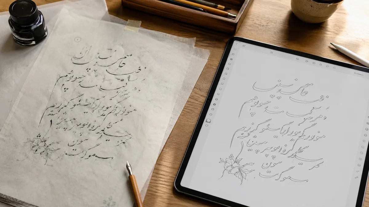
Create Your Letters by Hand
Whatever you draw on paper is what you'll spend hours cleaning up on screen. Time spent on materials, lighting, and unhurried execution at this stage pays back several times over in the vector phase. Get your materials and tools set before you start, and write each character on a fresh, well-lit sheet rather than squeezing the whole alphabet onto one page.
Materials and Setup
- • Paper: Smooth, sized stock - Rhodia 80-90 gsm, Bristol board, or HP LaserJet 32lb - keeps ink from feathering and gives crisp scan edges
- • Ink: Dense, opaque black - Sumi, Higgins Eternal, or Moon Palace - so the scanner reads a clean threshold. Diluted walnut and grey inks cause grief at the trace step
- • Tool consistency: Use the same calligraphy pen or brush for the whole alphabet. Switching nibs mid-set shifts contrast and the font reads inconsistent
- • Guidelines: Print guides at your target x-height (5-10mm is comfortable for most scripts). Our practice sheet generator outputs custom slant and x-height grids
- • Lighting: Even, daylight-balanced light. Side lighting exaggerates pen pressure and biases your judgement of stroke weight
- • Reference: Keep a printed style sheet of letters you've already locked in, so later characters match the earlier ones
Type designers routinely draw each glyph multiple times and select the strongest version, rather than trying to nail each letter in one pass. The goal at this stage is a clean, considered set of source drawings, not a finished font.
- • Multiple takes: Draw each character 3-5 times and pick the version that holds proportion and rhythm best
- • Consistent metrics: Hold baseline, x-height, cap height, and ascender/descender lengths across the whole set - mark them on the sheet
- • Spacing in mind: Letters drawn too tight or too wide on paper become very visible spacing problems in the font
- • Margins around each glyph: Leave room around each letter for scanning and to give yourself room to adjust sidebearings later
- • Lightbox or printed grids: Trace consistent guidelines so vertical and slant references don't drift mid-alphabet
- • Short sessions: Take a break every hour. Style drift in a long session is real, and it's hard to spot until you compare letters side by side
- • Side-by-side review: Lay finished letters next to each other, not in alphabetical order. Mismatches in weight or slant jump out immediately
Drawing Digitally Instead
Plenty of working type designers skip paper entirely and draw straight in vectors or on a tablet. The trade-off is that you lose the natural variation a real pen produces, and you lean more heavily on your digital drawing skill to keep stroke contrast convincing.
- • iPad + Procreate: Draw with Apple Pencil, export as vector SVG files for import into font software
- • Graphics Tablet: Draw directly in Adobe Illustrator or Inkscape using pen tablets like Wacom
- • Hybrid Approach: Sketch rough forms on paper, scan, then refine and perfect digitally
Scan & Digitize
Vectorisation is the bridge between hand work and a working font. The two things that matter here are scan quality and how aggressively the trace settings smooth your curves. A high-resolution scan with clean contrast gives the auto-trace something honest to work from; a low-resolution or grey scan forces it to guess, and the guesses show up as lumpy curves and noisy outlines.
Scanning Settings for Best Results
- • Resolution: 600 DPI minimum for acceptable quality; 1200 DPI preferred for finest detail capture
- • Color Mode: Grayscale (16-bit) for subtle detail, or black & white (1-bit) for clean bold strokes
- • File Format: TIFF uncompressed for maximum quality, or high-quality PNG (lossless compression)
- • Contrast Adjustment: Increase contrast to separate ink from paper, ensuring clean edges for vectorization
- • Clean Background: Scan against pure white paper or use levels adjustment to eliminate paper texture
Vectorising converts a raster scan into mathematical paths so the letters scale cleanly from 8pt body to 144pt headline without losing edge quality. Three common routes, in order of cost:
Option 1: Adobe Illustrator (Industry Standard)
Best for: Professionals with Adobe subscription seeking fastest, highest-quality results
- 1. Place scanned image in Illustrator (File → Place)
- 2. Select image, choose Object → Image Trace → Make
- 3. Open Image Trace Panel, adjust threshold slider for clean conversion
- 4. Click Object → Expand to convert traced image to editable vector paths
- 5. Use Direct Selection tool (white arrow) to refine anchor points and curves
Option 2: Inkscape (Free Alternative)
Best for: Budget-conscious creators willing to learn open-source software
- 1. Import scanned image (File → Import)
- 2. Select image, choose Path → Trace Bitmap
- 3. Adjust threshold, speckles, and smoothing in trace settings
- 4. Click OK to generate vectorized layer, delete original bitmap
- 5. Refine paths using Node tool (F2 key) to perfect curves
Option 3: Calligraphr (Integrated Web Platform)
Best for: Beginners wanting simplified workflow from scan to font in one place
- • Download and print Calligraphr's custom template
- • Draw letters directly into template boxes
- • Scan completed template and upload to Calligraphr
- • Platform automatically detects, traces, and vectorizes each character
- • Proceed directly to font assembly within same interface
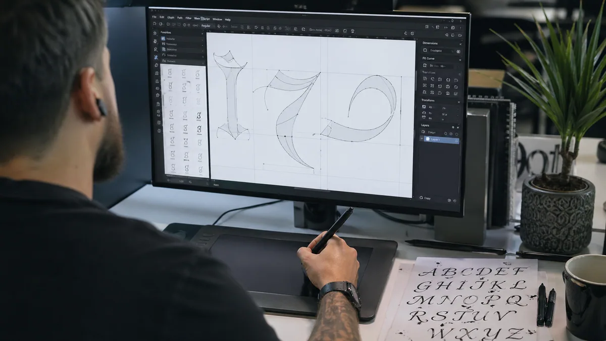
Font Software & Assembly
Font software is where vectors become an installable OTF: it manages Unicode mapping, sidebearings, kerning tables, and OpenType features. The right tool is the one whose interface you'll actually finish a font in. Glyphs and FontLab are industry standard, but Calligraphr produces a working font with a much shorter learning curve, and that matters more for a first project than feature completeness.
Choose Your Font Software
| Use this if… | Best tool | Why |
|---|---|---|
| You want a working first font this week | Calligraphr | Template workflow, lowest setup friction, enough features to test the idea. |
| You are on macOS and want a serious type-design path | Glyphs | Strong script-font tooling, OpenType authoring, and a deep tutorial ecosystem. |
| You need professional Windows support | FontLab | Cross-platform editor with detailed outline, spacing, and variable-font control. |
| Budget is zero and you can tolerate rough edges | FontForge | Capable and open source, but slower for most first-time script designers. |
Calligraphr (best entry point)
- • Price: Free tier covers up to 75 characters; Pro is around $8/month for unlimited glyphs and OpenType features
- • Platform: Browser-based, runs on any OS
- • Learning curve: Gentle - guided template-to-font workflow
- • Best for: First fonts, prototypes, and fonts that don't need deep contextual alternates
- • Limitation: Less fine control over outlines and advanced OpenType layout than dedicated editors
Glyphs (industry standard, macOS)
- • Price: Glyphs Mini around $54.99; full Glyphs around $329.99 (one-time licence)
- • Platform: macOS only
- • Learning curve: Moderate, with strong official documentation and an active tutorial scene
- • Best for: Serious script and display work, variable fonts, and full OpenType feature authoring
- • Why it's the default: Modern interface, scriptable in Python, used widely in commercial type foundries
FontLab (cross-platform professional)
- • Price: Around $499 one-time, with educational discounts
- • Platform: Windows and macOS
- • Learning curve: Steep - large feature surface, lots of windows
- • Best for: Designers who need Windows support or are working in studios standardised on FontLab
- • Strengths: Deep outline tools, full OpenType and variable font support
FontForge (free, open source)
- • Price: Free, GPL-licensed
- • Platform: Windows, macOS, Linux
- • Learning curve: Steep, with a dated interface that lags modern editors
- • Best for: Zero-budget projects and Linux users who want a fully open toolchain
- • Honest assessment: Capable, but most first-time font designers will get to a finished release faster with Calligraphr
The interface differs across editors, but every font goes through the same sequence. Most modern editors work on a 1000-unit em (UPM 1000) by default, which keeps your metrics aligned with industry conventions.
- 1. Import vectors: Drop SVG or EPS outlines into the matching character slots
- 2. Unicode mapping: Confirm each glyph is assigned the correct Unicode codepoint so it types from the keyboard
- 3. Sidebearings: Set left and right spacing for each glyph - this drives the default rhythm of words
- 4. Vertical metrics: Lock baseline, x-height, cap height, and ascender/descender values so letters sit consistently
- 5. Kerning: Adjust specific pairs that look loose or tight (AV, To, We, Ta, ff, ll for scripts) using class kerning where the editor supports it
- 6. OpenType features: Author
liga,dlig,salt,calt, andswshfeatures for ligatures, alternates, and swashes - 7. Font info: Fill in family name, style, version, designer, foundry, and licence/copyright fields
Refine, Test & Export
Spacing, kerning, and cross-application testing are the work that separates a font people actually use from a set of nice-looking letters. Beautifully drawn glyphs with broken spacing read as amateur the moment a designer sets a paragraph; a well-spaced, well-tested font with simpler letterforms feels professional immediately. Budget real time for this stage - it's not a final pass, it's its own phase.
Critical Testing Procedures
- • Multi-Size Testing: Test at 12pt (body text), 24pt, 48pt, and 144pt to ensure readability at all scales
- • Application Compatibility: Install and test in Microsoft Word, Adobe InDesign, Photoshop, and web browsers
- • Letter Combinations: Check all problematic pairs (AV, To, Wa, We, Ta, Va) for spacing issues
- • Real Sentences: Type actual paragraphs and headlines, not just alphabet strings
- • OpenType Features: Verify ligatures activate automatically and alternates are accessible
- • Cross-Platform: Test on both Windows and Mac systems if possible (rendering differs)
- • Print Testing: Print samples at various sizes to catch issues invisible on-screen
Professional type designers use specific test strings designed to reveal spacing, kerning, and coverage issues. These pangrams (sentences containing every letter) help identify problems quickly.
• The quick brown fox jumps over the lazy dog — All 26 letters
• Sphinx of black quartz, judge my vow — Shorter pangram
• Handgloves — Tests letter spacing rhythm
• AVATA AWAY — Tests problematic uppercase kerning
• 1234567890 — Verifies numeral alignment and spacing
• áéíóú ÁÉÍÓÚ ñÑ çÇ — Tests accented character positioning
Export Settings & Best Practices
- • Format: OTF (OpenType Font) recommended for maximum compatibility and feature support
- • Hinting: Enable auto-hinting to optimize rendering on low-resolution screens
- • Unicode Mapping: Ensure all characters have proper Unicode values for cross-platform compatibility
- • Font Metadata: Complete family name, style name, version number, designer credit, and copyright
- • License Embedding: Set appropriate embedding permissions (installable, editable, print & preview)
- • File Testing: Install exported font on a clean system to verify it works before distribution
Selling Your Custom Font
With a finished, tested font, the next decision is distribution: which marketplaces to list on, how to price personal vs. commercial licences, and how much of the work is sales rather than design.
Earnings vary widely. Many independent script fonts settle into modest, steady royalty income; a smaller number become standout sellers on the strength of distinctive style, strong preview imagery, and consistent marketing. Treating font releases as part of a wider calligraphy business - alongside commissions, teaching, and stationery work - is usually a more reliable model than expecting any single font to carry the income on its own.
Monetization Options
Top Font Marketplaces
- • Creative Market: Popular with designers, 40% commission to platform, strong discovery features
- • MyFonts (Monotype): Professional marketplace, 50% commission, access to serious type buyers
- • Etsy: Easy setup, low fees, huge craft/wedding market, excellent for script fonts
- • Your Own Website: Keep 100% profits minus payment processing, full control over branding
- • Design Bundles: Great for bundle deals, good passive income potential
- • Font Bunny / DaFont: Free distribution builds exposure, link to paid commercial licenses
- • Gumroad: Simple direct selling platform, 10% fee, good for independent creators
Pricing Strategy
Base pricing on font complexity, target market, and competition analysis:
- • Simple Display Fonts: $12-$25 for personal use license
- • Script Fonts with Alternates: $25-$50, higher if extensive OpenType features included
- • Font Families: $50-$150+ for multiple weights (light, regular, bold)
- • Commercial License: 2-3x personal license price, or $50-$200 depending on font complexity
- • Extended/Enterprise: Custom pricing for unlimited use, typically $300-$1,000+
- • Bundle Discounts: Offer 30-40% off when buying multiple fonts together
On marketplaces like Creative Market and MyFonts, the listing thumbnails do most of the selling. Designers scroll fast and buy what they can immediately picture using on their next brief. A strong listing typically includes the font set in realistic contexts - wedding suite, logo, packaging, social tile - rather than only on a neutral specimen sheet.
Aim for 5-10 mockups that each show a different use case. Pair them with the font pairing assistant so buyers can see which families sit well next to your script for body text and supporting copy.
Realistic Timeline & Success Tips
Plan for a first font to take 40-60 working hours from blank page to released OTF. Subsequent fonts in a similar style typically run 15-25 hours once your drawing, vectorisation, and spacing workflow is established. Treat the first one as an investment in process; expect the second to be roughly twice as efficient.
How Long Will This Actually Take?
For a basic font (70-85 characters, nothing too fancy), here's the realistic breakdown:
- Planning & style development:3-5 hours
- Drawing all characters (multiple versions):8-15 hours
- Scanning & vectorizing letters:4-10 hours
- Font software setup & import:3-6 hours
- Spacing, metrics & kerning pairs:6-12 hours
- Testing, refinement & debugging:4-8 hours
- Preview graphics & marketing assets:3-6 hours
- Total (first font):30-60 hours
Adding advanced features like extensive ligatures, swashes, and alternates can add 10-20+ additional hours.
Lessons from Independent Type Designers
- • Ship a single style first: A finished one-weight font in the wild beats a half-finished family. Add weights and alternates in version 2.
- • Draw the awkward letters multiple times: Lowercase a, g, y, z, &, and the ampersand reward 3-5 attempts before you commit.
- • Get critique early: TypeDrawers, the r/typography subreddit, and Briefcase Type Foundry's open critiques surface problems you stop seeing yourself.
- • Study the market you're entering: Browse the bestseller pages on MyFonts and Creative Market for your category. Note price, character count, mockup style, and licensing.
- • Print at multiple sizes: Screens flatter sloppy spacing. Printed proofs at 12pt, 24pt, 72pt, and 144pt show what's actually wrong.
- • Treat preview imagery as a deliverable: The marketplace thumbnail is the product page. Budget time for it the way you budget time for kerning.
- • Build an audience while you work: Posting in-progress shots on Instagram or TikTok seeds a launch list before release day.
- • Keep a build log: Note decisions, problems, and fixes. The notes pay for themselves on the next font.
Getting the First One Out the Door
A first font is a serious project, not a weekend exercise - but it's a finite one. The most useful thing you can do now is define a tight scope (one weight, base Latin set, a small handful of OpenType alternates) and work through the five stages above without scope-creeping mid-project.
Once that font is installed, licensed, and used in real designer work, the next one is genuinely easier. The drawing, the vectorisation, the spacing pass: each becomes a familiar step rather than a fresh problem. Calligraphr's free tier is the lowest-friction starting point if you want to see your handwriting type back at you this week.
Start creating your font with Calligraphr (it's free!) →