Table of Contents
Affiliate Disclosure: This page contains affiliate links to products selected for practical fit. When you purchase through these links, we may earn a commission at no additional cost to you. Recommendations are based on product specifications, community feedback, and fit for common calligraphy needs. See our complete Tools Guide for detailed product reviews.
Brush calligraphy is the quickest way most beginners get that satisfying thick-and-thin lettering look: press on the downstrokes, ease up on the upstrokes, and let the flexible tip do the work.
If formal calligraphy alphabets feel intimidating, brush lettering is a friendlier door into the same world. You do not need a pointed nib, an oblique holder, or a jar of ink. A small brush pen like the Tombow Fudenosuke or Pentel Fude Touch Sign Pen is enough to start practicing lowercase letters tonight. That accessibility is why brush calligraphy sits at the center of modern calligraphy, bullet journals, planner headers, envelope addressing, and handmade cards.
The important thing is to treat brush lettering as calligraphy, not decorated handwriting. You are still building letters from deliberate strokes. The brush tip simply replaces the metal nib. Downstrokes become thick because you press into the side of the tip. Upstrokes stay thin because you release until only the point touches the paper. That pressure change is the whole game.
Essential Tools for Brush Calligraphy
Brush pens make the setup simple, but the right pen and paper matter. A frayed tip or scratchy notebook can make your alphabet look worse than your hand skill deserves.
Hard-tip vs. soft-tip brush pens
Hard-tip brush pens have a firm felt tip that resists pressure. They are best for small letters, tight alphabet drills, and beginners who press too hard. The Tombow Fudenosuke hard-tip and soft-tip set is popular because you can feel the difference immediately: the hard tip gives control, while the soft tip gives bigger contrast but demands a lighter hand.
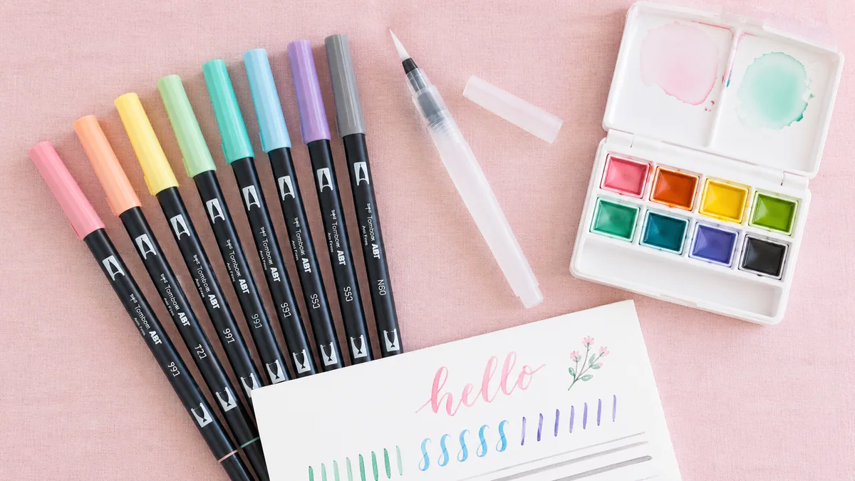
Soft-tip brush pens bend more easily. They can produce dramatic downstrokes and expressive curves, but they also punish heavy pressure. Use them once you understand the movement. The Pentel Fude Touch Sign Pen sits in a useful middle ground for colorful practice, and the Kuretake Bimoji Fude Brush Pen gives a tidy medium fude feel for everyday lettering.
Water brushes and watercolor lettering
A water brush, such as the Pentel Aquash style of brush, has a squeezable barrel and a nylon brush tip. You can fill it with water for watercolor palettes or diluted ink for portable lettering. It feels looser than a felt-tip pen. That makes it beautiful for large words, washes, and expressive flourishes, but it is not the easiest tool for your first A-Z alphabet. Learn pressure with a small felt-tip pen first, then bring in a water brush for larger compositions.
Paper that protects your brush tips
Smooth paper is not a luxury here. Felt tips drag across rough copy paper and start to fuzz, especially when you practice hundreds of oval strokes. Rhodia dot pads, Clairefontaine Triomphe paper, marker paper, and smooth laser paper all work well. Dots or faint guidelines help you keep x-height, ascenders, and descenders consistent. For custom lines, print a sheet from the practice sheet generator and slide it under marker paper or trace over it on a light pad.
Brush Pen Starter Kit
Everything you need to start brush calligraphy
Tombow Fudenosuke Brush Pens
Professional brush pen 2-pack with both soft and hard tip options. Features flexible brush tips that create extra fine t…
Pentel Fude Touch Sign Pen
Affordable flexible brush pen with felt brush tip. Good for beginners experimenting with brush lettering. Available in m…
Kuretake Bimoji Fude Brush Pen
Japanese-made felt-tip brush pen with a medium fude nib, ideal for beginners learning brush calligraphy fundamentals.…
Rhodia Dot Pad A4
Premium French paper perfect for calligraphy practice and finished pieces. The subtle dot grid helps maintain consistent…
Pretty Simple Lettering Workbook
Calligraphy practice workbook with guided lettering exercises. Pretty Simple Lettering Workbook.…
We may earn a commission when you buy through these links. See all recommendations →
Pressure Control Fundamentals
Brush calligraphy pressure is simple to explain and surprisingly hard to make automatic. The rule is: thick down, thin up. When the stroke moves downward, press the brush into the page so the flexible tip spreads. When the stroke moves upward, release pressure until only the point glides over the paper.
The transition matters more than brute force. Beginners often press suddenly at the top of a downstroke, which creates a blunt blob, then snap off pressure at the baseline, which leaves a hook. Instead, think of the tip as a dimmer switch. Add pressure as the stroke begins to descend, hold it through the main downstroke, then gradually release as the line curves or exits.
- Grip: Hold the pen farther back than a regular pen. A death grip makes every upstroke shake.
- Angle: Keep the pen around 45 degrees to the paper. Too upright gives scratchy thin lines; too flat crushes the tip.
- Speed: Move slowly on downstrokes and a little quicker on upstrokes. Painfully slow upstrokes tend to wobble.
- Movement: Let the wrist and forearm help. Finger-only writing creates cramped curves.
The Brush Calligraphy Alphabet: A-Z Stroke Notes
A brush alphabet is easiest when you practice letters by stroke family instead of marching from A to Z. Letters share parts. The oval in a appears again in d, g, o, and q. The entrance stroke in i helps with u, w, and n. Once you see those families, the alphabet feels less like 26 separate drawings.
Lowercase alphabet stroke families
| Letter group | Letters | Stroke-order focus |
|---|---|---|
| Oval letters | a, d, g, o, q | Thin entry, thick left-side downstroke, thin closure, then stem or descender. |
| Underturn letters | i, t, u, w | Thick downstroke, light curve at the baseline, thin exit stroke. |
| Overturn letters | m, n, h | Thin upstroke into a rounded shoulder, then press through the downstroke. |
| Loop letters | b, f, k, l, j, y, z | Keep loops thin on the way up and press only as the stroke travels downward. |
| Compact connectors | c, e, r, s, v, x | Use small pressure changes. These letters get muddy if every stroke is heavy. |
For lowercase letters, build each character in pieces. A lowercase a is not one casual loop. It is an oval plus a downstroke plus an exit. A lowercase h is an ascending loop plus a shoulder. A lowercase w is two underturns with a thin exit. Stroke order keeps the contrast predictable because you always know where pressure belongs.
Uppercase A-Z brush alphabet
Capitals give you more freedom, especially in modern calligraphy, but pressure still follows direction. A, M, N, V, W, X, Y, and Z often use heavier diagonal downstrokes with lighter return strokes. B, D, P, and R need controlled bowl pressure so the rounded areas do not turn into thick black patches. C, G, O, Q, and S are curve tests: press on the descending side and release as the stroke rises.
If your capitals look busy, reduce the flourishes. One clean entry or exit stroke is usually enough. You can always add ornament later with a lighter touch, much like the controlled flourishes covered in calligraphy styles. The alphabet should read first and decorate second.
How to Form a Lowercase "a"
The lowercase a is a perfect test letter because it uses the core skills behind most of the brush alphabet: a thin upstroke, a pressured oval, a second downstroke, and a clean exit. Practice it slowly before moving to words.
- Start with a thin entry stroke. Touch the tip lightly to the baseline and move upward toward the waist line. Do not press yet.
- Press into the oval downstroke. Curve over the top, then add pressure as the stroke moves down the left side of the oval.
- Release to close the oval. As the stroke curves upward, release pressure and close the oval with a thin line.
- Add the stem and exit. Place the pen at the waist line, press down for the stem, then release into a thin exit stroke.
If the pressure rhythm still feels strange, try faux calligraphy for one practice session. Write a simple monoline a, then manually thicken only the downstrokes. That exercise trains your eye to see where brush pressure should happen before your hand can do it naturally.
Common Beginner Mistakes
No pressure variation
If every line is the same weight, you are probably writing with the pen too upright or moving like regular handwriting. Slow down. Say "press" on every downstroke and "light" on every upstroke until the rhythm sticks. It feels silly, but it works.
Wobbly upstrokes
Thin upstrokes show every tremor. Most wobble comes from tension, not lack of talent. Loosen your grip, lift your wrist slightly, and move a little faster. A very slow hairline is harder to control than a confident one.
Wrong paper
Rough paper chews brush tips. It also makes you press harder to overcome drag, which ruins the pressure rhythm. If your upstrokes skip and your tips look fuzzy after a few pages, change paper before blaming your pen.
Letters built as one continuous scribble
Brush calligraphy letters are written in planned strokes. Lift the pen when the form calls for it. A clean lift between the oval and stem of a is better than a twisted one-stroke shape that puts pressure in the wrong place.
Brush Calligraphy vs. Pointed-Pen vs. Broad-Edge
Brush calligraphy, pointed-pen calligraphy, and broad-edge calligraphy all create contrast, but they create it differently. Brush and pointed-pen scripts are pressure-based. Broad-edge scripts are angle-based.
| Style | Tool | How contrast happens | Best for |
|---|---|---|---|
| Brush calligraphy | Felt, nylon, or bristle brush tip | Pressure on downstrokes, release on upstrokes | Modern lettering, planners, cards, beginner practice |
| Pointed pen | Flexible split metal nib and ink | Nib tines spread under pressure | Copperplate, Spencerian, formal envelopes |
| Broad edge | Flat nib, marker, or Pilot Parallel | Fixed pen angle creates thick and thin strokes | Italic, Gothic, foundational hand, historic scripts |
If you love expressive, casual letters, stay with brush pens. If you want delicate hairlines and formal scripts, try pointed pen after reading the sibling calligraphy alphabet guide. If you prefer structured historic hands, explore broad-edge styles through the broader style overview.
A Simple Practice Plan
Spend the first week on strokes, not quotes. Ten minutes a day is enough if the practice is focused. Day one: thick downstrokes and thin upstrokes. Day two: underturns. Day three: overturns. Day four: ovals. Day five: loop letters. Day six: lowercase alphabet families. Day seven: one short word, written slowly.
After that, build your own worksheets with the practice sheet generator, test pen sizes in the pen comparison tool, and use the cursive generator when you want style ideas for names or headings. Keep one page from your first week. In a month, it will be the proof that your hand is learning.