Affiliate Disclosure: This page contains affiliate links to products selected for practical fit. When you purchase through these links, we may earn a commission at no additional cost to you. Recommendations are based on product specifications, community feedback, and fit for common calligraphy needs. See our complete Tools Guide for detailed product reviews.
Faux calligraphy is the great equalizer. It lets you create elegant, thick-and-thin lettering with nothing more than a ballpoint pen and a steady hand: write the word in cursive, outline the downstrokes, and fill them in. Traditionalists treat it with suspicion and beginners treat it as a lifeline, and it works beautifully for everything from bullet journal headers to hand-lettered signs.
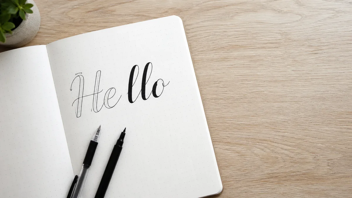
What is Faux Calligraphy? The Three-Step Trick
Faux calligraphy (also called "fake calligraphy" or "false calligraphy") is a modern lettering technique that mimics the thick-and-thin strokes of traditional calligraphy without using calligraphy tools. Instead of varying pressure on a flex nib or holding a broad-edge pen at a specific angle, you create the illusion of contrast through a simple three-step process:
- Write your word in cursive using any pen—ballpoint, gel pen, marker, pencil. Keep the letters connected and flowing.
- Identify all downstrokes (strokes moving downward or diagonally down-right). Draw a parallel line next to each downstroke, creating a thin outline.
- Fill in the outlined space to create thick downstrokes. Leave upstrokes thin. Voilà—calligraphy.
The result looks remarkably similar to Copperplate or Spencerian pointed-pen scripts, with their characteristic hairline upstrokes and thick, bold downstrokes. The difference? You created it with a cheap pen in 30 seconds.
The History of Faux Calligraphy: Modern Lettering, Not Ancient Art
Unlike scripts with centuries of pedigree, faux calligraphy has no ancient lineage. It's a 21st-century invention, born from the explosion of hand-lettering in the 2000s and 2010s. As bullet journaling, hand-lettered signs, and DIY wedding decor became popular, crafters needed a way to create elegant lettering without investing in calligraphy lessons or specialty pens.
The technique gained traction on Pinterest, YouTube, and Instagram around 2010–2015, spread by letterers and crafters who shared step-by-step tutorials. It wasn't taught in traditional calligraphy guilds or historical exemplars—it was a grassroots workaround that stuck because it worked. Two forces accelerated its spread: Ryder Carroll's Bullet Journal method (introduced in 2013), which created millions of crafters who wanted elegant headers without buying nibs; and the modern lettering wave led by educators like Kelly Creates founder Kelly Klapstein, whose tutorials and books treated faux calligraphy as a legitimate on-ramp rather than a shortcut.
Today, faux calligraphy sits in the blurry zone between calligraphy and hand lettering. Purists argue it isn't "real" calligraphy because it doesn't use traditional tools or techniques, a position grounded in the broad-edge and pointed-pen traditions documented by organizations like the International Association of Master Penmen, Engrossers and Teachers of Handwriting (IAMPETH). That distinction matters when you're learning the craft: the pressure control, pen-angle discipline, and tool intuition you build with a flex nib don't come from outlining strokes by hand. Faux calligraphy is best understood as a lettering technique that produces a calligraphic look, not as a substitute for the underlying skill set.
Tools for Faux Calligraphy: Anything That Writes
The beauty of faux calligraphy is that you can use literally any writing tool. That said, some tools make the process easier or produce better results:
Pens and Markers
- Ballpoint pens — Cheap, reliable, and available everywhere. Black or blue ballpoint is perfect for practice. The thin line makes it easy to see where to add thickness.
- Gel pens — Smoother than ballpoint, with darker, more saturated lines. Great for finished pieces on greeting cards or journal spreads.
- Sakura Pigma Micron pens — Fine-tipped, archival-quality pens beloved by bullet journalers. The 01 or 02 size is ideal for faux calligraphy outlines.
- Tombow Fudenosuke brush pen (hard tip) — A brush pen with a firm tip that behaves like a fineliner. Excellent for smooth, controlled faux calligraphy on larger projects.
- Sharpie or other permanent markers — For faux calligraphy on non-paper surfaces (wood signs, glass, fabric). The thick line makes filling easier but leaves less room for fine detail.
Paper
Any smooth paper works—printer paper, notebook paper, cardstock, even kraft paper. Avoid heavily textured or absorbent paper if you're using gel pens or markers, as they'll feather and blur.
Guidelines
Print or draw light pencil guidelines to keep your baseline straight and your x-height consistent. Use our practice sheet generator to create custom faux calligraphy guidelines with the correct slant and spacing.
How to Create Faux Calligraphy: Step-by-Step
The three-step trick above is the whole technique. In practice, most beginners benefit from breaking step two ("outline") into two smaller moves—first identifying which strokes to thicken, then drawing the parallel lines. That gives us four practical steps:
Step 1: Write Your Word in Cursive
Choose a word and write it in flowing, connected cursive using a fine-tip pen. Don't worry about thick or thin strokes yet—just focus on smooth, consistent letterforms. Keep your slant consistent (most people naturally slant 10–15° to the right). If you need a quick model before you draw, try the word in our cursive generator. If your cursive is rusty, see our how to write in cursive guide for a refresher.
Step 2: Identify Downstrokes
Look at your word and mentally mark every stroke that moves downward. This includes:
- Straight downstrokes (the stems of l, h, k, b, d, f)
- Curved downstrokes (the left side of o, a, d, g)
- Diagonal downstrokes (the down-right strokes in v, w, y)
Do not thicken upstrokes, horizontal strokes, or connecting ligatures. The rule is simple: if the pen is moving down, thicken it. If it's moving up or sideways, leave it thin.
Step 3: Draw Parallel Outlines
For each downstroke, draw a parallel line to the left (for right-slanting letters) about 2–3mm away, creating a thin outlined shape. Think of it like giving each downstroke a shadow. The parallel line should follow the curve of the original stroke—if the downstroke curves, the outline curves too.
Step 4: Fill In the Outlined Space
Color in the space between the original downstroke and the parallel outline. You now have thick downstrokes and thin upstrokes—instant calligraphy. For best results, fill carefully to avoid going outside the lines. A fine-tip pen or marker gives you more control than a broad tip.
Common Faux Calligraphy Mistakes (and How to Fix Them)
1. Thickening Upstrokes
If your letters look clunky or over-heavy, you're probably thickening upstrokes as well as downstrokes. Solution: Only thicken strokes that move downward. Upstrokes stay thin, always.
2. Uneven Outline Spacing
If your thick strokes vary wildly in width, your parallel lines aren't consistently spaced. Solution: Imagine a ghost line 2–3mm to the left of every downstroke. Keep that distance uniform. You can even use a ruler to measure at first.
3. Jagged or Wobbly Outlines
If your outlines are shaky, you're drawing too slowly or gripping your pen too tightly. Solution: Draw the outline in one smooth, confident motion, just like you drew the original stroke. Think "trace and fill," not "carefully color in."
4. Inconsistent Baseline or Slant
If your letters wobble up and down or lean in different directions, you're not using guidelines. Solution: Always use light pencil guidelines or a printout underneath your paper. Erase pencil lines after filling for a clean finish.
For more troubleshooting, check our common calligraphy mistakes guide.
When to Use Faux Calligraphy vs. Traditional Calligraphy
Faux calligraphy is a tactical tool, not a full calligraphy replacement. Here's when each approach shines:
Use Faux Calligraphy For:
- Quick projects (greeting cards, bullet journal headers, chalkboard signs)
- Non-paper surfaces (wood, glass, fabric, plastic)
- Travel or situations where you can't carry calligraphy gear
- Teaching kids or beginners the thick/thin rhythm without sharp nibs
- Mockups and layout sketches before committing to ink
Use Traditional Calligraphy For:
- Formal projects (wedding invitations, certificates, commissioned work)
- Large-scale pieces where speed and fluidity matter
- Projects where you want authentic calligraphy texture and variation
- Skill-building and artistic growth
For a deeper dive into these distinctions, see our calligraphy vs. hand lettering guide.
Practice Ideas and Projects
Faux calligraphy is perfect for hands-on projects:
- Bullet journal headers — Try our 30-day calligraphy challenges and letter each day's header in faux calligraphy.
- Greeting cards — Hand-letter names or short messages on birthday cards, thank-you notes, or holiday greetings.
- Chalkboard signs — Use chalk markers for faux calligraphy on menu boards or event signage.
- Quote art — Letter your favorite quote in faux calligraphy, frame it, and hang it as decor.
- Envelope addressing — Practice faux calligraphy on envelopes for a touch of elegance without the commitment of dip pens.
For more project inspiration, see our beginner's guide to calligraphy and modern calligraphy overview.
Recommended Pens for Faux Calligraphy
While you can use any pen, these markers and fineliners make faux calligraphy easier and more polished. They give you crisp outlines and easy fills—exactly what the technique calls for: