Affiliate Disclosure: This page contains affiliate links to products selected for practical fit. When you purchase through these links, we may earn a commission at no additional cost to you. Recommendations are based on product specifications, community feedback, and fit for common calligraphy needs. See our complete Tools Guide for detailed product reviews.
Setting Up Procreate for Calligraphy Success
Procreate ships with illustration defaults. Calligraphers need tighter control—custom pressure curves, higher DPI canvases, and gesture shortcuts that respect lettering rhythm.
I wasted two weeks fighting Procreate's out-of-the-box settings when I first switched from analog pointed pen work. My upstrokes ballooned into downstrokes, layers maxed out mid-composition, and exports looked pixelated on Instagram. One Saturday afternoon I finally sat down with the Procreate Handbook and dialed in canvas presets, pressure curves, and StreamLine settings. Overnight, my digital practice felt as fluid as dip pen on Rhodia.
This tutorial walks through every setting that matters for modern calligraphy, Copperplate, and brush lettering. By the end you'll have a canvas library tuned for Instagram squares, print work, and daily drills—plus pressure curves that respond like a real nib.
Step 1: Create Custom Canvas Presets
Canvas size determines layer count, export quality, and whether your iPad bogs down mid-stroke. Procreate's defaults (Screen Size, A4) aren't optimized for lettering. Build these three presets and you'll cover 95% of calligraphy work:
Instagram Square (Daily Practice & Social)
Open Procreate. Tap the + icon (top right). Tap the dimensions field and enter:
- Width: 2048 px
- Height: 2048 px
- DPI: 300
- Color Profile: sRGB IEC61966-2.1
Tap Create. This 2048px square fits Instagram's native resolution without compression artifacts. At 300 DPI it prints sharp at 6.8" × 6.8"—ideal for small greeting cards or framed pieces. On an iPad Air M3, this canvas supports 50+ layers.
A4 Print (Client Work & Portfolio)
Create a new canvas with these specs:
- Width: 2480 px
- Height: 3508 px
- DPI: 300
- Color Profile: Display P3 (or Adobe RGB if your print shop requires it)
This matches A4 paper at print resolution. Layer count drops to ~20 on base iPads, ~35 on Pro models. Use this for wedding invitations, commercial lettering, or any work destined for physical print.
Practice Drills (Low-Res Speed)
For warm-up drills and throwaway sketches:
- Width: 1500 px
- Height: 1500 px
- DPI: 150
- Color Profile: sRGB
Lower resolution = more layers, faster brush response. Perfect for 20-minute drill sessions where you'll never export the file. I keep a "Drills" folder full of these—they load instantly and never stutter.
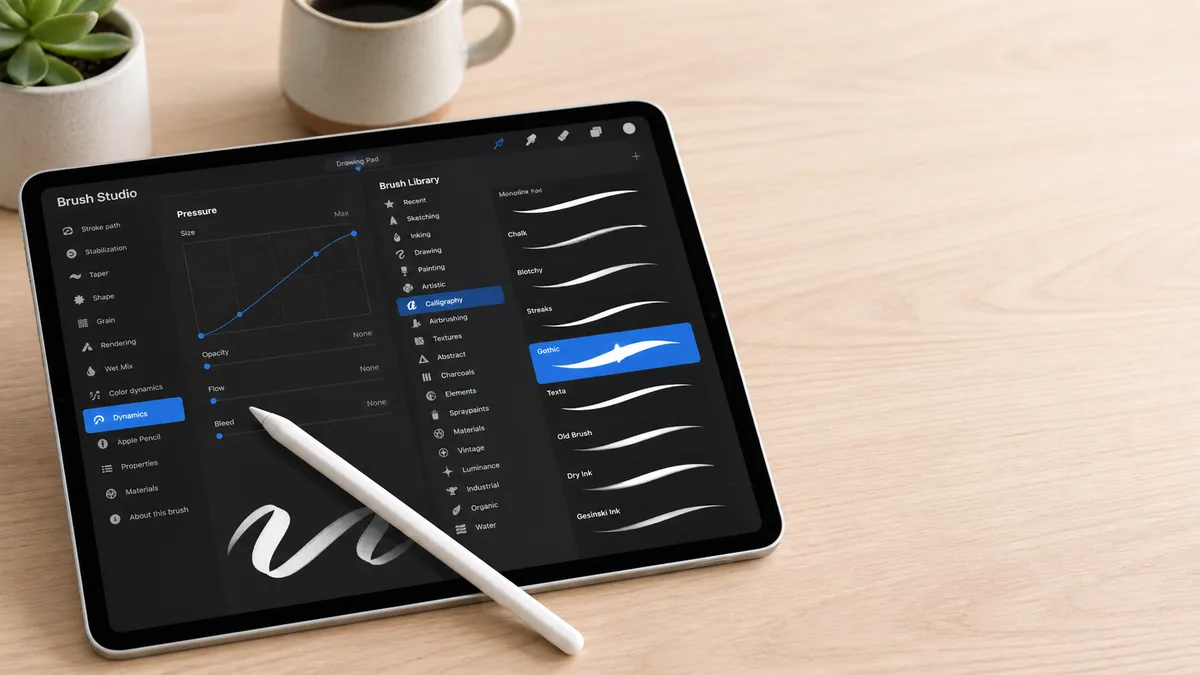
Step 2: Adjust Pressure Curves for Nib Simulation
Out of the box, Procreate's pressure curve is linear: light pressure = thin stroke, heavy pressure = thick stroke, with smooth graduation in between. That works for painting. Calligraphy demands steeper contrast—hairline upstrokes on feather-light touch, dramatic swell on the downstroke.
Open any canvas. Tap Actions (wrench icon) → Prefs → Pressure and Smoothing → Pressure Curve. You'll see a diagonal line from bottom-left to top-right.
For Pointed Pen (Copperplate, Spencerian, Modern Calligraphy)
Tap Edit Pressure Curve. Drag the curve to create an S-shape:
- Bottom third: Steep climb. Light pressure yields ultra-thin hairlines (mimics the un-flexed pointed nib).
- Middle third: Gentler slope. Medium pressure opens the tines gradually.
- Top third: Flatten slightly. Heavy pressure maxes out stroke width without runaway thickness.
Test on a scrap layer: draw a series of connected ovals with varying pressure. Upstrokes should stay thread-thin; downstrokes should swell to 5–7× the width. If upstrokes thicken too fast, make the bottom third steeper. If downstrokes don't swell enough, add more curve in the middle.
For Brush Lettering & Monoline
Monoline lettering uses uniform stroke weight, so leave the curve linear or flatten it (less pressure variation). Brush lettering sits somewhere between pointed pen and monoline—try a gentle S-curve with less drama than Copperplate. The Tombow Fudenosuke brush pen has subtle flex; mimic that with a curve that swells 2–3× rather than 7×.
Step 3: Tune StreamLine for Smooth Curves
StreamLine is Procreate's real-time stroke smoothing. It averages your pen path over a sliding window, removing hand tremor and micro-wobbles. Too little and your curves look jittery; too much and strokes lag behind your Apple Pencil like you're drawing through molasses.
Open Actions → Prefs → Pressure and Smoothing → StreamLine. The slider ranges from 0% (no smoothing) to 100% (maximum delay). For calligraphy:
- Pointed pen styles: 50–65%. Enough to stabilize compound curves but not so much that exit strokes feel sluggish.
- Brush lettering: 40–55%. Preserve organic bounce and texture variation.
- Textured / distressed lettering: 0–30%. Let imperfection shine.
Test by drawing a series of connected spirals at conversational speed. If the stroke lags visibly behind your pen tip, reduce StreamLine by 10%. If spirals look choppy or angular, increase by 10%. I settled at 55% for pointed pen flourishes and 35% for rough-edged brush scripts.
Step 4: Import Practice Grids as Reference Layers
Analog calligraphers tape guideline sheets under translucent paper. Procreate's Reference feature does the same without the tape. Export a slant guide or baseline grid from our Practice Sheet Generator (52° slant, x-height 10mm, cap height 15mm—standard Copperplate proportions).
In Procreate, tap Actions → Add → Insert a Photo. Choose your grid PNG. The grid appears on a new layer. Tap the layer thumbnail → uncheck the checkmark icon. The layer becomes a Reference—visible on canvas but excluded from export. You can draw on top without worrying about erasing the grid or merging it into your final artwork.
Adjust opacity if the grid feels too dark: tap the layer → N (blend mode icon) → drag Opacity to 30–50%. I keep a library of reference grids saved in my Files app—Copperplate slant, Italic 5° slant, brush lettering baseline-only, and a dot grid for faux calligraphy layouts.
Step 5: Organize Layers Like a Pro
Procreate caps layer count based on canvas size and iPad RAM. A 2048px square on iPad Air M3 supports ~50 layers; a 4000×5000px canvas drops to 15. Work smart:
- Name your layers: Tap the layer thumbnail, tap the name field, type "Main Text," "Flourishes," "Shadow Layer." Five layers named "Layer 12" is a nightmare when you need to adjust opacity or reorder.
- Group related elements: Select multiple layers (swipe right), tap Group. Collapse groups to reduce visual clutter.
- Merge finished work: Once a letterform is finalized, pinch two layers together to merge. You can't un-merge, so duplicate first if you're unsure.
- Lock layers you're not editing: Swipe left on a layer thumbnail → Lock. Prevents accidental marks on background elements.
Check your current layer limit: Actions → Canvas → Canvas Information. If you're routinely hitting the cap, reduce DPI (200 instead of 300 for web-only work) or work at smaller dimensions.
Step 6: Set Up Essential Gestures & Shortcuts
Procreate's default gestures favor illustration. Letterers need fast access to undo, layer management, and brush sizing without lifting the pen. Customize in Actions → Prefs → Gesture Controls:
Undo / Redo (The Most Important Setting)
Default: two-finger tap to undo, three-finger tap to redo. I remapped to:
- Undo: Two-finger tap (keep default) + swipe left with two fingers (faster for rapid undo chains).
- Redo: Swipe right with two fingers.
Calligraphy lives in the undo stack. A bad flourish? Two-finger swipe. Overshot the exit stroke? Swipe again. I undo 30–50 times per composition—make it muscle memory.
Brush Size & Opacity
Hold a finger on the left side of the screen while dragging your pen up/down to adjust brush size (default). I disabled opacity adjustment (rarely needed mid-stroke) and kept only size control. Test it: hold your non-pen hand on the screen edge, draw a stroke while sliding your finger—you'll see the brush cursor grow and shrink.
Eyedropper (Color Sampling)
Long-press anywhere on canvas to sample color. Useful when matching shades across layers or pulling color from imported reference images. I keep this gesture enabled—it's non-intrusive and saves trips to the color picker.
Step 7: Configure Brushes (Start with Defaults, Upgrade Later)
Procreate ships with 200+ brushes, organized into sets (Calligraphy, Inking, Artistic, etc.). For lettering, start here:
- Monoline (Calligraphy set): Uniform stroke weight, perfect for sans-serif lettering and practice drills. No pressure variation—what you draw is what you get.
- Script (Calligraphy set): Mimics flexible pointed pen with moderate pressure response. Good for modern calligraphy and casual brush scripts.
- Dry Ink (Inking set): Adds texture and grain, simulating rough paper or aged ink. Use sparingly—too much texture fights legibility.
These defaults cover your first month of practice. When you're ready for historical accuracy or specialty effects, invest in premium brush packs from Peggy Dean, The Lovely Lettering Co., or The Inky Collective. Our Best Procreate Brushes for Calligraphy guide reviews the top options for Copperplate, Blackletter, and textured brush lettering.
To import a .brush or .brushset file: download to Files app, tap to open in Procreate. The brush appears in your library under the set name. Organize custom brushes into folders (swipe left on a brush → Duplicate → drag into a new set) so they don't clutter the default library.
Step 8: Export Settings for Web & Print
Procreate offers five export formats. Choose based on destination:
For Instagram, Social Media, Web Portfolios
Actions → Share → PNG. Check Maximum resolution. PNG preserves transparency (useful for logo work or layered compositions) and doesn't compress color like JPEG. Color profile should match your canvas: sRGB for web.
For Print (Commercial, Client Deliverables)
Actions → Share → TIFF or PSD. TIFF exports a flattened, lossless image at full DPI—ideal for print shops. PSD preserves layers, allowing further editing in Photoshop or Affinity Photo. Always export at 300 DPI minimum. Set color profile to Adobe RGB or Display P3 (check with your printer—most prefer Adobe RGB).
For Vector Editing (Affinity Designer, Illustrator)
Actions → Share → PDF. Procreate rasterizes your artwork into a PDF wrapper (not true vector), but it imports cleanly into design apps for tracing or composite layouts. For genuine vector output, you'll need Affinity Designer for iPad or a desktop tool.
Quick Mockups & Proofs
JPEG works for quick client previews or low-stakes sharing. It compresses file size but discards transparency and introduces artifacts in high-contrast areas (like black ink on white). Never use JPEG for final deliverables.
Next Steps: From Setup to Mastery
You've configured Procreate for calligraphy. Now build skill through structured practice:
- Spend 10 minutes daily on basic stroke drills—ovals, compound curves, ascender loops. Use your low-res Practice canvas and the default Monoline brush.
- Follow the 30-Day Calligraphy Challenge to build consistency. Digital practice accelerates learning because undo removes fear—you'll attempt flourishes and ligatures you'd avoid on paper.
- Study traditional scripts (Copperplate, Italic, Uncial) and adapt them to iPad workflow. Use the Cursive Generator to preview how different styles handle the same phrase.
- Invest in specialty brushes once you've identified your preferred style. A $15 Copperplate brush pack will feel transformative after a month on defaults.
- If you're still choosing hardware, read our iPad buying guide—screen size and Apple Pencil model impact the long-term experience more than processor speed.
For deeper technique study, pair iPad practice with book learning. Our Best Calligraphy Books guide includes titles that translate beautifully to digital workflow—Edward Johnston's foundational text and Sheila Waters' modern calligraphy approach both apply whether you're holding a Nikko G nib or an Apple Pencil.
The Procreate Lettering hub ties together all our iPad calligraphy resources. Bookmark it as your roadmap from first canvas to selling your own brush packs.