Table of Contents
Affiliate Disclosure: This page contains affiliate links to products selected for practical fit. When you purchase through these links, we may earn a commission at no additional cost to you. Recommendations are based on product specifications, community feedback, and fit for common calligraphy needs. See our complete Tools Guide for detailed product reviews.
The oldest piece of writing most people have ever seen in person is probably less than 200 years old. The British Library keeps the Diamond Sutra (868 CE) behind glass; Trinity College Dublin shows two folios of the Book of Kells under low light; the Palace Museum in Beijing rotates Wang Xizhi tracings into view a few weeks a year. That long, fragile chain of hand-made letters is what we mean by calligraphy.
The word itself is Greek: kallos (beauty) and graphein (to write). The practice is older. Egyptian scribes were already cutting hieroglyphs into limestone at Saqqara around 2700 BCE, and Shang Dynasty diviners were carving questions into ox scapulae at Anyang a thousand years before that. Both groups cared about how the marks looked, not only what they said.
Calligraphy is not fancy handwriting. It is a trained craft with measurable conventions: nib angles, stroke orders, rhythmic spacing, and proportional systems handed down through manuals and apprenticeships. The International Association of Master Penmen, Engrossers and Teachers of Handwriting (IAMPETH), founded in 1949, still publishes exemplars and runs an annual conference for Western pointed-pen and broad-edged traditions. Comparable bodies (the Society of Scribes and Illuminators in London, the Japanese Calligraphers Association in Tokyo) hold equivalent roles for their own scripts.
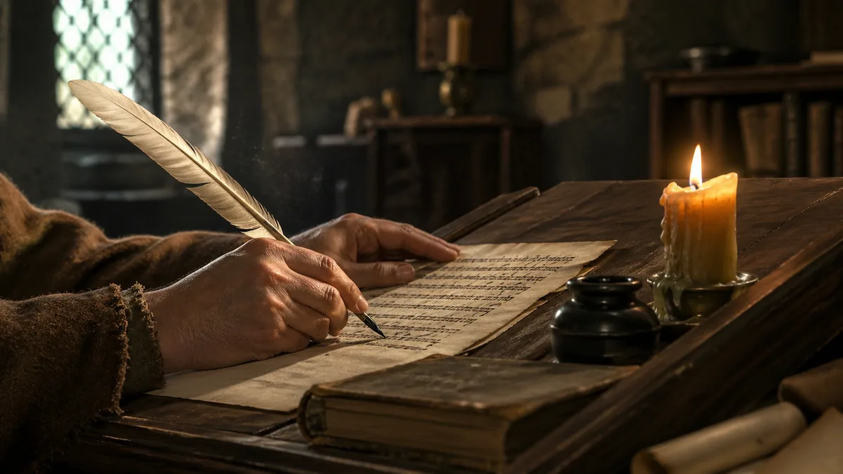
Before Gutenberg cast his first type around 1440, every book in Europe was a scribe's handwriting. The St Gall scriptorium copied roughly 400 manuscripts that we still have. The Abbasid Bayt al-Hikma in 9th-century Baghdad employed teams of warraqun (paper-makers and copyists) who reproduced Galen, Aristotle, and Ptolemy in Arabic. In Tang China, calligraphic skill was tested in the imperial civil service exams; a careless hand could end a career before the content was even read.
The current revival is unusual because it is voluntary. Almost no one needs to write by hand for a living any more, yet a wedding-stationery industry, an Instagram economy of brush-pen practitioners, and gallery shows by Brody Neuenschwander or Massimo Polello all sit alongside the older traditions. Many people arrive through a beginner's guide or by experimenting with modern brush calligraphy and only later read about Wang Xizhi or Edward Johnston.
Knowledge Preservation: Before movable type (1440 CE), scribes hand-copied every book, making calligraphy essential to preserving philosophy, science, literature, and religious texts across generations.
Religious Expression: Sacred texts in Christianity, Islam, Buddhism, and Hinduism received reverential treatment through beautiful letterforms, turning scripture into devotional art.
Social Stratification: Fine handwriting demonstrated education and refinement. In imperial China, calligraphic ability literally determined career success through civil service examinations.
Cultural Identity: Each civilization developed distinct scripts reflecting aesthetic values, compare the geometric precision of Kufic Arabic to the fluid expressiveness of Chinese cursive script.
Design Foundation: Every font on your computer traces back to calligraphic traditions. Typography pioneer Hermann Zapf trained as a calligrapher before creating Palatino, Optima, and dozens of influential typefaces.
Understanding calligraphy's history helps you appreciate why certain styles developed specific characteristics, why particular tools and materials matter, and how contemporary practice connects to millennia of human creativity. Whether you're interested in wedding calligraphy, exploring professional opportunities, or simply enjoying beautiful letterforms, you're participating in one of civilization's oldest artistic traditions.
Ancient Origins (3000 BCE - 500 CE)
Writing and calligraphy emerged together, the earliest civilizations immediately recognized that visual presentation affected meaning, authority, and permanence.
The earliest calligraphic traditions appeared independently in multiple civilizations between 3200-2000 BCE. Archaeological evidence shows that ancient scribes weren't just recording information; they were consciously designing letterforms for aesthetic impact and symbolic power. Temple inscriptions, royal decrees, and religious texts received more elaborate treatment than everyday writing, establishing a hierarchy that persists in typography today (display fonts versus body text).
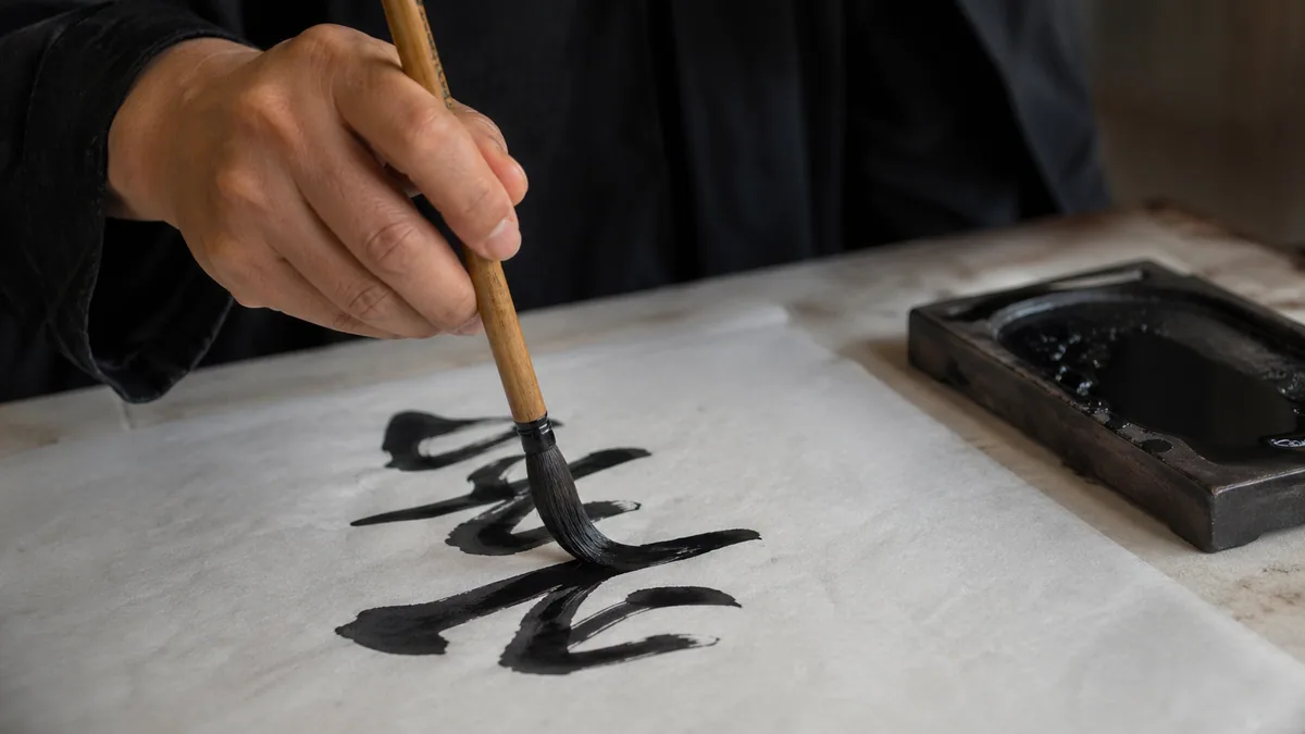
Chinese Calligraphy: The Oldest Continuous Tradition
Wang Xizhi's Lantingji Xu (Preface to the Orchid Pavilion Gathering, 353 CE) is the most-copied work in Chinese calligraphy. The original is lost; we know it from Tang dynasty tracings, and from centuries of students copying those tracings. That chain of copying is itself the tradition. Chinese calligraphy (書法, shūfǎ, "the method of writing") has run more or less continuously from Shang oracle bones around 1200 BCE to today, which makes it the longest-lived calligraphic practice still in active use.
Each character functions as a complete compositional unit, balancing positive and negative space, thick and thin strokes, angular and curved elements. By the Han Dynasty (206 BCE - 220 CE), calligraphy had become one of the "Four Arts" expected of an educated official, alongside guqin music, weiqi (Go), and painting. Tang emperors collected Wang Xizhi above all others; the Qianlong Emperor in the 18th century kept his favourite tracings in the Sanxitang ("Hall of Three Rarities") at the Forbidden City.
The Four Treasures of the Study (文房四寶)
Chinese calligraphers traditionally work with four essential tools, collectively called the "Four Treasures." Their quality directly affects what the brush can do on the page:
1. Brush (毛筆, máobǐ): Animal hair (wolf, goat, rabbit, or mixed) mounted in bamboo handles. Stiff wolf hair gives angular strokes; soft goat hair gives flowing curves. Working calligraphers typically own dozens for different scripts and sizes.
2. Ink (墨, mò): Solid ink sticks made from pine soot or oil soot bound with animal glue. The calligrapher grinds the stick on an inkstone with water immediately before use, controlling density by hand.
3. Paper (紙, zhǐ): Xuan paper (宣紙), perfected during the Tang Dynasty (618-907 CE), is the standard. Its absorbent long-fibre structure registers brush pressure precisely and resists yellowing over centuries.
4. Inkstone (硯, yàn): Carved from Duan, She, Tao, or Chengni stone. The surface must be smooth enough not to damage the ink stick but rough enough to grind it. Antique stones from named quarries reach collector prices.
Script Evolution: Six Major Styles
Chinese calligraphy evolved through distinct script styles, each serving different purposes. Calligraphers learn these sequentially, as each style builds understanding of stroke fundamentals:
Oracle Bone Script (甲骨文, 1200 BCE)
Earliest form, carved on bones and shells. Angular, pictographic, shows writing's pictorial origins.
Seal Script (篆書, ~200 BCE)
Formal, archaic style standardized during Qin Dynasty. Still used for signature seals (chops) and decorative inscriptions.
Clerical Script (隸書, ~200 BCE)
Han Dynasty administrative writing. Simplified seal script with elegant, wave-like horizontal strokes.
Regular Script (楷書, ~200 CE)
Standard modern form. Balanced, clearly structured, taught to beginners. Tang Dynasty master Yan Zhenqing (709-785 CE) established canonical proportions.
Running Script (行書, ~200 CE)
Semi-cursive style linking some strokes. Wang Xizhi's (303-361 CE) "Lantingji Xu" (Orchid Pavilion Preface) exemplifies this style's pinnacle.
Cursive Script (草書, ~200 CE)
Highly abbreviated, abstract, fast execution. Prioritizes emotional expression over legibility. Requires extensive training to read.
Egyptian Hieroglyphics: Writing as Sacred Art
Ancient Egyptian writing (circa 3200 BCE - 400 CE) developed one of history's most visually complex scripts. Hieroglyphics (from Greek "sacred carvings") combined pictorial symbols representing objects, phonetic signs for sounds, and determinatives clarifying meaning. This tri-partite system created texts that functioned simultaneously as communication, decoration, and spiritual invocation.
Egyptian scribes underwent rigorous training lasting years, studying in temple schools called "Houses of Life." The profession commanded high social status: scribes served as administrators, accountants, record-keepers, and religious officials. A Middle Kingdom text advises: "Be a scribe! Your body will be sleek, your hand will be soft... You stride freely on the road." Literacy remained rare (perhaps 1% of the population), making scribes indispensable.
Three distinct scripts served different purposes. Hieroglyphics appeared on monuments, temples, and tombs in their formal pictorial form, slow to execute. Hieratic script (priestly writing) simplified hieroglyphics for papyrus manuscripts and administrative documents. Demotic (popular writing) emerged around 650 BCE as an even faster cursive form for everyday use. All three coexisted, chosen based on context and medium.
Scribal Tools and Techniques
Writing Surface: Papyrus scrolls made from Cyperus papyrus plant stems, or limestone ostraca (pottery shards) for practice and drafts.
Writing Implements: Reed brushes (from Juncus maritimus), cut at an angle and chewed to create brush-like tips. Later, hollow reeds cut to pen-like points.
Pigments: Black ink from carbon (soot mixed with gum arabic), red ink from red ochre for headings, emphasis, and corrections. Two-color palettes with circular depressions for grinding pigments.
Notable Examples: The "Book of the Dead" papyri (funerary texts), Turin King List (chronological royal record), and temple wall inscriptions at Karnak demonstrating hieroglyphic artistic techniques.
Roman Scripts: The Western Foundation
Compare two surfaces. The Trajan Column inscription in Rome (113 CE) gives us the canonical Roman capital: thick verticals, thin horizontals, subtle entasis in the stems, and serifs cut with a chisel. A wax tablet from a Vindolanda fort on Hadrian's Wall, dated about the same period, gives us the same alphabet written quickly with a stylus, with broken strokes and slanted letters that already look halfway to a cursive hand. Romans used both, depending on whether the audience was the gods, the emperor, or a centurion ordering more beer.
In 1968 the American calligrapher Edward Catich published The Origin of the Serif, in which he argued that the Trajan letters were first painted on the stone with a flat brush and then carved over the brush strokes. The serifs are not a chisel quirk; they are what happens when a flat brush enters and leaves a stroke. That argument is now the standard reading of Roman lapidary letters, and it explains why the same forms feel calligraphic when reproduced with any broad-edged tool.
The Romans wrote on stone, wax, papyrus, and (later) parchment, with bronze styli, reed pens (calamus), and quills cut from large bird feathers. The flat-edged reed or quill naturally produces the thick-thin contrast you see in every later broad-pen tradition, from Carolingian minuscule through Gothic Textura.
Roman Contributions to Calligraphy
Geometric Letter Construction: Romans established proportional systems: a circle-based O, a square-based H, half-width E, F, L, B, P, R, and S. Those ratios are still visible in digital fonts.
Serif Development: Brush-painted entries and exits, later cut into stone. They define stroke endings and give the eye something to track horizontally.
Optical Spacing: Inscriptions show letters placed by visual weight rather than mechanical measurement, the principle that became modern kerning.
Baseline Alignment: Consistent bottom alignment, allowing the eye to track across lines without resetting.
Hierarchy Through Scale: Important text larger, subsidiary text smaller. Obvious now, codified by Roman cutters.
Medieval Period (500-1500 CE): The Golden Age of Western Calligraphy
Medieval monasteries transformed calligraphy into sacred practice, producing illuminated manuscripts that combined text, art, and devotional labor into works of breathtaking beauty.
The medieval period saw Western calligraphy reach extraordinary heights. After the fall of Rome, Christian monasteries became Europe's primary centers of literacy and learning. Monks in scriptoria (writing rooms) dedicated their lives to preserving classical knowledge and creating religious texts. The Benedictine Rule specifically designated time for writing as spiritual work, copying scripture equaled prayer. This elevated calligraphy beyond mere craft into devotional art.
Illuminated Manuscripts: When Text Became Art
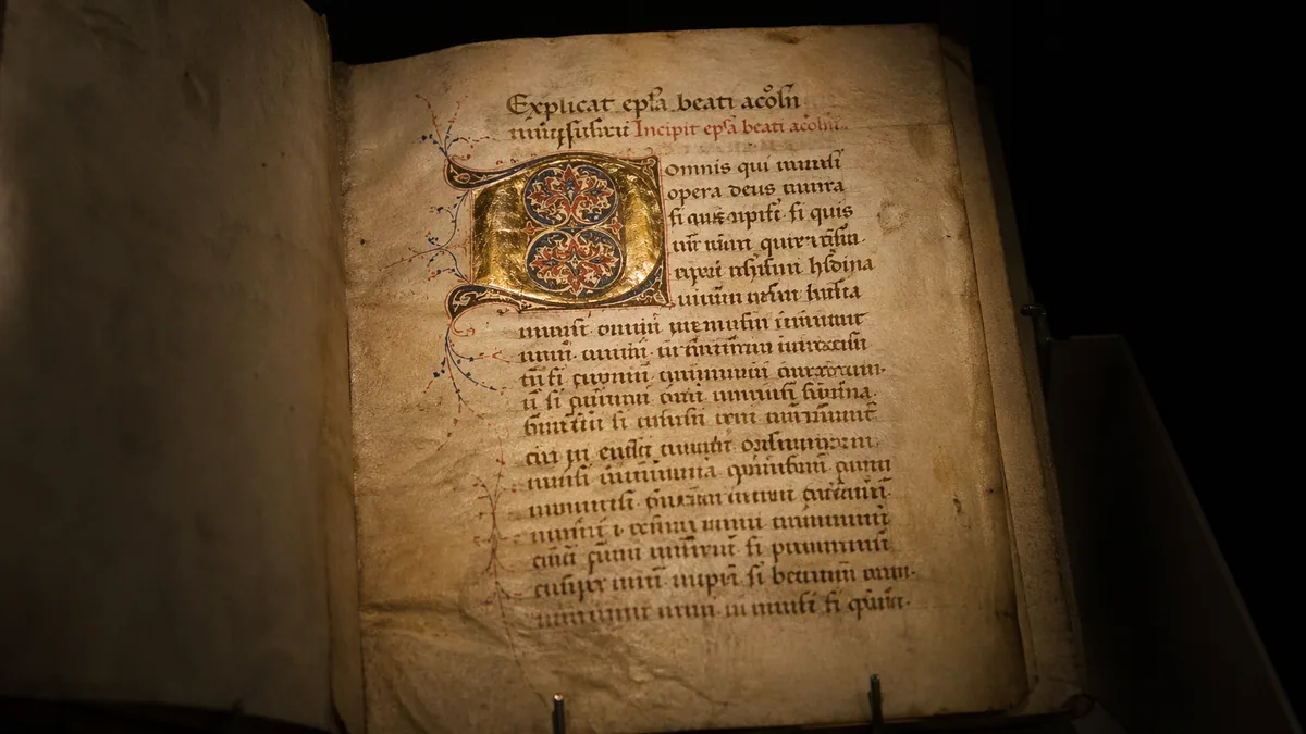
Illuminated manuscripts represented medieval culture's highest artistic achievement, combining calligraphic text with gold leaf (hence "illuminated"; they literally glowed in candlelight), elaborate border decorations, and miniature paintings. A single Gospel book might require two years of continuous work by multiple specialists: parchment makers, scribes, illuminators, and binders.
The process began with parchment preparation, animal skins (usually sheep, goat, or calf) scraped thin, stretched, treated with lime, and polished smooth. Scribes ruled guidelines using lead points, then wrote with quill pens (usually goose, swan, or crow feathers) cut to chisel points. Inks came from oak galls (growths caused by wasp larvae) crushed and mixed with iron salts and gum arabic, producing deep black-brown that resists fading for centuries.
Masterpieces of Illumination
Book of Kells (circa 800 CE): Created in Irish monasteries, possibly Iona. Contains the four Gospels in Latin, with extraordinarily intricate Celtic knotwork, spirals, and zoomorphic designs. Some pages feature over 100 intertwined designs per square inch. Now housed at Trinity College Dublin.
Lindisfarne Gospels (circa 715 CE): Anglo-Saxon manuscript from Holy Island. Scribe Eadfrith created all calligraphy, illumination, and painting alone, an exceptional single-artist achievement. Features carpet pages (full-page abstract designs) and ornate initials.
Book of Durrow (circa 650 CE): Earliest surviving fully illuminated Gospel book. Shows early Hiberno-Saxon style with abstract patterns, symbolic animal representations, and bold color contrasts.
Très Riches Heures (1412-1416 CE): French Gothic illumination at its peak. Created for the Duke of Berry by the Limbourg Brothers. Features detailed calendar illustrations showing medieval life with unprecedented realism and color sophistication.
The Six-Stage Production Process
- Parchment prep: Animal skins processed, stretched, scraped thin, and polished, vellum (calf skin) was finest quality
- Page layout: Guidelines ruled with lead or silver point, margins calculated, text columns planned
- Text writing: Scribe writes with quill pen in iron gall ink, black or brown for body text
- Rubrication: Adding red headings, paragraph marks, and emphasis using vermillion or red lead
- Gilding: Gold leaf application using gesso (raised plaster base) or shell gold (powdered gold mixed with binder)
- Illumination: Painting miniatures, borders, and decorative elements using mineral and organic pigments, ultramarine (lapis lazuli), vermillion (cinnabar), verdigris (copper acetate)
Gothic Scripts (Blackletter): Textural Density
From the 12th century onward, Gothic (Blackletter) scripts dominated Northern European calligraphy. The style emerged as parchment costs skyrocketed and compressing letterforms allowed more text per page. But Gothic wasn't merely economic pragmatism; it created distinctive aesthetic texture through rhythmic vertical strokes, earning the name "textura." Viewed at a distance, a page of Gothic text resembles woven fabric: dense, regular, visually rhythmic.
Gothic scripts demanded exceptional technical skill. The broad-edged pen angle (typically 30-45 degrees) produced diamond-shaped serifs and strong vertical emphasis. Letters compressed horizontally while stretching vertically, with minimal curved strokes. Spacing became critical, too loose and the texture broke; too tight and legibility suffered. Master scribes achieved perfect rhythmic texture through years of practice developing consistent letter width, stroke weight, and spatial relationships.
Regional variations developed distinct characters. German Fraktur (broken script) remained Germany's standard printing type until 1941. Italian Rotunda softened Gothic angularity with rounded curves. French Bastarda blended Gothic and cursive elements. England developed its own variations like the Secretary Hand used for official documents. Gothic's influence persists, modern graphic designers use Blackletter fonts for medieval atmosphere, metal band logos, newspaper mastheads, and tattoo art. To preview Fraktur and other blackletter styles with your own text, try our blackletter generator.
Gothic Script Varieties
Textura Quadrata
Most formal Gothic style. Quadrilateral (four-sided) letterforms, diamond serifs, minimal curves. Used for liturgical texts. "Textura" refers to woven-fabric appearance.
Rotunda
Southern European variant. More rounded, open letterforms than Northern Gothic. Popular in Italy and Spain. Influenced early Italian type design.
Bastarda
French hybrid style mixing formal and cursive elements. More fluid than Textura, faster to write. Used for non-liturgical manuscripts and administrative documents.
Fraktur
German variant with "broken" angular strokes. Became Germany's standard print type from 1500s-1940s. Still used decoratively for Germanic cultural references.
Islamic Calligraphy: The Supreme Art
Islamic calligraphy achieved unprecedented status as the highest form of visual art in Islamic culture. Since traditional Islamic theology discouraged figurative representation (especially of humans and animals), calligraphy became the primary vehicle for artistic expression. The Quran states that the first revelation commanded "Read!": making the written word sacred. Calligraphers didn't just copy scripture; they created visual manifestations of divine revelation.
Arabic script's cursive nature (letters connect within words) creates flowing lines perfect for elaborate artistic treatment. Medieval Islamic calligraphers developed dozens of canonical scripts, each with specific proportional systems. The master calligrapher Ibn Muqla (886-940 CE) established the "proportioned script" system using dots (nuqta) as measurement units; each letter's height, width, and curve followed geometric ratios relative to dot size. This mathematical precision underlying organic flowing forms exemplifies Islamic art's fusion of geometry and fluidity.
Calligraphic training took years under master-apprentice relationships. Students practiced endlessly, mastering each script's proportions, rhythm, and spiritual dimensions. The Ottoman Empire established formal calligraphy schools, awarding certificates (ijazah) authorizing masters to teach. Some calligraphers specialized in specific scripts, Kufic masters for architectural inscriptions, Thuluth specialists for mosque decoration, Naskh experts for Quranic manuscripts. The tradition continues today, with contemporary Islamic calligraphers blending historical forms with modern aesthetics, exploring new expressions while respecting sacred heritage.
Major Arabic Script Styles
Kufic (الخط الكوفي)
Earliest script, angular and geometric. Named for the city of Kufa, Iraq. Used for early Qurans and architectural decoration, especially mosque inscriptions.
Naskh (خط النسخ)
Rounded, highly legible script. Standard for Quranic texts and printed Arabic. Balanced proportions, clear letterforms. "Naskh" means "copying."
Thuluth (خط الثلث)
Elegant cursive with elongated verticals. Used for titles, headings, and mosque decoration. Considered one of the most beautiful Arabic scripts. "Thuluth" means "third."
Diwani (الخط الديواني)
Ornate Ottoman chancery script. Complex ligatures and stacked letterforms. Used for official documents and royal decrees. Highly decorative with interweaving forms.
Nastaliq (نستعلیق)
Persian flowing script for poetry and literary texts. Diagonal baseline, hanging letters. Considered the most beautiful script by Persian and Urdu traditions.
Maghrebi (الخط المغربي)
North African regional style. Distinctive rounded forms, open loops. Used across Morocco, Algeria, Tunisia. Still popular in West African Arabic writing.
Renaissance to 19th Century (1500-1900): Elegance and Standardization
The Renaissance revived classical forms while the printing press democratized knowledge, yet calligraphy thrived as personal correspondence, official documentation, and business necessity evolved into sophisticated arts.
The Renaissance brought humanist values emphasizing clarity, proportion, and classical aesthetics. Scholars rejected Gothic scripts as medieval darkness, instead drawing inspiration from Roman capitals and Carolingian minuscules. Printing gradually replaced handwritten books, but this freed calligraphy to explore new territories, personal letters, business documents, official proclamations, and pure artistic expression. The period saw calligraphy transform from sacred art into essential social and business skill.
Italic Scripts (1500s): Humanist Clarity
Italian Renaissance scholars developed Italic (Cancellaresca or Chancery Cursive) as an elegant alternative to Gothic density. Based on Roman letterforms, Italic featured forward slant, flowing letter connections, and open counter spaces promoting readability. Papal scribes in the Vatican Chancellery used it for official correspondence, hence "Chancery", and it spread across Europe as the epitome of educated handwriting.
Ludovico Vicentino degli Arrighi's 1522 writing manual "La Operina" taught Italic to a broad audience, making it the first widely published calligraphy instruction book. Niccolo Niccoli earlier pioneered the style in 15th century Florence, while Giovanni Francesco Cresci's "Essemplare di più sorti lettere" (1560) advanced technical refinements. These writing masters established calligraphy as teachable discipline with systematic methods rather than monastery secrets.
Italic's influence persists, modern italic typefaces derive from these Renaissance forms. When you italicize text today, you're using descendants of Vatican chancery handwriting. The style also profoundly influenced the development of connected letterform techniques that define cursive writing. For practical application, explore our custom practice sheet generator to work on Italic-style letter connections.
Copperplate (1700s-1800s): The Engraver's Legacy
Copperplate script (also called English Roundhand) dominated 18th-19th century formal correspondence. The name derives from engraved copper printing plates used to reproduce writing manuals, not the writing itself. Engravers like George Bickham ("The Universal Penman," 1733-1741) created extraordinary exemplars showing the style's expressive potential. These engraved examples often exceeded what pen alone could achieve, creating ideals that calligraphers pursued for generations.
Unlike broad-edged pens used for earlier scripts, Copperplate requires pointed flexible nibs that spread under pressure. Light upstrokes require minimal pressure (producing hairlines), while downstrokes with increased pressure spread the nib tines apart (creating swells). This pressure-modulation technique demands exceptional fine motor control and years of practice to master consistently. Victorian penmanship teachers spent entire lessons on pressure control exercises before students touched actual letters.
Copperplate characteristics include 52-55 degree forward slant, oval letter shapes, dramatic thick-thin contrast, and elaborate flourishing. Master penmen developed individual flourishing styles, creating personal signatures (literally: flourished initials authenticated documents). The script's complexity made it difficult to forge, adding security value to important documents and currency. When executed expertly, Copperplate achieves almost mechanical precision; Victorian clerks produced ledgers where every entry matches exactly.
Technical Requirements
Tool: Pointed flexible nib (oblique pen holder optional but helpful for maintaining slant angle)
Paper: Smooth, non-absorbent paper essential, rough surfaces catch flexible nib tines
Slant: Consistent 52-55 degree forward slant throughout (guidelines typically used)
Pressure: Light upstrokes (hairlines), heavy downstrokes (swells), pressure modulation creates all contrast
Ovals: All letterforms based on precise oval shapes at consistent angle
Spacing: Consistent letter and word spacing achieved through rhythmic arm movement
Spencerian Script (1840s): American Business Standard
Platt Rogers Spencer (1800-1864) created America's first native penmanship system, drawing inspiration from nature: the shapes of stones worn smooth by water, the curves of vines and shells. More practical than Copperplate yet still elegant, Spencerian featured rhythmic ovals, moderate slant (closer to 50 degrees), and flowing arm movement. Spencer promoted "muscular movement": writing from shoulder and arm rather than fingers, which let scribes work for hours without fatigue.
Spencerian became America's standard penmanship from 1850-1925, taught in schools and businesses nationwide. The script appeared everywhere, business correspondence, bookkeeping ledgers, legal documents, personal letters. Most famously, Frank M. Robinson wrote the original Coca-Cola logo in Spencerian script in 1886, and it remains virtually unchanged today. Many 19th century American documents, including the last page of the Emancipation Proclamation's engrossed copy, showcase Spencerian flourishing.
Spencer's sons continued his work after his death, publishing "Spencerian Key to Practical Penmanship" (1866) which standardized instruction. Business colleges taught Spencerian for professional correspondence, making penmanship ability a marketable job skill. Bank tellers, clerks, accountants, and secretaries needed excellent handwriting; poor penmanship limited career prospects. Today's calligraphers study Spencerian for its balance between elegance and legibility, making it perfect for wedding invitations and formal documents.
Evolution and Successor Methods
Business Applications: Bookkeeping ledgers, business correspondence, legal documents, certificates, diplomas. Banks preferred Spencerian for check writing due to its difficulty to forge.
Cultural Legacy: Coca-Cola logo, Ford Motor Company logo (originally), countless 19th century documents. Represents Victorian-era American business culture.
Palmer Method (1888): A.N. Palmer simplified Spencerian for mass public education, emphasizing speed over flourishing. Less ornate, faster execution, became standard in American schools 1900-1960s.
Decline (1920s onward): Typewriters reduced handwriting necessity. By 1950s, cursive instruction emphasized simple legibility over artistic execution. Today experiencing revival among calligraphy enthusiasts and hand lettering practitioners.
Modern Era (1900-Present): Revival and Reinvention
The 20th century brought calligraphy full circle, from necessity to art, while the digital age paradoxically sparked unprecedented interest in hand-lettered work.
Typewriters, computers, and digital communication eliminated calligraphy's practical necessity, yet the art thrived precisely because it became optional. What was once mundane skill transformed into specialized craft, artistic medium, and mindfulness practice. The modern era divides into distinct phases: early 20th century revival, mid-century modernist experimentation, and contemporary digital-age renaissance.
Arts & Crafts Revival (1900-1950)
Edward Johnston (1872-1944) almost single-handedly revived calligraphy as a living art. Teaching at London's Central School of Arts and Crafts from 1899, he studied medieval manuscripts systematically, reconstructing historical techniques through careful observation and experimentation. His 1906 book "Writing & Illuminating, & Lettering" became the foundational text, teaching thousands that calligraphy wasn't museum relic but living practice adaptable to modern needs.
Johnston's most famous legacy might be the London Underground typeface (1916), commissioned by Frank Pick. Though technically a typeface, it demonstrates how calligraphic principles (humanist proportions, clean geometry, purposeful simplicity) translate to modern design. Johnston's "Foundational Hand," his interpretation of 10th century Carolingian minuscule, became the standard teaching script for beginners. Its clear letterforms and logical construction principles make it ideal for learning calligraphic fundamentals.
Johnston's students spread his methods internationally. Anna Simons brought his approach to Germany. Graily Hewitt advanced gilding and illumination techniques. Rudolf Koch in Germany developed parallel practices, creating powerful type designs (Neuland, Kabel) based on calligraphic principles. William Morris's earlier Arts & Crafts movement provided philosophical framework: rejecting industrial mass production, valuing handcraft, and seeking beauty in everyday objects. Together, these figures established calligraphy as modern art form while respecting historical roots.
Key Figures and Contributions
Edward Johnston (1872-1944): British calligrapher who revived broad-edged pen calligraphy. Created Foundational Hand, wrote seminal "Writing & Illuminating, & Lettering" (1906), designed London Underground typeface. Established systematic teaching methodology.
Rudolf Koch (1876-1934): German calligrapher and type designer. Created Neuland font, numerous calligraphic typefaces. Emphasized spiritual dimension of letterforms, operated as part of artist community in Offenbach.
Anna Simons (1871-1951): Johnston's student who brought his methods to Germany. Taught at Düsseldorf, influenced German calligraphy education. Translated Johnston's book into German, spreading his influence across Europe.
Graily Hewitt (1864-1952): Johnston's student who specialized in gilding and illumination. Advanced technical understanding of gold leaf application on vellum. Taught at Royal College of Art.
Mid-Century Modernism (1950-1980)
Hermann Zapf (1918-2015) bridged traditional calligraphy and modern typography, creating some of history's most influential typefaces. Trained as a calligrapher during WWII, Zapf understood that good type design requires calligraphic sensitivity: how strokes begin and end, how curves flow, how positive and negative space balance. His typefaces (Palatino, Optima, Zapfino) demonstrate this understanding, achieving mechanical precision while retaining organic warmth.
This period saw calligraphers push boundaries, treating letterforms as abstract art rather than merely legible communication. Claude Mediavilla in France, Thomas Ingmire in America, and Brody Neuenschwander in Belgium created large-scale calligraphic paintings for galleries and public spaces. These artists asked: if calligraphy no longer serves practical function, what can it become? Their experimental work, sometimes barely legible, explored rhythm, texture, gesture, and emotion through letterforms.
Simultaneously, calligraphy maintained commercial applications. Logo design, book jackets, advertising headlines, film titles, projects requiring human touch that mechanical type couldn't provide. Companies like Hallmark employed staff calligraphers. Before desktop publishing, advertising agencies hired lettering artists for custom headlines. This sustained professional calligraphy even as everyday handwriting declined. Want to explore different calligraphy styles for professional work? Understanding historical development helps you choose appropriate styles for different contexts.
Contemporary Renaissance (1980-Present)
The digital age created unexpected calligraphy revival. Social media (especially Instagram and Pinterest) connected practitioners globally, creating community and inspiration impossible before. YouTube tutorials democratized learning; anyone with internet access can watch master calligraphers work. Online marketplaces (Etsy, Instagram shops) enabled professionals to reach customers worldwide. What was once limited to local markets became global opportunity.
The wedding industry explosion (late 2000s onward) created enormous demand for hand-lettered invitations, place cards, signage, and envelope addressing. Couples seeking personalized, unique celebrations valued handmade elements over mass-produced alternatives. This sustained thousands of professional calligraphers while introducing millions to the art through wedding planning. Many professional calligraphers today support themselves primarily through wedding work, supplemented by workshops, online courses, and commercial commissions.
Contemporary practice spans enormous range: traditional scripts executed with historical tools, modern interpretations mixing styles freely, brush pen calligraphy accessible to beginners, iPad/Procreate digital lettering, experimental abstract work. Some calligraphers pursue historical accuracy, studying manuscripts and reconstructing period techniques. Others innovate freely, combining calligraphy with watercolor, incorporating 3D elements, or creating letter-based installations. This diversity makes contemporary calligraphy vibrant and accessible, there's room for every interest and skill level.
Interestingly, our tool-saturated lives created hunger for analog, tactile experiences. Calligraphy offers counterbalance to screens, working with physical materials, seeing ink flow on paper, developing physical skill through practice. Many practitioners describe meditative, mindfulness-inducing qualities. Psychologists note calligraphy's therapeutic potential for anxiety, focus issues, and stress management. What began as practical communication evolved into art, then craft, and now encompasses wellness practice. Ready to start your own practice? Check our complete beginner's guide or create custom practice sheets tailored to your level.
Contemporary Calligraphy Landscape
Modern Tools & Materials: Brush pens (Tombow, Pentel) make calligraphy accessible without nib maintenance. iPad apps (Procreate, Affinity Designer) enable digital calligraphy with pressure sensitivity. Traditional tools (pointed pen, broad-edged pen) remain popular among serious practitioners. Explore our comprehensive tools guide for choosing the right materials.
Learning Resources: YouTube tutorials, Instagram communities, online courses (Skillshare, Domestika), in-person workshops, calligraphy guilds. Self-taught practitioners common due to accessible instruction. Traditional apprenticeship rare but still exists.
Style Diversity: Modern/faux calligraphy (bounce lettering), traditional scripts (Copperplate, Italic, Gothic), brush calligraphy, pointed pen, experimental abstract work, mixed-media combinations. No single "correct" approach, pluralistic practice.
Professional Applications: Wedding stationery (invitations, envelopes, signage, place cards), brand identity and logos, editorial illustration, gallery exhibitions, murals and public art, product packaging, social media content creation. Many professionals combine multiple income streams. Learn about starting your own calligraphy business.
Community & Connection: Instagram hashtags (#calligraphy, #moderncalligraphy), Facebook groups, local guilds (Society of Scribes, regional chapters), workshops and retreats, online challenges (30-day practice calendar), competitions and exhibitions.
Emerging Trends: 3D letterforms and dimensional work, augmented reality integration, sustainable/eco-friendly materials, therapeutic and mindfulness applications, cross-cultural fusion styles, community-engaged public projects.
Global Calligraphic Traditions
Every major civilization developed unique calligraphic traditions reflecting linguistic structure, cultural values, and aesthetic philosophies, creating a rich global heritage still evolving today.
While this article focuses primarily on Western and Middle Eastern traditions, calligraphy flourished worldwide, each culture creating distinctive approaches. Understanding these global traditions deepens appreciation for calligraphy's universal appeal: the human impulse to make writing beautiful transcends all cultural boundaries. Explore the full range in our comprehensive calligraphy styles guide.
East Asian Traditions
Chinese, Japanese (Shōdō), and Korean (Seoye) calligraphy share brush-based tools and philosophical foundations but developed distinct characteristics. Chinese calligraphy emphasizes individual expression within historical forms: students master traditional scripts before developing personal style. Japanese Shōdō connects deeply to Zen Buddhism, valuing spontaneity, presence, and the unrepeatable moment; each stroke is a meditation. Korean calligraphy blends Chinese influence with Hangul script's geometric clarity, creating unique aesthetic combining fluid brushwork with architectural letterforms.
All three traditions view calligraphy as cultivation of character, not merely technique. The process matters as much as result, practicing calligraphy develops patience, focus, and mindfulness. Master calligraphers spend lifetimes perfecting fundamental strokes, understanding that technical mastery enables authentic expression.
Arabic & Persian Traditions
Islamic calligraphy elevated Arabic script to supreme artistic heights across cultures from Morocco to Indonesia. With dozens of canonical scripts, it adorns mosques, manuscripts, everyday objects, and contemporary art. Persian Nastaliq, developed specifically for poetry, demonstrates flowing elegance considered the most beautiful script by Persian and Urdu traditions. Turkish Diwani showcases Ottoman courtly sophistication with complex ligatures and stacked forms.
Modern Arabic calligraphy balances tradition with innovation. Contemporary calligraphers explore abstract expressions, digital media, public murals, and gallery installations while respecting sacred heritage. The script's visual versatility, capable of extreme geometric precision or fluid organic flow, continues attracting artists worldwide.
Western European Traditions
Western traditions, Roman capitals, Gothic, Italic, Copperplate, reflect different historical periods and purposes. Contemporary Western calligraphers practice both historical scripts with period accuracy and experimental modern approaches. The wedding invitation industry sustains thousands of professional calligraphers, while fine artists push letterform boundaries in galleries. Western calligraphy's diversity accommodates every interest, from medieval manuscript recreation to contemporary abstract expression.
Unlike East Asian and Islamic traditions where calligraphy maintained continuous cultural status, Western calligraphy experienced decline then revival. This interruption created interesting dynamic, less rigid tradition, more room for innovation, but also less systematic teaching infrastructure. Contemporary Western calligraphers often blend multiple influences freely.
South Asian Traditions
Sanskrit, Devanagari, Tamil, Bengali, and other Indian scripts developed rich calligraphic traditions for religious and literary texts. Devanagari's horizontal line (shirorekha) connecting letters creates distinctive visual rhythm. South Asian calligraphy maintains strong connections to religious practice, Hindu temples feature elaborate scriptural inscriptions, while Sikh Gurbani calligraphy adorns Gurdwaras with verses from the Guru Granth Sahib.
Thai, Tibetan, Burmese, and other Southeast Asian scripts also developed sophisticated calligraphic traditions, often for Buddhist religious texts. These circular, flowing scripts create patterns distinctly different from angular Western or East Asian forms, demonstrating calligraphy's extraordinary global diversity.
Cultural and Historical Significance
Calligraphy's historical impact extends far beyond beautiful letterforms; it shaped education, preserved knowledge, determined careers, expressed spirituality, and created lasting cultural identity across civilizations.
Understanding calligraphy's historical significance helps us appreciate why it matters today. These aren't merely old writing styles; they're windows into how civilizations thought about knowledge, beauty, spirituality, and communication. Each tradition reveals cultural values through aesthetic choices.
Knowledge Preservation
Before Gutenberg's printing press (1440 CE), every book existed because someone hand-copied it. Monastic scriptoria and Islamic libraries preserved classical philosophy, scientific treatises, religious texts, and literature through centuries. Calligraphers literally saved human knowledge from oblivion. Without their patient labor, we'd have lost most ancient and medieval thought.
Social Stratification and Opportunity
Fine handwriting signaled education, refinement, and opportunity for advancement. In imperial China, calligraphic skill literally determined career success, civil service examinations required beautiful writing alongside correct answers. In Victorian England, poor penmanship closed doors to clerkships and professional positions. Penmanship schools offered working-class students paths to middle-class careers.
Religious Expression and Devotion
Many traditions treated writing sacred texts as spiritual practice. Buddhist monks copying sutras, Christian scribes illuminating Gospels, Islamic calligraphers rendering Quranic verses; all viewed their work as devotional act. The process mattered as much as the product. Attention, care, and beauty honored the sacred content being transmitted.
Artistic Achievement and Cultural Status
Master calligraphers achieved fame comparable to painters and sculptors. Wang Xizhi's work fetched imperial prices in Tang Dynasty China. Islamic calligraphers received court appointments. Renaissance writing masters published bestselling manuals. Calligraphy commanded respect as legitimate art form requiring lifetime mastery.
Cultural Identity and Values
Each culture's script embodies its aesthetic values. Compare angular, compressed Gothic letterforms (reflecting medieval Northern European character) with flowing, expansive Persian Nastaliq (expressing lyrical Persian poetry traditions). Scripts become visual manifestations of cultural identity, preserving distinctiveness, expressing shared heritage.
Design and Typography Foundation
Every typeface traces back to calligraphic traditions. Understanding historical letterforms improves contemporary design work. Type designers study calligraphy to understand stroke relationships, proportion systems, and spacing principles. The Trajan Column's letters still inform modern display typefaces. Chinese type design requires calligraphic understanding. Graphic designers benefit from historical knowledge when choosing and using fonts appropriately.
Today's calligraphy revival reconnects us with these historical dimensions. When you practice traditional techniques, you're joining millennia of practitioners. When you avoid common mistakes through proper instruction, you're benefiting from accumulated wisdom. Whether you're interested in wedding calligraphy as business or exploring modern interpretations as art, you're participating in living tradition connecting past, present, and future.
The Future of Calligraphy
Despite living in the most text-saturated era in history, calligraphy thrives, perhaps because screen-dominated lives create hunger for tactile, mindful, human-made beauty.
Social media unexpectedly became calligraphy's greatest promoter. Instagram connects practitioners globally, creating community and inspiration impossible before. YouTube tutorials make master-level instruction freely available; anyone with internet access can watch experts work, slowed down and explained clearly. Online marketplaces (Etsy, Instagram shops) enable professionals to reach worldwide customers. What was once geographically limited became borderless practice.
The irony? Digital tools enabled analog revival. People tired of screens seek physical, tactile activities, holding pens, mixing ink, seeing work emerge on actual paper. Calligraphy offers counterbalance to digital saturation. It requires presence, develops physical skill, creates tangible results. Psychologists recognize therapeutic benefits, calligraphy practice reduces anxiety, improves focus, creates meditative states. What began as practical communication evolved into wellness practice.
Simultaneously, digital tools expand creative possibilities. iPad apps with pressure sensitivity enable calligraphy without physical materials. Digital work allows infinite revision, color experimentation, and easy sharing. Some purists resist digital calligraphy as "not real," but history shows traditions evolve: pointed pens replaced quills, synthetic brushes joined natural hair, and digital tools simply add options. The principles remain: understanding letterform construction, developing consistent execution, making deliberate aesthetic choices.
Emerging Trends and Directions
Hybrid Analog-Digital Workflows: Many professionals scan traditional calligraphy, then refine digitally, combining handmade authenticity with digital precision. Wedding invitations might feature hand-lettered names scanned and printed. Logos start with brush sketches, then vectorized for scalability.
3D and Dimensional Lettering: Calligraphers explore beyond two dimensions, sculptural letterforms, projection mapping onto architecture, augmented reality overlays. Technology enables letterforms to move, rotate, respond to interaction. The boundary between calligraphy, sculpture, and installation art blurs productively.
Cross-Cultural Fusion: Global connectivity enables artists to blend traditions, combining Gothic and Arabic scripts, mixing Chinese brushwork with Western letterforms, creating new hybrid aesthetics. Some traditionalists criticize mixing, but cultural exchange drives artistic evolution.
Sustainable and Ethical Practices: Growing interest in sustainable materials, plant-based inks, recycled papers, ethical animal-fiber brushes (or synthetic alternatives). Calligraphy's inherent sustainability (minimal waste, long-lasting materials, handmade production) aligns with environmental consciousness.
Therapeutic and Educational Applications: Schools experimenting with calligraphy for focus, fine motor development, and mindfulness. Occupational therapists using it for hand rehabilitation. Mental health practitioners recognizing meditative benefits. Calligraphy transcends art practice, becoming wellness tool.
Community Engagement and Public Art: Calligraphers creating community murals, leading public workshops, developing participatory projects. Moving beyond individual studio practice toward socially engaged art. Democratizing access while building local artistic community.
Technology will keep changing the picture. Generative models can now produce convincing "hand-lettered" images on demand, which raises real questions about authorship, value, and what people are paying for when they commission a piece. The honest answer is probably specific to each calligrapher and each client. What seems steady, looking back over the timeline this article covered, is that hand-made letters keep finding new jobs as their old ones disappear: monks lost the book trade to Gutenberg, Spencerian clerks lost the ledger to the typewriter, and Palmer-method schoolchildren lost the daily exercise book to the keyboard. Each time, calligraphy survived as something narrower and more deliberate than what it replaced.
The practical entry points have not really changed: a guided beginner sequence, ruled practice sheets, and enough repetition to develop a hand. The history is mostly there to tell you which decisions other people have already made about angle, slant, and proportion, so you do not have to invent them again. For working calligraphers, the same history is a catalogue of commercial niches that have come and gone and may come back. And if you only want to see the letters set in motion, our font generator renders them across cursive, calligraphy, blackletter, and hand-lettering — every tradition this article touches on, in one tool.