A curated gallery of 18 beautiful script fonts grouped by mood — elegant, romantic, modern, playful, and vintage — with concrete use cases for tattoos, Instagram bios, logos, and wedding invitations.
12 min readAll Levels Level
Table of Contents
How to choose an aesthetic cursive font
A "beautiful" cursive font is the one that matches the feeling of the thing it sits on — not the one with the most loops.
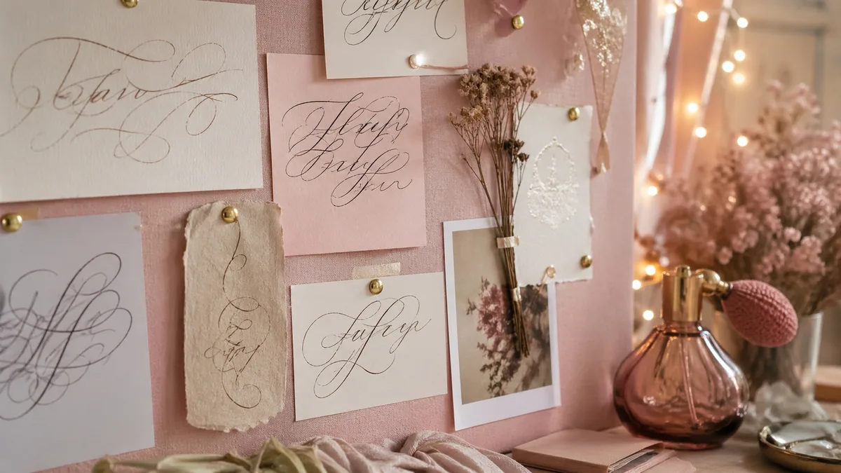
Every script style we ship in the cursive generator carries baggage from somewhere — a 19th-century engraver's hand, a 1950s sign painter, a Sunday-afternoon brush-pen sketch. When you pick a font for an Instagram bio, a tattoo, or a wedding invite, you're picking that history too. The job of this gallery is to make those moods obvious so you can match them on purpose instead of by accident.
Most people get stuck because they search the way they search for a noun ("cursive font") when the brief is really an adjective ("elegant", "romantic", "fun"). Below, the 18 script fonts loaded on this site are grouped into five aesthetic buckets: elegant & formal, romantic & wedding, modern minimalist, playful & casual, and vintage & decorative. Each tile shows the font rendered in itself, so you can read what the font feels like at a glance — which is, usefully, the only thing your audience is going to do.
Start from the use case, not the font
Write down one sentence: "This font goes on a [thing] for a [person] who feels [adjective]." A line like "wedding invite, for a quiet bride who feels classic" lands you in Elegant & Formal. "T-shirt for a surf brand that feels nostalgic" lands you in Vintage. The bucket comes first, the font comes second.
A short note on terminology: cursive, script, and handwriting fonts overlap heavily in marketing copy but type designers usually mean slightly different things. Cursive technically describes any joined writing; script is the broader type-design genre that includes formal copperplates and casual brush styles; handwriting fonts mimic everyday penmanship and rarely connect every letter. For a deeper history of how these traditions diverged, the calligraphy styles overview and the modern calligraphy guide unpack the lineage.
Citations: terminology and stylistic groupings draw on Hermann Zapf's classification work and ongoing teaching from IAMPETH (the International Association of Master Penmen, Engrossers and Teachers of Handwriting).
Elegant & formal scripts
The closest digital descendants of 19th-century Copperplate and Engrosser's Script.
Elegant scripts share a few signatures: a steep, consistent slant (usually 52–55°), high contrast between hairline upstrokes and shaded downstrokes, and capitals that take up more vertical room than they strictly need. They were originally cut for steel-nib engravers and that DNA is still visible — the letters look composed, not written in a hurry. Use them when you want the reader to slow down before they even read the words.
Great Vibes
Great Vibes
Wedding-invitation classic with confident, sweeping capitals.
Best for: Wedding invites, luxury logos, gallery prints.
Allura
Allura
Refined Spencerian feel with disciplined letter slants.
Best for: Boutique branding, monograms, place cards.
Pinyon Script
Pinyon Script
Quiet Copperplate elegance — narrow, formal, very readable.
Best for: Editorial pull-quotes, certificates, letterheads.
Mr De Haviland
Mr De Haviland
Hairline-thin contrast in the engrosser's tradition.
Best for: Save-the-dates, jewellery brands, perfume packaging.
Petit Formal Script
Petit Formal Script
Tight, formal, almost notarial — the smallest engraver's hand.
Best for: Stationery, embossed business cards, fine-print captions.
Watch the size
Hairlines this thin disappear under 18 px on a phone screen and fall apart in print under about 14 pt. If your design has to live small — a footer credit, a mobile-only banner — drop down into the romantic or modern buckets where the strokes carry more ink.
Pairing tip: elegant scripts almost always want a quiet serif partner — Cormorant Garamond, Playfair Display, or even a high-x-height sans like Inter at a low weight. Set the script as a one-line hero and let the serif carry every other piece of information. For a structured walkthrough of building these pairings, the font pairing assistant is a good next stop.
Softer than the formal copperplates, warmer than modern brush — built for love letters, stationery, and anything that wants to feel hand-finished.
Romantic scripts trade some of the rigid contrast of engraver's hands for generous ascenders, gentle bowls, and a slightly looser baseline. They look less like they were ruled and more like they were written. Tangerine and Parisienne, in particular, feel like the digital cousins of the brush-pen "modern calligraphy" wave that dominated wedding stationery from roughly 2014 onward — see the wedding calligraphy guide for how that translates to real invitation suites.
Tangerine
Tangerine
Tall, airy, slightly nostalgic — feels like a love letter.
Best for: Wedding programmes, poetry layouts, IG bios.
Parisienne
Parisienne
Soft brush curves with a Left-Bank café vibe.
Best for: Patisserie menus, bridal blogs, gift tags.
Sacramento
Sacramento
1950s sign-painter romance — relaxed but on-balance.
Best for: Quote prints, signage, mood boards.
Alex Brush
Alex Brush
Inky brush stroke that swings between casual and dressy.
Best for: Photographer logos, watercolour invites, hero headlines.
A specific note on Tangerine: it's tall and airy, which means it eats vertical space. Give it room — at least 1.4× line height — or the ascenders and descenders will tangle and the romance turns into clutter. Sacramento and Parisienne are more forgiving in tighter layouts.
Instagram bio length
Instagram caps the bio field at 150 characters, and most "fancy" Unicode-glyph copy counts each character as 2–3. If you're styling a bio with the generator, keep the source phrase under about 60 characters so the converted version still fits. Romantic scripts read best at one short line, not three.
Low-contrast, mostly mono-line scripts that play well with sans-serif UIs and current editorial design.
Modern script design has moved sharply away from high-contrast copperplates over the last decade. Designers like Laura Worthington and Alejandro Paul popularised mono-line and low-contrast brush scripts that sit comfortably next to Inter, Söhne, or whatever sans-serif is currently running your product UI. Caveat, Bad Script, and Satisfy all sit in this lane: confident, even-weight strokes, modest slant, and a slightly informal baseline that reads as "human" rather than "ceremonial".
Caveat
Caveat
Honest, handwritten, slightly imperfect.
Best for: Notion banners, sticky-note headlines, planner stickers.
Bad Script
Bad Script
Quick ballpoint feel — looks like a friend's note.
Best for: Newsletter signoffs, journaling, casual UI.
Satisfy
Satisfy
Confident marker stroke with a rounded, modern slant.
Best for: App splash text, podcast covers, IG carousels.
These three are also the safest bets for documents that need to survive Microsoft Word or Google Docs — Caveat in particular is bundled with both. If your script has to survive being copied into a real working file (a brief, a CV header, a Notion page), start here. The cursive handwriting generator uses several of these for its handwritten previews.
Going deeper: pairing two scripts
The classic "two scripts in one design" trap: pairing two fonts from the same bucket (e.g. Caveat + Satisfy) and getting visual mush. The fix is to pair across buckets — one elegant script as the hero, one modern script as the support — and to keep at least a 2× size difference. Anything closer and the eye reads them as competition. For a deeper treatment, see the custom calligraphy fonts guide.
Modern Calligraphy Must-Haves
Popular tools for modern calligraphy and brush lettering
Bouncy baselines, marker-pen weight, and zero apology — the buckets that built Etsy and half of YouTube.
Playful scripts are deliberately uneven. The baseline wobbles, the stroke contrast is modest, and the letters lean into one another like they're in a hurry to say something. Dancing Script is the bestseller of the bunch — it's been one of the top three Google Fonts in the script category for most of the last decade — but Yellowtail's chunky retro slab and Kaushan Script's bold brush are arguably better when you need the type to do the heavy lifting on its own.
Dancing Script
Dancing Script
Bouncy baseline, friendly weight — the internet's favourite script.
Best for: Etsy shops, blog headers, kids' party invites.
Yellowtail
Yellowtail
Retro surf-shop brush with chunky downstrokes.
Best for: Café menus, t-shirt prints, summer campaigns.
Marck Script
Marck Script
Loose felt-tip energy, fast and a little bit mischievous.
Best for: Doodle posters, lifestyle blogs, scrapbook pages.
Kaushan Script
Kaushan Script
Bold brush slab — loud, modern, very legible.
Best for: Sale banners, YouTube thumbnails, sportswear.
Use playful scripts as a pattern interrupt: one short headline, then immediately switch to a clean sans for body copy. Setting whole paragraphs in any of these is what makes designs look like a Cricut starter pack. They also do beautifully on merch — Yellowtail and Kaushan both hold up at small sizes on a t-shirt or a sticker, where the more delicate scripts simply won't survive screen printing. For more on that genre, the calligraphy vs hand lettering piece is worth a read.
Vintage & decorative scripts
Postcard, signpainter, and sideshow energy — fonts that look older than they are.
The vintage bucket is small but distinctive. Berkshire Swash borrows from early 20th century travel-poster lettering — heavy slab terminals, generous swashes, and a slight forward lean that recalls Italianate sign painting. Arizonia is gentler, closer to mid-century postcards, with rounded loops that read as warm rather than ornate. Both fonts work hardest when they're allowed to be the only decorative element on the page. Layer them on top of a busy background and they'll fight you.
Berkshire Swash
Berkshire Swash
1920s travel-poster swash with a vaguely Tuscan flourish.
Best for: Pub signage, vintage logos, antique-shop labels.
Best for: Greeting cards, bakery branding, retro packaging.
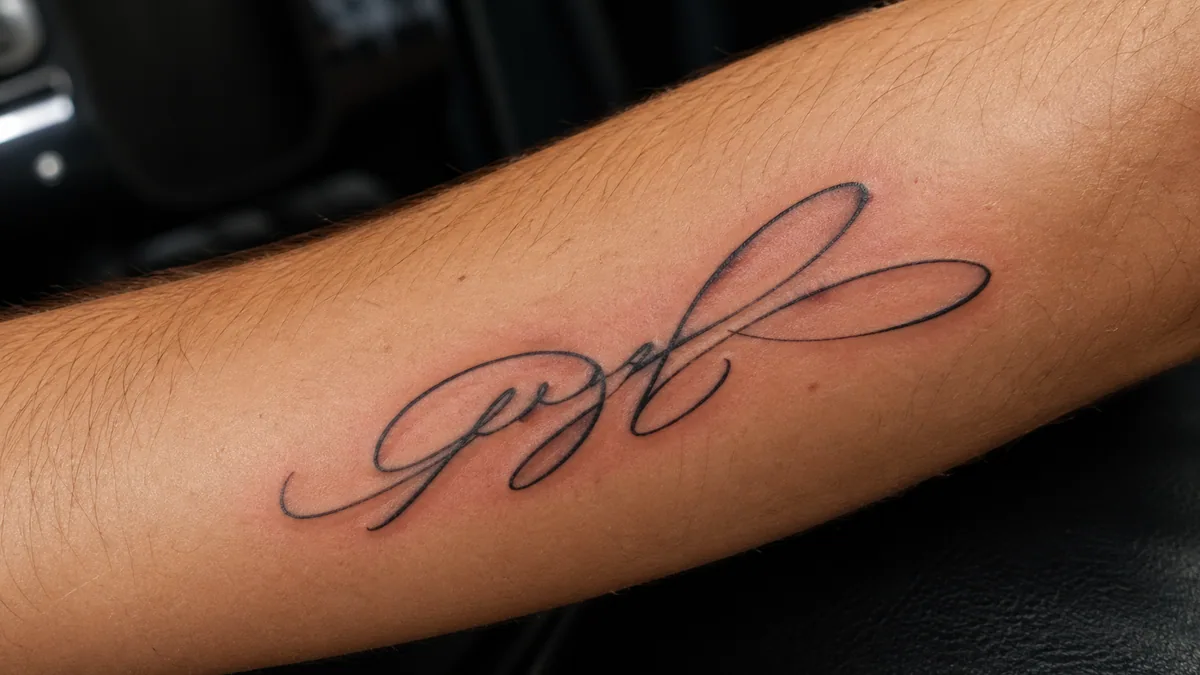
Tattoo legibility, honestly
People search for tattoo fonts daily, but most aesthetic scripts age badly under skin. Hairline-heavy fonts (Mr De Haviland, Petit Formal, Pinyon) blow out within a year as ink spreads — a phenomenon documented in tattoo-aging studies and well-known to experienced tattooists. If you want a script tattoo that looks good in five years, use a heavier mono-line script (Satisfy, Kaushan, Berkshire Swash) and ask your artist to slightly thicken every stroke. Always test the design at the actual size, on tracing paper, before booking the chair.
A few rules that hold up across every bucket above:
One script per layout.Two scripts in the same composition is the single most common amateur giveaway. If you must use two, see the “going deeper” callout above.
Never set body copy in a script.Every font on this page was designed for display sizes — 24 pt and up. Below that, even the modern minimalist scripts lose their character.
Mind the case. Most cursive fonts hate ALL CAPS — letters were drawn assuming connected lowercase forms. Title Case or sentence case almost always reads better.
Check at final medium.A font that sings on a 27" monitor can collapse on a phone, on coated paper, or under embroidery. Always preview at the size and on the surface where it will actually live.
For longer-form practice on letterforms themselves — what makes one script "elegant" and another "playful" at the stroke level — the calligraphy styles overview and the modern calligraphy guide are the two best companion reads on the site.
Try these fonts with your own text
A gallery only gets you so far — a font “feels right” for your specific words or it doesn't. Two free tools on this site let you test that in seconds:
Cursive generator — type any phrase and preview it instantly across all 18 of the fonts above. Best for captions, quotes, and bios.
Cursive name generator — purpose-built for names and monograms, with download options. Best for tattoos, signatures, and logo exploration.
When you find a contender, do the obvious sanity check: paste the phrase into the generator, screenshot it at the size it'll actually appear, and look at it again tomorrow. Aesthetic decisions almost always look different after a night's sleep — which is, in calligraphy as in everything else, the cheapest professional habit there is.
Sources & further reading: IAMPETH archives on Engrosser's Script and Spencerian, Hermann Zapf's About Alphabets for type classification, and Google Fonts' script-category usage statistics for popularity context.
Modern Calligraphy Must-Haves
Popular tools for modern calligraphy and brush lettering
What's the most aesthetic cursive font for an Instagram bio?▾
For most bios, Tangerine, Parisienne, and Sacramento read as the most aesthetic at small sizes — they have enough stroke contrast to feel intentional but not so much that hairlines disappear on a phone screen. Type your bio into the cursive generator, screenshot it at actual size, and check it on your phone before committing. Note that Instagram caps the bio at 150 characters, and many fancy Unicode glyphs count as 2–3 characters each, so keep your source phrase under about 60 characters.
Which cursive font is best for tattoos?▾
For tattoos that age well, choose mono-line or low-contrast scripts: Satisfy, Kaushan Script, Dancing Script, or Berkshire Swash. Hairline-heavy fonts like Mr De Haviland, Petit Formal Script, and Pinyon Script look stunning on screen but blow out within 1–2 years as tattoo ink spreads under the skin. Always print your design at the actual size, hold it against the body part, and ask your artist to slightly thicken every stroke. Test in tracing paper first.
Can I use these Google Fonts commercially?▾
Yes. All 18 cursive fonts in this gallery are distributed through Google Fonts under the SIL Open Font License (OFL) or the Apache 2.0 license, both of which permit commercial use — including in logos, products you sell, wedding stationery you bill clients for, and apps. You don't need to credit the designer, but you can't sell the font file itself. Always re-check the license on the font's Google Fonts page if you're using it in a high-stakes commercial context.
What's the most readable elegant cursive font?▾
Pinyon Script is the most readable of the truly formal scripts in this gallery — it has Copperplate elegance but slightly heavier downstrokes than Mr De Haviland or Petit Formal, which keeps it legible at smaller sizes. Allura is a close second. For body-style elegance (multiple words on one line), Allura wins; for a single ceremonial line on an invitation, Pinyon Script tends to read most cleanly.
What's the difference between a cursive font and a script font?▾
In casual use the terms overlap, but type designers use them slightly differently. Cursive technically refers to any joined writing — the connecting strokes between letters are what define it. Script is the broader type-design category that includes formal Copperplate, brush scripts, and casual handwriting. So all cursive fonts are scripts, but not all script fonts are cursive — some scripts (like Berkshire Swash) have only loosely connected letters. In practice, you can use the words interchangeably when shopping for fonts.
Which cursive font should I use for my wedding invitation?▾
It depends on the wedding's tone. Classic, formal weddings: Great Vibes, Allura, or Pinyon Script paired with a serif like Cormorant Garamond. Modern romantic weddings: Tangerine, Parisienne, or Alex Brush paired with a clean sans like Inter. Rustic or boho weddings: Sacramento, Caveat, or Satisfy with a humanist sans. The wedding calligraphy guide on this site walks through the full timeline and pricing context for printed suites.
What's the best cursive font for a feminine logo?▾
For luxury feminine logos (skincare, jewellery, fashion): Allura, Mr De Haviland, or Pinyon Script. For warm feminine logos (florists, photographers, lifestyle brands): Parisienne, Alex Brush, or Sacramento. For modern feminine logos (wellness apps, indie product brands): Caveat or Satisfy. The rule of thumb: the more contrast in the strokes (thin upstroke, thick downstroke), the more luxury the logo reads. Mono-line scripts feel approachable; high-contrast scripts feel exclusive.
How do I combine two cursive fonts in one design?▾
Carefully — two scripts in the same composition is the most common amateur design giveaway. If you must, pair across buckets (one elegant + one modern, never two from the same bucket) and keep at least a 2× size difference so the eye reads them as a hierarchy, not a competition. The much safer approach is one cursive script paired with one neutral serif or sans-serif. The font pairing assistant on this site suggests safe pairings for any cursive in this gallery.
Continue Reading
Related Articles
Continue your calligraphy journey with these guides