Affiliate Disclosure: This page contains affiliate links to products selected for practical fit. When you purchase through these links, we may earn a commission at no additional cost to you. Recommendations are based on product specifications, community feedback, and fit for common calligraphy needs. See our complete Tools Guide for detailed product reviews.
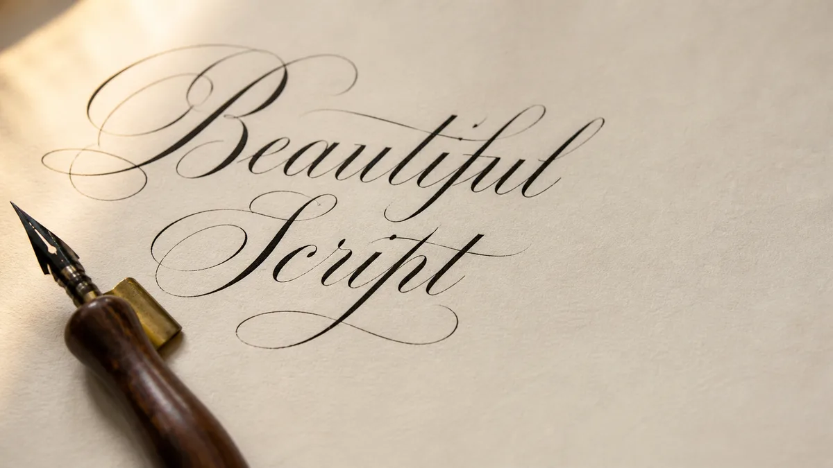
Engrosser's Script is the American formal pointed-pen hand most closely tied to IAMPETH, certificate work, and the Master Penman tradition. It grows out of Copperplate, but it is slower, more exacting, and often retouched after the first pass. That last detail matters. Engrosser's Script is not everyday writing. It is lettering built to survive close inspection.
What Engrosser's Script is
Engrosser's Script developed in the late 19th-century United States as penmen adapted the older English Roundhand tradition for diplomas, resolutions, certificates, formal invitations, and engrossed documents. The term "engrosser" originally referred to the person who prepared official documents in a finished hand. By the time American business colleges and penmanship schools were in full swing, the hand had become a discipline of its own.
The version most calligraphers study today was shaped by the Zaner-Bloser school and its circle of master penmen. E. A. Lupfer, who taught at the Zanerian College of Penmanship and later helped preserve the tradition through instruction and exemplars, is one of the names that appears again and again in IAMPETH study. His work shows the Engrosser's ideal: clean hairlines, deliberate shades, controlled spacing, and letterforms that feel drawn with a compass even when they were made with a flexible nib.
If you are coming from Copperplate calligraphy, Engrosser's Script will feel familiar at first. The slant is similar. The tools overlap. The lowercase letters still depend on ovals, compound curves, hairlines, and shaded downstrokes. But the working standard is different. Copperplate can be written as a beautiful formal hand. Engrosser's Script is often constructed, corrected, and polished until the page looks almost engraved.
How it differs from Copperplate, Spencerian, and ornamental penmanship
The fastest way to understand Engrosser's Script is to compare it with its nearest relatives. These scripts share pointed pens and pressure-release rhythm, but they were built for different jobs.
Engrosser's Script vs. Copperplate
Copperplate is the broad family name many people use for formal pointed-pen calligraphy descended from English Roundhand. Engrosser's Script is the American, late-19th-century formalization of that family. In practice, Copperplate is often written stroke by stroke with a flexible nib. Engrosser's is more likely to be drawn, adjusted, and retouched. A shade may be built with several passes. A hairline may be cleaned after it dries. A capital may be penciled first, then inked slowly.
That is why Engrosser's Script can look suspiciously perfect. It is supposed to. The goal is not the lively movement of a letter written at speed. The goal is a finished formal hand suitable for a certificate that someone might frame. If Copperplate is a disciplined performance, Engrosser's is more like miniature draftsmanship.
Engrosser's Script vs. Spencerian
Spencerian calligraphy was engineered for speed. Platt Rogers Spencer's system trained students to write business correspondence with rhythm, arm movement, and graceful elliptical forms. It can be astonishingly beautiful, but its beauty comes from motion. The letters are light, connected, and economical.
Engrosser's Script moves in the opposite direction. It slows down. It accepts pen lifts. It prizes symmetry over pace. Spencerian asks, "Can this be written beautifully all day?" Engrosser's asks, "Can this single line look flawless when photographed?" That is why many pointed-pen students do best when they learn Spencerian movement first, then graduate to Engrosser's precision.
Engrosser's Script vs. ornamental penmanship
Ornamental penmanship is the showier cousin. It uses the same pointed-pen control but adds birds, scrolls, cartouches, offhand flourishing, and capital forms that can fill half a page. Engrosser's Script may include flourished capitals, but the body text remains disciplined. Ornamental penmanship lets the penman perform. Engrosser's Script makes the penman behave.
Essential tools for Engrosser's Script
Engrosser's Script rewards fussy tools. A sturdy beginner nib can teach pressure control, but the script's very fine hairlines and dense shades are easier with a sharper, more responsive point. You do not need a cabinet full of vintage nibs to begin, but you do need paper and ink that will not sabotage you.
Very fine flexible nibs
Traditional recommendations include the Gillott 1068A, Hunt 22, Hunt 101, and Leonardt Principal EF. The Gillott 1068A is the aspirational nib many engrossing students hear about first, but it is not always easy to source. Since it is not currently in our product catalog, the closest practical affiliate options are the Hunt 101 Imperial nib for a softer American feel and the Leonardt Principal EF nib for very fine hairlines.
- Gillott 1068A: A classic fine flexible nib for skilled hands. Treat it as a later goal if you are still learning pressure control.
- Hunt 22: Often recommended for controlled shades and formal work, though availability varies.
- Hunt 101: Responsive and dramatic, with enough flex for Engrosser's practice once your touch is light.
- Leonardt Principal EF: A modern fine-point option for delicate hairlines and small formal lettering.
Oblique holder, ink, and paper
Use an oblique holder unless you have a specific reason not to. The flange helps align the nib with the script's slant so both tines meet the paper evenly. A straight holder can work for some hands, but an oblique holder removes one common source of ragged shades. For an affordable start, the General oblique holder is good enough to learn with before you consider a custom flange.
Ink should be dark, fluid, and predictable. Historical engrossers used iron gall because it produced fine hairlines and a permanent line. Modern students often use Diamine Registrar's ink, well-prepared sumi ink, or a carefully thinned black ink. Avoid thick craft inks for this hand. They make fine nibs feel blunt.
Paper matters just as much. Smooth Bristol is excellent for finished work because it can handle retouching and multiple passes. Rhodia is a good practice surface because it is smooth, consistent, and easy to find. If your nib catches, fibers pull, or hairlines feather, stop blaming your hand for a paper problem. For broader supply comparisons, see our pen comparison guide and use the practice sheet generator for slant and x-height drills.
Engrosser's Script Starter Kit
Everything you need to start Spencerian — fine-flex nibs, an oblique holder, iron gall ink, and a Spencerian-ruled pad
Hunt 101 Imperial Nib
More flexible than Nikko G, producing dramatic thick-thin contrast. Requires better pressure control but rewards skilled…
General-Purpose Oblique Holder with Brass Flange (2-pack)
A budget oblique holder with a multi-fit brass flange that bends to grip Hunt 22, Nikko G, Leonardt Principal and most o…
Diamine Registrar's Ink (Iron Gall) 30ml
Diamine's Registrar's Ink is one of the few modern iron gall inks still made to a traditional recipe. It writes a soft b…
Spencerian Practice Pad — 55° Slant Guide
A printed practice pad with the classic 55° Spencerian slant ruled across every page, so you can drill ovals, push-pulls…
We may earn a commission when you buy through these links. See all recommendations →
Letter construction: skeleton first, shades second
The biggest mistake beginners make is trying to create finished shades before they can draw a sound letter. Engrosser's Script depends on the same anatomy covered in our calligraphy alphabet guide: slant, x-height, baseline, waistline, ascenders, descenders, and spacing. But the first version of each letter should be almost boring. Draw the monoline skeleton. Check the proportions. Only then add weight.
A monoline skeleton is the bare path of the letter without pressure. For lowercase n, that means a hairline entrance, a shaded stem location, an overturn, a second stem, and a hairline exit. For lowercase o, it means a balanced oval whose right side is not pinched. For capitals, it means the main sweep, counter-space, and exit path before any dramatic shade is considered.
Skeleton
Hairline path first: entry, stem, shoulder, stem, exit.
Shade
Add pressure only on the two downstrokes.
Retouch
Clean small edges after the ink dries; do not redraw.
Once the skeleton works, shades can be built in two ways. The first is traditional pressure: press on the downstroke, release before the turn, and let the flexible nib make the swell. The second is retouching: add ink to widen or smooth a shade after the first stroke dries. Retouching is one of the clearest practical differences between Engrosser's and faster pointed-pen hands. A Spencerian word that needs retouching usually means the rhythm broke. An Engrosser's Script certificate may expect retouching as part of the finishing process.
One letter-formation flow: lowercase n
The lowercase n is a good test letter because it exposes slant, pressure, turns, spacing, and shade placement without hiding behind ornament. Work it larger than normal at first. A 5 mm x-height is not too big for study.
- Rule the page. Draw a baseline, waistline, and 52-55° slant lines, or print them with our practice sheet generator. Keep the page angle fixed.
- Draw the monoline path. With barely any pressure, trace the entrance stroke, first stem, rounded shoulder, second stem, and exit. Do not shade yet.
- Add the first shade. On the first downstroke, apply pressure gradually after the hairline entry, reach full shade in the middle, then release before the baseline.
- Shape the shoulder. Lift or lighten the pen through the turn. The shoulder should be round enough to breathe, not a corner.
- Add the second shade and retouch. Shade the second downstroke to match the first. After it dries, retouch only where the edge is uneven. If both shades need major repair, return to skeleton drills.
A sane practice path
The most efficient route to Engrosser's Script is not to start with Engrosser's Script. Start with pointed-pen fundamentals. Spencerian teaches the hand to move, to keep a light touch, and to release pressure cleanly. Copperplate teaches formal ovals, slant, and shade placement. Engrosser's asks you to combine those skills, then slow them down.
A practical path looks like this: first, study basic pointed-pen strokes and simple calligraphy styles so you understand where Engrosser's sits historically. Next, practice Spencerian arm movement until hairlines stop feeling fragile. Then study Copperplate ovals and compound curves. After that, move into Engrosser's skeletons, shade studies, and retouching. If you want historical context for why American schools valued these hands so highly, our calligraphy history guide is a useful companion.
Keep sessions short. Engrosser's Script punishes fatigue. Twenty minutes of focused shade matching is better than two hours of tense nib wrestling. Date your pages. Circle one good letter from each sheet. That little audit trains your eye, which is half the discipline.
Resources worth studying
The IAMPETH archive is the first stop. Look for Zanerian material, E. A. Lupfer exemplars, certificate writing, and lessons by Master Penmen. Do not just admire the pages. Trace the slant, compare shade widths, and study how much empty space the best writers leave inside ovals and capitals.
The Spencerian Saga series by Michael and Debra Sull, with historical work associated with Schin Loong, is also useful even though Spencerian is a different hand. It trains the eye to see American penmanship as a connected tradition rather than separate internet categories. Schin Loong's Master Penman work is especially valuable for students who want to understand how historical penmanship, flourishing, and modern teaching meet.
Use modern tools carefully. A digital reference can help you compare proportions, and our cursive generator can help visualize script mood for projects, but it cannot replace slow pen work. Engrosser's Script is learned through the pressure of metal on paper, the tiny pause before a turn, and the judgment to leave a stroke alone when extra ink would make it worse.