Affiliate Disclosure: This page contains affiliate links to products selected for practical fit. When you purchase through these links, we may earn a commission at no additional cost to you. Recommendations are based on product specifications, community feedback, and fit for common calligraphy needs. See our complete Tools Guide for detailed product reviews.
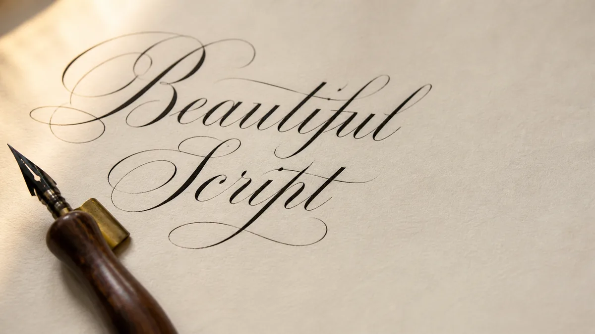
Copperplate calligraphy—also known as English Roundhand—is the pointed-pen script that defines elegance. With its delicate hairlines, dramatic swells, and precise 52–55° slant, Copperplate has graced wedding invitations, formal certificates, and engraved stationery for nearly three centuries. If you've ever seen swooping cursive that looks almost too perfect to be handwritten, you were probably looking at Copperplate. It sits at the formal end of our broader calligraphy styles guide, so it's worth knowing where it lands before you commit to the practice hours.
The History of Copperplate: From Engravers to IAMPETH
Copperplate emerged in 18th-century England, not from calligraphers but from engravers. Writing masters of the era commissioned skilled craftsmen to engrave their exemplars onto copper plates, which were then printed in copybooks sold across Europe and colonial America. The name "Copperplate" refers to those engraved plates, not the script itself—though the term stuck.
Because engraving tools could create impossibly fine lines, the printed exemplars set a standard of perfection that human hands could only approximate. Early practitioners used quill pens cut to flexible points, then later switched to steel nibs when mass production made them affordable in the 1830s. By the Victorian era, Copperplate had become the gold standard for formal correspondence and business writing.
What sets Copperplate apart from later scripts like Spencerian is its formal, almost architectural structure. Where Spencerian flows like a river, Copperplate stands at attention. The letterforms are rooted in geometry—ovals, not ellipses—and the capitals are ornate, often featuring elaborate flourishes that would make a Baroque architect proud.
Essential Tools for Copperplate Calligraphy
Copperplate is unforgiving of cheap tools. You need gear that responds to subtle pressure changes and doesn't fight you on every stroke.
Pointed Pen Nibs
The pointed pen nib is non-negotiable. Unlike broad-edge nibs that create uniform strokes, pointed nibs flex under pressure to produce the signature hairline-to-swell contrast. Beginners should start with moderately flexible nibs:
- Nikko G nib — The most popular beginner nib. It's flexible enough to create beautiful swells but sturdy enough that you won't accidentally split the tines. It also holds a lot of ink, so you're not constantly re-dipping.
- Zebra G nib — Similar to the Nikko G but slightly stiffer. Some calligraphers prefer it for cleaner hairlines.
- Hunt 101 — A classic American nib, softer than the Nikko G. It produces gorgeous swells but requires gentler handling.
- Brause EF66 nib — Very flexible, beloved by advanced scribes. Wait until you've mastered pressure control before trying this one.
Oblique Pen Holders
An oblique holder is the secret weapon of Copperplate. The angled flange positions the nib at the 52–55° slant naturally, so your hand doesn't have to contort. You can technically use a straight holder, but you'll be fighting physics the whole way. Popular oblique holders include the Speedball Oblique for beginners and custom-turned holders from artisans like John Neal Bookseller for those ready to invest.
Ink: Walnut, Iron Gall, or India
Copperplate demands fluid, fast-flowing ink. Thick inks clog flexible nibs and disrupt your rhythm. Historical scribes used iron-gall ink (which is slightly corrosive and fades to brown over decades), but modern calligraphers often prefer walnut ink for its smooth flow and rich sepia tone. India ink works too, though it dries faster and can gum up your nib if you pause mid-session. For more details, see our calligraphy inks guide.
Paper and Guidelines
Use smooth, bleed-resistant paper. Rhodia or HP 32lb laser paper are favorites—the nib glides without snagging. Print or draw slant guidelines at 52–55° with light pencil or use a lightbox under guideline sheets. Consistent slant is half the battle in Copperplate. Not sure which pointed nib to commit to? Use our pen comparison tool to compare pointed nibs side-by-side on flex, ink capacity, and beginner-friendliness, and generate a tailored Copperplate guideline sheet from the practice sheet generator.
The Copperplate Alphabet: Ovals, Slant, and Shading
Every Copperplate letter is built from a few foundational strokes: the full-pressure oval, the compound curve (which combines a hairline entry with a shaded downstroke), and the ascending/descending loop. The script's geometry is non-negotiable:
- Slant angle: 52–55° from the baseline. Not 45°, not 60°—that narrow range is what gives Copperplate its distinctive posture.
- X-height ratio: The body of lowercase letters (x-height) is typically 3 nib widths tall. Ascenders and descenders extend 2–3 nib widths beyond.
- Oval shape: True ovals, not ellipses. Think of a chicken egg standing upright, not lying on its side.
Lowercase letters like o, a, d, g all share that same oval core. Capital letters, especially C, G, L, S, are where Copperplate gets theatrical—flourishes extend in graceful arcs, and shading appears on every downward curve. Mastering the capital C alone can take weeks; it's a compound curve that spirals inward, swells at the base, and exits with a delicate hairline.
For a comprehensive breakdown of letter anatomy, see our calligraphy alphabet guide.
How to Practice Copperplate: Drills, Drills, Drills
Copperplate isn't learned by writing words. It's learned by drilling basic strokes until your muscle memory takes over. If you need help pacing the drills across several weeks, use the calligraphy practice routine as your loose schedule. Here's the practice hierarchy:
- Full-pressure ovals: Fill rows with perfect ovals at a 52° slant. Your goal: every oval identical in size, slant, and stroke weight. This is meditation, not art. Do 100 ovals before attempting a single letter.
- Compound curves: Start with a hairline upstroke, apply pressure on the downstroke to create a swell, release to hairline at the bottom. This is the DNA of Copperplate. If your compound curves are shaky, your letters will be shaky.
- Ascending and descending loops: Practice l, h, k, f, g, y, p. Loops should be graceful, not cramped, and they must maintain the 52° slant even at the top of the ascender.
- Letter groups: Once your strokes are solid, practice letters in families—oval letters (o, a, d, g, q), then straight letters (i, l, t), then tricky ones (s, r, z).
Use our practice sheet generator to create custom drills at the correct slant and spacing. Aim for 30–60 minutes of daily practice. Progress in Copperplate is glacial, but it's cumulative—every session builds muscle memory that doesn't fade.
Common Copperplate Mistakes (and How to Fix Them)
Even experienced calligraphers struggle with these Copperplate pitfalls:
1. Inconsistent Slant
If your letters lean in different directions, you're either not using guidelines or you're rotating your paper mid-word. Solution: Use a lightbox with printed slant lines and keep your paper stationary. Rotate your arm position, not the page.
2. Thick Upstrokes (Reverse Pressure)
If your hairlines are fat, you're pressing on the upstroke. Solution: Lighten your grip. The pen should almost float on upstrokes—only the tines' weight touches the paper. On downstrokes, apply gentle pressure. It's a whisper-to-speak dynamic, not off-to-on.
3. Boxy or Squashed Ovals
True ovals are round, not rectangular. If your o looks like a racetrack, you're flattening the curves. Solution: Slow down and focus on smooth, continuous motion. The oval should feel like drawing a figure-eight's top loop.
4. Racing Through Letters
Copperplate is not fast writing. If you're trying to match your everyday handwriting speed, you'll produce jagged, uneven letters. Solution: Slow down. Think of each stroke as a separate, intentional movement. Speed comes after months of practice, not before.
For more troubleshooting, check our common calligraphy mistakes guide and advanced techniques breakdown.
Related Scripts and Further Learning
Once you've built a foundation in Copperplate, you can explore related pointed-pen scripts like Spencerian calligraphy (more relaxed, business-oriented) or dive deeper into historical exemplars through IAMPETH's archives. If you're interested in other calligraphy styles, you might also enjoy Italic (a broad-edge script), modern calligraphy (which borrows Copperplate's bouncy baseline but breaks its geometric rules), monoline calligraphy (no flex, all rhythm), or faux calligraphy (which lets you fake the swells with a regular pen while you save up for nibs).
For those curious about the distinction between formal scripts and casual styles, see our calligraphy vs. hand lettering guide. And if you're building a practice routine, our stroke practice drills and monthly challenges calendar can keep you accountable.
Recommended Copperplate Tools and Supplies
Ready to start your Copperplate journey? This starter kit is the conversion-ready bundle for the script — pointed nib, oblique holder, sumi ink, dot-grid practice paper, and a guard sheet. Once you have it, head back to the calligraphy styles hub to plan your next script.