Affiliate Disclosure: This page contains affiliate links to products selected for practical fit. When you purchase through these links, we may earn a commission at no additional cost to you. Recommendations are based on product specifications, community feedback, and fit for common calligraphy needs. See our complete Tools Guide for detailed product reviews.
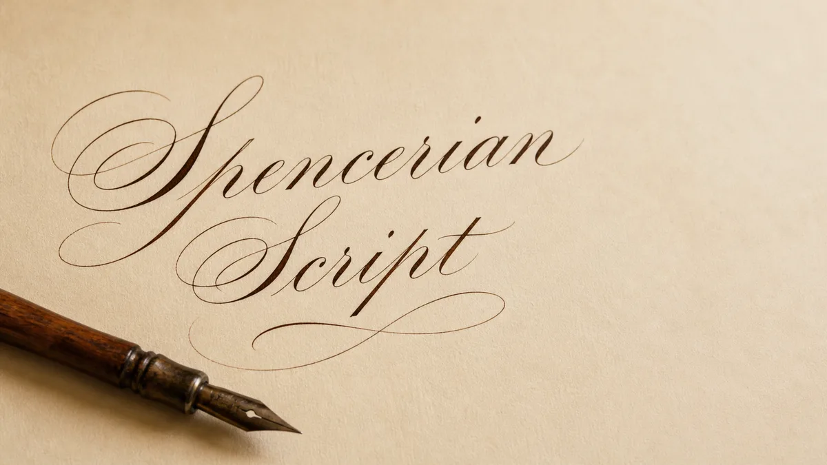
Spencerian calligraphy is the pointed-pen script that defined American penmanship for nearly a century. Created by Platt Rogers Spencer in the 1840s, this flowing, elliptical style became the standard for business correspondence, legal documents, and formal writing until typewriters took over. If you've ever admired the original Coca-Cola logo or vintage Ford script, you were looking at Spencerian's legacy. It's the more relaxed sibling of the formal pointed-pen scripts in our calligraphy styles guide.
The History of Spencerian: Platt Rogers Spencer and the American Dream
Platt Rogers Spencer didn't set out to revolutionize handwriting—he was obsessed with beauty in motion. Born in 1800, Spencer spent his youth in upstate New York sketching the curves of waves, leaves, and pebbles smoothed by Lake Erie. He noticed that nature's most graceful forms shared a common geometry: the ellipse.
By the 1840s, Spencer had distilled those observations into a complete writing system. Unlike Copperplate, which demanded strict geometric ovals and a formal 52° slant, Spencerian was built around the natural elliptical motion of the forearm. Spencer taught students to position their paper at an angle, rest their forearm on the desk, and let the arm's natural arc shape every letter. The result was a script that looked like it was skating across the page.
The script's dominance ended with the typewriter, but its influence never died. Master penman Michael Sull, along with collaborators including Debra Sull and historical insights from Schin Loong, revived authentic Spencerian instruction through the Spencerian Saga book series in the 1990s and 2000s. These volumes reproduce original exemplars, drill sequences, and capital-letter constructions that had been lost for decades. Today, Spencerian is taught at IAMPETH conventions and practiced by calligraphers worldwide.
What distinguishes Spencerian from other pointed-pen scripts is its rhythm. Where Copperplate stands at attention, Spencerian dances. The lowercase letters have looser loops, gentler slants (often 50–52°), and a bouncing baseline that gives text a lively, organic feel. It was designed to be written quickly without sacrificing beauty. Before you commit a page to someone else's name, preview the rhythm in the cursive name generator and mark where the long loops will fall.
Essential Tools for Spencerian Calligraphy
Spencerian demands the same core toolkit as Copperplate—pointed pen, flexible nib, fluid ink—but with subtle differences in preference and technique.
Pointed Pen Nibs
Spencerian scribes favor moderately flexible nibs that respond to light pressure. The goal is hairline-to-swell contrast without the extreme delicacy of engraver's nibs. Top choices:
- Zebra G nib — The most popular Spencerian nib. It's flexible enough for graceful swells but sturdy enough for confident speed. Many professionals use Zebra G exclusively.
- Nikko G nib — Slightly more flexible than the Zebra, with a smoother feel. It holds more ink and produces slightly thicker hairlines, which some scribes prefer for readability.
- Hunt 101 — A classic American nib, softer than both the Zebra and Nikko. It gives beautiful swells but requires a lighter touch. Ideal for those who've mastered pressure control.
- Brause EF66 nib — Very flexible, excellent for advanced Spencerian flourishes. Wait until you're comfortable with basic letterforms before trying this one.
Pen Holders: Straight vs. Oblique
Here's where Spencerian diverges from Copperplate tradition. Platt Rogers Spencer himself advocated for straight holders and angled paper positioning—he believed the natural arc of the arm should create the slant, not the pen. Many modern Spencerian practitioners follow this advice, angling their paper 45° to the left (for right-handers) and using a straight holder.
That said, oblique holders work perfectly fine for Spencerian, especially if you're already comfortable with one from Copperplate practice. The Speedball Oblique is a solid beginner choice. Try both and see which feels more natural.
Ink: Speed and Flow
Spencerian was designed for speed, so your ink needs to keep up. Thin, fast-flowing inks are essential. Walnut ink is a favorite—it flows beautifully, doesn't clog flexible nibs, and dries to a warm sepia tone. India ink works too, though it dries faster and can gum up your nib if you pause mid-session. For a deeper dive into ink choices, see our calligraphy inks guide.
Paper and Guidelines
Use smooth, coated paper that won't feather or bleed. Rhodia pads or HP 32lb laser paper are ideal. Print slant guidelines at 50–52° (slightly more relaxed than Copperplate's 52–55°) or use a lightbox to overlay guidelines beneath your writing surface. Choosing between flexible nibs is its own rabbit hole — use our pen comparison tool to compare flexible nibs side-by-side, then build a Spencerian-ruled guideline sheet in the practice sheet generator.
The Spencerian Alphabet: Ellipses, Loops, and Arm Motion
Every Spencerian letter is built from elliptical strokes that mirror the natural motion of the forearm. Unlike Copperplate's strict ovals, Spencerian ellipses are elongated, almost egg-shaped when viewed at the script's slant. This geometry creates the script's signature flowing rhythm.
Key structural principles:
- Slant angle: 50–52° from the baseline. Less rigid than Copperplate, but consistency is still critical.
- X-height ratio: Lowercase bodies are typically 3 nib widths tall, with ascenders and descenders extending 2–3 widths beyond. Capitals can be 5–6 nib widths tall.
- Elliptical ovals: The lowercase o, a, d, g are ellipses, not circles. Think of them as tilted ovals, longer top-to-bottom than side-to-side.
- Connected letters: Spencerian is meant to be written with minimal pen lifts. Letters connect via hairline ligatures, creating a continuous ribbon of ink.
Lowercase letters like n, m, h feature high, arcing loops that give Spencerian its bouncy character. The s is a graceful figure-eight-style stroke. Capital letters are where the script gets theatrical—the capital C, G, S spiral outward with flourishes that can extend well beyond the letter's base width.
For a comprehensive breakdown of letter anatomy, see our calligraphy alphabet guide.
How to Practice Spencerian: Arm Movement Over Finger Control
Spencerian isn't learned through finger dexterity—it's learned through whole-arm movement. Platt Rogers Spencer insisted that students master the arm's natural elliptical arc before attempting any letterforms. Here's the practice hierarchy:
- Elliptical drills: Fill pages with overlapping ellipses, moving your arm from the shoulder. Your wrist should stay relatively still; the motion comes from your forearm pivoting on the desk. Do 200 ellipses before writing a single letter.
- Compound curves with shading: Practice the fundamental Spencerian stroke—hairline entry, pressure on the downstroke, release to hairline at the exit. This is the DNA of every letter.
- Ascending and descending loops: Practice l, h, b, f, g, p, q, y. Loops should arc gracefully and maintain the 50–52° slant even at the top of the ascender.
- Letter families: Once your ellipses are smooth, practice letters in groups—oval letters (o, a, c, d, g, q), then straight letters (i, l, t, u), then compound letters (n, m, h, k).
- Word practice: Connect letters into simple words (minimum, mammoth, lullaby) that drill repetitive strokes. Focus on rhythm and consistent spacing.
Use our practice sheet generator to create custom drills at the correct slant and spacing. Aim for 30–60 minutes of daily practice. Spencer himself recommended short, focused sessions over marathon drills—muscle memory builds through consistency, not exhaustion.
Common Spencerian Mistakes (and How to Fix Them)
Even experienced calligraphers trip over these Spencerian pitfalls:
1. Finger Writing Instead of Arm Writing
If your letters are cramped, shaky, or inconsistent, you're probably moving your fingers instead of your arm. Solution: Tape a pencil to the back of your hand so it sticks out past your fingertips. Practice ellipses without letting the pencil hit the paper—this forces you to move from the shoulder.
2. Boxy Ellipses (Copperplate Ovals)
If your o looks round instead of elliptical, you're falling back into Copperplate habits. Solution: Tilt your paper more aggressively (45° for right-handers) and exaggerate the vertical elongation of your ovals. Spencerian ellipses should feel like stretched circles.
3. Inconsistent Baseline
Spencerian has a naturally bouncy baseline, but if your letters are jumping up and down randomly, you're losing control. Solution: Use ruled guidelines with a clear x-height marker. The baseline can undulate slightly, but the x-height should remain rock-solid consistent.
4. Over-Flourished Capitals
Spencerian capitals are ornate, but beginners often add loops and swirls that turn letters into tangled masses. Solution: Copy capitals directly from exemplars without adding your own flourishes. Master the standard forms first; personalization comes after you've internalized the structure.
For more troubleshooting, check our common calligraphy mistakes guide and advanced techniques breakdown.
Related Scripts and Further Learning
Once you've built a Spencerian foundation, you can explore its more formal cousin, Copperplate calligraphy, its broad-edge counterpart Italic, or dive into modern calligraphy, which borrows Spencerian's flowing baseline but breaks traditional slant and spacing rules. For lighter-weight options, see monoline calligraphy and faux calligraphy. If you're curious about the broader landscape, our calligraphy styles guide covers dozens of scripts.
For those interested in the practical application of Spencerian, see our calligraphy business guide (Spencerian is highly sought-after for wedding invitations) and our calligraphy vs. hand lettering breakdown. And if you're building a structured practice routine, our stroke practice drills and monthly challenges calendar will keep you accountable.
Recommended Spencerian Tools and Supplies
Ready to start your Spencerian journey? This starter kit is the conversion-ready bundle for the script — fine-flex nibs, an oblique holder, iron gall ink, and a Spencerian-ruled practice pad. From here, head back to the calligraphy styles hub to plan your next script.