A step-by-step beginner's guide to cursive handwriting — posture, basic strokes, every letter family, joining letters, common mistakes, and a 30-day practice plan you can actually finish.
18 min readBeginner Level
Table of Contents
Affiliate Disclosure: This page contains affiliate links to products selected for practical fit. When you purchase through these links, we may earn a commission at no additional cost to you. Recommendations are based on product specifications, community feedback, and fit for common calligraphy needs. See our complete Tools Guide for detailed product reviews.
How to Write in Cursive (Quick Answer)
To write in cursive, set up good posture and paper angle, learn the five basic strokes that every letter is built from, practice lowercase letters in families that share a shape, then join those letters with connecting strokes — keeping a single, consistent slant throughout.
Here is the whole workflow in order. Each step links to the detailed section below:
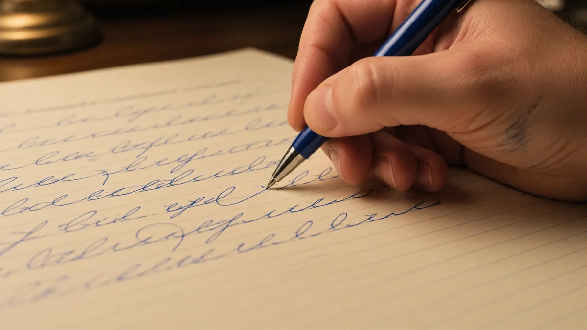
Set up your body and paper. Sit tall, tilt the page about 30°, and hold the pen with a relaxed grip so you write from the arm, not the fingers.
Master the five basic strokes. The undercurve, overcurve, oval, and ascending and descending loops make up every cursive letter.
Practice lowercase by letter family. Group letters that share a shape so muscle memory transfers from one to the next.
Add the uppercase letters. Learn capitals after lowercase, since you use them far less often.
Join letters with connecting strokes. Keep the pen moving and let the exit stroke of one letter flow into the next.
Expect legible, connected handwriting within a few weeks of short daily sessions, and a comfortable personal style within two to three months. Want a per-letter model to copy? The calligraphy alphabet reference shows every letterform, and you can preview any word in a flowing script with the cursive generator before you copy it by hand.
Why Bother Learning Cursive in 2026?
Cursive isn't a relic. It's the fastest way to write longhand by hand, and the act of forming connected letters genuinely helps your brain process information.
You probably landed here for one of three reasons. Maybe school never really taught you cursive and now you can't sign a check without feeling like a kid. Maybe you're a parent (or grandparent) trying to help a child whose curriculum dropped handwriting in second grade. Or maybe you're learning English and want your handwriting to look like the adults around you. Whatever brought you here, the path forward is the same — and it's shorter than you think.
Research published in the Journal of Motor Behavior has consistently shown that handwriting, especially the continuous-loop motion of cursive, recruits more motor planning regions than typing. A 2020 study from NTNU in Norway found measurably stronger memory consolidation in students who took notes by hand. You don't need to be a neuroscientist to feel it: when you slow down and write, ideas tend to stick.
What this guide will (and won't) do
We're focused on standard American cursive — the practical handwriting style used in day-to-day notes, letters, and signatures. If you want pointed-pen Copperplate or broad-edge Italic, head over to the calligraphy styles guide or our deeper beginner's guide to calligraphy instead. Cursive first, fancy stuff later.
Step 1: Posture, Paper Position, and Grip
Before you write a single letter, set up your body. Bad posture is the single biggest reason adults complain that their hand cramps after half a page. Sit so your feet are flat on the floor, hips slightly higher than your knees, and the desk hits you somewhere around mid-rib. Keep both forearms resting lightly on the desk — your writing arm should be free to slide, not pinned in place.
Paper position matters more than you think
Right-handed writers should tilt the top of the paper roughly 30° to the left. Left-handed writers tilt it 30° (or more) to the right, which keeps the wrist below the baseline and stops you from smudging fresh ink. If you're left-handed, our full left-handed calligraphy guide covers underwriter vs. overwriter grips, paper angle, and pen choices in much more detail.
The tripod grip — relaxed, not crushed
Hold the pen between thumb and index finger, resting it on the side of your middle finger. The pen should sit at roughly a 45° angle to the paper, pointing back toward your shoulder. The grip pressure test: if your knuckle turns white, you're squeezing too hard. Cursive flows from the shoulder and elbow, not from clenched fingertips.
The “ripe tomato” rule
Old-school penmanship teachers at IAMPETH (the International Association of Master Penmen, Engrossers and Teachers of Handwriting) use this cue: hold the pen the way you'd hold a ripe tomato — firm enough that it won't slip, gentle enough that you won't bruise it. Try it for one practice session and your hand fatigue will drop noticeably.
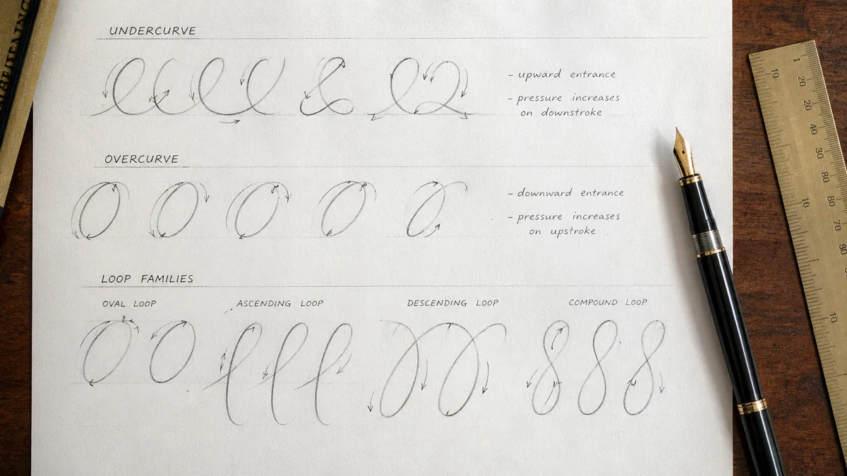
Step 2: Master the Five Basic Strokes
Every cursive letter is built from five repeating shapes. Drill these for 10 minutes a day for a week and most letters will already feel familiar before you ever try to write them.
The under-curve — a smooth upward swing that starts on the baseline and curves up to the midline. Think of it as the bottom of a bowl, lifting up to the right. This is the entry stroke for i, t, u, w, j, p, r, s.
The over-curve — the mirror image. Starts on the midline, arches over, and lands on the baseline. It opens letters like n, m, h, v, y, x.
The oval — a slanted egg shape, roughly 55° from horizontal. Practice it counter-clockwise and clockwise. Ovals form the body of o, a, c, d, e, g, q.
The slant line — a straight diagonal at the same 55° as the oval. Consistency of slant is what makes cursive look tidy rather than wobbly.
The loop — an extended slant line that comes back through itself, either above the midline (l, h, b, k, f) or below the baseline (g, j, y, z, f).
Spend a full sheet on each stroke before you move on. Don't race. The goal isn't to fill the page — it's to make the twentieth stroke look like the first. If you want ruled practice paper with the right baseline, midline, and ascender lines already drawn, our custom practice sheet generator will print exactly what you need.
Why slant consistency matters more than letter shape
Master penman Michael Sull has noted in his books and IAMPETH workshops that uneven slant is the single biggest tell of an untrained hand. The brain reads inconsistent slant as “messy” even when individual letters are correctly formed. Pick one slant angle (most American cursive uses 50–55°) and commit. Lined slant guides — included on our practice sheets — will train your eye in a week.
Step 3: Lowercase Letters, Grouped by Family
Don't learn the alphabet in alphabetical order. That's a curriculum-design mistake that's been confusing kids for a century. Group letters by the strokes they share, and you'll learn five letters in the time it usually takes to learn one.
Family 1: The straight family — i, l, t
Start here. These are the simplest letters and they teach you the entry/exit stroke rhythm of cursive without forcing you to lift your pen. i is an under-curve, a slant down, an under-curve out, and a dot added last. l is a tall loop, t is a slant up, slant down, with the cross-bar added at the end. See the full breakdown for cursive l and cursive t.
Family 2: The hump family — n, m, h, u
Built on over-curves and under-curves. n is one hump; m is two; h adds a tall loop entry; u flips the humps upside down. Practice them as a chain: nnnn, mmmm, uuuu. The repetition trains your hand to come back to the baseline at the same height every time.
Family 3: The oval family — o, c, e, a, d, g, q
All seven of these letters start with a counter-clockwise oval. c is just an incomplete oval. e is a small loop opening into one. a, d, g, qare ovals with a tail attached. Master the oval and you've essentially learned a third of the alphabet. Detailed walkthroughs live at cursive o and cursive a.
Family 4: The tricky middles — s, r, f
These letters give beginners the most grief because they don't look anything like their printed counterparts. Cursive sis a single closed shape that resembles a lowercase printed l with a belly. Cursive r has a small shoulder bump that throws people off. f is the only letter with both an upper and a lower loop. Walk through cursive s step-by-step if it keeps tripping you up.
Family 5: Descenders & outliers — b, p, k, x, z, v, w, y, j
The leftovers. b, v, wshare a tricky high exit stroke that throws joins into chaos if you let it sit too high — we'll fix that in the joining section. p, j, y, g are descenders (they dip below the baseline). khas a small decorative loop that's often the first letter people start to flourish. x and z are once-a-page letters in real life — drill them last. The full A–Z library at cursive letters A–Z has stroke order for every letter.
Drill order that actually works
Practice each family for two days before moving on. By day 10 you'll have all 26 lowercase letters covered. Resist the urge to write words until each family flows without hesitation — words built on shaky letters just bake the wobble in.
Step 4: An Honest Take on Uppercase Letters
Cursive capitals are the showpiece of the alphabet — and also the part most adults never fully learn. Here's the secret nobody tells you: in everyday cursive, you only need to write capitals well enough to start a sentence and sign your name. That's about a dozen letters in heavy rotation.
Capitals don't connect to the lowercase letter that follows them — there's a tiny visual gap. That single rule makes them much more forgiving than lowercase. You can afford a little flair on a capital that you couldn't get away with mid-word. The full breakdown — including stroke order, common variants, and the elaborate Spencerian forms — lives in our cursive capital letters guide.
Don't copy fancy “Q” charts
You'll see decorative cursive Q's online that look like the number 2. That's from the Palmer Method — beautiful, but completely unreadable to anyone under 50. Use a more modern Q (looks like a printed Q with a flourish) unless you're writing for an audience that grew up on Palmer.
Step 5: Joining Letters Without Breaking Flow
This is the part of cursive that turns it from fancy printing into actual handwriting. Every lowercase letter has an entry stroke (where it begins) and an exit stroke (where the next letter picks up). When the exit of one letter aligns with the entry of the next, the join is invisible and the word flows.
Most joins are easy: the exit stroke lands on the baseline and the next letter starts right there with an under-curve. Trouble shows up with the high-exit letters — b, o, v, w — which finish near the midline rather than the baseline. The next letter has to start from the midline too, otherwise you get a weird dip.
Three joins worth drilling separately
br, or, wr— the “r” has to start high. Treat the join like a small horizontal bridge, then drop into the r's shoulder.
oo, oa, oe— two ovals in a row. Keep them the same size or the word looks like it's shrinking.
ws, vs, bs— a high-exit letter followed by an s. Glide into the s from the midline; don't drop to the baseline first.
Practice these as nonsense syllables: brob, oroar, wsws. It feels silly, but isolating the join is the fastest way to fix it. When you're ready for real-word drills, paste any phrase into our cursive handwriting generator and trace the output a few times.
Step 6: Common Mistakes (and How to Fix Them)
After teaching this stuff for a while, the same five mistakes show up over and over. Catch them early and you'll save yourself months of un-learning.
Finger-writing instead of arm-writing. If your fingers are doing all the work, your letters will be tiny and your hand will cramp. Move from the shoulder.
Inconsistent slant. Pick one angle (50–55° works for most adults) and stick with it. Use slant guides on your practice sheets until your eye knows the angle without help.
Lifting the pen mid-letter.The whole point of cursive is the connected stroke. If you're lifting after every loop, you're writing slow print, not cursive.
Letters that drift off the baseline. Use ruled paper, every time, for at least the first three months. Free-handing on blank paper is a graduation, not a starting point.
Going too fast.Speed comes from confidence, and confidence comes from a thousand slow, correct repetitions. There's no shortcut.
Use this table to match the problem you see in your own handwriting to the fix and the worksheet that drills it:
For a more thorough audit of pen pressure, spacing, and posture issues, our deep dive on common calligraphy mistakes covers the diagnostic side — what a wobbly stroke actually means about what your hand is doing.
Step 7: A 30-Day Practice Routine That Works
Twenty minutes a day for thirty days. That's the whole plan. Skip a day, fine — but don't skip two in a row.
Dr. K. Anders Ericsson's research on deliberate practice — the same body of work that Peak and Outliers popularized — is unambiguous on this point: short, focused sessions with feedback beat long, mindless ones every single time. Twenty minutes is enough to build muscle memory; an hour is enough to bake in fatigue mistakes.
Week-by-week breakdown
Days 1–7: Strokes and the straight family. Five minutes of warm-up ovals and slant lines, fifteen minutes on i/l/t.
Days 8–14: Hump and oval families. Add n/m/h/u, then o/c/e/a/d/g/q. Start writing simple three-letter words: cat, dog, mom.
Days 15–21: Tricky letters and joins. Add s/r/f and the descender family. Drill the br, oo, and ws joins from Step 5.
Days 22–28: Capitals and short sentences. Add the dozen capitals you actually use. Write your name, address, and a sentence each day.
Days 29–30: Real writing. Copy a paragraph from a book. Date the page. Compare it to day 1 and feel proud.
For a structured calendar with daily prompts already laid out, our 30-day calligraphy challenge calendar works equally well for cursive — it gives you a different focus letter or stroke each day so you don't have to think about what to drill.
Date every page
This sounds trivial. It isn't. Cursive improvement is gradual and you won't notice it day to day. Putting the date on every practice sheet means three weeks in, you can flip back to day 1 and see exactly how far you've come. That visible progress is the single best motivator I know of.
Tools, Paper, and Helpful Apps
You don't need fancy gear. The whole appeal of cursive is that you can practice it with a ballpoint and a notebook. That said, a few small upgrades make a real difference.
Pen: a smooth medium-tip rollerball or fountain pen. Pilot G-2 (0.7), Uni-ball Vision, or any entry-level fountain pen like the Pilot Metropolitan.
Paper: ruled or dotted paper with a clear baseline. Rhodia, Clairefontaine, or any decent composition notebook works. Thin copy paper feathers; avoid it.
Practice sheets: generate your own at the right size and slant with our practice sheet tool — name, alphabet, or full sentence templates with proper baseline, midline, and slant guides.
Visualization helper: the cursive handwriting generator shows any phrase in a clean cursive font at any size — handy for tracing or for checking your own letterforms against a reference.
Signature practice: the cursive name generator previews your name in eighteen different scripts, which is genuinely useful when you're developing a personal signature style.
Where to Go After You've Got the Basics
Once you can write a paragraph in clean, consistent cursive — usually somewhere around week six or seven of regular practice — you've got real options. Some directions worth considering:
Push toward true calligraphy with our beginner's guide to calligraphy — broad-edge and pointed-pen techniques that build directly on cursive fundamentals.
Explore historical scripts in our calligraphy styles overview — Spencerian, Copperplate, Italic, and modern brush hands all share roots with the cursive you just learned.
The honest closing thought: cursive is a small skill that pays back disproportionately. A neat, fast handwriting feels good in a way that's hard to explain until you have it. Thirty days from now, you can have it. Pick up the pen.
How long does it take to learn cursive as an adult?▾
Most adults can produce legible, consistent cursive within 4–6 weeks of daily 20-minute practice. Real fluency — writing a paragraph without thinking about letterforms — usually shows up around the 8–12 week mark. The biggest accelerator isn't talent; it's frequency. Research on motor skill acquisition published in the Journal of Motor Behavior consistently shows that short daily sessions outperform longer weekly ones by a wide margin. If you can commit to 20 minutes a day for 30 days using our 30-day routine, you'll have a working cursive hand.
Should I learn cursive or print first?▾
If you can already print legibly, go straight to cursive. Print and cursive use different motor patterns — cursive flows from the shoulder and uses connected strokes, while print is built letter-by-letter from the fingers. There's no transferable foundation you'd be missing by skipping print first. For young children who are still building fine-motor control, most occupational therapists recommend starting with print around age 5–6, then layering cursive in around age 7–8 once basic letter shapes are reliable. Adults relearning don't need that progression.
What's the best paper and pen for learning cursive?▾
Use ruled paper with a visible baseline and midline — composition notebooks, Rhodia pads, or printable practice sheets all work. Avoid blank paper for at least the first three months; it makes inconsistent slant and drifting lines impossible to spot. For pens, a smooth medium-tip rollerball (Pilot G-2 0.7, Uni-ball Vision) or an entry-level fountain pen like the Pilot Metropolitan gives you good ink flow without forcing you to press hard. Skip cheap ballpoints — they require so much pressure that they bake in finger-writing habits.
Why do my cursive letters look uneven and wobbly?▾
Three usual suspects. First, slant: most untrained cursive has letters tilting at different angles, which the brain reads as 'messy' even when individual letters are correct. Pick one slant (50–55° from vertical works for most adults) and use slant guides until your eye locks on. Second, finger-writing instead of arm-writing — small, cramped letters mean your fingers are doing the work; cursive should move from the shoulder. Third, going too fast. Confident speed comes from a thousand slow, correct repetitions, not from rushing the early ones.
How do I write cursive if I'm left-handed?▾
Left-handed cursive is absolutely doable, but the setup differs. Tilt your paper 30° or more to the right (opposite of right-handers). Keep your wrist below the baseline rather than hooked above it — the hooked grip is the main reason lefties end up smudging fresh ink. Use quick-drying ink (most rollerballs and gel pens dry in 1–2 seconds). The full breakdown of underwriter vs. overwriter grips, paper position, and pen recommendations lives in our dedicated left-handed calligraphy guide. With proper setup, lefties write cursive just as fast and cleanly as righties.
Are cursive capital letters worth learning?▾
You only need about a dozen of them for everyday use. Capitals start sentences, names, addresses, and signatures — that's 90% of where they show up. The good news: cursive capitals don't connect to the lowercase letter that follows, which makes them more forgiving than lowercase letters. You can even modify or simplify them without breaking the flow of the word. Skip the elaborate Spencerian forms (the fancy Q that looks like a 2 is unreadable to most modern readers). Stick with modern, clearly-readable capital forms from our cursive capital letters guide.
What's the difference between cursive, calligraphy, and hand lettering?▾
Cursive is everyday connected handwriting — practical, fast, written with any pen. Calligraphy is a skilled craft using specialized tools (broad-edge nibs, pointed pens) that create thick-and-thin contrast through pen angle or pressure. Hand lettering is the art of drawing letters as illustrations, often built up slowly with multiple strokes and not meant to be 'written' in real time. Cursive is the foundation for both. The shoulder-driven movement, slant consistency, and stroke mechanics you build in cursive transfer directly to calligraphy and lettering when you're ready.
Can I teach my child to write in cursive at home?▾
Yes, and many parents are doing exactly this since most US schools dropped cursive instruction after 2010. Start around age 7–8, once a child has stable print handwriting. Use the family-grouped order from our guide (i/l/t first, then n/m/h/u, then ovals) rather than alphabetical order — it's much faster. Keep sessions short, 10–15 minutes max for younger kids, and use printable practice sheets with clear baselines. Make it routine but not punitive: a daily five-minute warm-up before homework works better than long weekend marathons.
Do I really need to drill basic strokes before writing letters?▾
Yes — and skipping this step is the single most common reason adults stall out. Every cursive letter is built from five repeating shapes: under-curves, over-curves, ovals, slant lines, and loops. If those base shapes aren't consistent, no amount of letter-level practice will fix the underlying wobble. IAMPETH (the International Association of Master Penmen) has taught stroke-first instruction for over a century, and modern motor learning research backs it up. One week of stroke drills makes the next three weeks of letter practice dramatically more productive.
Is cursive faster than printing?▾
For trained writers, yes — usually 20–30% faster, mostly because you're not lifting the pen between letters. That said, untrained or rusty cursive is often slower than print because the writer is thinking about each letterform. Speed is a downstream effect of fluency, not a starting goal. Once you can write a sentence in cursive without consciously thinking about individual letters (typically around week 6–8 of daily practice), the speed advantage shows up automatically. Don't try to write fast early on; focus on consistency and let speed emerge.
Continue Reading
Related Articles
Continue your calligraphy journey with these guides