The eight fundamental strokes that build every script — entrance, hairline, shaded downstroke, oval, compound curve, overturn, underturn, and loops — with per-stroke drills and a 25-minute daily routine.
14 min readIntermediate Level
Table of Contents
Affiliate Disclosure: This page contains affiliate links to products selected for practical fit. When you purchase through these links, we may earn a commission at no additional cost to you. Recommendations are based on product specifications, community feedback, and fit for common calligraphy needs. See our complete Tools Guide for detailed product reviews.
Why Stroke Drills Are Non-Negotiable
Letters are not the unit of calligraphy. Strokes are. Every script you admire — Copperplate, Spencerian, Italic, modern brush — is assembled from a small set of repeating shapes. Drill the shapes and the alphabet falls out almost for free. Skip them and your letters will always look like a wobble of compromises.
Edward Johnston, the man who effectively rebooted Western calligraphy in 1906 with Writing & Illuminating, & Lettering, opened his teaching with stroke practice before he ever showed a student a finished alphabet. The International Association of Master Penmen (IAMPETH) still teaches the Engrosser's Script tradition the same way: weeks of ovals and compound curves before a single lowercase a. They are not being precious. They are short-cutting your muscle memory.
If you are brand new, work through the beginner's guide first to set up your tools and posture, then come back here. If your letters already look recognisable but feel uneven, this is exactly the page you want. The eight strokes below are the building blocks of nearly every Western pointed-pen and broad-edge script. Print yourself a stack of guidelines from the practice sheet generator and we will work through them in order. For a weekly rhythm that keeps drills, letters, and finished words in balance, keep the calligraphy practice guide nearby.
What "basic strokes" actually means
In the Copperplate / Engrosser's tradition, the "basic strokes" are the seven or eight minim shapes that combine to form every minuscule letter. In broad-edge hands like Italic, the underlying set is similar but the pen behaviour is different — you get contrast from angle, not pressure. The drills below work for both traditions; only the tool changes.
Warm Up Before You Drill
Cold hands write cold lines. Before you uncap a nib, spend three to five minutes on movement drills with a pencil or a cheap pen. The point is not to make anything beautiful — it is to remind your shoulder that it owns the long strokes and your fingers only steer the short ones. Skipping warm-ups is the single most common reason a practice session goes sideways in the first ten minutes.
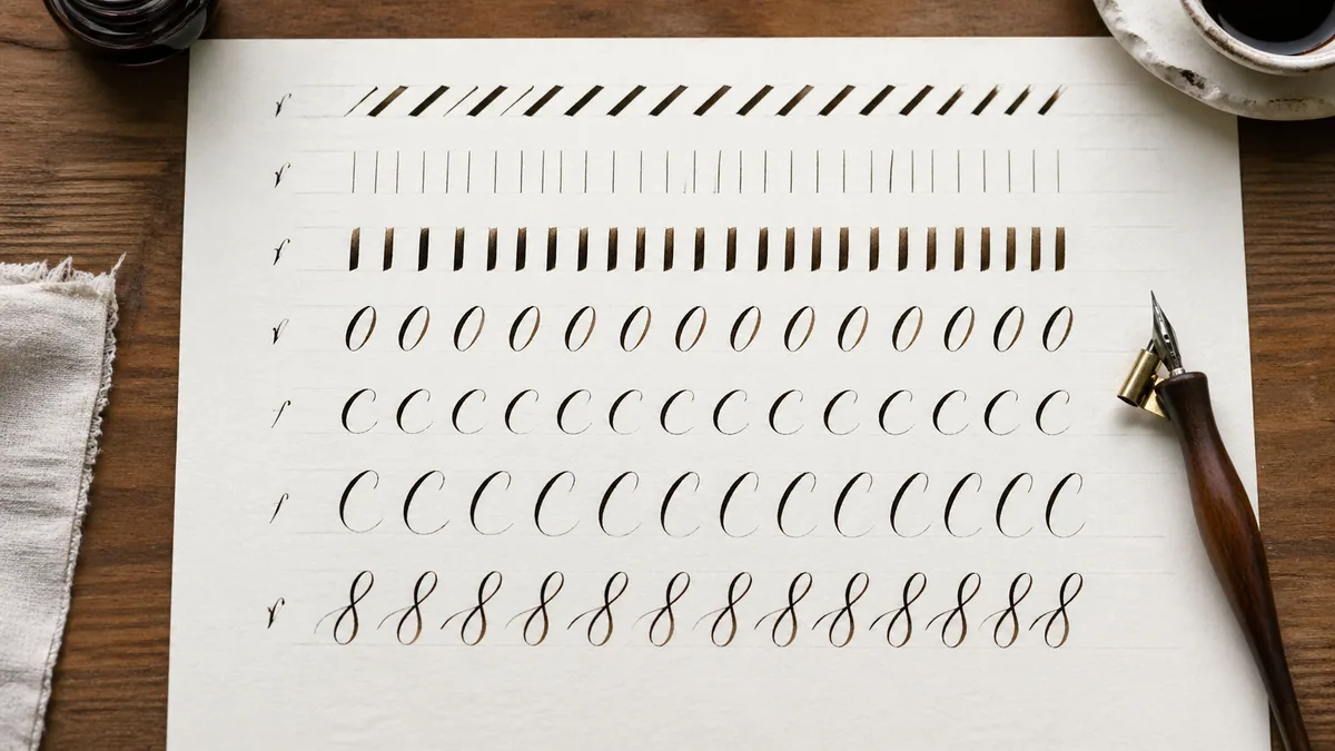
Fill half a page with parallel diagonal lines at your script's slant (typically 52° for Copperplate, 5°–10° for Italic). Move from the elbow.
Fill the other half with continuous overlapping ovals. Do not lift the pen for at least ten ovals in a row.
Switch to your real pen and ink. Lay down ten slow, light hairlines just to confirm the ink is flowing and the nib is seated.
The two-minute breath check
Watch a beginner during a downstroke and you will often see them hold their breath. Pressure tracks tension. Before each shaded stroke, exhale on the down. It sounds absurd; it works. This is the same breath-and-stroke pairing taught in East Asian brush traditions, and the motor learning literature consistently links steady respiration with smoother fine-motor output.
1. The Entrance Stroke (Lead-In)
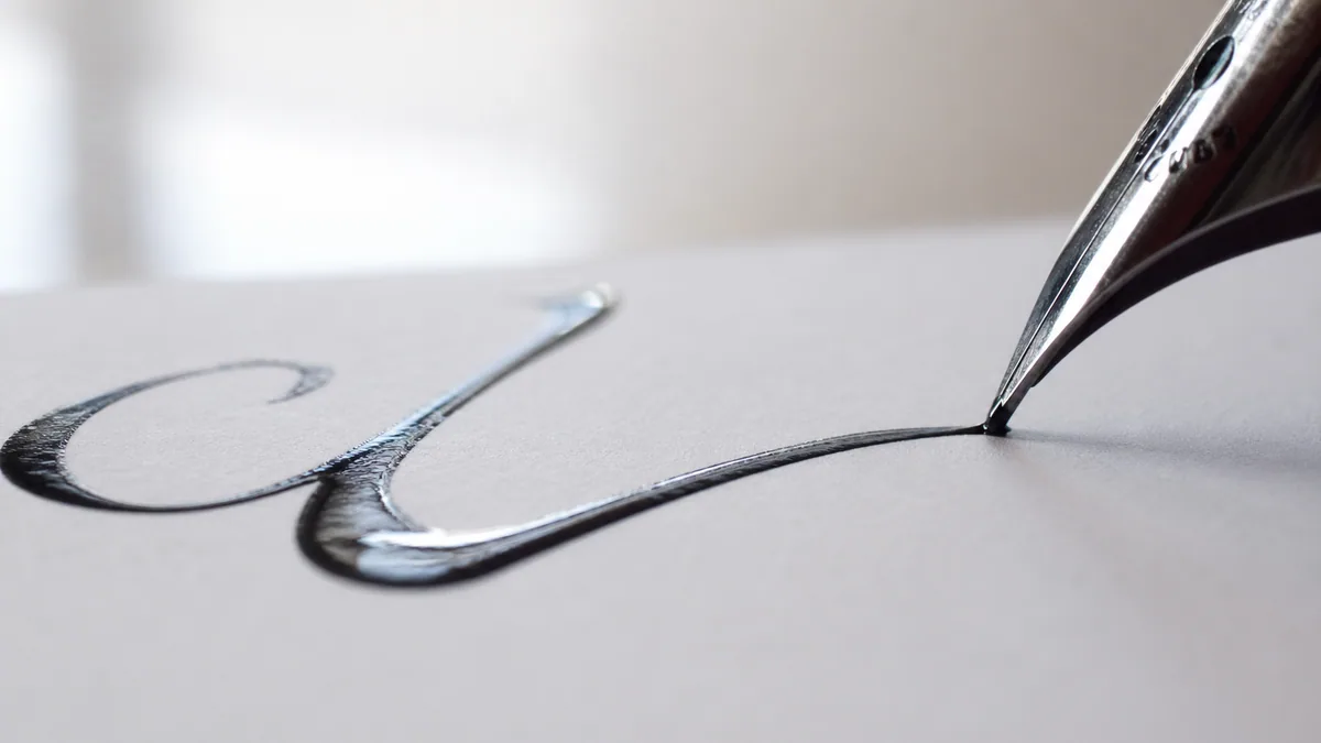
The entrance stroke is the short hairline that begins almost every minuscule letter — the little ramp that lifts off the baseline before the body of the letter starts. In Copperplate it is a gentle upward curve from the baseline to the waistline; in Italic it is a brief diagonal lead-in off the previous letter. It looks trivial. It is not. The entrance sets the rhythm and slant of everything that follows.
You will see entrance strokes in i, m, n, r, u, v, w, x and most of the other lowercase letters. If your entrances are inconsistent, your letter spacing will fight you forever — see the letter spacing guide for why.
Common errors
Starting with a fat blob (you pressed before moving), entering at the wrong angle (the rest of the letter then has to compensate), and entering too long so the next letter sits too far away. Lift the pen cleanly off the page at the top of the entrance — do not drag through into the next stroke without a thought.
Drill routine
Draw a baseline and waistline 5 mm apart on practice paper.
Make 30 entrance strokes in a row, all at the same slant, all touching the waistline at the same height.
Mark with a coloured pen any three that match each other most closely. Those are your reference.
Repeat the page until at least 20 of the 30 match your reference.
2. The Hairline Upstroke
The hairline is the thin line that climbs from the baseline to the waistline (or higher) under almost no pressure. With a pointed pen the tines must stay closed; the slightest push will spring them open and ruin the line. With a broad-edge pen the hairline is the natural product of moving parallel to the nib edge. Either way, the hairline is the single best diagnostic for whether you are actually relaxed.
Hairlines connect everything. Every transition from a downstroke into the next letter is a hairline. If yours wobble, that wobble will be magnified across an entire word. Choosing a flexible nib that suits your pressure helps — see the guide to calligraphy pens for nib recommendations by experience level.
Common errors
Catching the paper because you pushed slightly into the tines, ink starvation halfway up the stroke (your nib needs re-dipping or the reservoir is too full and surface tension is fighting you), and curving when you meant to go straight. A wobbly hairline is almost never the nib — it is grip pressure. Loosen your fingers until the pen feels like it might fall.
Drill routine
Fill a full row with 25 parallel hairlines from baseline to waistline, all the same slant.
Fill the next row with hairlines from baseline to ascender line — twice as long, same pressure.
Do one row of overlapping hairlines (each starts halfway up the previous one). Any catch or skip is a pressure problem; lighten up.
3. The Shaded Downstroke
The shaded downstroke is the thick vertical (or near-vertical) line that gives Copperplate and Engrosser's its dramatic contrast. With a pointed pen you get shading by pressing on the way down, opening the tines so more ink flows. With a broad-edge pen the same direction simply presents the full nib width to the page. This stroke is the spine of letters like b, d, h, k, l, p, t and the body of nearly every numeral.
The Engrosser's tradition — codified in the late 19th century by penmen like Louis Madarasz and E.A. Lupfer and preserved today through IAMPETH — treats the shaded downstroke as the showpiece of the entire script. Pressure should ramp on at the top, hold steady through the middle, and ramp off cleanly at the bottom. If you can master that single envelope, half the letterforms come for free.
The pressure envelope
Think of the shaded stroke in three phases: attack (light, then increasing pressure for the top 15–20% of the stroke), sustain (constant maximum pressure through the middle), and release (steadily decreasing pressure for the final 15–20%, ending in a clean point). If the bottom of your downstroke ends abruptly, you released too late. If it tapers too early, you released too soon.
Common errors
Splitting the tines so wide that ink pools and railroads (two parallel lines with white in between), uneven shade because you wobbled mid-stroke, and hooking the bottom because you curved out of the stroke before fully releasing pressure. Railroading specifically can also wreck a soft nib like a Gillott 303 — back off the pressure.
Drill routine
Make 20 shaded downstrokes from waistline to baseline, all the same width at the thickest point.
Repeat with stems from ascender line to baseline. Pay attention to keeping the maximum width consistent over the longer travel.
Alternate one hairline, one shaded, one hairline, one shaded across a row. This trains the pressure switch — the hardest motor skill in pointed-pen work.
4. The Oval
The oval is the parent shape of a, c, d, e, g, o, q and most uppercase letters with curved bowls. A correct calligraphic oval is not an egg and not a circle — it is a slanted ellipse with the long axis matching the script's slant. The shading typically falls on the left side of the oval (about the 7-to-11 o'clock arc on a clock face), tapering to hairlines top and bottom.
Most beginners draw ovals as two arcs that fail to meet, which produces lopsided letters. Practising continuous overlapping ovals — as taught in the Palmer and Zaner-Bloser business writing traditions — fixes this faster than anything else. You can see the oval at work across every script in the calligraphy styles overview and the calligraphy alphabet guide.
Common errors
Egg-shaped ovals (one end fatter than the other), drifting slant so each oval points a different direction, and visible pen lifts at the top or bottom where the two halves meet. The oval should look like one continuous motion even if you secretly drew it in two strokes.
Drill routine
Draw 50 continuous overlapping ovals across the page without lifting the pen. Yes, fifty.
Draw 20 isolated ovals, each touching baseline and waistline. Mark the three best.
Draw 20 reverse ovals (counter-clockwise). This is your a and g bowl direction — most learners ignore it.
5. The Compound Curve
The compound curve is an overturn followed immediately by an underturn — a graceful S-shape inside the x-height. It is the characteristic stroke of letters like n (when you treat its second arch as part of the connection) and shows up explicitly in v, w and several uppercase forms. It is also the single most useful stroke for diagnosing whether your shading and unshading are happening at the right moments.
Get the compound curve fluent and you will feel a very specific click: pressure rising as the pen comes down and over, then releasing just as the pen turns to come back up. That timing is the heartbeat of every script that uses the underlying motion.
Common errors
Pressing through the bottom of the curve instead of releasing (creates a dark blot at the transition), and producing a lopsided S where the top arch and bottom arch are different sizes. Symmetry is the win condition here.
Drill routine
Draw 20 compound curves across a single row, all the same height and slant.
Connect three compound curves in a chain without lifting the pen. This is essentially the body of mmm.
Slow the speed by half and repeat. Compound curves are usually wobbly because you are rushing.
6. The Overturn
The overturn is a hairline upstroke that curves over at the top, then descends as a shaded downstroke. Think of the first arch of an n or m. It is the mirror partner of the underturn (next stroke). The transition at the top should be smooth — no corner, no pause — and the shading should ramp on as the pen tips into the descent.
Most arched letters in the lowercase live and die on the overturn. If you are seeing inconsistent letter heights or wonky m and n shapes, the overturn is almost always the culprit. This is also one of the most reviewed strokes in the common calligraphy mistakes breakdown.
Common errors
A pointed corner at the top of the arch (you stopped instead of curving), shading that starts too early and bleeds into the curve, and arches that flatten out into table-tops instead of soft domes.
Drill routine
Draw 25 overturns in a row, all the same width and height.
Chain three overturns into a row of arches and verify the gaps between arches are equal.
Draw an overturn slowly, deliberately rolling pressure on only after the apex of the curve.
7. The Underturn
The underturn is the reverse: a shaded downstroke that releases pressure as it curves at the bottom and exits as a hairline. It is the second arch of an n, the body of u, and the foot of countless other letters. Where the overturn tests onset of pressure, the underturn tests release — and most beginners are far worse at releasing than at pressing.
You are doing it right when…
…the bottom of the curve is a smooth transition with no visible pressure point, the exit hairline matches the thickness of every other hairline on the page, and the curve sits exactly on the baseline rather than above or below it. If all three are true, your release is clean.
Common errors
Releasing too late so the curve has a thick bottom (looks like a hook), releasing too early so the stroke goes thin before the curve, and bouncing off the baseline so the underturn ends below the writing line.
Drill routine
Draw 25 underturns in a row, all the same width and depth.
Pair each underturn with an overturn beside it — verify they are mirror images.
Write rows of u u u u using only the underturn motion plus an entrance stroke.
8. Ascending & Descending Loops
Loops are the long, looping shapes that travel above the waistline (ascenders: b, f, h, k, l) or below the baseline (descenders: f, g, j, p, q, y, z). An ascending loop is a hairline that climbs to the ascender line, curves over, and returns as a shaded downstroke. A descending loop is the reverse below the baseline. Together they give a script its rhythm and vertical interest, and they are the most likely strokes to embarrass you in front of a finished piece.
Loops also expose your paper choice. Long thin lines on a fibrous sheet feather; long shaded strokes on cheap paper bleed. If your loops keep failing despite good technique, check your paper against the recommendations in the paper types guide before blaming your hand.
Common errors
Pinched loops with no white space inside (unreadable when adjacent loops collide), loops that lean at a different angle than the body of the letters, and loops where the cross-over point sits above or below the x-height instead of right on it.
Drill routine
Draw 20 ascending loops, all the same height and width.
Draw 20 descending loops directly underneath, mirroring the size.
Combine: write a row of l y l y l y to chain ascender and descender loops in alternation.
A 25-Minute Practice Routine That Actually Works
Anders Ericsson's research on deliberate practice — the same body of work behind the much-misquoted "10,000 hours" idea — is consistent on three points: practice must target a specific weakness, must include immediate feedback, and must be done at the edge of current ability rather than the comfortable middle. The routine below applies all three to stroke drills.
Warm-up (3 minutes). Pencil drills on a scrap sheet: parallel slant lines, then continuous ovals. Do not pick up your real pen yet.
Targeted drill (10 minutes). Pick one of the eight strokes — the worst one from your last session — and fill a full page. Mark your three best repetitions.
Pair drill (5 minutes). Combine that stroke with the one it most often connects to (e.g. entrance + hairline; overturn + shaded). One row of pairs.
Application (5 minutes). Write three letters that are mostly built from today's stroke. Do not write words yet; the goal is to feel the stroke inside a letter context.
Cool-down review (2 minutes). Date the page. Note in pencil at the bottom which stroke you will tackle tomorrow and why.
Print real guidelines, every session
Practising on blank or unruled paper is the second-fastest way to ingrain bad habits (right after "practising on cheap paper"). Generate a fresh batch of guideline sheets for each script and slant from the practice sheet generator — set baseline, x-height, ascender, descender, and slant lines so your eye has something to measure against.
Want a pre-built progression instead of designing your own? Run through the 30-day challenges calendar, which alternates stroke drills with letter and word days so you do not burn out on a single repeating shape. Many learners also use the cursive handwriting generator to print exemplar words at the right size for tracing during the application phase.
Self-Critique Without Spiraling
The fastest way to plateau is to fill a page, decide it is "okay", and turn the sheet. The fastest way to quit is to fill a page, decide it is terrible, and conclude you have no talent. Neither response gives you information. Use a structured critique instead.
Pick your three best repetitions on the page. Circle them in green.
Pick your three worst. Circle them in red.
Write one sentence describing what the green ones share and one sentence describing what went wrong in the red ones.
That second sentence is tomorrow's drill target.
Signs your stroke practice is working
You can do 10 of a given stroke in a row that look essentially identical. Your hairlines and shaded strokes have visibly different weights. Your ovals close cleanly. You can write the full lowercase alphabet using only the eight strokes above without inventing new motions. Hit those four and you are ready to move from drills to letters.
Where to Go After You Have Drilled the Eight
Once the eight strokes feel automatic — meaning you can produce them on demand without thinking about pressure — your next move is to assemble them into letterforms. Work through the alphabet guide letter by letter, paying attention to which of the eight strokes each letter is built from. Then graduate to words and spacing using the letter spacing guide.
From there, you have a fork. If you are pulled toward the classical pointed-pen scripts, study the essential techniques page on pressure control and pen angle. If contemporary brush calligraphy is your destination, go to modern calligraphy and apply the same eight strokes with a brush pen — the shapes are identical, only the tool changes. Whichever direction you choose, the daily routine stays the same: warm up, drill the weakest stroke, apply it inside three letters, critique, plan tomorrow.
One last sanity check
If you have drilled for three weeks and a particular stroke still misbehaves, the problem is usually equipment, not technique. Swap the nib, change the paper, or revisit your grip. Then grab another fresh stack from the practice sheet generator and try again. Stroke practice is the most boring and most rewarding thing in calligraphy. Keep showing up.
Essential Practice Tools
Quality tools for developing calligraphy techniques
How long should I drill basic calligraphy strokes daily?▾
Twenty to thirty minutes a day is the sweet spot for stroke practice — long enough to build motor memory, short enough to avoid fatigue-induced bad habits. Anders Ericsson's research on deliberate practice shows that focused, targeted sessions outperform marathon practice by a wide margin. A useful structure: 3 minutes of warm-up, 10 minutes drilling your single weakest stroke, 5 minutes pairing it with a connecting stroke, 5 minutes applying it inside three letters, and 2 minutes of self-critique. Most learners see meaningful improvement after 14–21 consecutive days of this routine.
Why do my hairline upstrokes look wobbly?▾
Wobbly hairlines are almost always a grip or pressure problem, not a nib problem. If you grip the pen tightly, the tiny tremors of your hand transmit straight through to the line. Loosen your fingers until the pen feels like it might fall, support the pen with the side of your middle finger rather than pinching it, and move from the elbow rather than the fingers for any stroke longer than the x-height. If wobble persists after you have relaxed, check that your nib is properly seated in the holder and that the reservoir is not so full that surface tension is fighting your motion.
What's the difference between an entrance stroke and a lead-in?▾
They are the same thing under two names. 'Entrance stroke' is the term used in the Copperplate and Engrosser's tradition; 'lead-in' is the term you will hear more often in modern brush calligraphy and Italic instruction. Both refer to the short hairline that begins a letter — the little ramp from the baseline up to the start of the body of the letter. The function is identical: it sets the slant, sets the rhythm, and gives the eye a clean transition between letters.
Can I practice these strokes with a brush pen instead of a dip pen?▾
Yes — the eight strokes are tool-agnostic. Tombow Fudenosuke and Pentel Fude Touch brush pens reproduce all eight (entrance, hairline, shaded downstroke, oval, compound curve, overturn, underturn, loops) with the same shape and rhythm; the only thing that changes is how you generate contrast. With a pointed dip pen you press to create the shaded portion. With a brush pen you tilt and apply pressure to flex the brush tip. The motor learning still transfers in both directions, so brush practice is a legitimate path to dip-pen technique and vice versa.
What's the best paper for stroke drills?▾
Smooth, bleed-proof, and cheap enough that you will not flinch at filling 50 of them. Rhodia dot pads (80 gsm, ultra-smooth) are the most common recommendation; HP Premium 32lb laser paper is a much cheaper alternative that performs surprisingly well with most pointed pens. Avoid copy paper (it feathers), watercolor paper (too textured for hairlines), and anything glossy (ink will not dry and will smear into your shaded strokes). Heavier 80–100 gsm paper is fine for warm-ups but unnecessary for routine drills.
How many pages of stroke drills before I should start writing letters?▾
There is no fixed page count, but a reliable signal is this: when you can produce 10 of any single stroke in a row that look essentially identical, you are ready to start using that stroke inside letters. Most learners hit that benchmark for the easier strokes (entrance, hairline) within a few sessions, and for the harder ones (shaded downstroke, compound curve) within 10–14 days of consistent drilling. You do not need to perfect all eight before starting letters — start applying them as soon as each one is reliable.
What is the compound curve in calligraphy?▾
The compound curve is an overturn followed immediately by an underturn — a smooth S-shape inside the x-height of your script. It tests both onset and release of pressure within a single motion, which is why it is one of the most diagnostic strokes for spotting timing problems. You will see it in the body of letters like v and w and in the connecting motion between many other letters. If you can draw a clean compound curve, you have effectively proven that you control both halves of the pressure envelope.
Should I trace exemplars or freehand strokes first?▾
Trace first, freehand second, then alternate. Tracing in the first 1–2 weeks builds the correct motor pattern faster than freehand because your hand cannot drift into bad habits. After about a week, switch to side-by-side practice — trace one row, then freehand the next row underneath it without looking back. By week three, freehand should dominate, with tracing reserved only for new strokes or stubborn problem areas. This trace-then-freehand progression is the same one used in formal Engrosser's Script training and remains the standard method taught at IAMPETH workshops.
Continue Reading
Related Articles
Continue your calligraphy journey with these guides