Converting plain text into cursive is now a one-step task: paste a string into a web font renderer, pick a script face, and copy the result into Canva, an Instagram bio, a Word document, or a Procreate canvas. The hard part is no longer producing the letters. It is choosing a font that suits the medium, fixing spacing the renderer gets wrong, and shipping the output in a format that survives the trip to wherever it is going to be read.
One important distinction up front. Traditional calligraphy takes months of nib-angle and pressure practice; digital conversion is instant. But there are two different kinds of "instant cursive" online, and they are not equivalent. True font rendering uses an installed or web-loaded OpenType font and produces real ligatures, kerning, and contextual alternates. Unicode "stylistic" generators that copy-paste characters like 𝓱𝓮𝓵𝓵𝓸 substitute Mathematical Script code points for Latin letters, which screen readers announce as gibberish, search engines do not index as words, and many platforms either strip or render in a fallback font. For anything you want indexed, accessible, or rendered consistently, use real fonts.
Export the design or install the font?
This is the decision that prevents most font problems. Export a PNG, PDF, or SVG when the cursive text is finished artwork. Install the font from Google Fonts when the text must stay editable in another app.
| Workflow | Best for | Watch out for |
|---|---|---|
| Export PNG | Instagram, TikTok, Facebook, Pinterest, Procreate layers, and quick Canva graphics. | The text becomes an image. It looks consistent, but you edit it by returning to the generator. |
| Export PDF or SVG | Invitations, print files, cutting machines, Illustrator, and Figma handoff. | Best when the lettering is final. Convert to outlines before sending if a printer or teammate may not have the font. |
| Install from Google Fonts | Microsoft Word, Adobe InDesign, Photoshop, Canva, Figma, and apps that can read local fonts. | Collaborators need the same font installed unless you export a final PDF, SVG, or image. |
| Copy Unicode lookalikes | Decorative bios where accessibility and search do not matter. | Screen readers, search engines, and some mobile apps treat those characters as symbols, not normal letters. |
Preview the script in the Font Generator, then use its install button to open the selected font on Google Fonts. Google provides the downloadable font files and license details; this site only previews fonts and exports finished artwork.
The Three-Step Process for Converting Text to Cursive
Type or paste your string into the cursive generator above. Spell-check first in Word or Google Docs: cursive lowercase a/o/u and m/n/r are easy to misread, so a typo that would jump out in Arial can survive several proof passes in script.
Plan the destination before you commit to a length. Logos and monograms work best at two to four words. Instagram quote graphics read well at one or two short lines. For longer passages, expect to break the cursive into a headline plus body in a sans-serif rather than setting the whole block in script. Connected scripts lose readability quickly past three lines, especially on phone screens where line height collapses.
Cursive faces fall into a few practical buckets. Formal copperplate and engrosser's scripts (Edwardian Script, Snell Roundhand) carry the heaviest stroke contrast and suit formal invitations, certificates, and anything that needs to read as ceremonial. Brush scripts (Brush Script MT, Pacifico) feel quick and informal and work for cafe menus, casual social posts, and product packaging aimed at a younger audience. Modern monoline scripts (Allura, Great Vibes, Sacramento) sit in between: clean enough for client-facing decks and brand marks, warm enough to avoid feeling stiff. Match the bucket to the job before you start auditioning specific fonts.
Once you have a candidate, set the size and spacing deliberately. On screen, cursive generally needs at least 18px to keep thin upstrokes from breaking up; in print, 14pt is a reasonable floor and 24pt+ is safer for any face with strong stroke contrast. Default tracking from a web font almost never matches what a script needs, because the metrics were designed to fit isolated characters into a glyph box rather than to flow as connected handwriting. Tighten or loosen until the connecting strokes look continuous without letters collapsing into each other. The letter spacing guide has specific numbers per script style.
Once the styling looks right, decide how the result needs to leave the page. Export PNG for social posts and mobile graphics. Export PDF or SVG for print and vector handoff. For Canva, Figma, Word, Google Docs, Procreate, or Adobe apps where the text must stay editable, install the actual font file from Google Fonts and type the string in the destination app instead of pasting characters across.
For anything that will be shared as a finished asset, export as PNG or SVG rather than relying on the recipient having the font installed. A Google Doc shared with a collaborator who lacks the font will silently substitute Arial or Times. Test at the actual delivery size too, not just at the size you designed at: a script that reads cleanly at 64px on a desktop preview can lose its hairline upstrokes entirely once it is downscaled into a 320px-wide mobile feed or a 600 dpi business card.
Understanding Cursive Typography: What Makes Text Look Cursive
Cursive fonts are defined by specific typographic characteristics that distinguish them from print fonts. Recognizing these elements helps you evaluate whether a font truly delivers an authentic cursive aesthetic or merely mimics it with limited success.
- Connected Letterforms
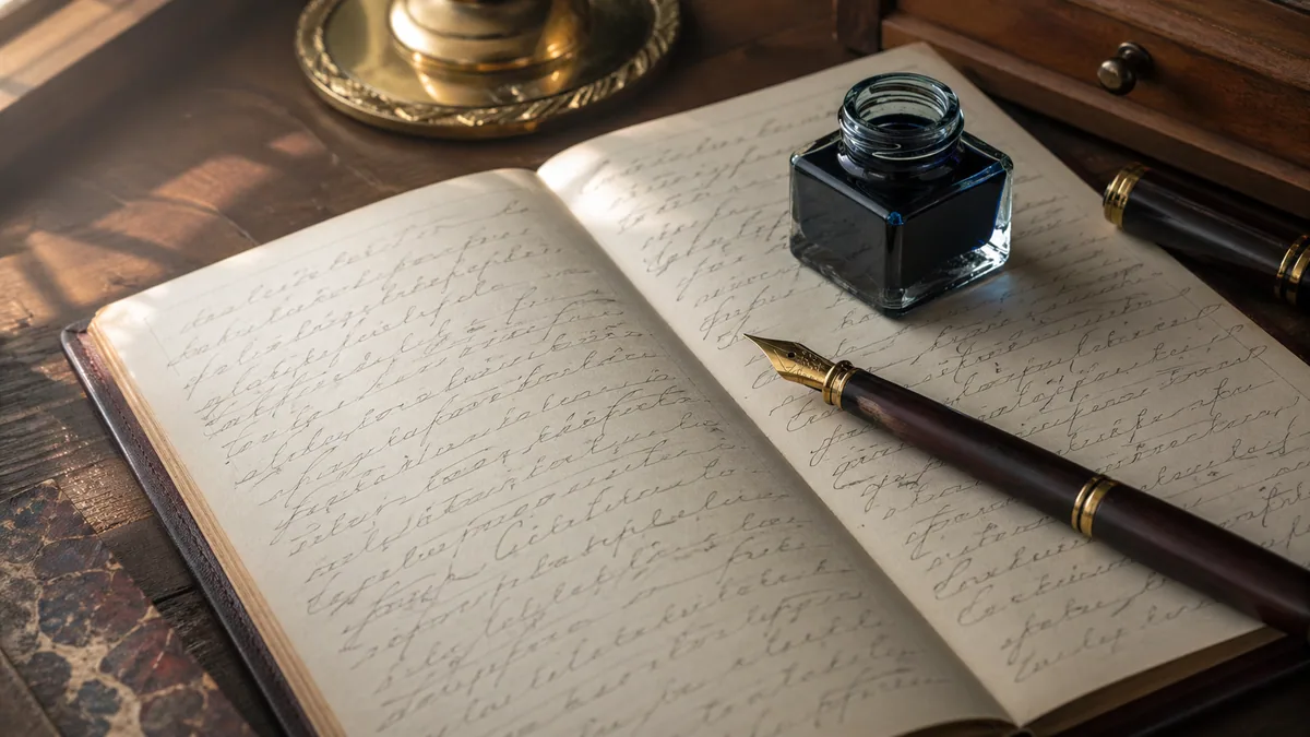
- This is what makes cursive actually look like cursive: letters that connect to each other. In real handwriting, your pen flows from one letter to the next without lifting off the paper. Good digital cursive fonts replicate this with ligatures (fancy term for those connecting strokes). The really well-made fonts even have contextual alternates, which is a nerdy way of saying the font is smart enough to adjust how letters connect based on which letters are next to each other. An "o" connecting to an "n" looks different than an "o" connecting to a "t", and quality fonts handle this automatically. It's these little details that separate amateur-looking text from the professional stuff.
- Italic Slant and Forward Motion
- Most cursive fonts incorporate a forward slant, typically ranging from 10 to 20 degrees, which mimics the natural angle of handwriting. This rightward lean creates visual momentum and energy. The slant should be consistent across all letterforms; varying angles appear amateurish and disrupt the text's flow. This principle dates back to 16th-century Italian writing masters who established standards still followed in calligraphy styles today.
- Stroke Variation and Contrast
- Premium cursive fonts exhibit varied stroke weights that mirror the pressure changes in handwriting. Downstrokes typically appear thicker while upstrokes remain thin and delicate. This contrast adds elegance and visual interest. Copperplate-style fonts show dramatic contrast, while casual scripts maintain more uniform strokes. Understanding stroke contrast helps you select fonts appropriate for your medium: high-contrast fonts may lose detail when reproduced at small sizes or in certain printing conditions.
- Ascenders, Descenders, and Flourishes
- Cursive fonts feature extended ascenders (letters like h, l, k reaching upward) and descenders (letters like g, y, p extending downward) that create rhythmic variation in your text. Many formal cursive fonts include optional swashes and flourishes (decorative extensions that add personality). While beautiful, flourishes should be used strategically; excessive ornamentation can reduce readability and appear unprofessional. Consider exploring custom calligraphy fonts to understand how professional type designers balance decoration with function.
Professional Best Practices for Using Cursive Text
Converting text to cursive is straightforward, but using it effectively requires understanding design principles that separate professional work from amateur attempts. These guidelines, drawn from professional typography and design practice, will help you achieve polished, sophisticated results.
The most common failure mode in script-heavy designs is using cursive for headlines, body, captions, and buttons at the same time. Pick one element to carry the cursive (usually the headline, a name, or a single emphasised phrase) and set everything else in a clean sans-serif or transitional serif. The script reads as decorative because the surrounding type is not competing with it.
When you genuinely need cursive for longer text, such as a wedding quote or a multi-line invitation block, increase line-height to roughly 1.5x to 1.7x. Ascenders, descenders, and flourishes need vertical room or adjacent lines start tangling. The font pairing assistant can suggest sans-serif and serif companions that hold their own next to a script without fighting it.
Context-Appropriate Selection
Match the script to the use case. Copperplate and Spencerian are formal hands designed for ceremonial documents; they belong on wedding suites, diplomas, and luxury packaging, not on a casual cafe menu. Brush scripts read as friendly and current and pair well with Instagram graphics, indie product labels, and creative business cards. Modern monoline scripts are the safe middle option for client-facing business materials where you want warmth without ceremony.
Audience matters as much as occasion. The same Edwardian Script that signals "heirloom" to a 70-year-old reader can read as dated to a Gen Z audience that associates heavy formal scripts with their grandparents' wedding albums. For tech-adjacent brands, retail aimed at under-30 buyers, or anything with a contemporary visual identity, lean toward modern monoline or contemporary brush scripts and reserve the formal hands for genuinely traditional contexts.
Color and Contrast Considerations
Aim for a WCAG contrast ratio of at least 4.5:1 for body-sized cursive and 3:1 for large display text (18pt and above). Hairline upstrokes in copperplate-style faces effectively make the text "thinner" than its nominal size, so treat borderline ratios as failing rather than acceptable. Cursive is also harder to read for users with dyslexia and low vision; if the text carries critical information (event details, prices, instructions), repeat it in a sans-serif nearby rather than relying on the script alone.
Be cautious with colored text on colored backgrounds. Gold script on navy looks elegant on a 5K monitor and can become illegible on a dim phone screen in sunlight. The calligraphy color palette tool lets you check pairings against contrast thresholds before you commit.
Before committing to a cursive font for an important project, test how it appears across your target platforms. A font that looks stunning on your desktop monitor might render poorly on mobile devices due to anti-aliasing differences or screen resolution limitations.
For printed materials, request a test print before ordering large quantities. Thin strokes in high-contrast cursive fonts may disappear in certain printing processes, particularly on textured papers or with lower-quality printers. Professional print designers always review physical proofs to catch these issues before production.
Common Mistakes to Avoid When Using Cursive Text
When the entire layout is set in script, nothing reads as emphasised and the eye has nowhere to rest. Connected scripts also force readers to decode letterforms more slowly than print, so a paragraph of body copy in cursive measurably increases reading time and drop-off. Reserve script for headlines, names, single-word emphasis, or short ceremonial blocks; set the rest in a quiet sans-serif or transitional serif.
The same restraint applies to mixing scripts. Pairing two cursive faces in one design (a copperplate headline over a brush-script tagline, say) almost always reads as indecisive, because the two faces compete for the "decorative" role. Pick one script and let it carry the entire ornamental load, then pair it with a neutral text face that stays out of its way.
- Ignoring Letter Spacing
- Many digital cursive fonts require manual letter spacing adjustments to look their best. Default spacing settings may cause letters to crash into each other or appear disconnected. Professional designers meticulously adjust tracking (overall spacing) and kerning (spacing between specific letter pairs) to achieve optimal results. Learn more about proper spacing techniques in our detailed calligraphy techniques guide.
- Using Low-Quality Free Fonts
- Free is fine for personal experiments, but free script fonts often ship with incomplete character sets (missing accented characters, ampersands, or punctuation), broken or missing OpenType features (no
liga,calt, orswshtables), and inconsistent connection points between glyphs. Those are the features that make a script actually look like handwriting rather than a row of disconnected letters. For client work, brand identity, or anything destined for print, license a font from a foundry that lists its OpenType feature support: a $20 to $50 license usually buys real ligatures, contextual alternates, and stylistic sets that the free version of "the same" font does not include. - Forgetting Mobile and Accessibility
- Cursive text that looks beautiful on a large screen may become illegible on smartphones. Always preview your designs on actual mobile devices before publishing. Additionally, consider accessibility for users with visual impairments or dyslexia, since cursive fonts can be particularly challenging for these audiences. Provide alternative text or use cursive sparingly in contexts where readability is critical.
Advanced Techniques and Resources
Once you've mastered basic cursive text conversion, explore advanced techniques to elevate your work further. Professional designers combine digital cursive fonts with other elements to create truly distinctive designs.
Consider pairing digital cursive fonts with hand-drawn flourishes, borders, or illustrations. This hybrid approach adds authenticity and personality that purely digital designs sometimes lack. Many professional invitation designers use this technique, combining perfectly consistent cursive text with unique hand-illustrated details. Understand the relationship between these approaches in our article on calligraphy vs hand lettering.
If you're interested in developing your own handwritten cursive skills alongside using digital tools, generate custom practice sheets to train your muscle memory. Understanding how cursive letters are traditionally formed improves your ability to select and customize digital fonts effectively. The 30-day calligraphy challenge provides structured daily practice to build your skills progressively.
For those working on specialized projects, explore resources tailored to specific needs. Learn about proper calligraphy tools if you're transitioning to traditional methods, discover the nuances of modern calligraphy styles, or understand common calligraphy mistakes that affect both digital and hand-lettered work.
The intersection of digital tools and traditional craft continues evolving. Contemporary designers increasingly blend these approaches, using digital cursive for efficiency while incorporating handmade elements for distinctiveness. This balanced approach respects calligraphic traditions while embracing modern workflow efficiencies, a philosophy championed by type designers and lettering artists worldwide.
Getting Started with Your Cursive Text Projects
Start on low-stakes work where mistakes are cheap: an Instagram story, a birthday card, a header for a bullet-journal page, a one-line quote graphic. Each of those forces you to make the same decisions you would make on a paid project (font choice, size, spacing, contrast) at a scale where iterating is fast and nothing is printed at quantity.
When the basics feel automatic, scale up. A wedding suite that holds a consistent script across save-the-date, invitation, RSVP, and menu cards is a strong portfolio piece. Branded materials for a friend's small business expose you to the constraints of working inside someone else's color and logo system. A quote-graphic series with a single script paired against several sans-serifs is one of the fastest ways to build an eye for pairing.
Typography rewards iteration more than theory. Use the cursive generator to audition fonts side by side, save the ones that work, and discard the ones that look promising at 64px but fall apart at delivery size. The faster you cycle through bad combinations, the faster you stop making them.