Affiliate Disclosure: This page contains affiliate links to products selected for practical fit. When you purchase through these links, we may earn a commission at no additional cost to you. Recommendations are based on product specifications, community feedback, and fit for common calligraphy needs. See our complete Tools Guide for detailed product reviews.
Monoline calligraphy strips away the thick-and-thin drama of traditional scripts and replaces it with clean, uniform strokes that feel modern, minimalist, and effortlessly elegant. Without contrast to lean on, the style relies on letter shape, spacing, and negative space to do the heavy lifting. If you love the structure of calligraphy but want something that works on Instagram as well as wedding invitations, monoline is your script.
What is Monoline Calligraphy? The Single-Weight Revolution
Monoline calligraphy (also called "monoweight" or "monoline lettering") is a contemporary lettering style that uses consistent stroke width throughout every letter. Unlike Copperplate, Spencerian, or Italic, which create visual interest through thick/thin contrast, monoline relies on letter shape, spacing, and rhythm to create elegance.
Think of it as the sans-serif side of calligraphy: geometric, clean, and built for clarity. The letterforms often borrow from traditional scripts (Copperplate slant, Italic arches, Spencerian loops), but they're rendered in a single, unvarying line weight. The result reads as both classic and contemporary. If you are adapting an existing wordmark, test the words in the cursive generator first, then simplify the joins into a monoline version by hand.
The History of Monoline: A 21st-Century Invention
Unlike scripts with centuries of lineage, monoline calligraphy has no historical precedent. Traditional calligraphy was defined by contrast—thick downstrokes, thin upstrokes—because that's what edged tools (broad-edge nibs, pointed pens, brushes, quills) naturally produce. A monoline stroke requires tools that prevent variation: technical pens, fineliners, monoline markers, or brush pens held with consistent pressure.
The style gained traction in the early 2010s through hand-lettering communities on Instagram, Pinterest, and design blogs. Letterers like Amanda Arneill, Nicole Miyuki Santo, and Lisa Quine popularized monoline as a bridge between traditional calligraphy and modern graphic design. It was legible, reproducible, and adaptable—perfect for branding, social media graphics, and DIY projects.
By the mid-2010s, monoline had become a staple of the modern calligraphy toolkit. It's taught in online courses, Skillshare classes, and calligraphy workshops worldwide, often as an entry point for beginners who find pointed-pen pressure control intimidating.
Essential Tools for Monoline Calligraphy
Monoline is tool-agnostic—any pen that produces a consistent line works. That said, certain tools make the process easier and produce professional results:
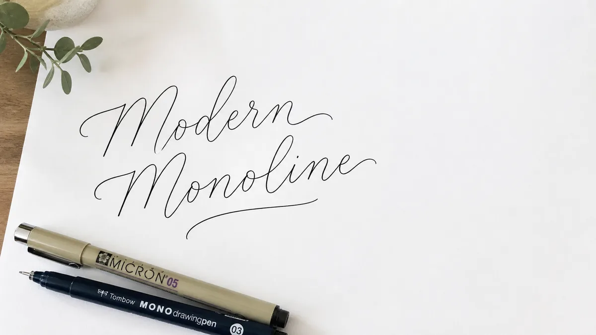
Pens and Markers
- Sakura Pigma Micron pens — The gold standard for monoline work. These archival-quality fineliners come in sizes from 005 (0.20mm) to 08 (0.50mm). The 03 (0.35mm) or 05 (0.45mm) are ideal for most monoline calligraphy.
- Tombow Fudenosuke brush pen (hard tip) — A firm brush pen that behaves like a fineliner. The hard tip prevents flex, giving you a consistent monoline even with slight pressure variation.
- Pentel Fude Touch Sign Pen — A Japanese brush pen with a firm, felt-like tip. Excellent for smooth, controlled monoline on larger projects.
- Copic Multiliner SP or Staedtler Pigment Liners — Professional-grade fineliners with replaceable nibs. More expensive than Microns but longer-lasting.
- Uni Pin or Copic Multiliner — Technical pens favored by architects and designers. Ultra-precise, consistent line weight, but less forgiving on textured paper.
Brush Pens for Monoline
Yes, you can create monoline with brush pens—just hold them with light, consistent pressure so the tip doesn't flex. This technique is popular for larger lettering where fineliners would take too long. The Kuretake Bimoji Fude and Tombow Dual Brush Pens (held lightly) work well for this approach.
Paper
Use smooth, non-absorbent paper. Rhodia, HP 32lb laser, or Clairefontaine work beautifully. Avoid textured watercolor paper or cheap notebook paper—fineliners will catch on rough fibers and produce inconsistent lines.
Guidelines
Print or draw light pencil guidelines to keep your baseline straight and your x-height consistent. Use our practice sheet generator to create custom monoline guidelines with the correct slant and spacing.
The Monoline Alphabet: Structure Without Contrast
Monoline letterforms borrow structure from traditional scripts but strip away thick/thin variation. Here's what defines monoline:
- Consistent stroke width: Every stroke is the same thickness—no swells, no hairlines.
- Slant angle: Typically 10–15° to the right, though vertical monoline is equally valid.
- Letter spacing: Slightly looser than traditional calligraphy to prevent letters from feeling cramped without thick/thin contrast.
- Simplified forms: Monoline often simplifies or omits the elaborate entry/exit strokes of traditional scripts. Letters connect with clean, minimal ligatures.
Common monoline styles:
- Copperplate-inspired monoline: Borrows the 52° slant and oval structure of Copperplate but renders it in uniform strokes.
- Italic-inspired monoline: Uses the springy arches and compressed letter width of Italic in a single weight.
- Casual/bouncy monoline: Letters sit at varying heights on the baseline (like modern calligraphy) for a playful, informal look.
- Geometric monoline: Letters are constructed from circles, straight lines, and arcs, like architectural lettering.
For a comprehensive breakdown of letter anatomy, see our calligraphy alphabet guide.
How to Practice Monoline Calligraphy
Monoline is the most accessible calligraphy style for beginners, but that doesn't mean it's easy. Without thick/thin contrast to hide imperfections, every wobble, spacing error, and inconsistent slant is visible. Here's how to build clean, confident monoline:
- Basic strokes: Practice drawing straight vertical lines, curved arcs, and ovals with smooth, consistent motion. Use a ruler or French curve as a guide if your freehand curves are shaky. Do 100 ovals before attempting letters.
- Letter families: Practice letters in groups—straight letters (i, l, t), oval letters (o, a, c, d), arched letters (n, m, h), and complex letters (s, g, y).
- Spacing drills: Write the word minimum 20 times, focusing on consistent letter spacing and rhythm. The repeated m, i, n strokes expose spacing inconsistencies.
- Baseline control: Practice writing full sentences on lined paper, keeping every letter's base aligned to the baseline. Monoline's clean aesthetic falls apart if the baseline wobbles.
- Speed practice: Monoline is meant to be faster than traditional calligraphy. Once you've mastered slow, deliberate letterforms, practice writing at conversational speed. The goal is fluency, not perfection.
Use our practice sheet generator to create custom monoline drills. Aim for 15–30 minutes of daily practice—monoline rewards consistency more than marathon sessions.
Common Monoline Mistakes (and How to Fix Them)
1. Inconsistent Line Weight
If your strokes vary in thickness, you're either pressing too hard (causing brush pen flex) or using a low-quality pen. Solution: Use a firm fineliner like a Micron or Multiliner, and hold your pen lightly. The pen should glide, not press into the paper.
2. Cramped or Touching Letters
Without thick/thin contrast, monoline needs breathing room. If your letters touch or overlap, they'll blend into a visual blob. Solution: Increase letter spacing—aim for the width of a lowercase n between words, and about one-third of that between letters.
3. Wobbly or Shaky Strokes
If your lines are shaky, you're moving too slowly or gripping too tightly. Solution: Loosen your grip, speed up slightly, and draw each stroke in one confident motion. Think "smooth arc," not "careful tracing."
4. Inconsistent Slant
If your letters lean in different directions, you're not using guidelines or you're rotating your paper mid-word. Solution: Use printed slant guidelines and keep your paper stationary. Rotate your shoulder angle, not the page.
For more troubleshooting, check our common calligraphy mistakes guide.
When to Use Monoline vs. Traditional Calligraphy
Monoline and traditional calligraphy serve different purposes:
Use Monoline For:
- Modern, minimalist projects (branding, logos, social media graphics)
- Situations where you need to scan, digitize, or reproduce lettering cleanly
- Fast turnaround work (monoline is 2–3× faster than pointed-pen scripts)
- Beginners building foundational lettering skills before tackling pressure control
- Pairing with geometric or sans-serif designs
Use Traditional Calligraphy For:
- Formal, classical projects (wedding invitations, certificates, awards)
- Situations where historical authenticity matters
- Pieces where texture and variation add visual interest
- Skill-building and mastery of traditional techniques
For a deeper dive into these distinctions, see our calligraphy vs. hand lettering guide.
Related Styles and Further Learning
Once you've mastered basic monoline, you can explore hybrid styles that blend monoline with other techniques. For example, faux calligraphy starts as monoline cursive, then adds thickness to downstrokes. Or you can combine monoline lowercase letters with thick-and-thin capitals for contrast.
If you're interested in the broader landscape of scripts, our calligraphy styles guide covers dozens of options. And if you're building a structured practice routine, our stroke practice drills and monthly challenges calendar will keep you accountable.
For those curious about adapting monoline for professional work, see our calligraphy business guide for tips on pricing, client communication, and project management.
Recommended Monoline Tools and Supplies
Ready to start your monoline journey? These tools will set you up for success: