Affiliate Disclosure: This page contains affiliate links to products selected for practical fit. When you purchase through these links, we may earn a commission at no additional cost to you. Recommendations are based on product specifications, community feedback, and fit for common calligraphy needs. See our complete Tools Guide for detailed product reviews.
Your nib choice determines stroke character more than any other variable—the difference between a Nikko G and a Brause EF66 is the difference between forgiving flexibility and uncompromising precision.
After testing over forty nib models across twenty years of professional calligraphy work, I've learned that nib selection is not about finding the "best" nib—it's about matching tool characteristics to script requirements and personal writing pressure. The International Association of Master Penmen, Engrossers and Teachers of Handwriting (IAMPETH) archives contain detailed nib analyses from master penmen like E.A. Lupfer and C.P. Zaner, who understood that different hands demand different flex profiles, tip geometries, and metal tempers.
This guide examines every nib category used in professional calligraphy: pointed nibs for Copperplate, Spencerian, and modern script, plus broad-edge nibs for Italic, Gothic, and foundational hands. You'll learn which nibs work best for beginners versus advanced practitioners, how nib width affects letterform proportions, what "springiness" actually means in practical terms, and how to identify quality issues before you waste money on inferior products.
Pointed Nibs vs. Broad-Edge Nibs
Calligraphy nibs divide into two fundamental categories, each producing entirely different stroke characteristics. Pointed nibs have a sharp tip that flexes under pressure to create thick downstrokes and hairline upstrokes—the defining feature of Copperplate, Spencerian, and Engrosser's scripts. Broad-edge nibs have a flat, chisel-shaped tip that maintains constant width throughout each stroke, producing the thick-thin contrast through stroke direction rather than pressure—the hallmark of Italic, Gothic, Uncial, and foundational hands.
This distinction is not just mechanical—it's philosophical. Pointed pen work emphasizes rhythm, pressure modulation, and continuous flow. Broad-edge work emphasizes angle consistency, edge sharpness, and constructed letterforms. Edward Johnston's seminal 1906 text Writing & Illuminating, & Lettering devotes separate chapters to each nib type precisely because the muscle memory and aesthetic principles differ fundamentally.
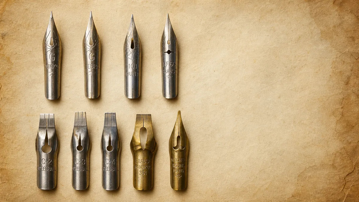
Pointed Nibs: Flex and Precision
Nikko G: The Beginner's Workhorse
The Nikko G nib dominates beginner recommendations for good reason: it's nearly indestructible, forgiving of inconsistent pressure, and produces clean hairlines even when writing too fast. Originally designed for manga illustration, the Nikko G has a stiffer flex profile than traditional Copperplate nibs, which means beginners can achieve decent thick-thin contrast without the precise pressure control that formal scripts demand.
The trade-off? Less dramatic line variation. A skilled calligrapher using a Hunt 101 or Gillott 303 will produce swells and hairlines that a Nikko G simply cannot match. But for learning proper letterforms, mastering slant angle, and building muscle memory, the Nikko G's stability outweighs its limited flex range. Expect 40–60 hours of practice before a Nikko G feels "worn in" to your personal pressure and starts to develop character.
Zebra G: Smooth Flex for Modern Calligraphy
The Zebra G nib sits between the stiff Nikko G and highly flexible vintage nibs. It offers noticeably smoother ink flow and more responsive flex than the Nikko, making it ideal for modern calligraphy styles where exaggerated flourishes and thick downstrokes create visual impact.
The Zebra G requires more careful pressure modulation—push too hard and the tines will spread beyond recovery, leaving permanent splaying that ruins hairlines. I've seen beginners destroy a Zebra G in under twenty minutes by treating it like a ballpoint pen. If you're just starting, master the Nikko G first, then graduate to the Zebra G once your pressure control is consistent.
Brause EF66: Extra-Fine Copperplate Precision
The Brause EF66 Extra Fine nib is the professional standard for formal Copperplate and Engrosser's Script. Its hairlines are finer than any Japanese manga nib, and its flex response is immediate and precise. Master penmen like Michael Sull and Jake Weidmann favor the EF66 for certificate work and formal engrossing because it produces the razor-sharp hairlines that define professional-grade script.
The challenge? The EF66 is unforgiving. Any wobble in your hand, any inconsistency in pressure, any rough spot on your paper—it will catch and skip. I would not recommend the EF66 to anyone with fewer than 100 hours of pointed pen experience. This is a precision instrument that demands precision technique.
Additionally, the EF66 wears faster than other nibs. On toothy paper (anything rougher than Rhodia or HP 32lb), expect the tip to dull after about 6–8 hours of writing. On ultra-smooth paper, you'll get 15–20 hours before replacement. Budget accordingly.
Broad-Edge Nibs: Width and Angle
Understanding Nib Widths
Broad-edge nibs are measured in millimeters of edge width: 0.5mm, 1mm, 1.5mm, 2mm, 2.5mm, 3mm, and upward to 6mm for display work. The nib width determines x-height proportions in traditional scripts. Italic script, for example, specifies an x-height of 5 nib-widths—meaning if you use a 2mm nib, your lowercase letters should measure 10mm tall. Gothic Textura uses 4.5 nib-widths, while Uncial uses 4 nib-widths.
This is not arbitrary. These ratios evolved over centuries to produce optimal readability and aesthetic balance at manuscript scale. When you see historical exemplars that look "wrong," it's often because a modern scribe used incorrect nib widths relative to x-height. Follow the traditional proportions until you understand them well enough to break them intentionally.
Speedball C-Series: American Standard
Speedball C-Series nibs are the most widely available broad-edge nibs in North America. They're affordable ($1–$2 per nib), consistent in manufacturing quality, and available in sizes from C-0 (largest) to C-6 (smallest). The C-2 (approximately 2.5mm) is ideal for learning Italic, while the C-3 (approximately 2mm) works well for Foundational hand.
The main limitation is edge sharpness. Speedball nibs have slightly rounded corners compared to European nibs, which produces less crisp serifs. For practice and informal work, this doesn't matter. For formal pieces or historical reproduction, consider Mitchell or Brause nibs.
Lamy Z50: Fountain Pen Convenience
The Lamy Z50 nib set offers broad-edge calligraphy in fountain pen format—no dipping required. The 1.1mm, 1.5mm, and 1.9mm nibs fit Lamy Joy pens and provide consistent ink flow without the mess of traditional dip nibs. This is transformative for beginners who find dip-and-write rhythm frustrating.
The trade-off is limited size range and slightly less crisp edges than traditional dip nibs. But for daily practice, note-taking in calligraphic hands, or sketching letterform ideas, fountain pen nibs eliminate friction and keep you writing. Pair with our practice sheet generator for guided drills.
Nib Selection Matrix
Beginner pointed pen (first 50 hours): Nikko G. Build pressure control and consistent slant before moving to more responsive nibs.
Intermediate pointed pen (50–200 hours): Zebra G for modern styles, Brause EF66 for traditional Copperplate. Experiment with both to understand flex range.
Advanced pointed pen (200+ hours): Hunt 101, Gillott 303, vintage specialty nibs. Match nib characteristics to specific script requirements.
Beginner broad-edge: Speedball C-2 or C-3, or Lamy 1.5mm fountain nib. Learn angle consistency and stroke sequence.
Intermediate broad-edge: Mitchell Roundhand or Brause Bandzug in multiple widths. Explore different script proportions.
Advanced broad-edge: Pilot Parallel pens for color mixing, or handmade quills for historical reproduction.
Quality Issues to Watch For
Not all nibs are created equal, even within the same model. Manufacturing inconsistencies are common, especially in budget-priced nibs. Before committing a new nib to final work, test for these issues:
Misaligned tines: Hold the nib up to light. The two tines should meet perfectly at the tip with no gap. Even a hair-width gap will cause ink flooding and poor hairlines.
Rough spots: Run your fingernail gently across the nib tip. You should feel uniform smoothness. Any catch or roughness will snag on paper.
Inconsistent flex: For pointed nibs, test flex on scrap paper. The tines should spread evenly under pressure and return to original position immediately. Uneven flex indicates metal fatigue or manufacturing defect.
Expect about 1 in 10 budget nibs to have quality issues. This is why buying nibs in bulk (packs of 10 or more) makes economic sense—you'll have backups when you encounter a dud. For detailed technique guidance and common pitfalls, see our comprehensive guides.
Pairing Nibs with Holders and Inks
Nib performance depends heavily on pen holder compatibility and ink viscosity. Pointed nibs designed for oblique holders (like the Brause EF66) perform poorly in straight holders because the angle changes. Broad-edge nibs require holders with sufficient grip diameter to maintain proper edge angle. For holder selection, see our pen holder guide.
Ink viscosity matters equally. Thin, fluid inks (like Japanese sumi ink) work beautifully with fine-pointed nibs but may flood broad-edge nibs. Thicker India inks control well in broad nibs but can skip in extra-fine pointed nibs. Match your ink to your nib—see our ink selection guide for detailed compatibility information.
Understanding nib mechanics, flex characteristics, and quality indicators transforms your tool selection from guesswork to informed choice. The masters documented in calligraphic history spent years testing and refining nib preferences—you can shortcut that process by learning from their collective experience. Pair your nib knowledge with structured practice and you'll progress faster than you thought possible.