Affiliate Disclosure: This page contains affiliate links to products selected for practical fit. When you purchase through these links, we may earn a commission at no additional cost to you. Recommendations are based on product specifications, community feedback, and fit for common calligraphy needs. See our complete Tools Guide for detailed product reviews.
The right ink transforms calligraphy from frustrating to fluid—choose wrong, and you'll battle feathering, skipping nibs, and faded work that loses legibility within months.
After two decades of working with every major ink formulation—India, sumi, iron-gall, walnut, acrylic, and shellac-based—I've learned that ink choice matters more than most beginners realize. The International Association of Master Penmen, Engrossers and Teachers of Handwriting (IAMPETH) archives document hundreds of cases where beautiful penmanship deteriorated because scribes chose inks optimized for cost rather than archival stability. Your ink is not just a consumable; it's the permanent record of your skill.
This guide examines every ink type used in professional calligraphy practice, from traditional carbon-based India ink to modern acrylic formulations. You'll learn which inks work best with pointed nibs versus broad-edge tools, how to prevent bleed on different paper types, what lightfastness ratings actually mean, and how to clean your tools properly after each session. We'll also cover loading techniques, storage methods, and troubleshooting common flow problems.
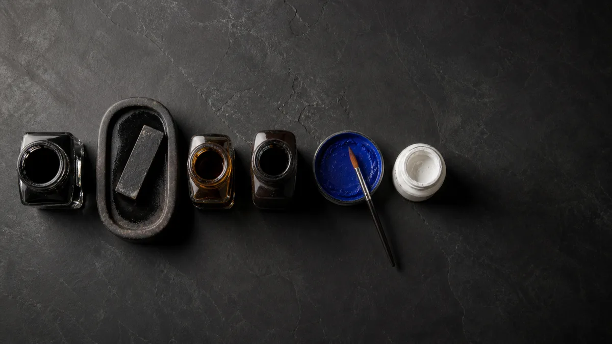
Understanding Ink Types
India Ink: The Professional Standard
India ink—a carbon-based suspension with shellac binder—remains the gold standard for professional calligraphy work. The carbon particles are lightfast (permanent under UV exposure), waterproof once dry, and dense enough to produce crisp edges on quality paper. Speedball Super Black India Ink is the workhorse in most professional studios because it flows smoothly from pointed nibs without clogging and dries to a true black rather than the blue-black you get from cheaper formulations.
The downside? India ink requires diligent nib cleaning. The shellac binder hardens quickly, and if you let it dry on your nib, you'll spend ten minutes scrubbing instead of writing. Always rinse your nib immediately after a practice session, and never leave India ink sitting in a reservoir overnight.
Sumi Ink: Smooth Flow for Asian Scripts
Traditional Japanese sumi ink, made from pine soot and animal-hide glue, offers unmatched smoothness for brush work and broad-edge nibs. Kuretake Sumi Ink is a liquid formulation (as opposed to grinding a stick) that works beautifully with Italic and foundational hands. The glue binder is less aggressive than shellac, so cleanup is easier, but the trade-off is slightly lower water resistance once dry.
Sumi ink is particularly forgiving on delicate Japanese papers and produces subtle tonal variations that add life to letterforms. If you're practicing modern calligraphy with flexible brush pens, sumi-based inks integrate seamlessly with that tradition.
Iron-Gall Ink: Historical Authenticity
Iron-gall ink—the writing medium of Leonardo da Vinci, Thomas Jefferson, and Johann Sebastian Bach—is a chemical formulation that starts blue-black and oxidizes to permanent brown-black within hours. Rohrer & Klingner Iron-Gall Ink is the modern formulation used by conservators and historical calligraphers.
The appeal? Unmatched archival stability. Iron-gall ink chemically bonds with cellulose fibers in paper, making it nearly impossible to erase or fade. The challenge? It's mildly acidic and can corrode steel nibs over time. Use stainless steel or gold nibs with iron-gall formulations, clean immediately after each session, and never let it sit in a reservoir for more than an hour. This is not a beginner-friendly ink, but if you're recreating medieval manuscripts or Copperplate exemplars for museum work, nothing else looks quite right.
Walnut Ink: Warm Sepia Tones
Walnut ink, made from walnut husk extract, produces a warm brown tone favored for vintage-style invitations and historical reproductions. Tom Norton Walnut Ink comes as a concentrate you dilute to preferred intensity—full strength for deep browns, diluted 2:1 for sepia, diluted 4:1 for antique washes.
The advantage is aesthetic: walnut ink evokes 18th-century correspondence and pairs beautifully with cream or ivory papers. The disadvantage is moderate lightfastness—expect some fading if exposed to direct sunlight for extended periods. Use walnut ink for ephemera (wedding invitations, personal correspondence) rather than archival documents.
Acrylic Inks: Vibrant Color Options
Acrylic-based calligraphy inks offer vivid, opaque colors that carbon-based inks can't match. They're waterproof when dry, lightfast to varying degrees (check the manufacturer's rating), and work well on non-porous surfaces like vellum or coated cardstock where traditional inks would bead up.
The trade-off is thickness. Acrylic inks are more viscous than India or sumi inks, which means they require larger nibs or dilution for pointed pen work. For Spencerian or Copperplate hairlines, stick with traditional formulations. For bold brush lettering or broad-edge Uncial scripts, acrylics shine.
Lightfastness and Archival Considerations
Lightfastness measures an ink's resistance to UV degradation. The ASTM (American Society for Testing and Materials) rates lightfastness on a scale of I (excellent, 100+ years) to V (fugitive, fades within months). Professional work demands ASTM I or II ratings. Carbon-based inks (India, sumi) inherently achieve ASTM I. Dye-based colored inks vary wildly—some modern formulations reach ASTM II, while cheap craft inks fade to nothing within a year.
For colored work with archival requirements, Finetec Gold Watercolor Palettes offer genuine mica pigments rated ASTM I for lightfastness. These are watercolor-format but work beautifully for calligraphic illumination and gilding accents when mixed to proper consistency.
Loading Techniques and Flow Control
How you load ink onto your nib determines flow consistency. For dip pens, submerge the nib only halfway into the ink bottle—past the reservoir vent hole but not touching the nib shoulder. Withdraw slowly and touch the nib side to the bottle rim to remove excess. This gives you 8–12 letters per dip with proper flow.
Overloading causes blobs at the start of strokes. Underloading leads to skipping halfway through words. The correct load feels intuitive after about 40 hours of practice, but beginners should count strokes per dip to calibrate. If you're getting fewer than six letters or more than fifteen, adjust your loading depth.
Troubleshooting Bleed and Feathering
Bleed (ink spreading beyond stroke edges) and feathering (ink wicking along paper fibers) destroy letterform crispness. The culprit is usually mismatched ink viscosity and paper absorbency. High-absorbency papers (like Strathmore 300-series) require thicker inks or sizing. Low-absorbency papers (Rhodia, HP 32lb laser) handle fluid inks beautifully.
If you experience bleed, first test your ink on scrap paper. Thin India ink with distilled water (never tap water—minerals affect flow) in 5% increments until you find the sweet spot. Alternatively, switch to a less absorbent paper. For detailed troubleshooting, see our common mistakes guide and technique refinements.
Cleaning and Storage
Proper cleaning extends nib life by years. For India, sumi, and acrylic inks: rinse the nib under lukewarm water immediately after use, then wipe with a soft cloth. For stubborn dried ink, soak the nib in ammonia-free window cleaner for five minutes, then rinse. Never use abrasive cleaners or steel wool—you'll scratch the nib and ruin its ink-holding properties.
Store inks tightly capped in a cool, dark location. India ink degrades when exposed to temperature fluctuations or direct sunlight. If your ink has been open for more than a year, test it on scrap before committing to final work—viscosity and flow characteristics change as solvents evaporate.
For comprehensive tool care, visit our beginner's guide. To practice with fresh ink, generate custom practice sheets or explore different scripts with our cursive generator.
Recommended Inks by Use Case
For Copperplate and Spencerian: Higgins Eternal Black or Speedball Super Black. Both offer low viscosity for hairline upstrokes and dense blacks for shaded downstrokes.
For Italic and foundational hands: Kuretake Sumi Ink or any professional-grade India ink. The broader strokes forgive slight viscosity variations.
For historical reproductions: Rohrer & Klingner Iron-Gall. Accept the maintenance burden for authentic period appearance.
For colored work: Start with ASTM-rated acrylic inks or genuine mica watercolors (Finetec) rather than craft-store dye inks.
For vintage aesthetics: Tom Norton Walnut Ink diluted to taste, paired with cream or ivory papers.
Understanding ink chemistry, flow mechanics, and archival requirements transforms your calligraphy from practice exercises into lasting work. The masters documented in historical calligraphy traditions understood this—ink choice was never an afterthought. Pair your ink selection with appropriate materials and consistent practice, and you'll see immediate improvements in letterform quality and longevity.