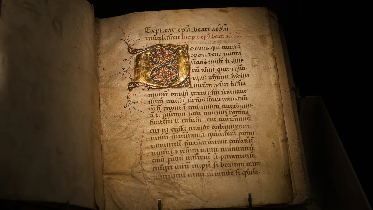
Uncial is a rounded, broad-edge manuscript hand. Start with a flat-edged tool and one labelled exemplar, then practise the spaces inside and between letters before attempting a whole alphabet.
It suits a short heading, a greeting, or a few lines of text with room around them. You do not need connected cursive first. Unlike the loops in Spencerian, the contrast comes mainly from the orientation of a broad edge, not from flexing a pointed nib. Our style comparison helps if you are still choosing between those approaches.
Uncial, half-uncial, and the word Celtic
Historical manuscript labels describe particular letter constructions and traditions. Uncial and half-uncial are not interchangeable names for any rounded alphabet, and Celtic is not a single script. Modern fonts marketed under those labels may borrow a few shapes without reproducing a historical hand. Use the label attached to the exemplar you study, rather than trying to build one alphabet from unrelated specimens.
For a practical modern starting point, the Society of Scribes Uncial workshop description outlines a sequence of broad-edge strokes, letters, spacing, and a small finished piece. It also uses broad-edge markers to simplify the first session. This guide follows that general progression, not the workshop's proprietary alphabet or handouts. See our calligraphy history guide for broader context.
Choose a tool that makes the contrast visible
A broad-edge marker removes the need to manage a reservoir while you learn the shapes. A broad nib and compatible ink work too. A round felt-tip gives a different result: you would have to draw the thick strokes rather than make them with the edge. Compare these tools in the pen guide and use the nib guide before buying a dip nib and holder separately.
Choose smooth paper that does not feather with your ink. Test a curve and a short horizontal stroke in a corner. If the edge catches or leaves fuzzy hairs, change the surface before blaming your movement. Our paper guide explains this trade-off. Keep a pencil, ruler, and scrap test sheet beside you; an expensive collection of tools will not correct inconsistent guides.
Set proportions from the exemplar
Find the exemplar's letter height and recommended nib angle. Measure height in nib widths if that is how its author specifies it. For example, a model that calls for four nib widths would have an eight-millimetre body with a two-millimetre nib. That is a measurement example, not a universal Uncial proportion. Draw a baseline and a top guide, with separate allowance for any strokes extending beyond them.
Keep nib angle and letter slant separate. The former describes the edge against the writing line; the latter describes the lean of a letter. Read the italic lesson for that distinction, but do not transfer its proportions automatically. Write a few short strokes with the edge held consistently. If the contrast changes halfway through each one, you may be rotating the pen.
Practise curves before filling a page
Choose a rounded form from your model. Compare its enclosed space, where the strokes meet, and how the thick areas sit around that space. Work large enough to see a flattened curve. Draw a few attempts, select the closest one, and name the difference you want to change next. Repeating a distorted oval fifty times makes it familiar, not necessarily closer to the model.
Next, pair that curve with a straight-stemmed form from the same exemplar. Notice which parts can share a movement and which need a different start. Lift and reposition when the model requires it; Uncial is not a test of writing without lifting. The stroke practice guide helps isolate troublesome transitions, while foundational hand offers another broad-edge comparison once you can keep this model consistent.
Move from letters to a short heading
Try an original heading such as CALM WATER, using the forms in your chosen model rather than assuming modern typed capitals are an exemplar. Sketch the line before inking. Compare the open area beside a rounded letter with the area beside a narrow one. Equal measured gaps can still look uneven. Keep the word space visibly larger than the spaces within either word.
Use the spacing tool to explore optical spacing, not to prescribe historical Uncial metrics. For a card, pencil the heading on scrap paper at its intended size and place it over the blank card to judge the margins. Resist filling every remaining area with ornament. The title should still be the first thing the reader sees.
Check the result before adding another style
Look for one repeated problem: uneven body height, cramped enclosed spaces, or changing stroke contrast. Correct that problem on a fresh line. The mistakes guide can help separate a tool problem from a spacing problem. Date the sample and note the nib width so the next comparison uses the same scale.
For the next session, save a short task in the practice calendar. You can use the font generator to compare a contrasting subtitle, clearly separate from the handwritten Uncial. When choosing a fuller reference, inspect sample pages in our book guide for actual construction diagrams, not just attractive finished pieces.