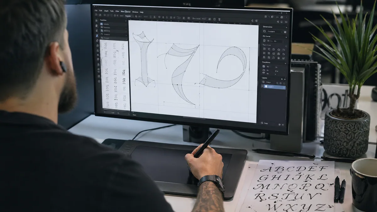
Digitizing hand lettering starts with a clean scan or photograph. Keep a raster image when texture matters; create and refine vector paths when you need editable outlines. Renaming a PNG to SVG does not convert the artwork.
Decide on the deliverable first. A social graphic, a printed card, and a vinyl cut file are different jobs. Our business guide discusses agreeing on deliverables with a client. For a typeface that accepts new text, you need a font-making workflow instead: see custom calligraphy fonts. A vector drawing of one word is not an installable font.
Capture a useful original
Scan flat artwork or photograph it square-on in even, diffuse light. Keep the camera parallel to the page so one end of the word is not larger than the other. Avoid shadows across fine strokes and leave space around every flourish. Save the untouched capture before you adjust contrast, erase marks, or crop.
For print, calculate the pixels required at the intended physical size. A five-by-seven-inch image at 300 pixels per inch needs 1500 by 2100 pixels before any required bleed. That is a planning example; use the printer's specification for the actual job. The paper guide helps distinguish surface texture you want to preserve from unwanted feathering in the original marks.
Clean the image before tracing
Straighten the page and crop away the desk. Adjust contrast enough to separate ink from background without erasing thin strokes. Remove isolated dust and pencil marks on a duplicate layer or copy. For transparency, inspect both the outside of the word and enclosed spaces inside letters. Leaving white patches inside an o is easy when you remove only the outer background.
Preserve soft washes and texture when they are part of the work. The watercolor lettering guide explains why tonal variations matter, while ruling-pen lettering may depend on irregular edges. A hard black-and-white threshold can discard those features. Keep a raster master even if you also make a simplified vector edition.
Choose raster or vector deliberately
PNG stores pixels and supports transparency. It is useful for an overlay when the file has enough pixels at its intended size. Vector paths describe curves and filled shapes. They can scale and be edited as geometry, but a trace must decide which boundaries to keep. More paths are not automatically a better representation.
An SVG can also contain a raster image or live text instead of outlined lettering. Our generator exports font-dependent text SVG, not automatically outlined or cut-ready paths. See the font-format explanation before assuming that every file with the same extension behaves alike.
Trace a black-and-white version
In Illustrator, select the placed image and use Image Trace, adjusting its settings while watching fine strokes and enclosed spaces. Consult Adobe's Image Trace documentation for the current controls. Convert or expand the trace to editable paths when you are ready to work on the geometry. Preserve the original image on a separate layer.
Inkscape provides a free alternative through Path, Trace Bitmap. Its official tracing tutorial explicitly describes tracing as a starting set of curves, not an automatic finished result. For solid dark lettering, try a brightness threshold first. Compare several settings instead of accepting one that thickens hairlines or closes every small loop.
Inspect and repair the paths
Move the traced result away from the source image briefly so you can see what was actually created. Check for stray shapes, doubled contours, uneven joins, and white background objects. Zoom into the smallest letter openings, then return to the intended viewing size. A curve that looks imperfect at extreme zoom may be harmless in print; a closed counter remains a reading problem at any size.
Simplify nodes cautiously and keep a copy before each major change. Too much simplification can flatten a curve or move a terminal. Revisit the shape principles in calligraphy techniques and the spacing examples in the spacing tool. Repair the word as lettering, rather than treating the highest node count as the most accurate result.
Deliver the files the project needs
Save an editable master plus the agreed output format. Reopen the delivered file in a different viewer and inspect its size, background, and lettering. A PDF may contain raster artwork; it does not prove vector construction. For a composed card, use the font-pairing tool to add a readable secondary line without tracing that text unnecessarily.
If the work began on an iPad, follow the Procreate export workflow and retain the native layered file. Our brush guide helps distinguish drawing tools from output formats. Check the commercial-use guidance for licensed source material; tracing someone else's artwork does not remove their rights. For an original digital word instead of a scan, the name generator is a separate, faster starting point, with its own export limitations. Compare the device and brush recommendations in the iPad buying guide before replacing hardware for a one-off digitizing job.