The short answer
A cursive font changes how ordinary characters look. Unicode styled text replaces those characters with different code points that only resemble a font style.
Type the word hello
in a script font and the underlying text is still the five Latin letters h, e, l, l, and o. Change the font and the word takes on a new appearance. A copy-and-paste Unicode version such as 𝒽ℯ𝓁𝓁ℴ is a different sequence of characters, mostly drawn from the Mathematical Alphanumeric Symbols block. It may survive a paste where font formatting would be stripped, but that does not make it a portable font.
What a cursive font changes
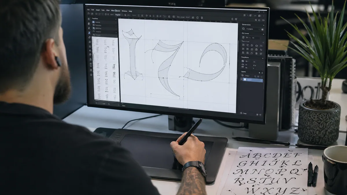
Digital text has two relevant layers. The character layer records what the text means, while the font supplies glyphs, the drawings used to display those characters. The Unicode Standard, Chapter 2 makes this character-versus-glyph distinction explicit. One character can have different glyphs in different fonts, and one font can substitute alternate glyphs according to context.
That separation is useful. In a properly made script font, OpenType substitutions can swap in a joining form, ligature, or alternate letter without changing the stored spelling. The technical rules for those substitutions are documented in the OpenType Glyph Substitution table specification. If you want to understand how designers build those features, our custom calligraphy font guide follows the process from drawn letters to a working font.
This is why a font-based headline remains searchable and editable. The letters underneath have not been swapped for ornamental lookalikes. A designer can move from a restrained monoline script to a high-contrast face without retyping the copy. Our aesthetic cursive font guide is useful when the question is visual mood rather than character encoding.
What Unicode styled text changes
Unicode does not define a general cursive alphabet
for social posts. Most fancy-text converters map basic Latin letters to symbols that were encoded for mathematical notation. The official Mathematical Alphanumeric Symbols chart labels sets such as Mathematical Script Capital A and Mathematical Bold Script Small A. Their identity includes the mathematical style; the appearance is not merely a decorative font choice.
That difference shows up as soon as software normalizes, searches, sorts, or reads the text aloud. Unicode compatibility normalization can map many mathematical alphabetic symbols back to ordinary Latin letters. The Unicode Consortium documents this in Unicode Standard Annex #15: Unicode Normalization Forms. Not every app applies the same normalization at the same stage, so two visually similar strings can behave differently.
Side-by-side comparison
| Question | Cursive font | Unicode styled text |
|---|---|---|
| What is stored? | Ordinary letters plus separate font styling | Different Unicode characters |
| Does the look survive plain-text paste? | No, unless the destination also applies the font | Often, when the destination supports those characters |
| Can you control joins and alternates? | Yes, if the font and app support the OpenType features | No typographic control beyond the available symbols |
| Is it suitable for long passages? | Sometimes, with a readable face and sensible size | Usually not |
| Best use | Graphics, invitations, print, PDFs, and visual layouts | Short decorative labels in tolerant plain-text fields |
Accessibility and search are the deciding factors
Screen-reader output depends on the platform, voice, language, and character support. Some mathematical symbols are announced with their full mathematical names. Others may be skipped or pronounced awkwardly. The Web Content Accessibility Guidelines require text to be available in a form users and assistive technologies can understand. The normative WCAG 2.2 recommendation is the right reference for web content, especially the requirements around text alternatives, meaningful sequence, and readable content.
Search has a similar problem. A site search may normalize 𝓅 to p, or it may treat them as unrelated. A social platform can change its indexing behavior without notice. Normal letters styled by CSS avoid that ambiguity. If the lettering must become an image, preserve a descriptive text alternative and keep important wording elsewhere as real text.
Readability matters even when the encoding is sound. Script letter forms can be unfamiliar, especially at small sizes. Compare options in the calligraphy styles guide, then use the font pairing assistant to give decorative script a quieter companion. For longer educational copy, the practical distinctions in cursive versus calligraphy help separate everyday handwriting from display lettering.
Choose the format from the destination
Start with where the result will live. I use a simple test: paste the result into a plain-text editor, search for one word, and listen to it with a screen reader. That small check catches more problems than a polished preview does.
- For a printed invitation or downloadable graphic: use the cursive generator to choose a real font and export the design. Review the result at its final physical size and on the chosen paper stock.
- For a social bio or short display name: Unicode styling may work, but retain a normal spelling in an accessible field and test the destination app before publishing.
- For a logo draft: work with a licensed font or original lettering, not a pasted mathematical alphabet. Read the calligraphy and hand-lettering comparison before deciding whether the mark should be typed or drawn.
- For handwriting practice: neither fancy Unicode nor a font teaches movement. Build a printable model with the practice sheet generator and follow the drills in our cursive writing guide.
Common mistakes and better fixes
- Calling Unicode symbols a font: say
Unicode styled text
ormathematical script characters
when that is what the converter produces. - Assuming every letter exists: mathematical sets contain historical exceptions and gaps. Some converters mix blocks to create a complete-looking alphabet.
- Using decorative text as body copy: reserve script for short phrases. Our calligraphy mistakes guide explains why spacing and legibility usually fail before style does.
- Trusting one preview: check a phone, desktop browser, PDF, and the final app. Font fallback and missing glyphs can change the result.
If your aim is to understand the shapes rather than publish them, study the letter families in the calligraphy alphabet guide and the connections in our technique guide. A digital font can suggest rhythm and contrast, but it cannot show how pressure, pen angle, and movement produced the stroke.