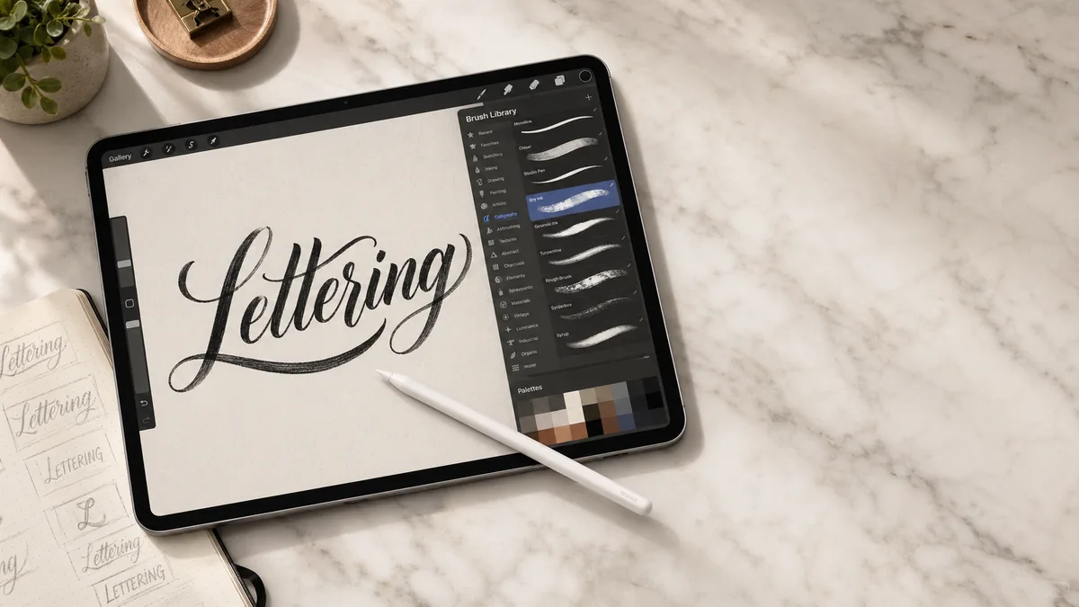
To draw clean cursive lettering in Procreate, build a word from controlled strokes, check the joins at its final viewing size, then export a copy with the right background. Smoothing can steady a shaky line, but a crowded join usually needs to be redrawn.
This is a workflow for connected script, from a rough word to a transparent image. For the app's basic controls, begin with our Procreate introduction. For a wider comparison of drawing styles and equipment, see Procreate lettering. For this exercise, use one short word. Try “hello”: its repeated l loops are easy to compare, and the e and o give you smaller enclosed spaces to check. Leave capitals for another session.
Set the output size before drawing
Decide whether the lettering will become a social image, printed card, or overlay on a photograph. For a five-by-seven-inch card at 300 pixels per inch, the artwork is 1500 by 2100 pixels before any printer-required bleed. Your printer may specify a different setup, so confirm the dimensions, bleed, and color requirements before finishing a commission. A canvas with too few pixels cannot gain crisp detail just because you change its DPI label later.
Leave a margin around ascenders, descenders, and possible flourishes. Create separate layers for your rough layout and final lettering. If you use a reference image, keep that separate too. Name the layers clearly enough that you can hide every guide before export. For paper work that will accompany the digital design, our paper guide explains why a proof on the actual stock is more useful than a bright screen preview.
Choose one brush and test its pressure response
Start with a smooth brush already installed in Procreate. Write a light rising stroke, a heavier descending stroke, and a curved transition between them. If all three have the same width, check whether the brush uses pressure to change size and whether your stylus supports pressure. Apple Pencil models differ; the USB-C model does not provide pressure sensitivity. Our iPad and Pencil guide is useful for checking compatibility. Test what you own before buying a replacement.
Duplicate a brush before changing it. In the official Brush Studio handbook, Apple Pencil settings control how pressure affects size and opacity, while Stabilization contains StreamLine and other smoothing controls. Change one setting, write the same test strokes, and compare. Increasing every control together makes it difficult to identify which one helped. The brush finder can narrow the options once you know whether you want a monoline, textured, or pressure-sensitive result.
Use smoothing without losing the shape
StreamLine can reduce small shakes; its pressure control smooths changes in applied pressure. Higher stabilization can also alter how closely a stroke follows your movement. Begin with modest assistance and increase it only until unwanted wobble becomes manageable. There is no single percentage that suits every brush, canvas size, writing speed, or hand. If an oval becomes narrow or a tight turn feels dragged away from the Pencil, reduce smoothing and test again.
Keep the same zoom level for a short comparison. Drawing an enormous letter while zoomed in and then judging a tiny word while zoomed out can disguise a spacing problem. Work at a comfortable scale, but return to the intended display size regularly. The stroke principles in our brush alphabet guide still help: lighten the exit before entering the next stroke instead of carrying a heavy downstroke through every join.
Build the word, then repair the joins
Sketch a baseline and a consistent lowercase height on the rough layer. Write “hello” loosely, checking how the repeated l forms relate. Lower the rough layer's opacity and draw on the clean layer above it. Lift the Pencil between strokes whenever that gives you better control. You can join two strokes neatly even when you draw them separately; there is no need to finish the word in one movement.
At each join, look for a sudden bump, a dark knot, or a connector that rises too high into the next letter. Undo and redraw the faulty stroke before trying to conceal it with texture. If a small repair is necessary, use the eraser with a suitable clean edge and inspect the word again at normal size. Our stroke practice guide helps isolate the movement, while common mistakes covers uneven height and crowded spacing.
Zoom out and check the spaces inside the letters. Can you still see through the e, or has its small loop filled in? Check the taller l loops and the o too. Compare gaps using the letter-spacing tool, then make optical adjustments rather than forcing equal measured distances. Cursive connectors make those spaces look different even when letter positions are mathematically even.
Compare letter shapes with a font reference
The cursive generator can show alternative proportions for your word. Export a reference image if you want to compare it in Procreate, then draw your own letterforms on a separate layer. Decorative fonts can suggest proportions, but they do not teach stroke order or the construction of a historical hand. For that, use the lessons in Copperplate or Spencerian.
Add decoration after the word reads clearly
Duplicate the clean lettering before experimenting. Add a flourish on a separate layer and check whether it competes with a letter or collides with a descender. Try a single flourish first. If you cannot tell an l from an e at normal size, more decoration will not solve it. The modern calligraphy guide has more on varying letter height while keeping a word readable.
Try the design in one solid color before adding texture. Contrast can disappear over a photograph even when the lettering looks strong on a plain canvas. If you need a different brush, compare the practical trade-offs in our brush buying guide. Buying a large bundle is unnecessary when the current brush already makes the strokes you need.
Export and check the actual file
Save a native .procreate copy so you retain editable layers. Hide the reference and guide layers. For a transparent overlay, turn off the Background color layer and remove any other opaque background, then use Actions, Share, PNG. Procreate's sharing documentation confirms that PNG preserves transparency but flattens the artwork. JPEG is unsuitable when you need a transparent background.
Reopen the exported PNG over both a light and a dark background. Inspect for stray pixels, clipped flourishes, and white patches inside letters. For print, inspect a proof at the intended physical size. A PDF export does not turn painted raster strokes into vector outlines. If a cutter or client needs paths, that is a separate vector-production task. See custom font and digitization basics before promising an editable font or cut-ready file.
Checked against Procreate's Brush Studio and Share handbook pages on September 20, 2026. Menu locations can differ by app version. This is a documentation-based guide, not a hands-on device test.