
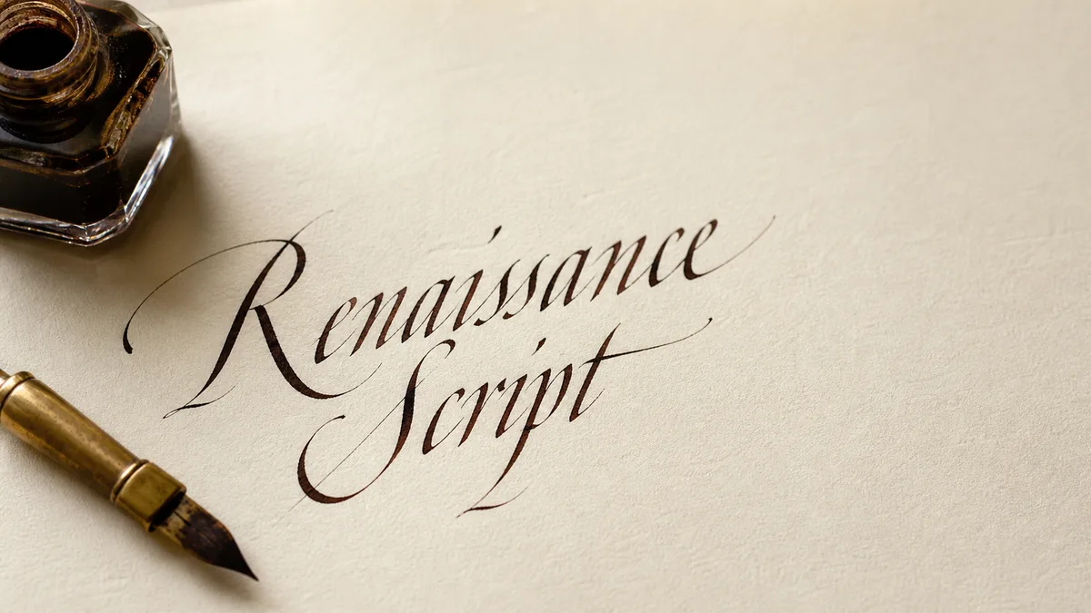
Learn broad-edge control with a steady writing-edge angle and light, even contact. Then isolate rotation, edge release and stroke building. These advanced changes reshape a stroke deliberately; they are not a reason to press a rigid nib harder.
A flat edge produces different widths as its direction of travel changes. That is the starting logic for italic, Foundational Hand and blackletter, though their proportions and stroke sequences differ. Pick one model for this session rather than combining every attractive feature into one alphabet.
Separate edge angle, travel and contact
Edge angle is the angle of the nib's writing edge to the baseline, viewed from above. Travel is the direction you pull the tool. Contact describes how much of that edge touches the sheet. None is the same as the holder's elevation above the desk.
Crossroads Calligraphy's comparison of pointed and broad nibs explains how nib width and angle produce broad-edge contrast. The nib guide helps identify your tool. For a cartridge pen, follow its ink and cleaning instructions; a wide edge does not make its feed suitable for dip-pen paint.
Establish a fixed-edge baseline
- Select smooth paper and a familiar, compatible ink. Use the paper guide if the edge catches or the ink feathers.
- Rule a baseline and x-height for your chosen model. Measure the height in nib widths with short stacked edge impressions. Do not assume one height ratio fits every script.
- Set the edge to the model's angle. For an isolated geometry drill, 45 degrees is an easy reference, not a universal rule for lettering. Pull several short vertical strokes without rolling the holder.
- Keep that edge angle while pulling a diagonal and a shallow curve. Observe the change in width caused by travel alone. Refill before a dry nib makes the comparison misleading.
Compare both sides of each vertical. An unintended taper can mean the holder rolled or one corner lifted. Reset with a small edge impression beside the next stroke. If the mark is still uneven, inspect ink flow and paper before changing technique. Our technique overview puts angle control alongside the other basics.
Rotate intentionally, in a small range
Rotation turns the edge relative to the baseline while you move. Start with a vertical pull and change from your reference angle to a slightly steeper angle halfway down. Stop and inspect the silhouette. Make a second stroke that returns to the starting angle near the end. Use a modest change that you can repeat rather than a dramatic twist.
Next, pencil a large circle and practice just one quarter of it. Turn the edge to keep its width roughly across the curve's direction of travel. Lift and reset between quarters if necessary. Later, join two quarters. This is a rotation study, not the fixed-angle oval used to learn a conventional letter.
Jake Rainis discusses rotation, releases and layered construction in his broad-edge stroke-control guide. Those concepts inform this drill sequence; the explanations and diagram here are original. His examples are not approval of this page, and a technique shown with one tool may not suit yours.
Practice release before adding a flare
Edge release reduces contact with the sheet. Begin with a short full-edge pull, then gently lift one corner near the end so the remaining contact makes a narrower finish. Keep the movement small. If the nib scratches, skips or resists, stop rather than driving the remaining corner into the paper.
Once the finish is predictable, try a short outward curve with the same corner release as you lift away. This makes a restrained flare. Practice it separately from a letter and aim into empty space. Increase speed only when the path is controlled. A flare that collides with the next letter is a spacing problem, not an achievement. The flourishing guide helps decide where decoration has room.
Build a stem and serif in separate strokes
Draw a short straight stem. Lift, then add a small diagonal serif that meets it cleanly. Repeat with the serif first and compare the joins. Building a shape from separate strokes lets you control the outline without demanding that one moving edge do everything.
For a pointed terminal, add one narrow reinforcing stroke after the main shape is settled. Avoid repainting the whole stem. Watch the counter, the open space inside a letter, while you add weight: a sharp outside edge is not worth closing that space. The letter-anatomy glossary names these parts, and common mistakes helps distinguish a small repair from a letter that needs redrawing.
Put the drills into a short word
Write a plain version of minimum or another stem-heavy word using your chosen model. Compare the internal gaps before adding anything. Use the letter-spacing guide to study the rhythm of dark strokes and white intervals. A font preview can suggest proportions; it does not prescribe a physical stroke order.
Make a second version with only one change, such as a modestly rotated capital stem or a released terminal. Keep the lowercase restrained. Plan a larger title with the calligraphy layout planner so the flourish has real space. Compare both versions at reading distance. If the decorated one reads less clearly, reduce the change.
Use a staged practice sheet
Create roomy rows with the practice-sheet tool. Use the first row for fixed-edge pulls, the second for small rotations, the third for releases and the last for built stems. Keep a plain reference stroke beside every experiment. This separates deliberate changes from drift.
Mark the row with your nib width, edge angle and paper. Circle a clean repeatable example rather than the most dramatic accident. Finish with one word and keep the sheet. On the next session, repeat the fixed-edge row first; advanced manipulation should add a choice, not erase your ability to hold the edge steady.