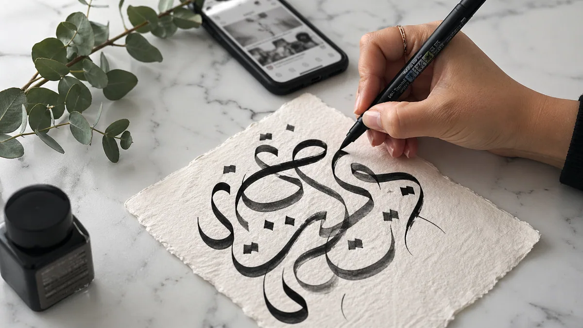
Begin calligraphy flourishing with a readable word and one pencil curve. Add ornament where there is room for it, then check whether the word is still readable without studying the decoration.
Flourishes can extend a letter or sit beside it as separate ornaments. A swash often refers to an alternate decorative letterform in a typeface. The terms overlap in casual use, but knowing whether you are editing a letter or adding a separate curve helps you avoid accidental extra letters. Our glossary explains the anatomy.
Use pencil before pressure
A pencil lets you study the path without also managing an ink reservoir or brush pressure. Write a short word you already know how to form. Leave space above and below it. If the base letters are uncertain, spend a session with basic strokes or your chosen alphabet before stretching their terminals into loops.
Loveleigh Loops' flourishing introduction recommends pencil or monoline practice and discusses oval-based curves. It is a useful instructional reference, not a rule that every tradition uses the same ornament. Our monoline guide is a suitable starting point when you want to practise the path without thick and thin strokes.
Find the space before drawing the curve
Look at the word's silhouette. Is there an open area beside a tall first letter, beneath a short ending, or above a row of small lowercase forms? Choose one area. Drawing a flourish into a gap is easier to judge than decorating every eligible letter. Avoid filling the space needed for another line of text or a card's trim margin.
Try the word hello as a layout exercise. Sketch one restrained entry curve on the h, leaving the two l loops alone. Then make a separate version with only an exit curve. Compare the versions instead of stacking the ornaments together. The spacing tool can help you notice when decoration disguises a gap that the underlying word still needs.
Build an oval, not a tangle
Draw the curve lightly and follow its direction with your eye. An oval usually changes direction more gradually than a tiny circular curl. Keep the turn large enough that you do not have to stop sharply at its tip. Repeat the same path beside the word to find a movement you can reproduce without straining.
Where a curve crosses itself or another stroke, leave enough visual separation to understand both paths. Crowded crossings can become dark knots when inked. For a first design, simplify an ambiguous crossing rather than adding another loop to balance it. The restrained structure in Copperplate and the different rhythm of Spencerian are useful comparisons, but study each with its own labelled exemplar.
Keep the letter recognisable
A flourish attached to an ascender should not turn it into a different letter. An extended t crossbar should not become a line through the next word. Cover the surrounding sentence and ask whether the single word still reads as intended. Then view the complete composition: a locally attractive loop may interfere with the line above it.
If the decoration makes the spelling uncertain, restore the original letter and use a separate ornament. Our join guide helps distinguish necessary connectors from optional extensions. In modern calligraphy, variation can be intentional, but readability remains a useful constraint for names, invitations, and headings.
Translate the pencil path into your tool
With a pointed nib or brush, practise the flourish separately before putting it onto finished work. Decide where a heavier stroke belongs in the model you are studying and where the path needs a light transition. Do not simply press at every downward-looking part of a rotated loop. Tool orientation and stroke direction need to work together, especially at a tight turn.
Use the nib guide and holder guide if the tool catches or your grip blocks the movement. A smooth surface can make fine lines easier to inspect; see paper choices. Stop when the hand becomes uncomfortable. Larger, easier curves are a better starting point than forcing a tiny ornament.
Use the generator as a layout sketch
The flourish generator lets you compare decorative curves around a word and export PNG or PDF. It is not a stroke-order tutor or a source of authenticated historical flourishes. Use it to compare placement, then check the physical movement against a teaching reference if you want to write the design by hand.
Try a simpler font in the cursive generator before blaming the ornament for every crowded area. For digital drawing, keep flourishes on a separate layer as described in the Procreate cursive workflow. That makes it easy to remove an experiment without redrawing the underlying word.
If you want a physical warm-up before adding decoration, use the printable loop warm-up pack. For nibs, holders, and ink that will make delicate curves easier to inspect, compare the recommendations in our calligraphy tools guide rather than choosing a flourish pen by appearance alone.
Finish at the intended size
Inspect the piece at the size its reader will see. Fine crossings that are clear on a large screen may merge on a small card. Leave enough margin that the longest curve is not clipped. Follow the digitizing guide if you need a reusable file, keeping in mind that a raster export is not automatically an outlined cut file.
End with one design you can explain: where the curve starts, which space it fills, and why the letters remain clear. That is a more useful practice result than an elaborate page you cannot reproduce.