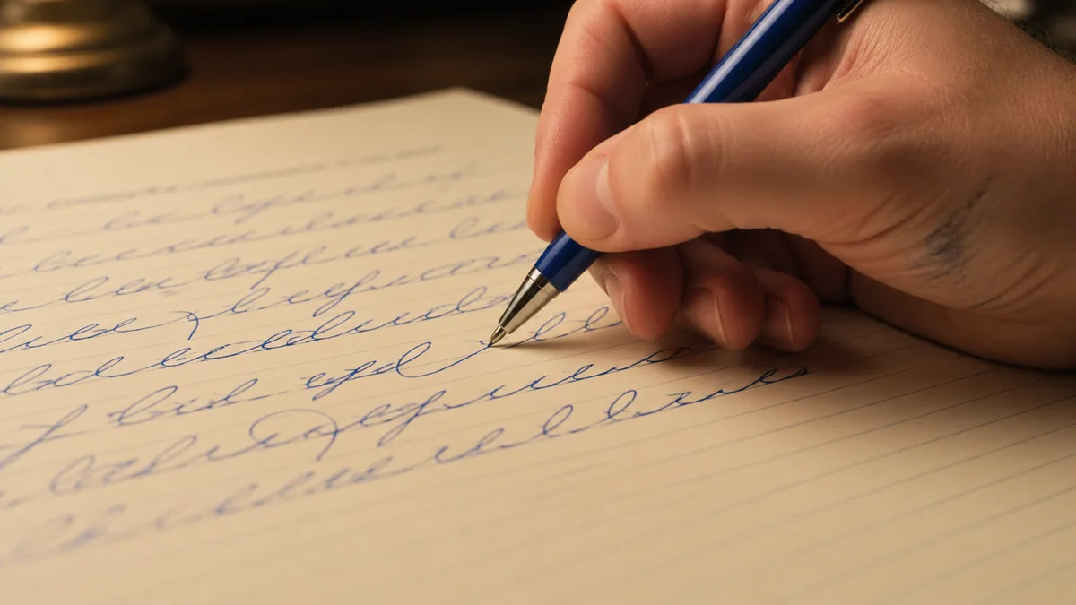
A cursive join carries the exit of one letter toward the start of the next without changing either letter into something else. Practise a troublesome pair first, then check it inside a word.
This guide is for diagnosing connections, not prescribing a universal school alphabet. Different handwriting models use different exits, loops, and pen lifts. Choose a labelled model from your teacher or reference book. Our cursive introduction covers the wider learning sequence; this page concentrates on what happens between two already recognisable letters.
Start with a compatible pair of letterforms
Write each letter separately and identify where the first finishes. Next, look at where the second begins. A join must bridge those positions while leaving enough space for both forms. If you mix the exit from one curriculum with an unrelated decorative font, that bridge may be awkward before you even start moving the pen.
The publisher's explanation of Getty-Dubay italic shows that joined writing can retain its basic italic letterforms. It is a useful example of why connected handwriting does not always mean looped school cursive, not proof that one system is best. Compare the options in our handwriting-method guide and cursive, italic, and script.
Compare low exits and higher exits
In many looped models, a letter such as i finishes near the baseline and rises into the next form. Some versions of o, b, v, and w leave from higher positions. Inspect the actual exemplar: those letters do not have one mandatory exit across all scripts. A high exit pulled down to the baseline unnecessarily can create an extra kink or a shape that resembles an added letter.
Try in and on if your model includes those joins. Mark the connection lightly in pencil on your reference, then copy the pair without adding extra humps. Compare the size of the n in both examples. Our letter reference identifies variant forms, while the glossary explains terms such as baseline, ascender, and counter. Use those terms to describe the problem precisely.
A short join exercise
For a printed comparison, keep our six-join Dancing Script reference (Free) beside the page. It shows font specimens, not the movement instructions for every handwriting model.
Choose one pair from a word you actually use. Write the first letter alone, the second alone, and the connected pair. Leave a visible gap before repeating the pair so you do not accidentally practise a new four-letter sequence. Compare each attempt with the model. Stop after a few examples and decide what needs changing before making more.
- Check that both individual letters are readable.
- Locate the first letter's exit and the next letter's entry.
- Connect them without squeezing the second letter narrower.
- Write the pair inside one short word and compare the spacing.
For example, work on mi before writing mint, or on ll before writing hill, provided those forms match your model. These are practice prompts, not a curriculum sequence. The worksheet generator can repeat custom words, but its fonts are tracing specimens rather than verified joining lessons. Keep the instructional exemplar beside the sheet.
Fix the gap rather than forcing the connector
When a word looks tangled, examine the empty spaces. A connector that rises too sharply can crowd the following letter. One that travels too far may make a single word look like two. Change the distance between the letter bodies before adding a new loop. The aim is a readable sequence, not equal measured gaps at every point.
Compare your examples with the spacing tool. In ordinary handwriting, keep a clear difference between spaces inside words and the breaks between them. In modern calligraphy, letter height can vary deliberately, but a join still needs a readable destination. Do not confuse a bouncy baseline with a connector that has lost its intended letter.
Pen lifts, dots, and capitals
Joining letters does not mean that your pen must stay down for every mark in a word. Follow your model for dotting, crossing, and planned lifts. Trying to complete a dot or crossbar without lifting can draw unwanted lines through the writing. Likewise, some capitals connect naturally and some are left separate; check the particular form.
Our capital reference gives variant-aware descriptions. If you are drawing decorative strokes rather than writing everyday notes, the rules of production differ again: cursive versus calligraphy explains that distinction. A cleanly connected painted word can be made from separate strokes.
Put the repair into normal writing
Write one sentence containing your practice word. Our sentence worksheet tool can provide font-based repetition, but also write the sentence without tracing. If the join works only when copied very slowly, keep the sentence short and let the movement become more familiar. No fixed number of repetitions guarantees fluency.
For adult practice, see relearning cursive. A fuller reference with labelled joins may be more useful than collecting random alphabets; our beginner book guide explains how to inspect sample pages. Keep the next session focused on the same real writing task until the corrected connection survives outside the exercise.
For prepared pair-to-word exercises, the Marck Script letter-join practice pack ($4) has ten lessons on common letter groups, followed by mixed words and sentences. Use it for copying the named font, not as stroke-order instruction for a different model.
For a traditional penmanship reference, consult the broader calligraphy book guide and check that the book actually covers your chosen hand. A volume of finished ornamental work is less useful for this task than a manual that explains where each letter starts and finishes.