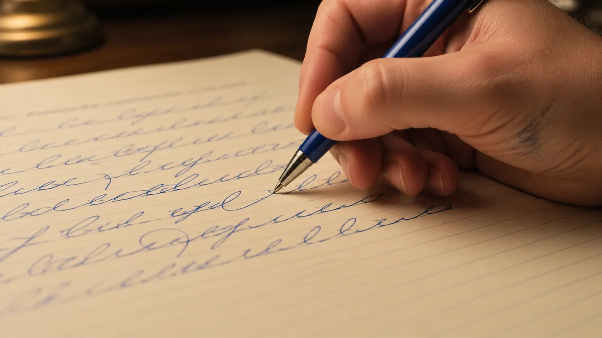
To relearn cursive as an adult, start with a sample of your everyday writing, choose one consistent model, and work on the letters or joins that make the sample difficult to read. You do not need to restart with an entire school workbook.
Your goal might be readable journal entries, a handwritten note, or simply enjoying a style you stopped using. Choose that goal before comparing alphabets. Decorative modern calligraphy and ordinary cursive ask for different amounts of time and care. The distinction in cursive versus calligraphy can save you from judging quick notes against a polished artwork.
Find out what needs changing
Write a short note at your usual pace: a few lines about a task you need to remember will do. Date it and leave it alone for a while. When you read it later, mark the places where you hesitate. Are the letters unclear, are words running together, or is the line drifting? Keep the parts that already work.
The National Handwriting Association's adult resources include approaches based on self-assessment rather than imposing one model. It also links to adult-appropriate copybooks and a free resource for unjoined writing. Those are useful options if you decide that legible print, rather than cursive, is what your daily task needs.
Record those observations on the handwriting self-assessment checklist (Free). Choose one thing to revisit rather than grading every letter.
Pick a model you can use repeatedly
Choose one reference with clear lowercase forms and examples of joins. Inspect its r, s, f, and z: familiar-looking alphabets can differ noticeably there. Do not combine a capital from a wedding font, a lowercase school alphabet, and a historical signature without understanding how the strokes meet. Consistency makes it easier to identify which part of a word needs repair.
Our cursive and italic comparison can help narrow the choice. Use the method guide if you want a named program. For a book, examine sample lessons before buying; the beginner book guide separates everyday readiness from specialist calligraphy study.
Make the setup comfortable
Use a familiar pen that writes without heavy pressure. Place the paper where you can see the line and move without twisting your wrist into an uncomfortable position. Try small adjustments rather than forcing a supposedly perfect grip. If you are left-handed, check where your hand passes over fresh ink and let the page position support visibility.
The left-handed guide discusses those choices. Our pen comparison is useful if the current pen skips or needs too much pressure, but new equipment is optional. Use ruled paper or a simple baseline to make height changes visible. Avoid shrinking the writing so far that you cannot see where a turn is closing.
Repair one small pattern
If your n and u look alike, practise their changes of direction in isolation, then use each in a short word. If the trouble is a connection, write the pair separately before placing it in the word. The join guide shows how to compare exits, entries, and space. Use the same letters you identified in the original note rather than drilling a random list.
A few attentive examples are enough to make a useful comparison. Circle the clearest one and describe why it works: perhaps the loop remains open, or the connector no longer crowds the next letter. Our cursive introduction provides more detail on individual forms. Do not treat any suggested practice schedule as a deadline for fluency.
Alternate copying with writing from memory
Copy a word with the reference visible, then cover the reference and write it again. Compare the results. Tracing can make you aware of a shape, but it does not tell you whether you can produce it without help. The worksheet generator can repeat your words as decorative font specimens; it is not an educator-verified handwriting curriculum.
If Marck Script is a model you want to copy, the longer-sentence practice workbook ($5) moves from short lines to linked thoughts, with open copying space. Its decorative font examples are separate from your everyday handwriting; keep checking the real task you identified at the start.
Use the spacing tool when the letters look acceptable but the sentence remains hard to read. Make word breaks obvious and keep the body height reasonably steady. Only then increase toward the pace needed for your real task. Slow artwork is not the same test as readable meeting notes.
End with something you would actually write
Finish a session with a short message, a journal sentence, or a list. Include the pattern you just practised. Next time, start by reading that piece before copying another model. If the repair vanished in normal writing, use a shorter task and the same pattern again. A dated sample is more informative than judging every attempt while the ink is still wet.
Save a small prompt in the practice calendar if reminders help you return. Read the practice guide for ways to structure sessions, and common mistakes when a repeated fault needs a clearer diagnosis. Keep a comfortable, readable style as the goal; matching somebody else's ornamental handwriting is optional.