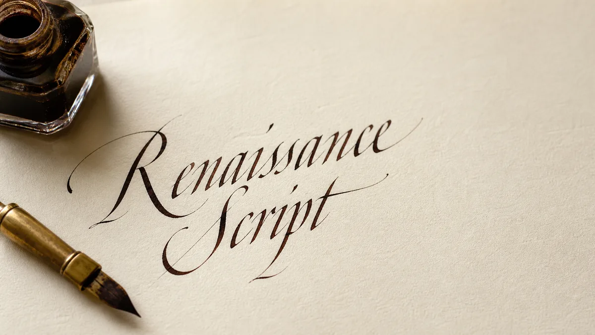
Cursive describes connected handwriting; italic can name a handwriting tradition or a typographic style; script often describes handwriting-like typefaces. They overlap, so the useful question is what you want to write, learn, or export.
A font menu, school workbook, and calligraphy class may use these words differently. None of the labels alone tells you the stroke order, degree of joining, or suitability for everyday notes. Use this guide to choose a direction, then use a specific exemplar or font rather than treating a broad category as an alphabet.
The same terms in different settings
| Term | Handwriting or calligraphy | Digital typography |
|---|---|---|
| Cursive | Writing with connections; exact forms depend on the model. | Often a loose label for fonts that resemble joined handwriting. |
| Italic | A family of hands with characteristic letter constructions, including joined everyday writing. | An italic font face; not necessarily connected or calligraphic. |
| Script | A general term that needs a qualifier, such as a named historical hand. | A typeface category inspired by written letterforms; some connect and some do not. |
The glossary explains more technical terms. For the difference between handwriting, deliberate pen strokes, and drawn letters, read calligraphy versus hand lettering. That is a different comparison from deciding whether a font should look casual or formal.
Cursive does not mean one school alphabet
A person may picture looped ascenders and descenders when they hear cursive, but joined handwriting includes other models. Capitals, connection heights, and pen lifts vary. A requirement to use cursive does not tell you which variant of r or z to copy. Start with the model used by the teacher, course, or reference you intend to follow.
Our handwriting-method comparison covers specific program choices. The beginner cursive guide is about practising forms, while the join guide helps when individually readable letters become crowded inside a word. You do not have to replace all your handwriting to repair one unclear join.
Italic handwriting can be joined
Getty-Dubay's publisher explains its model in What is Italic? and distinguishes basic italic from cursive italic. In that system, joining does not require replacing the underlying basic letter shapes. That is a description of the system, not independent evidence that it makes every learner faster or more legible.
Everyday italic handwriting also differs from a formal broad-edge calligraphy exercise. You can write an italic handwriting model with an ordinary pen. In italic calligraphy, the broad edge creates thick and thin strokes, and the lesson may prescribe nib-width proportions. Tilting ordinary text on a computer does not reproduce either the handwriting movement or the broad-edge construction.
An italic font is not simply a cursive font
In typesetting, a family may include a designed italic face with letterforms that differ from its upright face. An oblique treatment can instead slope the upright shapes. Font names and software menus are not always consistent, so inspect the actual letters. Neither treatment requires every character to connect to its neighbour.
Compare a word with repeated a and e shapes, such as a short name or heading. Look at the construction, not just the lean. Our custom-font guide explains how typefaces package shapes for reuse; fonts versus Unicode text explains why selecting a font does not change the characters on the clipboard. That distinction matters more than the label when pasting a name into a profile field.
Choose for the job in front of you
For notes, choose a model you can write comfortably and read later. Test a short ordinary sentence rather than a decorative alphabet. For a place card, a carefully constructed calligraphic hand may be worth the extra time. For a digital heading, compare fonts at the final display size and check that similar letters remain distinct.
Use the cursive generator for font comparisons and the font-pairing tool for a readable companion typeface. If the project involves learning with a pen, our pen guide helps match the tool to the hand. Buying a pointed nib will not give you the same contrast as a broad-edge italic nib.
Keep one comparison sheet
Our printed style-comparison sheet (Free) puts a few script-font specimens beside a lowercase Letterpaths model. It is a visual reference, not an Italic course or a font download.
Write the same short sentence in your current handwriting and the model you want to try. Add a printed font specimen beside them if you are comparing visual styles. Label each source so a decorative digital sample does not quietly become your instructional reference. Check word spacing and recognisable forms before judging ornament.
The practice-sheet tool produces font-based tracing pages for that comparison. For a named historical hand, consult the history guide and choose a reference with actual construction instructions. Keeping the intended task and the source visible is more useful than finding a supposedly definitive winner between three overlapping words.