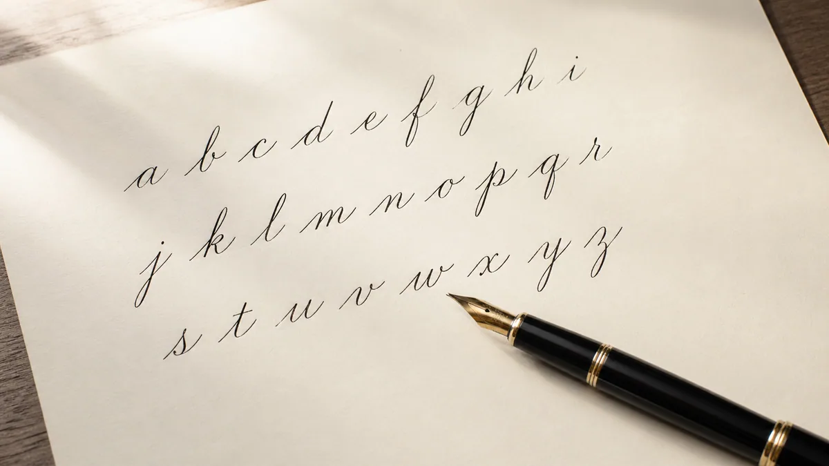
D'Nealian and Zaner-Bloser are handwriting programs. Cursive is a category of handwriting, not a competing curriculum. Both programs teach manuscript and cursive forms. Italic handwriting offers another route from separate letters to joined writing. Start with the model used at school, or compare sample lessons if you are choosing for yourself.
If your child has brought home an alphabet that looks different from the one you remember, start with the teacher's model. A second workbook can introduce different capitals or joins just as the first set becomes familiar. Our cursive learning guide explains the practice process; this comparison helps you choose what to practice. There is no academic-outcome ranking here, and a comparison of alphabets cannot diagnose a handwriting difficulty.
What each name means
D'Nealian: slanted manuscript with exit strokes
D'Nealian manuscript is recognizable for its slant and curved exit strokes on many lowercase letters. Those exits are often called tails. They introduce movements used when letters join. A child still needs to learn how those joins work within a word; adding connectors between printed letters is only part of the task. Follow the sequence and exemplars in the current edition rather than combining samples from unrelated internet charts.
Look at the publisher's D'Nealian Handwriting materials before choosing a level. Check the actual lowercase alphabet, the size of the writing lines, and the move from letters to words. The connected appearance can appeal to a learner who enjoys flowing shapes. Another learner may need extra demonstration to distinguish a letter body from its exit stroke. Watch how your learner handles the sample before deciding whether it suits them.
Zaner-Bloser: distinct manuscript and cursive models
Zaner-Bloser is commonly associated with upright manuscript letters built from familiar straight and curved strokes, followed by a separate cursive alphabet. The change is visible: a printed letter and its cursive counterpart may have different starts or shapes. That explicit transition can make sense for children who already use conventional print. It also means an adult should demonstrate the new movement rather than expecting a child to infer it from a finished word.
Consult Zaner-Bloser's own program resources for current scope and sequence. When comparing workbooks, inspect a lesson rather than relying on the cover's grade label. Can the learner tell where to start? Is the model visible while writing? Does the page leave space for independent attempts? Those questions matter more than which alphabet an adult finds prettier.
Italic: related basic and joined forms
Getty-Dubay italic begins with basic italic and develops joined forms while retaining the underlying letter shapes. The publisher's comparison of handwriting methods illustrates that relationship. Its argument for italic is a publisher's case for its own approach, not an independent trial proving superiority. Italic typically uses selective joins and avoids the many loops associated with conventional school cursive. Joined writing does not have to connect every letter in a word.
Everyday italic handwriting is also different from the broad-edge art described in our italic calligraphy guide. You can practice handwriting with an ordinary pencil. A chisel nib adds contrast and a separate tool-control problem; it is not a requirement for joining italic letters. See cursive versus calligraphy when the distinction becomes confusing.
A practical comparison before buying a workbook
| Approach | Starting model | What to check |
|---|---|---|
| D'Nealian | Slanted manuscript with exit strokes on many letters | Can the learner separate the letter body from its joining movement? |
| Zaner-Bloser | Upright manuscript, then a distinct cursive model | Is the transition taught explicitly, including unfamiliar capitals? |
| Getty-Dubay italic | Basic italic, then selective joins | Does the chosen course explain when to join and when to lift? |
Choose for the learner in front of you
For a child attending school, ask which edition and letter models the class uses. Match those at home unless the teacher recommends an alternative. For a homeschool learner, compare sample pages and choose a course whose instructions the adult can demonstrate. For an adult improving personal handwriting, there is more room to choose. Try a model in the writing you actually do, such as a notebook entry or a letter to a friend.
Try a short, low-pressure sample before committing. Write a few familiar letters, a name, and one short sentence. Notice legibility, comfort, and how often the learner has to stop to decode the model. Do not turn the trial into a timed contest. Keep dated samples, then compare like with like after practice. Our practice guide discusses setting a small, observable goal, while the practice calendar can help you remember the next session.
Compare joins, spacing, and capitals separately
A learner may form isolated letters well but lose clarity in words. Inspect the space inside an oval, the gap between neighboring letters, and the larger gap between words. The spacing tool helps explain visual spacing, but the chosen curriculum decides the actual joins. Our letter library can help with recognition across forms. For school practice, keep the teacher's alphabet beside the page instead of copying those decorative samples.
Capitals deserve their own check. Some finish separately; others offer an exit that joins. Follow the letter model instead of a blanket rule that the pen must never leave the page. For broader visual context, compare the historical hands in our style guide and calligraphy history. Those traditions help explain variation, but their elaborate forms need not become a child's everyday handwriting target.
Keep the materials ordinary
A comfortable pencil and appropriately sized ruled paper are enough for a first comparison. Check paper types and ruling before buying specialty pads. A broad-edge pen or flexible dip nib changes the task and can hide whether the handwriting model itself is working. Our pen guide is useful later, when the learner wants decorative lettering rather than school handwriting. Stop if writing hurts; persistent discomfort calls for individual advice, not a harder worksheet.
When changing methods makes sense
Do not switch after one untidy page. First check whether the learner understands the start point, has enough space, and can see the model. If difficulties persist, discuss them with the teacher and agree on a specific adjustment. The left-handed setup guide offers positioning ideas, not a rule that left-handed learners need a different alphabet. If you do change methods, keep a sample from before the change and give the new model a consistent period of practice. That gives you something useful to discuss at the next teacher meeting.
Editorial comparison updated September 20, 2026. Sources are the program publishers linked above; this is not a classroom trial or educator endorsement. D'Nealian, Zaner-Bloser, and Getty-Dubay names identify their respective programs. Sample availability and editions can change.