
Make a hand-lettered journal cover by planning a short title on a separate paper label, testing your pen, and attaching the dry label to an ordinary notebook. Add a matching bookplate inside. This project is about lettering and layout, not making a sewn binding.
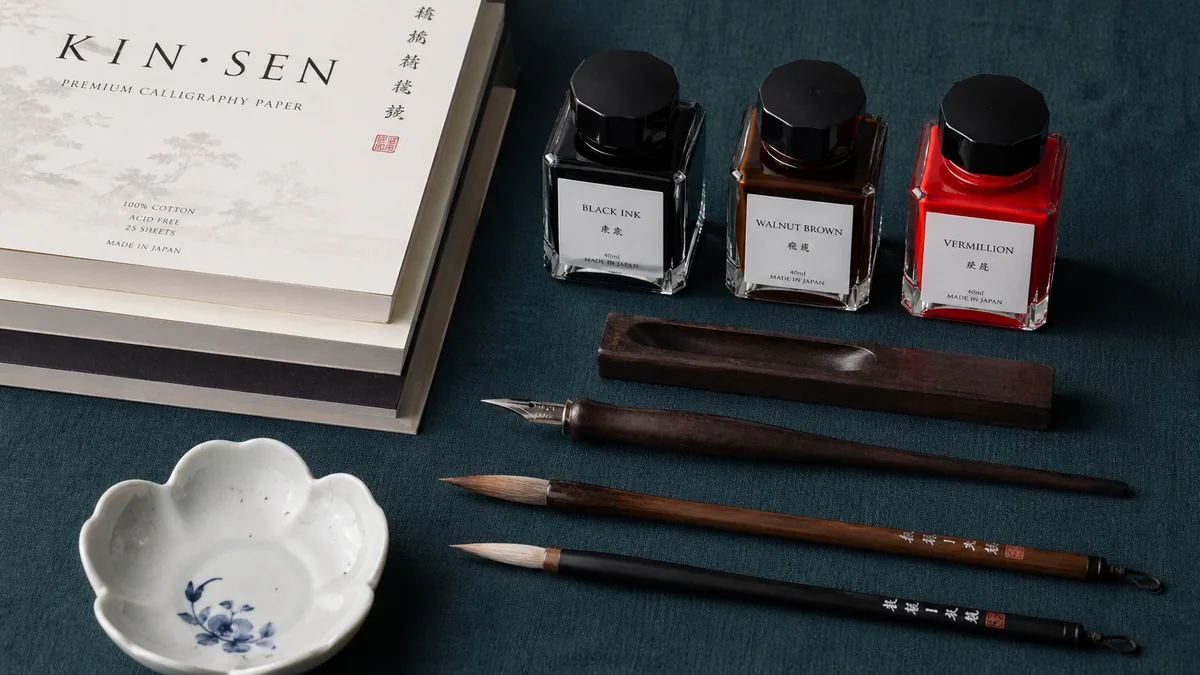
Book arts can suggest projects without becoming instructions to copy. Utah Calligraphic Artists' April 2026 French-link journal announcement describes a taught, sewn journal project. It is inspiration here, not the source of our layout or a binding lesson. Start with a notebook you own, pencil, ruler, scrap paper, and a familiar pen. The hero illustrates lettering supplies, not a photograph of this finished project.
1. Make a label that fits the cover
Measure the cover while it is closed. For an A5 notebook, a 100 × 65 mm paper label is a workable starting point; leave at least 10 mm inside each label edge for breathing room. Adjust for the notebook you actually have. Use a ready-sized label or paper piece rather than cutting into a bound cover.
Reserve a narrow strip at the spine where bending might loosen the label. Pencil the label position lightly on a removable paper mockup first. The composition planner can help compare title lines, but measure the printed draft against the physical notebook. A screen preview cannot establish the cover's dimensions.
2. Give the title a clear hierarchy
Try Field notes on two lines, with a small year beneath it. Make the important word larger and leave the subtitle plain. Use the font-pairing assistant to compare that relationship, then draw your own pencil draft. The calligraphy and hand-lettering comparison explains the difference between writing strokes and constructing letters.
Write the full title on scrap, not just its prettiest initial. Check the widest line and any long descenders. The spacing guide tool can help compare gaps; keep enough room between the lines that a descending y does not touch the subtitle. Rehearse a shorter title if the layout feels crowded.
3. Choose a pen for the surface
A familiar fineliner and monoline letters keep this first cover manageable. Test ink on the same label paper for spreading and drying. Coated, fabric, and textured notebook covers behave differently, which is why the separate label is useful. Our paper guide explains surface differences; paper weight alone cannot predict a clean line.
For a painted label, use suitable paper and follow the watercolor lettering lesson before mounting it. For broad expressive marks, read the ruling-pen guide and rehearse larger than this small label. A tiny cover is a poor place to discover how an unfamiliar loaded tool releases ink.
4. Add one original ornament
Choose a bird above the title, a banner below it, or a frame around one initial. Leave the other decorations out. These original SVG examples have blank lettering areas and transparent backgrounds. Download and resize one in an SVG-capable editor, or print it as a pencil-layout reference. They are design shapes, not a verified pen-stroke sequence.
Free to use, modify, and share, including commercial work; do not sell these files or repackaged copies. Read the free-use, no-resale license. These three designs contain no third-party artwork or bundled fonts. For drawing your own decoration, start with the flourishing guide. For a digital title sketch, try the text flourish generator.
5. Match the bookplate to the cover
On a second small label, write This book belongs to and leave a generous name line. Repeat only the cover's plain lettering or small border. Existing classic bookplates and modern bookplates are an alternative with fixed printed designs and blank name space. They are existing stationery, not new editable templates.
Place the bookplate on the inside front cover rather than over a pocket, elastic fixing, or printed ownership information. Check that the closed notebook still sits comfortably with the extra layer. If the cover coating resists the adhesive, leave the label loose while you choose a suitable method. Do not keep adding glue to a damp patch. The matching lettering matters more than making every surface accept the same label.
Optional: a no-cut folded note
For mini book lettering practice, take one landscape A4 sheet, 297 × 210 mm. Bring its left edge to its right edge and crease; fold the resulting 148.5 × 210 mm sheet top to bottom. The closed size is 148.5 × 105 mm. With US Letter paper, the same folds give 5.5 × 4.25 inches. This makes a four-panel folded note with a closed edge, not a sewn book or eight independently opening pages.
Mark the front lightly in pencil before unfolding to letter it. Keep words clear of creases and put a short note on the inside spread. For more calligraphy journal ideas, repeat the layout as a monthly heading. Check the mistakes guide before adding ornament to cramped lettering; photograph the dry result using the digitizing guide if you want a record of the layout.